DH101

Introduction to Digital Humanities

Page 24 of 38

Week 5 Frosted Sugar Bombs

This week I decided to look at the Frosted Sugar Bombs data which was basically just a list of ten thousand boxes of Frosted Sugar Bombs weight. From the data presented you can see very small differences in the weight of the boxes. However, with this scatter plot:

Screen Shot 2015-10-26 at 9.31.41 AM

One can begin to visualize just how far apart the weights can vary. The line graph helps the reader see around where the mean exists in this data. From the data, I found that the median was 20.45 oz, 20.44 oz was the mode, and the range was 19.74 oz to 21.16 oz. This graph does not examine all the data but instead looks at 100 values of weight in order to condense the scope of the project. It is unnecessary to look at 10,000 boxes when statistically taking a smaller subset of that data would not affect finding the mean or variation substantially in your final analysis.

Dow Jones and S&P 500 Monthly Closing Prices

John Rauch

DH 101 Blog 4

Disc 1C

For this blog post and data visualization, I chose the Dow Jones and S&P 500 data from Dr.Rasp’s website. I chose this data because I personally trade the financial markets, and found this information relevant.

Essentially what this data is, are all the prices the Dow Jones and S&P 500 closed at, at the end of each month over 20+ years. The excel spreadsheet contains only three columns: one for date, Dow Jones, and the S&P 500. There are 254 rows, so just looking at this data in Excel, the information is not very valuable. Furthermore, it would take a long time to scroll through each and every role. Data visualization is essential to make practical use of this date. I chose to use Tableau Public as my data visualization tool for this dataset.

Screen Shot 2015-10-26 at 8.38.49 AM

This first visualization shows the price action of the Dow Jones (Dija) compared to the price action of the S&P 500 over 22 years, along with the prices each of them touched at the particular time each year. Already, this data is much more useful, and we can see things we could not have just looking at the Excel sheet. First, both of these instruments move at roughly identical averages, almost mirroring one another. Next, we can see that price consolidated and moved sideways from about 1997-2011, before experiencing a sharp drop around 2012. We would not have been able to tell this quickly from just the Excel sheet. I also included trendlines for visualization, which helps to further analyze the movement of these instruments over time, something only possible through data visualization. Traders would find this very helpful, as trendlines are a major tool used in the financial markets.

Screen Shot 2015-10-26 at 8.38.34 AM

This next chart is further confirmation of what I have analyzed above. The Dow Jones is in blue, and the S&P 500 is in orange. This again works to show the very close relationship these two instruments have to one another, moving in very similar patterns and adhering to very similar trendlines. This information would be very valuable to traders looking to invest. It would not be wise to go “long” and buy either of these instruments, as price has broken down and through all previous trendlines.

Starting from a basic Excel sheet with only 3 columns, I have turned this data into something much easier to digest, by using data visualization. This is essential to truly understanding the importance of the data, and is very helpful to be seen with these visualization tools.

Chocolate Frosted Sugar Bombs

Weights of Boxes of Chocolate Frosted Sugar Bombs

I chose to visualize the Chocolate Frosted Sugar Bombs dataset that gave the weights of 10,000 random boxes of the Chocolate Frosted Sugar Bombs breakfast cereal using a Tableau Public bar graph.

 Screen Shot 2015-10-26 at 5.47.30 AM

What does your visualization tell you that you couldn’t see from the data itself?

Just by looking at the dataset, there wasn’t much that could be concluded because the data itself is just a list of the weights that isn’t organized in any way.  There is also a huge amount of data in this set with 10,000 weights, so the bar graph really helped in organizing all the weights (gives the count of boxes under each weight category) and visualizing the range, median, and mode of the data.  From the data, I could see that the median was 20.45 oz , that the data was most concentrated around that area, 20.42 oz was the mode, and the range was 19.74 oz to 21.16 oz.  I was surprised to see that 20 oz fell pretty far left of the graph because I had assumed before seeing the graph that 20 oz would be the median and the rest of the box weights would fall closely on either side of 20.   Of course Chocolate Frosted Sugar Bombs are fictional, but it was also interesting to see that of the 10,000 recorded weights, there were only thirty-four different box weights.  Of the 34 different weights,  27 of the 34 fell greater than 20 oz.  It was also interesting that the creators gave such a large dataset and were specific enough to give weights rounded to the 100ths place for a fictional product.

Florida Lottery Data Visualization

Screen Shot 2015-10-26 at 12.04.46 AM

The data set that I chose to analyze are the winning lottery number in Florida from 1988 to 2008. The tool that I chose to create this visualization was RAW. According to Yau, data visualizations are all about noticeable visual cues that impart information. The visual cues that are evident to this data set are color hue, position, and shape.

The most obvious visual aspect of this graph is the color hue. In RAW there were two coloring options, ordinal (categories) and linear (numeric). I selected linear because when the x-axis information (winning numbers) was considered categories there were too many colors that correlated with different numbers. Using linear, the color hue progresses darker with a greater amount of that number being a winning number during that year. The colors tell us that in the late 2,000 there were a lot of repeat lower digit winning numbers.

The position of this data visualization is harder for me to decipher than the color. There seems to be a clustering of slightly more hexagons and smaller dots by the darker colors. The similarity leads me to think that the position serves the same purpose as the color cue.

The shapes used in this visualization are hexagons. According to RAW, the purpose of the hexagons is to create a more comprehensible scatterplot, when graphing something with hundreds of points. The hexagons do make this visualization easier to read, however there are still smaller points within the hexagons and I’m not exactly sure what they mean.

Some of the visual cues broken down by Yau but not used in this specific data visualization are length, area, and volume. Because the data is not categorical length is not that appropriate of a tool for the lottery information. Volume and area could have possibly been used to show when there were a lot of the same winning numbers, but is probably not the most efficient way. There are many specific graph types that also would not make sense with this data, such as pie charts, bar graphs, or any other type that caters toward categorical data.

Overall what I learned from putting my data into RAW is that from around 2006-2008 there were the most repeated winning numbers and they were lower digits. The conclusion makes sense because single digits are more likely to reappear in a number sequence than double digits. Also there were more lottery numbers drawn in the more recent years than in the past.


Best City to NOT Live In

I chose the Best City in Florida dataset to put through various data visualization tools and see what kinds of results could be created. This dataset included information for twenty cities in Florida in regards to several quality-of-life variables. These variables ranged from household income, to literacy rate, to golf, to murder rate.

Working with this particular dataset, I definitely had to think it through and do a bit of manipulation to the way the dataset was processed through certain visualization tools. Using Google Fusion Tables, I imported the dataset Excel sheet and played with the various chart options that this data visualization tool offered. Many of them really didn’t make sense to me, as I wasn’t sure which variables were being shown, what particular numbers meant, etc. I had to do some minor editing of the dataset. For example, I found that I had to change the naming of the first column, as the tool labeled the first column as “col0” when it was actually the column that identified the Florida “city,” but Google Fusion Tables didn’t catch that intuitively.

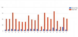
Then, I realized that for each chart/graph you had to choose which particular variables you wanted to focus on. Additionally, only certain ones made visual sense depending on the type of chart/graph. Not purposely trying to be morbid, I chose to analyze and compare murder rates and rape rates within each city. As Yau proposes in “Data Points,” data should be represented “with a combination of visual cues that are scaled, colored, and positioned according to values.” I chose to create a categorical bar chart (Chart 1) that would allow me to do just that to the data.  I was able to sort the data by city and put the murder rates and rape rates side by side. However, I first had to change the default number of  10 maximum categories to 20 so as to include all the cities that were in the dataset. After doing that, I could see which cities had the lowest rates of danger vs the cities that had to highest rates of danger. It looks like the city, P, would not be the safest to live in as it has the highest rape rate and the second highest murder rate.

Screen Shot 2015-10-25 at 10.49.06 PM
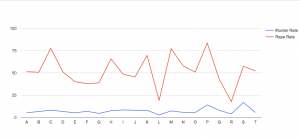
I also chose to look at the data through another visualization, one that charted lines side-by-side (Chart 2). By doing so, you could visually see in another way the higher murder and rape rates in city P, as both lines relatively spike/peak for the particular P point on the graph.


Screen Shot 2015-10-25 at 10.57.31 PM

Putting this particular dataset through thses visualization tools illuminated certain aspects of the data that I couldn’t see through just the excel sheet, like which city has acquired the highest rates of danger (murder and rape), as compared to the other Florida cities included in this study.  This exercise was definitely way more challenging than I expected. I’ve learned that all kinds of decision-making goes into data visualization, way more than I initially thought.  You can’t just import an excel sheet into these tools and magically create comprehensive charts and graphs that make sense. You really have to know and understand what variables you want to focus on and visualize, as well as understand the kinds of visualizations you want to make and which make sense with the data you have on hand.

Chocolate Frosted Sugar Bombs!

Although the Chocolate Frosted Sugar Bombs dataset is quite basic, I had to choose it because it relates to Calvin and Hobbes!

chocolate-frosted-sugar-bombs

This dataset deals with a random sample of 1000 boxes of the fictional cereal, and their corresponding weights.


For my visualization, I used Tableau to map out the counts for each measured weight. Close data points are grouped together, so its a more cohesive histogram. In this imaginary case-study, the manufacturer is under investigation for whether the cereal boxes truly did contain over 20 ounces as advertised.

Screen Shot 2015-10-26 at 12.16.41 AM

Without the actual visualization, it would be unclear whether the “General Junkfoods Corporation” really did participate in active false-advertising. There are 1000 separate records, so it’s difficult to come to a conclusion with just a glance. By using a histogram visualization on Tableau, I can see that the average weight is around 20.45oz. There are cases where the boxes fall under 20oz, but that occurs for less than 10% of the products.


It’s also interesting that the data fits an approximately normal distribution. Even for an imaginary manufacturing process, there is variation in the final products–some lucky consumers get an extra ounce of sugary goodness!


Note: Sorry for the low resolution images. The original files are higher quality, but they seem to downgrade on WordPress.

Visualization of NCAA baseball data

Nathan Yau defines good visualization as a representation of data that helps you see something that you might otherwise not be able to see by only looking at the source information. It enables you to visualize trends and patterns that allow you to see the information in a new way that is like seeing it for the first time. It was information that was there all along but it was slightly hidden and is now more apparent.

Data is the foundation for the visualization and the more you understand and the stronger the data base the greater the potential for an effective data graphic. Yau explains that a lot of people miss an important point and that is that good visualization is a winding process that requires statistics and design knowledge.

For my visualization I selected NCAA BASEBALL. File Name:NCAABASEBALL.XLS. This particular data contained information regarding the NCAA Regional Baseball tournaments from 2003 to 2008. These Regional baseball tournaments determine the 8 teams that will ultimately play in the College Baseball World Series in Omaha, Nebraska. The data included the City (or the site) where the game was played, the game number, the winning team, number of runs they scored, what seed the team was listed as, the losing team, how many runs they scored, and the seed number of the losing team. For the purposes of my visualization I selected to use RAW. RAW is an open source web tool that provided the ability to use a spreadsheet from Microsoft Excel into a graphic visualization. From RAW visualizations can be easily imported in and edited, or directly embedded into web pages.

Graph of NCAA Baseball

My first step was to select the data from the year played, the ranking that each team had and whether or not they won the game.  This allowed for the chart to display whether or not there was a relationship between how high a baseball team was ranked and whether or not they won the game. It would make sense statistically that the higher a team is ranked the more likely they are to win the game.

Best City In Florida Visualization

I chose to look at the Best City in Florida data set, as taken from Dr. John Rasp’s Statistics Website. The data set contains numerous categories pertaining to the quality of life of twenty different cities in Florida. These categories include: income, commute, job growth, physicians, murder rate, rape rate, golf, housing, median age, literacy, household income and recreation. A few things stood out to me when first looking at my data. The “top city” in each of the different categories varies quite substantially city to city. For example, those with the highest income and housing do not have the nearly the highest for golf and the rape/murder rates are still fairly high.

One of the things I was interested in looking at was the income level compared to murder rates to see if there is any correlation. Those with higher incomes generally live in areas less ridden with rape and murder. I was kind of shocked to see that that’s not really the case. As expected, those with lower income levels do indeed have more instances with murder, but those who have higher incomes (ie. the 40K dots) have murder rates equal to or higher than many of those cities with lower incomes.

Income v. Murder Rate

I was also interested in looking at job growth vs. income. I assumed that job growth would decrease when higher paying jobs produced higher income. After looking at the chart, it is safe to assume that I was actually incorrect until you get to the highest income levels. Lower paying jobs appear to be highly volatile when it comes to job growth, yet once one passes those lower levels, job growth appears to be at a steady, though minuscule, incline.

Screen Shot 2015-10-25 at 11.25.19 PM

I never thought about how interesting this type of data could be until I could actually visualize it and test my hypotheses. Super cool.


US Death Rates Caused by Homicide and Suicide

deathratesusgraph

I chose to visualize the United States death rate data sourced from the Statistical Abstract of the United States.  The data provides statistics of various causes of death in each state as well as information on related factors.

In my visualization, I compared the death rates caused by suicide and homicide per state by using Tableau’s side-by-side bar graph function.  I thought it was very interesting to see that in most states suicide was a greater cause of death than homicide except for the District of Columbia, Louisiana, and Maryland.   It was also fascinating that the District of Columbia had a tremendously large amount of homicides compared to every other state.  From viewing the data in this way it made me wonder if the data has any correlation in the citizens’ of the various states outlook on their quality of life or safety of where they live.  Also, if the data provided information on the death rates from year to year it would be interesting to see how/if the rates were affected by major events that occurred in the state each year.


Blog #4 Digital Visualization Dija S&P


Untitled


Before I begin to discuss what the data visualization provides I want to discuss why Tableau was the best tool to analyze this data. I began by trying to input the data into the RAW web program but I ran into the issue that the software more useful in mapping correlation on single cases rather than then compare changes over time. This is when I realized that the right program to represent this data was Tableau for its flexibility on portraying data.

From the Tableau program was able to plot the two sets of data against each other. We looked at the data from two different markets and compared them over time. There are a couple of advantages of being able to compare the data visually as opposed to mathematically on an excel sheet. To begin with, when the data is represented visually one can see trends without having to think about the changes. This allows for people who are viewing the data to be able to think about the implications that the data may show instead of having to think about what the trends are. Also the changes in the graphs are easier to note when portrayed accurately. In class we discussed ways in which some data can be presented certain ways in order to create certain effects that may fool the observer.

What the data shows as opposed to the excel is that there is general consistency between the DIJA and the S&P. This could help in the field of economics in the way that one understands the economy is consistent amongst most companies. There is not one set of companies that constantly out perform all others but rather there is a economic trends that effect an entire country all at once. With excel sheets, the similarities can also be observed but not with the same amount of clarity. There is a small difference in between both data sets which is that in general S&P chart at times does better than the Dija but they tend to continuously fall back into equilibrium. This might be harder to see if one was to look at just once data point. One might assume that the S&P is more successful than the Dija but with a visual representation of the data over time, one can see that in reality the two markets are basically the same in terms of performance over time.

« Older posts Newer posts »

© 2026 DH101

Theme by Anders NorenUp ↑