Nathan Yau defines good visualization as a representation of data that helps you see something that you might otherwise not be able to see by only looking at the source information. It enables you to visualize trends and patterns that allow you to see the information in a new way that is like seeing it for the first time. It was information that was there all along but it was slightly hidden and is now more apparent.
Data is the foundation for the visualization and the more you understand and the stronger the data base the greater the potential for an effective data graphic. Yau explains that a lot of people miss an important point and that is that good visualization is a winding process that requires statistics and design knowledge.
For my visualization I selected NCAA BASEBALL. File Name:NCAABASEBALL.XLS. This particular data contained information regarding the NCAA Regional Baseball tournaments from 2003 to 2008. These Regional baseball tournaments determine the 8 teams that will ultimately play in the College Baseball World Series in Omaha, Nebraska. The data included the City (or the site) where the game was played, the game number, the winning team, number of runs they scored, what seed the team was listed as, the losing team, how many runs they scored, and the seed number of the losing team. For the purposes of my visualization I selected to use RAW. RAW is an open source web tool that provided the ability to use a spreadsheet from Microsoft Excel into a graphic visualization. From RAW visualizations can be easily imported in and edited, or directly embedded into web pages.
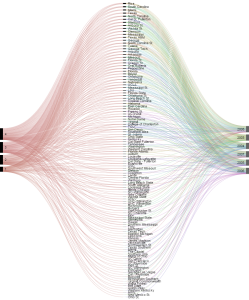
My first step was to select the data from the year played, the ranking that each team had and whether or not they won the game. This allowed for the chart to display whether or not there was a relationship between how high a baseball team was ranked and whether or not they won the game. It would make sense statistically that the higher a team is ranked the more likely they are to win the game.