I chose to look at the Best City in Florida data set, as taken from Dr. John Rasp’s Statistics Website. The data set contains numerous categories pertaining to the quality of life of twenty different cities in Florida. These categories include: income, commute, job growth, physicians, murder rate, rape rate, golf, housing, median age, literacy, household income and recreation. A few things stood out to me when first looking at my data. The “top city” in each of the different categories varies quite substantially city to city. For example, those with the highest income and housing do not have the nearly the highest for golf and the rape/murder rates are still fairly high.
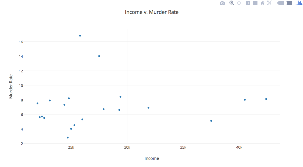
One of the things I was interested in looking at was the income level compared to murder rates to see if there is any correlation. Those with higher incomes generally live in areas less ridden with rape and murder. I was kind of shocked to see that that’s not really the case. As expected, those with lower income levels do indeed have more instances with murder, but those who have higher incomes (ie. the 40K dots) have murder rates equal to or higher than many of those cities with lower incomes.
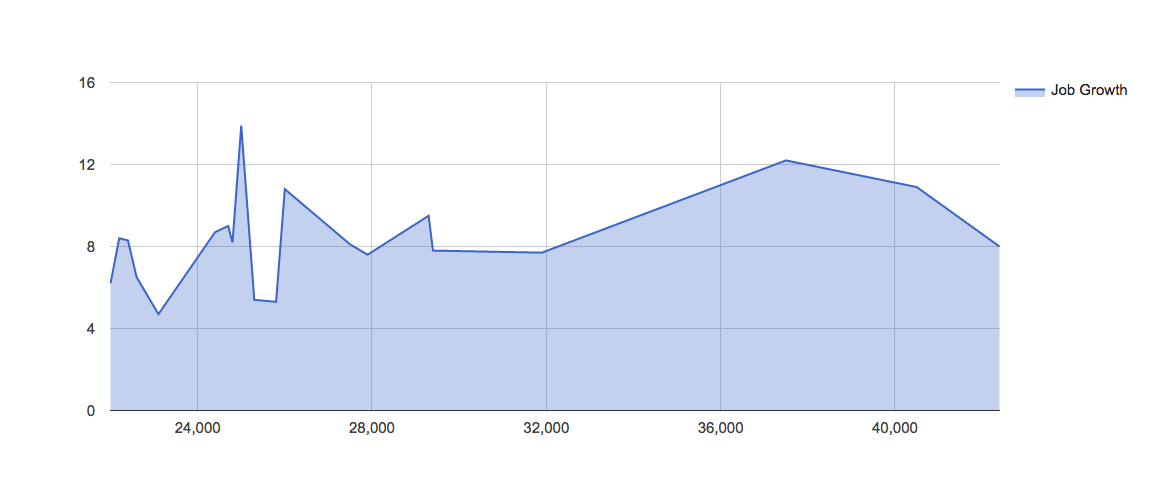
I was also interested in looking at job growth vs. income. I assumed that job growth would decrease when higher paying jobs produced higher income. After looking at the chart, it is safe to assume that I was actually incorrect until you get to the highest income levels. Lower paying jobs appear to be highly volatile when it comes to job growth, yet once one passes those lower levels, job growth appears to be at a steady, though minuscule, incline.
I never thought about how interesting this type of data could be until I could actually visualize it and test my hypotheses. Super cool.