http://nydishes.com/blogpost/DH.html
DH101
Introduction to Digital Humanities
Month: October 2015 (page 1 of 18)
Data visualization is a great technique for human beings to simplify something really complex and present in a comprehensible manner. Although it is a great tool, if not used correctly, it would be misleading and even be just as ineffective as receiving a raw data set.
Having been exposed to data visualization tools, I have played around with the data set for Amazon and CoCo Cola. The reason why I chose this data set was mainly for because I am interested in these stock prices of these companies. Also because I am an economics major and looking at these markets is something I do. The raw data was given in a form of an excel sheet that consists of 3 columns. That was it. With thousands of rows whose value consist of numerical number it is quite difficult to draw any conclusion or make any predictions of future stock prices. So I experimented with Tableu and came up with the following graph below.
As you can see, in the bar graph, coco cola has more positive returns than that of amazon. That we can easily see with the visuals provided in the bar graph. However, like I said before, you have to be careful of how you use data visualizations for it can be misleading. Although, coco cola seems to be doing better in returns, we can see that amazon has a higher return percent than that of coco cola.
Although data visualization can be misleading, when use correctly, it opens doors to effectively improve on a companies operation.
“Visualization is what happens when you make the jump from raw data to bar graphs, line charts, and dot plots…It’s easy to think that this process is instant because software enables you to plug data in, and you get something back instantly, but there are steps and choices in between…”– Nathan Yau, Data Points

Amazon Closing Price from 2004 to 2014 —– Yes, Nathan Yau, I thought it would be easy to make this data visualization but you were very right -there were actually many steps ..
After going over our survey results with RAW in class Wednesday, I felt pretty competent in using the data visualization tool. It was my first choice for the assignment because of this but also because of the pop in color and graphics it offers. In Data Points, Nathan Yau (Statistician and fellow Bruin) advises the ingredients to an effective data visualization are visual cues, coordinate system, scale, and context. I thought I could use RAW to communicate this but after my first half a dozen tries,I didn’t know what I was looking at. They key was choosing the appropriate graph for my data and finding relevant points to correlate.
The RAW graph above shows the closing stock market prices for Amazon.com from 2004-2014. I used the Hexagonal Binning that visually clusters the most populated areas on a scatterplot.
The prices ranged from 284 to 358 a share. The Dr. John Rasp’s Statistics Website data set was based on Yahoo Finance and showed the daily returns of both Amazon and Coca Cola. Initially, I tried to create a visualization that compared the two companies returns. I found it more effective to follow only Amazon because the visualization was too cluttered and hard to decipher. Everything Nathan Yau goes against in Data Points.
Ultimately, I have a data visualization that mimics the one from Google above . I wanted to represent the market progression of Amazon accurately and I did that by making the steps and choices Yau advised. The visualization is more Amazon focused than the raw excel sheet. It also shows the price progression in an order and actualization that cant be seen or compared with just the numbers.
Experimenting with Tableau, I created and uploaded three different data visualization using two different data sets. The first data visualization, presented above, is a simple representation of the US population since 1790. It draws on data from the US Census Bureau, which has been performing the national census since 1902. Using Tableau Public I was able to create an easy-to-understand graph which provides an ample visual representation of the US population. The only data that can’t be extracted is data that isn’t the national population (no surprise there).
The second data set was the Death Rates by State. It is a large and intricate dataset covering the major causes of death by state such as suicide, accidents, homicide, flu, AIDS, and more. It contains a lot of data drawn from Statistical Abstract of the United States but, without the actual abstract from which it was drawn from, there is no way to know what any of the numbers actually mean. There is no “per 100,000 population” or “per year” or any sort of information like that included within the basic data set so it’s difficult to determine what is actually being represented. Even more confusing is the AIDS and Homicide rates which are usually 1 or 2 digit numbers and I can only assume it’s a ratio of some sort but without looking it up further I have no way to know. So, to sum it up: Tableau good, dataset bad.
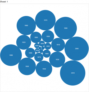 Just for fun and out of curiosity, I decided to make a poorly represented data set, purposefully disregarding the recommendations given by Nathan Yau. I represented the US population as a number of increasingly large circles which represent the decade the census information was drawn from. While ultimately a poor representation, in retrospect, I could have made it far better by arranging each bubble linearly. While not nearly as useful as the simple line graph, it would have still provided a decent visual representation of the data. As it stands, though, it’s pretty inadequate at giving users an idea of the differences and changes in size of the US population since the 1790’s.
The movieTitanic remains one of the world’s most classic movies and definitely my all time favorite. Whether it is Jack and Rose’s beautiful love story or the unforgettable soundtrack, this movie insightfully captures the result of the industrial revolution and the hierarchical nature of the 1912 society.
Though we all know that Jack and Rose were fictional characters created to bring the story to life, the movie Titanic is based on a real tragedy in history. Carrying 2,201 passengers and crews on board, RMS Titanic, the deemed unsinkable ship, set out from Southampton, England to New York on April 10th, 1912. Out of the people on the ship, 885 people were crew members, 325 first class passengers, 285 second class passengers and 706 third class passengers.
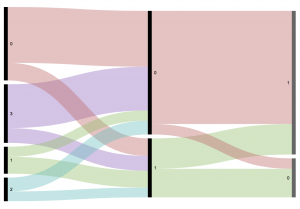
Looking at the first part of the alluvial diagram that shows how many people from which class survived this catastrophe, it can be seen that the number of people who survived (1 in the middle) in from each class (left: 0 is crew, 1 is first class, 2 is second class, 3 is third class) are approximately equal. However, since there are very different numbers of people in each class, there was a much higher percentage of survival rate in the higher classes. For instance, approximately 25% of crew members survived, 25% of third class passengers survived, 60% of the second class passengers survived and around 70% of first class passengers survived. This proves that History.com is accurate saying that “Passengers traveling first class on Titanic were roughly 44 percent more likely to survive than other passengers.” This also makes sense because on the movie, the crew members locked the hundreds of third class passengers in the lower floors of the boat so that the first class passengers to leave first.
Further, looking at the the second part of the diagram, we can see that out of the survivors, there are more females that survived than males when 1,731 of total people on the ship were male and only 470 were female (Right: 1 is male and 2 is female). This is also seen in the movie when women and children from the third class were let out to the life boats before the men.
From the diagram, we can see that Titantic depicted reality very well, which is one of the reasons why the movie remains an all-time classic.
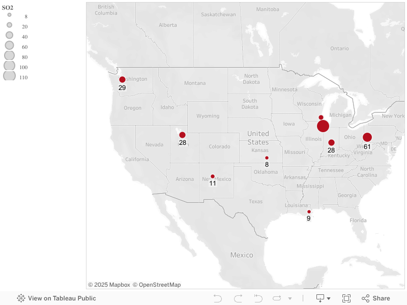
I visualized data about air quality in 41 cities in the United States on a map using Tableau Public. The data was obtained from A Handbook of Small Data Sets, edited by D.J. Hand, et al. Air quality was measured in terms of sulfur dioxide levels. Sulfur dioxide is a toxic gas with a pungent, irritating and rotten smell that is released during the manufacturing process.
I chose to use a symbol map to graph the data because of the geographic nature of the dataset. From the user’s perspective, it’s convenient to have a form of data visualization that is both quantitative and geo-spatial. That being said, the map gives users a sweeping view of which areas in the country have the poorest and highest air qualities and how bad their air quality is. It would make less sense for the data to be visualized in a bar graph, given that there’s a geographical significance to each number in the data set.
When looking at the data itself, it’s hard to notice that air quality in the midwest and along the east coast is worse than that in the west coast. Chicago, with an SO2 level of 110, has the poorest air quality followed by Providence, which has a SO2 level of 94, out of the 41 cities taken into account. On the other hand, cities in the west coast, such as San Francisco and Seattle have SO2 levels of 12 and 29, respectively.
However, it’s important to note that most of the cities in the dataset are those in the mid-west and east. Major metropolises on the west coast, such as Los Angeles, are not indicated on the map. Considering the lack of diversity in data measurements, the mid-west and east coast may not actually be worse than the west coast in terms of air quality. We would need more records about cities in the west coast to make such conclusion.
These two data visualizations share the story of poverty: the tales of various countries and the struggles they tell through the numbers of deaths, infant mortality, and life expectancy rates.
Incorporating Nathan Yau’s first point of visual cues, I aimed to map and locate where each of the data statistics regionally belonged to. In a sense, by taking what was once just pure numeric values and placing it on a map, it humanizes the numbers. It’s rather easy to brush off numbers, especially the more there are or the larger they get, as the viewer starts to glaze over the masses. Yet, by putting the numbers in the locations, it makes it suddenly become familiar– the viewer comes to terms that these are numbers of deaths/births of others in locations that even they reside in.
Furthermore, I strived to play with encoding “values to shapes, sizes, and colors” through the size of the dot in each location, which represents the death rates of each country, and the color, which represents the birth rates. This way, the audience can see a direct correlation between these two rows of information in relativity to other countries.
Something else that data visualization highlighted that may not have been able to be seen in the data alone is the ability to instantaneously see the direct correlation of what the GNP (Gross National Product), also understood as the country’s “market value”, and the standard of living. In the bar graph above, the countries are ranked by their GNP in increasing order from left to right. With that, one can clearly see a depletion in Infant Mortality rates as the GNP rises, as well as the life expectancy for both males and females to rise. This visualization gives the information to the audience to draw conclusions within themselves on the influences between socio-economic relationships and patterns.
I choose to work with the Pollution dataset that provides the, “air quality measurements on 41 U.S. cities,” from data gathered from, A Handbook of Small Data Sets, edited by D.J. Hand, et al. This content model of this dataset includes eight content types: City, S02, Manuf, Pop, Temp, Wind, Precip-in, and Precip-day. This is very limited data as it does not provide any information about what year/s the data for each city was collected, or represents. Also the content type “Manuf,” I am assuming refers to “Manufacture,” which I believe refers to industrial production in each city, but I am not completely sure.
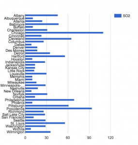
I used google fusion tables to develop two different charts to visualize the data. Firstly I made a horizontal bar graph that lists all 41 cities included in the dataset and the levels of SO2 in the atmosphere.
This visualization is able to simultaneously display the numerical SO2 outputs for each city and which city has the highest SO2 output. It also allows you to compare the SO2 outputs of each city in relation to one another. However, this visualization does not show you the exact number of SO2 output, that the dataset provides. This data visualization is problematic because it does not provide any information about the time periods in which this data refers to. Thus, the data visualizations I created, I believe could be misleading, or used to misinform just like the examples we looked at in class last week.
This Visualization allows you to correlate the SO2 output, population, manufacturing, and temperature in any given city. One can draw comparisons between these different elements to prove that one affects the other. However, this graph gives the allusion that you are tracking these rates over time because the lines are all connected, when in reality they are separate cities.
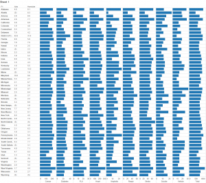
This week, I chose to analyze the death rates from various causes by each state. The data provided us with the death rates from various sources such as Alzheimer’s, cancer, diabetes, flu, heart, nephritis, respiratory problems, acid, vehicle deaths, and others. When looking at this data, there was so much to see and learn that it took me a little bit to understand what I wanted to visualize. By the end, I decided to only compare the death rates between cancer and heart disease, seeing that those are two of the most commonly known killers in the US.
As Yau says, the way you display your data is extremely important, so therefore choosing the right data visualization is very influential in how people view your data. I tried different methods and different programs, but each one seemed to be confusing if you haven’t played around with it for a little bit. It was also interesting to me to see how confusing the assortment of tools could be in addition to the enormous amount of data, and for a while I was only hurting myself by getting caught up in how to do everything. However, after playing around with some other data visualization tools I decided to use tableau since it is the easiest system for me to understand and use. After inputting the data set, I decided that the best way to compare the two diseases was to use a bar graph. This proved to be helpful since you could clearly see the data from each disease in each state against each other. You can see the visualization here.
© 2026 DH101
Theme by Anders Noren — Up ↑


