DH101

Introduction to Digital Humanities

Monday Oct 19 – LA Controller’s Office

I chose to examine the “All City Department Payroll” from the LA Controller’s Office. I thought this would be interesting to analyze because it would show just how much Los Angeles is investing in the different departments. I always hear about how different departments deserve more money than others, and how they are underfunded so I thought this data set would let me further examine funding disparities.

The data types include 22 departments and depict the funding for each of them in various visualizations – so essentially 22 records of outlining the departments’ fundings from 2011 to 2013. It also shows how each department is classified (parks & recs or LAPD) and how much tax money they receive for their department. When each department is clicked, a corresponding payroll appears delegated to them. The different visualization tools include various charts such as donuts, column charts, bar charts, pie charts, stacked bars, bubbles, and tree maps.

Screen Shot 2016-01-06 at 9.00.47 PM Screen Shot 2016-01-06 at 9.01.15 PM

To identify a dataset’s ontology, Wallack and Srinivasan define it as the distinctions seen between people’s personal “mental maps of their surroundings” (Wallack and Srinvasan, 1). For this dataset, the ontology is that of the LA Controller’s Office. By delegating specific fundings for specific departments, they decide what is important and needs to be invested in for LA to run smoothly and efficiently. In this dataset seen, there is a massive disparity seen between funding.

The LAPD, LAFD, and DWP departments receive the most amount of funding in comparison to the other departments, their three departments combined receive more than half of total tax payer’s money. Meanwhile the other 19 departments the other half. Departments such as Animal Services, Zoos, and Public Works receive some of the least amount of funding as seen by the stacked column chart.

Screen Shot 2016-01-06 at 8.47.11 PM

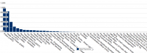
If the funding delegation was managed by veterinarians, the ontology of the dataset might differ greatly. This data set then might show Zoos and Animal Services receiving much more funding, while other departments might receive less.

I believe that the LA county public as well as the people who manage and work within these departments would find this data most illuminating. This is because it allows people to understand where exactly their tax money is going and whether they agree or disagree with the LA Controller’s Office. If the public knows how their money is being fractioned, they can better mold what they as a city believe to be important. Meanwhile for the people who work within the department, they can also see how much funding they are receiving and also seen the dominators within the LA county. For example, they can see that the Parks and Recs department is the most funded department underneath LAPD, LAFD, and DWP. If Parks and Recs aren’t needed or used as much as other departments, then maybe their funding can be transferred to other departments. By making this information public, departments can try and figure out the right balance of fundings.

What is left out of this data set is the reasoning behind the fundings. While the public can guess the LA Controller’s justifications for example the LAPD, LAFD, and DWP, some others may not be as obvious. Because everyone has different opinions about what is considered important to them, many different ontologies and funding breakdowns could exist.

mon nov 2- html website

Here is my website!

http://tateturnercollection.com/website/index.html

🙂

mon nov 16 – DH mapping analysis

For this week’s blog assignment, I decided to analyze the Digital Harlem website. The website compiles information from newspapers, legal records, and other published sources to describe the “everyday life” seen in New York City’s Harlem neighborhood during 1915 to 1930. The data is organized into three different subcategories, places, events, and people.

When I first entered the website, there was a welcome page that briefly described the data set, and throughout the website there were informational pop-up boxes. Without reading these, I would not have understood how to work the website. I like how they created these content boxes as pop-ups, to encourage the users to read them before they begin exploring the page.

I believe that the map is successful for this data set. There are three maps displayed on the interactive map page, and it allows the user to filter and search through the maps. Filters that can be used include the type of event such as arrest, extortion, drug dealing, etc.  Also different features, such as the borders of black settlement during 1920, 1925, and 1930 can be analyzed. I liked that this website allowed multiple layers to be searched allowing the comparison between different events, people, and places.

Screen Shot 2016-01-06 at 11.51.28 PM

I thought the map reflected the point of view of the government. I feel like this was the case because the website was focused mostly around crime during this time. Also, the people who were creating the website had legal documents describing all of these crimes to document. I was surprised to learn that the project was compiled by The University of Sydney, Australia – however it also made sense. While there was information on the different types of crime, there was not much background about why they occurred or what the cultural climate was during this time period.

Even though the website details that it is examining the everyday life of New Yorkers, it is actually measuring and describing the crime seen during this time. I felt that this should definitely be highlighted. By doing so, this website creates assumptions that these crimes describe the everyday life that was seen in Harlem. However Harlem is extremely well known for its culture, music, art, and creative people. This isn’t mentioned anywhere in the website, which really skews the users understanding of what Harlem truly is. I feel like this website needs to clarify its description to explicitly state what their aims are through their Digital Mapping.

mon dec 3 – 123D Catch

http://www.123dapp.com/Catch/Emily/4965992


here is my 123D Catch!


mon nov 23- vectors

For this week’s blog post, I decided to examine Erik Loyer’s and Kevin Pyle’s digital project Totality for Kids”. This project was inspired by McKenzie Wark’s book, and brought a comic book element and interactive interface to the plot line. The book describes post-war Paris, and shows the political radicalism shown during this time leading up to the general strike of May 1968. The digital interface shows protests seen during this time as well as the turmoil faced by Parisians during this time.

Screen Shot 2016-01-07 at 12.18.00 AM

I really loved how this interface fused both art with a digital interface to create this interactive project. On the interface itself, different quotes, images, and plot captions can be clicked on to further describe Paris during the early 50s. I loved the cartoon aspect that was used throughout the website, and I thought it allowed the creators to set the mood even more through color and their drawings. The colors of black, grey, and red really struck me as a navigated through the project – creating a dark and ominous, jaded mood.

Screen Shot 2016-01-07 at 12.18.49 AM

I also loved that these cartoons would open up captions that were very heavy lessons and analysis of Wark’s text. The differences between the youthful cartoon and the heavy message behind it I thought was really effective.

Screen Shot 2016-01-07 at 12.19.41 AM

However, there were also some difficulties and confusions I faced when going through this interface. There was not much content describing what exactly was happening throughout the interface, which made it somewhat difficult to understand. Luckily, there was an editor’s introduction that described Wark’s work briefly, however I was still confused what is book was about.

I wish that there was more of a concrete description about what the interface was aiming to accomplish before I entered it – just so I could appreciate it in its fullest. Also, as I was going through the comics, I felt confused with the captions sometimes and how they all related to one another. I wish overall that there were more descriptions outlining the overall project and how the different aspects related to one another.

Overall, I loved the visuals of the interface, but thought that the content and background could use some improvement.

Exploring UCLA’s Historical Photographs

The UCLA Library showcases many interesting Digital Collections from Medieval and Renaissance Manuscripts to Archive of Popular American Music. But, one collection in particular stood out from the pile: UCLA Historical Photographs. From the majestic Royce Hall to the artistic Sculpture Garden, the UCLA campus has served as inspiration and backdrop for countless photographs. As an amateur photographer myself, I would oftentimes just stop to appreciate the beauty of our campus. This is why it is so exciting to be able to see how the campus that we all love evolved in the past century.

Although this repository is limited and very difficult to navigate, it offers very valuable insight. This collection of 278 black and white photographs of the land, people and happenings around UCLA was drawn from various collections in the UCLA University Archives. These pictures, dating from 1925 to 1982, covered many subjects from campus construction to alumni events, from commencement ceremonies to student organization activities. Thanks to the relatively accurate information we have on each photo, including date and brief context, we can many tell many stories.

One intriguing topic that I would like to investigate might be the parts of UCLA that do not exist anymore, such as the Vermont Ave campus and the open-air Greek theater. Take Vermont Ave campus for example, I did not even know that the Vermont Campus existed, let alone it being the first actual campus for “UCLA”.

[image 1]

[image 2]

[image 3]

[image 4]

We can see from these images how the people dressed, what they did and even the position of women in the education system.

In fact, it is also fascinating for me to see the parts of campus that never changed, such as Royce hall and Powell Library, and their rise from the ground. This image shows the beginning of UCLA as we know it today.

However, because we have a limited number of photographs, as well as a limited description of each photo, there are many stories that we cannot tell. For instance, it is interesting for me to see aerial views of the construction of campus and development of Westwood, and even the flight crew that took the pictures but it is difficult for me to tell a cohesive story about, say, the troubles of aerial photography in 1929. Luckily this problem can be easily fixed if I founded other primary and second sources to use in conjunction with this collection.


3D Globe

Globe Visualization

3D Minion

http://www.123dapp.com/catch/2015-12-02-12-56-09/4813957

123D Catch Assignment

I created a 3D model of none other than a good old cup of coffee from YRL.

Screen Shot 2015-12-02 at 1.50.38 PM

http://www.123dapp.com/catch/coffee/4813970

Week 10: 3D MODEL

Link to room and chair (focus):  Not awesome as there are missing angles but the chair should be the point of focus.

3D Model Here


« Older posts

© 2025 DH101

Theme by Anders NorenUp ↑