Make a Pivot Table with Excel
A pivot table summarizes data values. For example, given a list of students’ majors, a pivot table can tell us how many students have declared an English major, a communication major, and so on. Here, we’ll use a pivot table first to understand the majors represented in our class, and next to understand the correlation of major with gender in our class.
1. Pick a column

To start with, we’ll look at one variable (major) in isolation. Use your mouse to click on Column B.
2. Turn your column into a pivot table (1)
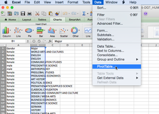
From the Data menu, select PivotTable. In the window that pops up, leave the options as they are and click OK.
3. Turn your column into a pivot table (2)

Excel will open a new worksheet and you’ll see a blank table, along with the PivotTable Builder. The PivotTable Builder allows you to select which values you’d like to summarize. In this case, we selected Majors in the previous step. Click on the word Majors on the PivotTable Builder and drag it, first into the Row Labels area and next into the Values area. Hey, look, the majors are summarized for you!
4. Turn your pivot table into a chart (1)
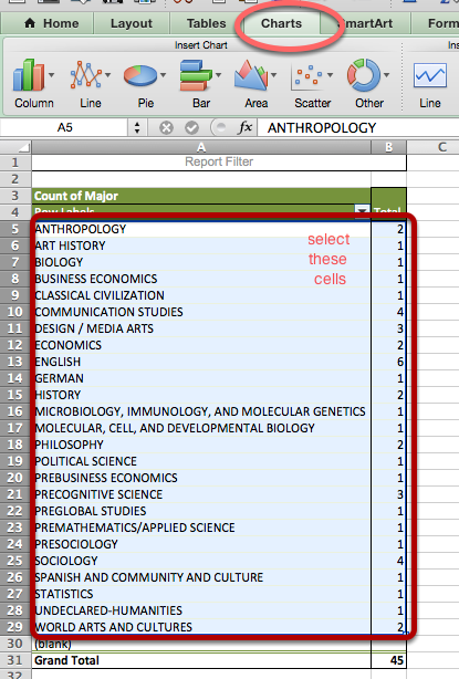
Now that your majors are summarized, it’s pretty easy to turn them into a chart. Use your mouse to select the cells indicated in the image above. Then click on the Charts tab.
5. Turn your pivot table into a chart (2)
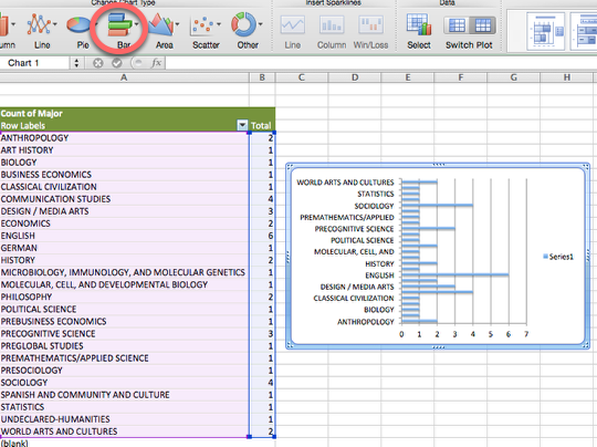
From the Chart tab, select Bar and then Stacked Bar. Check it out, you have a chart! Play with the coloring and formatting options to make the chart look the way you want.
6. Make a pivot table that compares two values

We actually have two columns in our dataset, so why not see how they correlate with each other? Follow steps one and two above, except this time, in step one, select both columns A and B. When you get to the PivotTable Builder, select the options indicated in the image above. (Tip: For “Row Labels,” it’s generally good to select the column that has more values in it, and for “Column Labels,” that column that has fewer values.)
7. Make a chart that compares two values (1)

Select the cells indicated in the image above. Then click on the Charts tab, just as you did in Step 4.
Make a chart that compares two values (2)
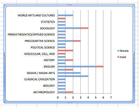
From the Charts tab, select Bar, and then Stacked Bar. Now you can see not only how many students have declared which major, but what proportion of these majors are male versus female!