I chose to examine the Body Fat dataset. I honestly struggled a lot in creating this graphing and analyzing the data. I was confused in deciding which graph would be the best way for me to display my data and I found the visualization websites pretty tricky. Any way, I chose to compare age and weight from the Body Fat dataset using Google Fusion Tables because it seemed the the most simple efficient site. Before creating this chart I thought that as you get older you gain weight until you reach a certain age, where then you begin to lose weight. From my data I saw that this was not true and that body fat grows accordingly with age. There was no real direct correlation I could see between age and body fat. However this may not be the case because in working with so much data from the original dataset, a lot of data was lost and there so a complete picture is not painted. from doing this I saw how complex and complicate creating a data visualization is and how they can be manipulated very easily to show the interest of the person creating the graph, however I found it hard to manipulate anything and will be practicing data visualization a lot more!
DH101
Introduction to Digital Humanities
Page 23 of 38
James Cameron’s famous movie Titanic (1997) have brought many people to tears when the “unsinkable ship” hit an iceberg and sank to the bottom of the Atlantic Ocean, ending the short-lived romance between Jack and Rose. In the film, many have lost their lives, and those who were lucky enough to climb onto the lifeboats were mostly women and children. To examine the proportions of women and men that have survived, I have chosen the Titanic Dataset. This dataset has 4 variables: class, age, sex, and survive, and it has 2,201 records. These variables are actually dummy variables, which means that the numerical values are simply codes for categorization. Thus, for class, 0 = crew member, 1 = first class, 2 = second class, and 3 = third class. For age, 1 refers to adult, while 0 refers to child. For sex, 1 = male and 0 = female, and for survive, 1 = yes and 0 = no. According to Nathan Yau, the ingredients to a data visualization are visual cues, coordinate system, scale, and context. As you can see from the data, we can only compare between categorical variables, since the only continuous measure is the number of records. Therefore, for visual cues, I combined the length and the color aspects along with a cartesian coordinate system to create a side-by-side stacked bar chart to best represent the data using Tableau Public.

The data has been divided into class, gender, and survival. We can now compare the groups that have either survived the voyage on Titanic or not in a side-by-side chart. And within these groups, we can also compare between classes of the passengers. The classes have also been split into gender (blue for males, red for females).
There are more people who did not survive than those who have survived, as indicated by the average line in each pane. And among those who have survived, more crew members survived than the rest of the passengers, including the first-class. More females have seemed to survive than males in each of their respective classes. We can also see that there were barely any females among the crew members, which explains the disproportionate amount of males that have survived in that group.
 It is interesting to note that among those who did not survive (0), the crew members (0) and the third-class passengers (3) lost the most lives, while the first-class group lost the least amount of people. And the third-class lost the most female lives out of all the other classes. Perhaps, social class played a big part in determining the passengers’ survival.
Because the data is coded as dummy variables, it is hard to see any pattern or relationship in the data without seeing a visual representation of the data. It was helpful that the codes were defined in the dataset, but it is difficult to make meaning out of these binary codes without data visualization. Binary codes and dummy variables are useful when it comes to recording data quickly and efficiently, but data visualization puts context into the data, making it possible for humans to read and understand the data. Charts and graphs, such as this one, show us what the data is trying to tell us. And in this Titanic Dataset, the data shows us the proportions of passengers that have or have not survived based on their age, gender, and class.
I examined the U.S Population Census dataset. This dataset marks the change in U.S Population since 1790 to now. I used Tableau Public to create a line marked line chart to visually present the change as follows:

By looking at the data visualization, it is apparent that there is a rise in population as the years progress. The counts are marked in ten year increments on the x axis, and the actual population number marked on the y axis. Looking more specifically, we can see that there is a slow gradual increase in the first fifty or so years, then the increase becomes more rapid. The overall shape of the graph resembles somewhat of an exponential line, in mathematical terms. This is something raw data in a spreadsheet would not have been able to tell. We could see exactly how much the increase is, but unless it is visually represented, the shape would not have been visible without a graph.
One thing this visualization fails to tell is the context behind the numbers. It is the job of the viewer with humanities information to give the reasoning to the dataset. Surely, there is a reason for the trend in increase in population. Some historical background is required to decipher the “why” behind the numbers. Why did the data start at 1790? How was the data collected?
One aspect I am personally very curious to know is if the populous counted slaves. If some states counted them, and some didn’t, there would also be discrepancies in the numbers. Around the years of 1840 to 1860 is where we see the beginning of large jumps in population, which was around the time of the Civil War. Since then, the jumps in population seem to get larger and larger. In more recent years, I’d also like to know if undocumented Americans are counted into the populous. With census populations, it is very difficult, if not impossible to get an exact number because we cannot keep track of every single person in one place.
The dataset is on the weights of 20 ounce boxes of Chocolate Frosted Sugar Bombs breakfast cereal, with 10,000 data entries. Immediately, what came to mind is the range of the data and what the near-average is within a sample of 10,000. With that said, the scatter plot helps to delineate where most of the entries fall in between, with the density of the plotted dots. It can be seen immediately that the range is between 19.924 and 21. Although the dataset only highlights one variable – weight – it is extremely useful to take a glance at whether or not this dataset falls within certain requirements, like a range for weight.
This data set puts 10,000 data entries into one graphic, which helps us understand where the MAJORITY of the data is centered around. This cannot be done easily by navigating through 10,000 data entries so a scatter plot helps to plot the individual weights as a whole to give a more immediate and complete idea. As well, hovering over the data points where the points start to condense gives us the range of where most of the data sits.
The visualization can be seen here.
The use of data visualization aids the viewer in identifying patterns that may not be recognizable in dataset form. This week, I decided to look at the “Body Fat” dataset, which is a compilation of data, from the Journal of Statistics Education website, for 252 men regarding their percent bodyfat measurements and other body size measurements.
To visualize the data, I chose to use RAW. Using its scatter plot option, I set “weight” as the x-axis, “bodyfat” as the y-axis, and “IDNO” and “age” as labels (separated by a comma and denoted on the graph as “IDNO, age”).
The result looks like this:

Previously, I predicted that the more the person weights, the higher their bodyfat percentage. This graph, which shows an upward, increasing trend, generally supports this hypothesis. The data visualization does, however, indicate instances of outliers and other extremities that you may not be able to see in a spreadsheet of the data.
Next, keeping the y-axis the same (“bodyfat”) set the x-axis as “height”:

Interestingly enough, although you can observe the proportion of body fat with height, you can also pull other interesting information off this visualization. For example, the average heights for these men seem to be between 65-75 inches (5’4”-6’, with a median around 5’8”). This information would have been a bit more difficult to obtain from just looking at the dataset.
To make it more complicated, I decided to change the x-axis to “neck,” leave y-axis as “bodyfat,” color-coded “age,” and left the “IDNO” as the label. The colors corresponded to 5-10 ages per age groups; what I mean is: 22-29 yo (red), 30-39 yo (purple), 40-49 (green), 50-58 yo (hot pink), 60-69 yo (orange), and 70, 72, 74, 81 yo are blue.

From this graph you can say that as the percentage of bodyfat increases, so do the neck measurements. Looking at the 40-49 yo block (green), I can see that this age group is more widespread, a bit more dynamic and larger in numbers compared to the other age groups.
If I continue to change the x-axis to the different body measurements, I can observe the different proportions of body part to percent body fat. For the most part, the trend continues to be increasing, so the measurement of the body part would increase as the percent body fat increases. This trend supports the purpose of this dataset as a reference for estimation of bodyfat percentages based on specific body measurements, “the goal is a regression model that will allow accurate estimation of percent body fat, given easily obtainable body measurements.”
(Apologies for the blurry snippets of the graphs, trying to embed the images kept causing my browser to crash. )’: )
For this blog I chose to look at the US population dataset of the United State. The data was taken from the United States decennial census. The dataset includes information on the US population beginning in 1790 and ending in 2010. To build a visualization of this dataset I chose to work with Raw. It was the most interesting to me in class and seemed the most user-friendly. I still do not feel very confident in my data visualization skills so I thought I would start somewhere that was more straightforward and simple to use.
The beginning of Yau’s text begins with exploring the reasoning as to why you chose to make your visualization a certain way. Obviously the graphing method you choose is a huge factor in how your visualization turns out, but even smaller modifications can have a great effect on your outcome such as size or color. In order make your visualization the best it can, all of these elements should be appropriate for the data you are working with.
For my data I explored several different formats including the delaunay triangulation option, a scatter plot, and a cluster dendrogram. Though I used the same data set for each visualization, each of the graphs were able to tell be different information about the data.

The delaunay triangulation format was not helpful at all for the assignment. I could not figure out how to make any of the text appear and I’m assuming that this template dose not include any numerical information, it is simply a way to represent data purely visually.

The scatter plot did an adequate job representing the data. With more practice I believe I could achieve a more correct sizing for the plot, which would improve on the ability to read the data.

The cluster dendrogram is also very simple to read however it had more room for data than the dataset I chose actually had. This format seems to be more effective when having 3 or more different columns of data.
To be honest the original excel sheet that my data came on was a better visualize it than the graphs I created in Raw. The dataset I chose was very straightforward and did not really need to be complicated by graphs and charts to be understood easily. The only other method of graphic that I believe would be helpful to visualize this information would be through a simple bar graph, and depending on what you were using the data for, a tool that illustrated percent increase of the population throughout the years.
From this exercise I have learned that sometimes you can complicate your dataset from over exhausting visualization tools. There is a time and place for programs such as Raw and you must be observant as to when it is acceptable to use them.
 This week, I took Dr. John Rasp’s dataset on bodyfat percentage sampled from 252 men, along with additional measurements of body size including chest, abdomen, arms, legs, neck, etc. The data states that body fat percentage is “normally measured by weighing the person underwater – a cumbersome procedure.” The data aimed towards estimating body fat percentage with these alternative body measurements which are much easier to collect. The data were taken from the Journal of Statistics Education website.
I utilized the free online data visualization tool Plot.ly to create a scatter plot showing the relation between body fat percentage and body weight.

This visualization allows the viewer to not only see the data that was collected, but also see a relationship between the variables selected–something the table alone does not show. The x-axis shows the body weight measurements of the sample of 252 men, and the y-axis shows their calculated body fat percentage based off measurements collected and calculated by the researchers. I made this into a scatter plot, as any other plot did not seem effective in accurately representing the collected data. By adding a best-fit line, the plot indicates a positive relationship between body fat percentage and body weight. I also went ahead and made another scatter plot to visualize the relationship between the estimated body fat percentage and thigh circumference (in centimeters), one of the many various body measurements.

Again, the plot shows a positive relationship between the variables.
All in all, this data visualization allows users to clearly see positive or negative relationships between selected variables, or if a relationship is present at all. I learned from this exercise is that one should be mindful of which variables to represent on each axis and to careful evaluate whether or not one’s selections are relevant to what one is trying to observe. I ran into this problem a few times, and ended up with plots presenting contradicting relationships.
The dataset I selected for my visualization project is a set of two sheets containing daily closing prices and percent returns for Amazon and Coca Cola from 2005 until 2014. Initially, I had considered using RAW to visualize my data interactively; however, after trying various approaches, I realized RAW is more suitable for visualizing datasets with multiple columns of attributes, whereas my dataset was more time-centered, featuring only two attributes. Thus, I decided that Tableau would be a better tool since it allows for better time-centered visualization and juxtaposition of multiple charts.
First, let me start by explaining my dataset: there are two sheets – one for Amazon and one for Coca Cola. Each has three columns: Date (by day), Closing Price (in dollars), and Daily Return (by percentages). In terms of interpretation and analysis, we can either look at relationships within a single company, or how these attributes compare between these two companies across time. I decided to examine if there are any patterns first between Amazon’s and Coca Cola’s daily Closing Prices, and the between their Daily returns.

I changed the date from “year” to “month”, and set the Closing Prices to display the “average” value. The blue is AMZN, while red is KO. I also added the Label option to make it easier to read points on the graph. From this visualization it seems that the average daily Closing Prices of both companies seem to increase from 2005 to 2014. Note, however, that each company has a different price scale: for Amazon the range is from about $44 to $407, while for Coca Cola it’s $16 – $45. This difference could influence us to see patterns that are not really there. In this case, however, it is valid to interpret the data in this way because the pattern is consistent for each company within its own price range. Also, it is noticeable that somewhere toward the end of 2009, prices for both had decreased.
Next, I created a similar visualization to compare Daily Percentage Returns for Amazon and Coca Cola.

Again, I set the Date to display by month, and the percentages to show by average. Notice, again, that the percentage ranges are not the same for each company: for Amazon it’s between -2% and 3%, and for Coca Cola it’s between -0.7% and 0.7%. And, just like the previous chart, we can interpret this one relatively in terms of general patterns. So here, it looks like both Amazon and Coca Cola experienced a significant decrease sometime near the end of 2008. Recalling what that the first chart illustrated both companies’ prices having decreased near 2009, it is possible to infer some connection between the two events.
Since I am not knowledgeable about stock prices, I am aware that I may be making inaccurate inferences about relationships. However, by completing this visualization project, I realized that by presenting your columns and rows visually, allows to see relationships that could hardly be spotted before. Furthermore, it allows to make comparisons across multiple sheets, and to view each attribute more closely (e.g. day by day), or more objectively (year by year).
Death Rates and GDP Analysis
For this week’s blog post, I decided to analyze the data and its visualization of the Poverty Statistics. This piece of data informs of the birth and death rates, infant mortality rates, life expectancies, and per capita GNP from 97 countries. With this data, I wanted to focus on the death rates and its association with the country’s GNP. To do this, I used Tableau Public to create two types of data visualizations. More specifically I wanted to analyze these factors in countries that were of interest to me based on living in the U.S. and based on the countries with the greatest death rates.
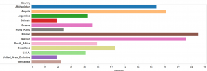
The reason why I chose to focus and use these countries to compare with is because death rates are big indicatives of poverty rates. So for the visualizations on this data, I chose to use side bar graphs to show the death rates of Afghanistan, Angola, Argentina, Bahrain, Greece, Hon Kong, Malawi, Mexico, South Africa, Swaziland, U.S.A., United Arab Emirates, and Venezuela (Image below). Visually, it can be seen that Bahrain and the United Arab Emirates have the lowest death rates, while the one with the highest is Malawi.
By simply looking at this, we can make assumptions about the socio-economic status of the country as a whole, but we can also infer dietary, and environmental issues. However, since we are speaking of poverty, it is more useful to focus on the monetary values of these countries. For this, I went ahead and produced a table with Tableau that shows the GNP’s for these countries (image below).
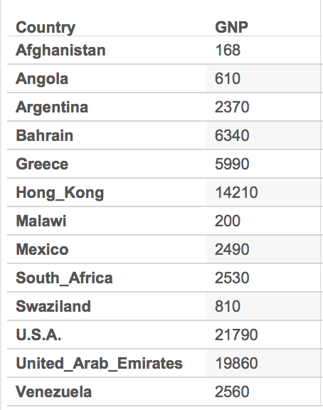
With the table as reference to the death rates, we see that Bahrain and the United Arab Emirates have one of the highest GNP’s up to about 19860. We then compare this to the one with the highest death rate, Malawi, and we see that its GNP falls low at 200. By simply looking at these pieces of data, we can quickly assume that in regards to these countries, there is a connection between the GNP and the death rates which can also be associated with the poverty. However, there is still a lot of research that can be done with just these few selected countries. For example, why is it that Afghanistan has the lowest GNP and a high, but not the highest, death rate? This is just one very obvious observation and question from this small part of the data, but like I said, there is still so much data that can be visualized and studied. Upon studying the countries’ culture we can maybe find out a link between their customs, rituals, diets, or their daily lives.
Again, this is only based on a very small extraction of the entire data because it would have been difficult visualizing the entire data set on this small interface as it can be seen below.

-Karla C.
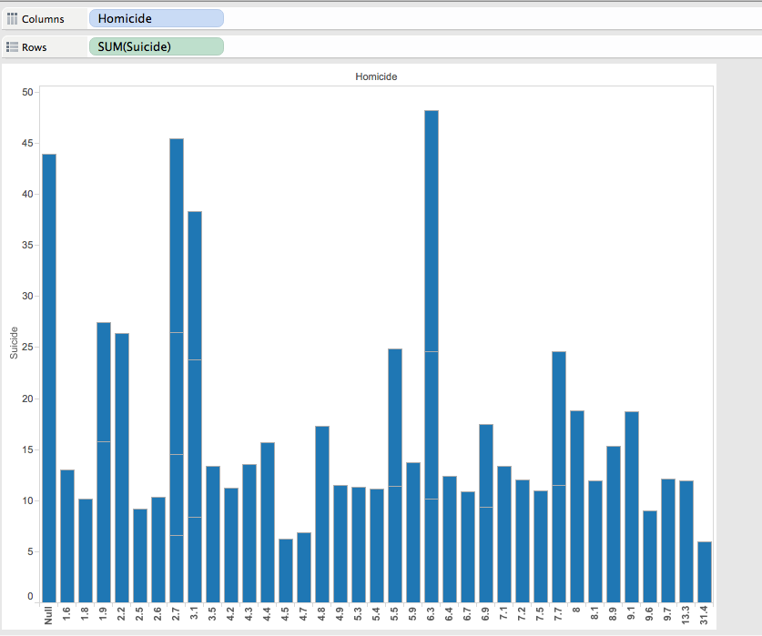
The data visualization I chose to use was Tableau because it demonstrate an easy and efficient way to graph and color coordinate data in a way that can be better understood visually then through a mess of data. I first began looking at the Data Set in relation to deaths. I decided to pick two topics in order to visually decide which was more common. I picked Homicide and Suicide. While morbid, it was used to see which was more of a common occurrence each year and how can it be graphed visually. Additionally it showed the distribution of age and demographics for which we can then see which was more common for a particular age, homicide or suicide, additionally so which was more common among a particular sort of demographic.
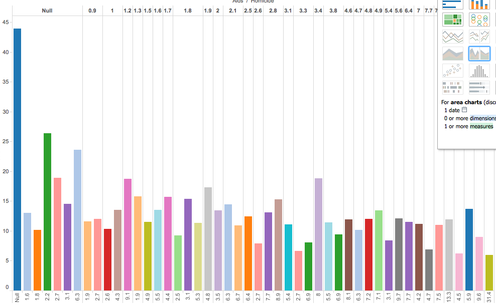
I additionally included AIDS to show and distribute different forms of death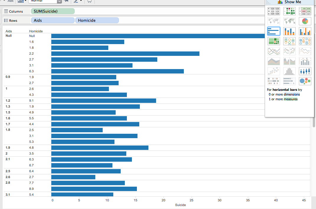
Tableau is an excellent way to visualize a particular data tool, because there many different graphing options and ways in which to set up a particular data set. Additionally you can upload more than one data set to the app, therefore creating data across many different variations.
Within this data set, and Tableau you can move your cursor over the bar, and It can be shown that in 6 homicides there are in fact 23 suicides. This graph can accurately represent that suicide is the main cause in death in most of the people used throughout this study. Additionally, you can also notice that AIDS is the lowest out of the 3 options in which death occurs.

This graph represent Homicide in relation to Heat Attack, Flu, Diabetes, Cancer, Alzheimers, Accid, etc.
While Tableau can easily represents figure. It may be hard for the everyday user (like myself) to figure out how to work it. Luckily, UCLA has LYNDA in order for to watch tutorials in which Tableau becomes simple. However, for the everyday user making these graphs and downloading the app could be a bit more difficult then say, Google Fusion or Google Tables. Google Fusion requires an online database whereas tableau you must download. I do however, believe that for this visualization both google fusion and tableau could have been utilized efficiently.
© 2026 DH101
Theme by Anders Noren — Up ↑