John Rauch
DH 101 Blog 4
Disc 1C
For this blog post and data visualization, I chose the Dow Jones and S&P 500 data from Dr.Rasp’s website. I chose this data because I personally trade the financial markets, and found this information relevant.
Essentially what this data is, are all the prices the Dow Jones and S&P 500 closed at, at the end of each month over 20+ years. The excel spreadsheet contains only three columns: one for date, Dow Jones, and the S&P 500. There are 254 rows, so just looking at this data in Excel, the information is not very valuable. Furthermore, it would take a long time to scroll through each and every role. Data visualization is essential to make practical use of this date. I chose to use Tableau Public as my data visualization tool for this dataset.
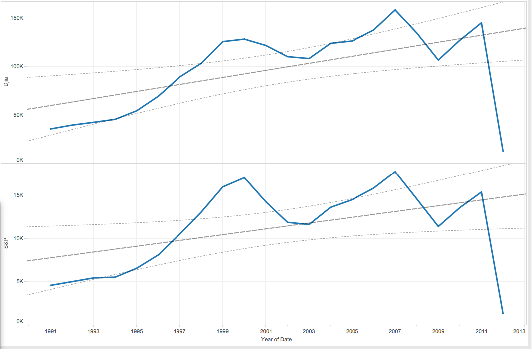
This first visualization shows the price action of the Dow Jones (Dija) compared to the price action of the S&P 500 over 22 years, along with the prices each of them touched at the particular time each year. Already, this data is much more useful, and we can see things we could not have just looking at the Excel sheet. First, both of these instruments move at roughly identical averages, almost mirroring one another. Next, we can see that price consolidated and moved sideways from about 1997-2011, before experiencing a sharp drop around 2012. We would not have been able to tell this quickly from just the Excel sheet. I also included trendlines for visualization, which helps to further analyze the movement of these instruments over time, something only possible through data visualization. Traders would find this very helpful, as trendlines are a major tool used in the financial markets.
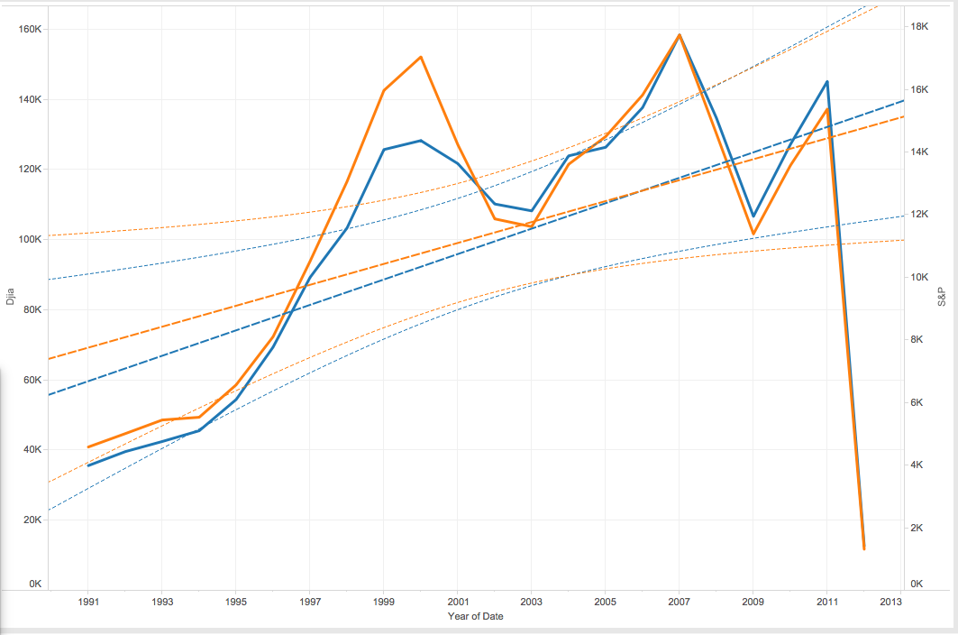
This next chart is further confirmation of what I have analyzed above. The Dow Jones is in blue, and the S&P 500 is in orange. This again works to show the very close relationship these two instruments have to one another, moving in very similar patterns and adhering to very similar trendlines. This information would be very valuable to traders looking to invest. It would not be wise to go “long” and buy either of these instruments, as price has broken down and through all previous trendlines.
Starting from a basic Excel sheet with only 3 columns, I have turned this data into something much easier to digest, by using data visualization. This is essential to truly understanding the importance of the data, and is very helpful to be seen with these visualization tools.