DH101

Introduction to Digital Humanities

Author: FrancescaAlbrezzi (page 37 of 38)

Reverse Engineering: Virtual Paul’s Cross Project

Screen Shot 2015-10-04 at 11.43.53 PM

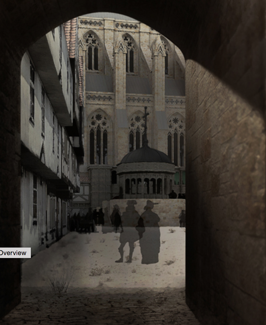
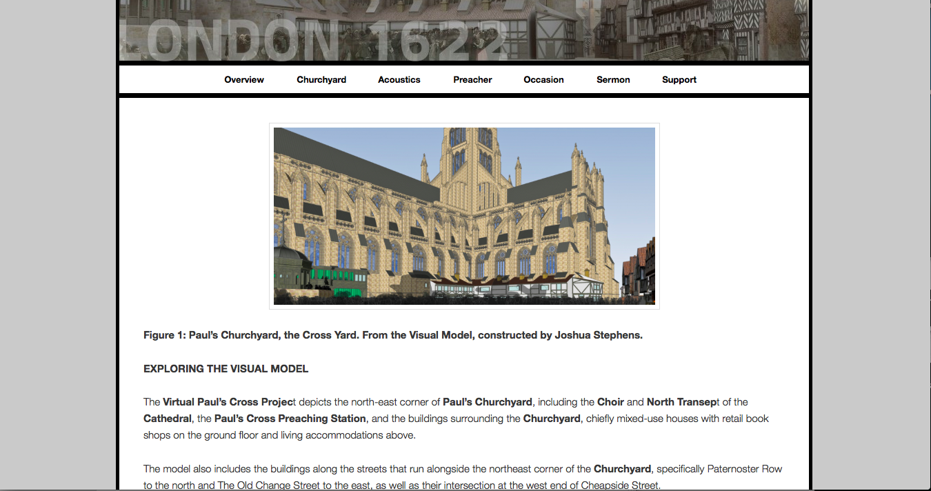
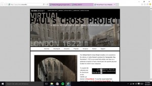
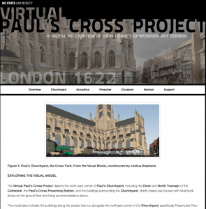
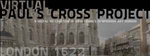
Overview: For this assignment, I decided to further examine the “Virtual Paul’s Cross Project”.  Created by NCSU (North Carolina State University) graduate students and professors, this site serves as a digital re-creation for John Donne’s Gunpowder Day sermon that occured on November 5, 1622 in Paul’s Churchyard, London. Not only does this website create a interactive visual model of Paul’s Churchyard during that time, it also allows users to explore the acoustics, the sermon text, and the speaker that would have been present on that day. I thought this project provided detailed information to the user as well as interactive models that captured the user’s attention. However, there were still some organizational areas I thought the site could improve on — showing just how difficult it is to compact such a large amount of information onto a layered digital platform.

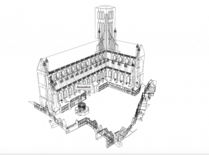
Sources: The creators of the website actually worked with very little evidence, because Old St. Paul’s church burned down. So they used archaeological surveys, engravings, paintings, and text to create an accurate portrayal of what the church would have looked like in that era (can find info under overview > installation). Also they used manuscripts, published works, and secondary sources to help create a conceptual framework for this sermon. (can find under support > works cited). For the actual sermon, they compiled photos of the actual speech during that day into one larger sermon that they then presented in their simulation (can find under sermon > developing the script & sermon > the script).

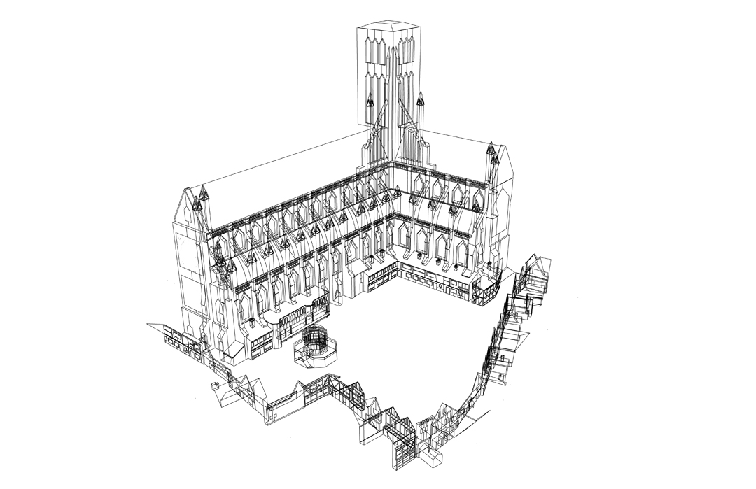
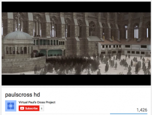
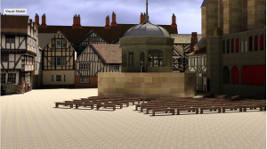
Processes: A team worked these layered processes to create this digital platform. After the collection of all the information, the team first carefully created the visual platform of the church — specifically choosing materials and textures they thought would have been seen during the early 17th century. Then for the acoustic re-creation, sound engineers were employed to create a highly accurate representation of what the sermon would have sounded like from different sections of the audience. They used geometry during this process too to determine how sound would be refracted. They also attempted to reconstruct what the setting would have been like then as well — including the weather and social aspects.

Screen Shot 2015-10-04 at 11.42.26 PM

Presentation: The presentation was successful for this project, as they layered the visual and audio models on top of one another. The user could interact with the virtual 3D modeling, showing how various positions in the church would have sounded/appeared as well. Also, the information and background was also presented in a user-friendly way. The use of youtube videos with the website creators made it easier for the user to understand how this model was created. I also liked the option to “Fly Around the Visual Model”. Overall, the information presented on the website was compiled well.

Screen Shot 2015-10-04 at 11.41.48 PM

Even though there were a lot of positives, I also noticed some organizational setbacks. For the tabs at the top of the website, I wish that they were labeled more specifically. Also I wish that the tabs themselves were not separate links for pages — it confused me at time/made it difficult to navigate through the website.

Overall, I think they successfully accomplished their goal to create a multidimensional experience of what it would be like to experience a sermon in Saint Paul’s Church during the 17th century.

Reverse Engineer Paul’s Cross Project

Paul’s Cross Project is a history and theology digital humanities project that attempting to virtually recreate John Donne’s Gunpowder Day sermon that took place November 5th, 1622. In order to create this virtual experience, the website offers a  “fly-around” feature allowing you to see where the sermon took place from a 3D perspective, an acoustic model, a bibliography of John Donne, and the manuscript of the sermon. The creators of the website describe the purpose of the website as to “understand and evaluate our assumptions about the look and sound of the Paul’s Cross sermon, to add experience in real time to our repertory of tools for interpreting these events, and to create the opportunity for testing and evaluating multiple models of the event it recreates as new information and new interpretations emerge.”

Screen Shot 2015-10-04 at 7.00.53 PM

Sources:

This recreation uses many primary and secondary sources in order to make the recreation as detailed as possible. The Primary sources include the manuscript of the sermon from the British Library, paintings like John Gipkin’s of Pauls’s Cross,  and many published works like Directions Concerning Preachers and Records of Convocations. The secondary sources are mostly books used to describe the Donne and Church of England, Paul’s Cross, The Chapel Royal, Paul’s Cathedral, the historical and cultural background of the event, and the conceptual framework.

WireframeHD-V3-for-WWW

Process:

In order to transform and combine all the different sources into the Viral Paul’s Cross Project we see on the website, many process had to take place to make the sources usable. The Project used architectural modeling software and acoustic simulation software to recreate the buildings and sounds from the event.  Ben Markham and Matt Azevedo were the acoustic engineers that took into account crowd noises, echo, and other ambient sounds to create the audio. Joshua Stephens, a graduate student in architecture, used google sketch up to create the visual model of the setting that also incorporated weather and environment.

Presentation:

The final piece of the project was to present all the information in a way that makes it easy for different kinds of users to engage in. Paul’s Cross Project decided to make a virtual experience through a website that categorized by churchyard, acoustics, preacher, occasion, sermon, and support. Each category brings a different element to the virtual experience that the user can explore.


Viral Paul’s Cross Project did a phenomenal job recreating the event. By going into such detail, like describing how the weather probably was at the time, it made me feel like I was apart of it. However, even after exploring the website for an hour, it was hard to understand the significance of John Donne’s sermon or any historical context.

A Digital Humanitarian Analysis of The Republic of Letters

Do you ever marvel in awe at the seemingly infinite amount of intellect that spawned during the Enlightenment period? Do you ever wonder if they had access to information that is not immediately accessible to them like we do today? Well, upon a comprehensive analysis of the letters of prominent intellects during the period, like Locke and Voltaire, the astonishing network of the transmission of information is made visibly apparent. This network has been digitized and is visually represented by a website called “The Republic of Letters”, which is a digital humanities project undertaken by Stanford professors and students. The project can be found here: http://republicofletters.stanford.edu/index.html and appears as follows:

republic of letters

Upon further investigation, one can discover the underlying elements that have made this seemingly impossible operation a daunting, though feasible task. We begin with the base of the project, called the source. Where did this project gather its information? Well, according to the introduction video conveniently placed on the home of the website, the entire database comes from “The Electronic Enlightenment Database”, which is an archive of over 50,000 letters from the period as well as their correspondents.

The next level that must be examined is called “processing.” This is the level in which data is organized in a particular way. The way Stanford has elected to process its data in this instance is by matching the authors of the intellectual’s letters with the people who received the letters. The people who received the letters names are made clear, but even more interesting is how the location of each letter becomes pronounced, both from where the letter was written and to where it was sent. Also, the times of each letter have been recorded.

The final level of interpretation is the presentation, or how the creators of the site chose to represent their data. There different levels in which the data is represented. First, you can click on an induvial name and the site will give you a brief biography of the person as well as a quick look into who the person was in correspondence with as well as where and when the letters were sent. But after the biography, you can click on the “correspondence” button which actually displays a map of where letters were sent and from where they were received by an intellectual. This allows someone to get a really good feel for the nationality of people the intellectuals were contacting. One can also contrast the network of letters from one individual to another! This allows the user to, as a creator of the project put it, “see things that we didn’t see before.” The user can also click on the network button, which shows in a Venn diagram of the kind of people that the intellectual would interact with (say a scholar or an aristocrat.)

This presentation of such a large amount of data is brilliantly done, as it is extremely user friendly and provides an easy way to juxtapose one intellectual from another. One can garner major insight into the lives of these intellectuals that was not readily available by noticing patterns in their correspondences. This would be a lengthy and daunting task if not for this digital humanities project.

-Michael Mathis

Blog Post: Monday, October 5th

Sources-What is it exploring (assets): Virtual Paul’s Cross Project

Link: vpcp.chass.ncsu.edu

This North Carolina State University site allows the viewer to experience the delivery of John Donne’s sermon which took place on November 5, 1622 in London, England. It is a digital re-creation of John Donne’s Gunpowder Day sermon. It is set up to help the viewer understand and evaluate the look and sounds of the Paul’s Cross Sermon. The research resulted in both pictures and information that was compiled for an experience with a view of Paul’s Cross Sermon and the sounds as they might have unfolded in real time. It was an attempt to recreate the event with both visual and auditory elements. The hope is that the digital experience offers new insights and will result in new information and new interpretations of the event.

Processes-What does it do with each of the sources (services)

This project is the result of using a large number of sources from archaeological and visual records and then integrating the information. Using historically accurate visual depictions of drawings, engravings, and data from existing structures a substantially correct visual model simulation was constructed. They were also able to integrate data about weather, climate and environmental conditions into architectural spaces. This visual model then assisted in the creation of the acoustic model. They were able to model the look and the sound.

Presentations-How is the site set up (display)

The site is set up with options to click on from the home page. These options include the headers of: the overview, the churchyard, the acoustics, the preacher, the occasion, the sermon and support. Each option had several subcategories with Overview containing purpose, framework, outcomes, installation and feedback. The churchyard had the visual model, the construction of the visual model, and a fly around option for the visual model. The acoustics heading had options for the acoustic model, hearing ambient noise, hearing auditability, and exploring auditability. The preacher heading contained information about John Donne including his style. The occasion had information regarding the environment, the weather, the size of the crowd, and the social environment. The sermon allowed for hearing the sermon. The support option contained information about the team that worked on the site, the committee, permissions that were obtained, recognitions, works that were cited and links.

This project can be classified as historical and architectural. I really enjoyed this project and thought that it was very well organized. One thing I didn’t like about the site was when you went to the feature where you could ‘fly around the visual model’ of the courtyard, it took you to youtube, and left the site completely. It would be more convenient if they could download the videos directly to the website.

One of the features of the cite of Virtual Pauls Cross project was the ability to explore a visual model of the location where his sermon was held.

One of the features of the cite of Virtual Pauls Cross project was the ability to explore a visual model of the location where his sermon was held.

Blog 1: Reverse Engineering The Salem Witch Trials Project

The Salem Witch Trials Project is an online archive of primary source material – including documents, maps, notable people, and literature – on the topic of the 1962 Salem witch trials. This archive has collated, transcribed, and analyzed many types of materials to provide a comprehensive picture of this period in history.

blog post 1 - salem witch trials

Sources: The project’s sources come from seven different libraries, museums, and archives, such as the Maine Historical Society and the Boston Public Library. The project was headed by two professors: Professor Benjamin C. Ray from the University of Virginia, who supervised the archival process, and Professor Bernard Rosenthal from the University of Birmingham, who led the transcription process. While the exact technical methods used are not clearly evident, the site notes which groups funded which processes; for instance, the grant for digitizing original court documents was provided by the American Academy of Religion.

Processes: Various processes were used to create the final archive of collected and transcribed information. Since a range of material is involved, the project type cannot be exclusively labeled but is rather a combination of being a digital edition, using timelines, mapping, etc. Source material like court records, sermons, personal letters, and diaries, were transcribed and sorted under their respective “Documents” subgroups, but none of this transcribed material includes pictures of the original documents. The Salem Witchcraft Papers seem to be the only transcribed documents that are typed out and also provide images of the source material. Much of the content of the project is scanned materials – like literature, church and court records, and maps – but there are also searchable archives of notable people involved in the witch trials. These archives provide twelve categories by which to group the notable people (e.g. “Died in Jail”), and then clicking on a person’s name provides a brief biography, and potentially other collected data, such as images, a scholarly essay about said person, and/or a courtroom exam. The project has further interactive material like an animated map that delineates the names and locations of both the accusers and accused.

Presentation: Overall, I was quite disappointed by the confusing layout of the project webpage. For instance, clicking on a subject category from the home page like “Documents and Transcriptions” brings you to a list of material that is different from the clickable subcategories (e.g. “Personal Letters”) listed under the overarching category title on the front page. Additionally, the format of the site is clunky, which is evident when trying to look at scanned documents since you cannot click through the images of the pages, but rather must click back to the index of images to see the next one. The site can also feel convoluted since it lacks the constant presence of a sidebar for quick and easy navigation, though the header does have basic links to the home page and other primary categories like “Maps” and “Books & Letters.”

I think many of the problems with this project’s presentation lie in the fact that it is an older one, so its aesthetics are crippled by an outdated website. With a minimalistic layout that lives up to its 2002 copyright year, extremely slow page load times that require multiple refreshes, and a few broken links leading to error pages instead of information, it is clear this site is not actively maintained. Even so, the project utilizes a variety of methods to display and aggregate its information; by conveying information through images, maps, documents, transcriptions, archival lists, and sorting functions, users can choose how they want to see the site’s information. However, as the site is frustrating to explore for modern users that are accustomed to cleaner and artistic websites with streamlined information, I believe this project is less appealing for a casual observer to peruse than it is for a dedicated academic to explore.

Charles Darwin’s Library- Reverse Engineered

The Charles Darwin’s Library  is an online collection of a portion of the books, manuscripts, and periodicals owned by Charles Darwin put together by the Biodiversity Heritage Library. Many of the digitized editions in the collection include Darwin’s annotations throughout his readings. The online library thus allows users to not only explore the books Darwin kept, but also in many cases his opinions on the subject matter giving insight into the mind of one of history’s most well-known scientists.

Screen Shot 2015-10-04 at 7.45.09 PM

Sources: The main source for this collection comes from Cambridge University which holds a vast number of books from Darwin’s personal collection that were donated to the library by Darwin’s son Francis after his death. The online library includes digitized editions of texts owned by Darwin as well as a number of surrogates, books that are bibliographically identical to those he owned, digitized by the Natural History Museum.

Process: The collection is based around the digital edition copies created by Cambridge and the Natural History Museum, as well as numerous other sources. Throughout many of Darwin’s personal editions there are annotations and the website offers transcriptions of those comments and markings made by Darwin. They organized the collection so that you may look at the works alphabetically, either by the author or title, or chronologically in the year they were published.

Screen Shot 2015-10-04 at 8.49.53 PM

Presented: Within this online reconstruction of Darwin’s works you can look through and interact with each work owned by Darwin that have been uploaded, flipping through as though you were actually reading the text. Once you’ve chosen a particular text to look at, they have organized it so that you may look through the text in its’ entirety or you have the option to skip through to the pages that Darwin annotated where you can view his handwritten comments on the page as well as the transcribed version to the side which also helps to locate any annotations by naming which line they can be found on or near. With each text there is also an option to download the material or the site offers a link to help you locate the book in a library near you.

Screen Shot 2015-10-04 at 9.24.23 PM Screen Shot 2015-10-04 at 9.24.28 PM

The site also provides the option to narrow your search through the library by either searching for a specific text or for a particular phrase.

As a whole the overall look of the site is not particularly advanced or modern, but it functions well given its’ purpose and it is accessible to al manner of users. Since the Darwin’s collection is only a page in the BHL website you might accidentally click yourself out into the website’s main page, but returning to Charles Darwin’s Library is easily done.

10.5.15 Reverse Engineering Virtual Paul’s Cross Project Ramirezgomez, Jose

Screenshot

http://vpcp.chass.ncsu.edu/

The project that I decided to breakdown was the Virtual Paul’s Cross Project. This project’s mission was to create visual models of St. Paul’s Cathedral in order to emulate what it would be like to attend a Paul’s Cross sermon in London in November of 1622 from different locations in the churchyard.

This project used a wide range of sources in order to create the model. The sources of data come from various visual sources. Among these sources, the project was created with detailed sketches, drawings,  maps, pieces of artwork, blue prints  and information from the where the churchyard in the current day.  All of this data shows different representations of the church and the experience from a sermon. For example, one of the paintings shows people closely together trying to listen to the sermon from various angles relative to the preacher. Some are sitting on the ground while others appear to be standing in front of a podium.

All of this information then gets processed in a unifying matter. Most likely, the data was used in order to make measurements of podium, churchyard, and other nearby buildings. After obtaining their data from various  blue prints and images and processing the data into a visual model, they were able to recreate how a sermon would sound like given the spaces they were able to visually recreate. They referenced other preachers such as John Donne to help recreate the sounds of languages one would be likely to hear at a sermon in London. All in all, the data was processed to figure dimensions of the churchyard and nearby structures as well as a how a sermon would sound like from within various places in the churchyard.

The presentation of the project is displayed as website that let’s one look at still images of a 3-D rendering of the churchyard. To see the entire model, there is a link to a video where one can see a fly-around perspective of the model. There is also a separate link where one can listen to the sounds of the churchyard so that one can better imagine what the acoustics would sound like during a sermon. I think that had the project made it more interactive to the user it would have been better. If the user could have flown around the churchyard at will the experience would been more immersive. Regardless, the data was well process and presented in a beautiful 3D rendering in order to help people better immerse themselves and get a better idea of what it was like to attend a sermon in London in November of 1622.


-Jose Ramirezgomez

A Breakdown of Paul’s Cross Project

Screen Shot 2015-10-04 at 오후 8.41.51

PURPOSE

The Virtual Paul’s Cross Project, created by North Carolina State University, aims to help its audience relive the experience of attending John Donne’s sermon at Paul’s St. Paul’s Churchyard for Gunpowder Day. John Donne, an Anglican priest and also, dean of St. Paul’s Cathedral in 1622, delivered a sermon on November 25, 1622 at the request of King James I, to defend the king’s decisions on national politics and religious policies — in particular, the “Spanish Match,” or the marriage arrangement between his son Charles and the Spanish princess, Maria Anna. Recognizing the political significance of the sermon and the array of social and cultural insight the actual occasion — both its physical and social environment — has to offer, the team recreated the sermon through multimedia mediums and text.

The purpose of the website is two-fold: technical and historical. First, it offers visual and audio models of the sermon, which serve to demonstrate how digital tools can be utilized to recreate the look and feel of a historical occasion based on archaeological and visual evidence. Second, the project provides textual descriptions of the preacher, occasion and sermon, giving insight into the social assumptions and conventions underlying the event.

SOURCES

Visual Model

The visual model is a digital recreation of St. Paul’s Cathedral and its surrounding environment. The team gathered data about the dimensions of the churchyard and its environment from surveys of existing records. They also referred to visual records such as old drawings and sketches of St. Paul’s Cathedral and surrounding buildings from art institutions like Sotheby’s and the Art Museum of London, to get an idea of the look and feel of the area. 

Audio Model

The audio model includes a recording of an actor reading the sermon manuscripts, which are from the British Library and Guildhall Library in London. The team referred to architectural drawings and archeological studies to understand how the physical space might have affected the reverberation of sound. They also simulated the ambient noise — birds fluttering, crowds whispering, church bells chiming, etc. — based on published works about the historical background of the era.

Textual Descriptions

For the textual descriptions about John Donne, the occasion and the sermon, the team got their information from published works of various universities including Johns Hopkins University, University of Cambridge and Oxford University.

PROCESSES

The team created a visual model of Paul’s Churchyard and its surrounding area through Google SketchUp based on data from surveys of existing structures and surviving visual records, such as drawings and sketches. Later, they added details and shading to the visual model using Photoshop. The team also created an audio simulation of the sermon including ambient noise of the crowd talking, birds chirping, horses galloping, etc. They referred to paintings and other visual records to see how many people were present at the sermon and what other objects might have contributed to the ambient noise. Taking into account various factors that affect the audibility of outdoor noise, such as the distance of the speaker, size of the crowd and the size of open field, the team recreated the audio of the sermon from eight different locations in the Courtyard and with four different sizes of crowd.

PRESENTATIONS

There are three major components to this project: visual and audio recreations of the sermon as well as the textual descriptions. The team breaks down the visual component of the sermon in the section “Churchyard,” using both text, images and fly-around videos of the sermon to provide the audience with a “look and feel” of the sermons at Paul’s Cross. Users simply have to scroll down the section to get through the content. Throughout the text, certain words are hyperlinked to external sites providing further explanation. The audio model is analyzed in the “Acoustics” section in a similar fashion.

The next three sections – “Preacher,” “Occasion,” and “Sermon” explain the social assumptions and significance of the sermon. While the first two sections target the senses, the latter three sections focus on providing the audience with a historical background.

Reverse Engineering Virtual Paul’s Cross Project

Virtual Paul’s Cross Project is a multimedia narrative combining timeline, 3D imaging, and acoustic engineering in order to provide a virtual experience of a two-hour sermon given by John Donne on November the 5th, 1622.

http://vpcp.chass.ncsu.edu/

vpcp.chass.ncsu.edu

The project’s intent was to digitally recreate an event that occurred in a place in time and space that is no longer exists.  It does so by providing a cross-media experience including visual models, interactive artifacts, acoustic recreations, and text.  These individual components intend to combine in the users mind to experience John Donne’s two-hour sermon.  A multidisciplinary team was involved to achieve this goal.

Sources: Although there was scant evidence of the time of Old Saint Paul’s Church because it burned down, a team of experts nonetheless drew from archaeological surveys, engravings, old paintings, manuscripts and published works in effort to provide an accurate representation of the event and environment down to the detail of its acoustics.  Sound seems to have been a key Source component to the success of this digital humanities project.  Images were also an integral part of the experience since they provided a detailed and realistic digital representation of the setting, namely the Old Saint Paul’s Church.  Text providing context and documentation provides a body of knowledge that has been gathered from both deduction and records.  In addition, an advisory committee provided depth and authority to the virtual content.

"Figure 2: Paul’s Churchyard, looking east, from the west. From the Visual Model, constructed by Joshua Stephens. "

“Figure 2: Paul’s Churchyard, looking east, from the west. From the Visual Model, constructed by Joshua Stephens. “

Process:  Content and information was curated, organized, photographed, quantified, and digitized to provide accuracy and sense of realism.  Software was used to process images into a 3D imaging experience of the church.  Sound was recreated and processed by acoustic engineers to provide the ambient sound of the church.  The sermon, which was re-recorded separately, was later combined digitally in order to have accurate acoustics.  A multi-disciplinary team of experts processed what that they had available to present a virtual experience of John Donne’s two-hour survey.

Fly-over

youtu.be/rdt0yCbvyHg

Presentation: The deliverable product is a visualized, web-accessible, searchable, and highly interactive experience.  Users can explore the visual church model as they peruse through various images with different angles, lighting conditions and close ups of the structure.  There is a featured YouTube video of 3D imaging representation of the church providing a fly-over experience.

The digital humanities project is web accessible and searchable providing the user with the ability to access the site via multiple internet-capable devices.  The experience, however, is probably best appreciated on larger screens as images reveal more detail and content is easier to interact with.  The website has a clean design and simple navigation using main and hidden menus below a hero image.

However, from an User Experience point of view, it is not very responsive.  The navigation does not provide you with a sense of where you are at all times.  It appears to be highly static in that the navigation menu does not dock above but rather goes off screen when scrolling down, as if it were one large poster.  There is a lot of “chrome” which is to say that the hero image takes up quite a bit of space where content could replace it.  It is not clear that when you click on individual images that a carousel of images will be provided, in fact if feels like it is just an individual copy of an image.

Overall Virtual Paul’s Cross Project does have amazing documentation of John Donne’s sermon for Gunpowder Day and one can appreciate the engineering that went into creating it and the effort that was put into it.  The only improvement I could see is updating it with newer more responsive technology in order to make it smoother and easier to use and navigate.


Blog 1: Reverse Engineering “The Newton Project”

newton

In this digital age, history is no longer only defined by paper documents or books confined in the basement of an archive, but brought beyond the walls to be made more accessible by all. The Newton Project is a online collection of Sir Isaac Newton’s published and unpublished writings on alchemical, mathematical, scientific, and religious subjects. Not only does it catalog his writing, but also provides a look into his personal life, views of him, controversies, and other historical background on this famous figure.

The project’s sources are mainly from the National Library of Isreal (NLI) and Cambridge Digital Library; other donors in the effort include the Science Museum Library and Newton Project Canada, the Jewish and National University Library (Hebrew University), and King’s College Cambridge, who also allowed the Newton Project team access to microfilms of Newton’s work. The data obtained from these sources are then processed based on the Text Encoding Initiative, and provides translated and transcribed versions of Newton’s text, as well as a scan of his original manuscript. The team utilized a combination of MathML and TEI-P5 encoding to transcribe the documents that were shared.  Furthermore, there are documents from Newton’s files called the “Waste Basket,” for those documents whose text was far too faded to be seen with the naked eye; these are processed and enhanced to become more visible.

Altogether, these elements are then presented to the audience in a clean, easy-to-navigate form. Newton’s texts are not only divided by the type of writing it is (ie “Works,” “Notebooks,” “Correspondence,” etc),  but also by the subjects on which he wrote about–from mathematical to religious. By having different versions of the manuscripts (diplomatic and normalized), the audience can compare the works side by side. While the diplomatic version of the text is closer to the actual transcription of Newton’s work, since its goal is to have the least number of edits, the normalized version provides an edited version of the transcript, where abbreviations are specified and textual mistakes made by Newton are edited. While the diplomatic version may be of more importance to an experienced user/historian, the normalized version is for those who are looking for a more readable script–perhaps for the less experienced or students. The original manuscript also is provided and is linked to the University of Cambridge Digital Library and commentary, allowing the audience to be even more informed on each individual manuscript; this option is best for those who are browsing because it offers quick and easy access to a summary about Newton’s work. For more advanced users, the site also presents downloadable files such as an XML file and Schema, which are the underlying computer code and design of the documents. In addition, the site also has a search tab, which will allow for those who are looking for a specific text to search quickly and efficiently. Overall, the appearance and presentation is much like an online library–a digital library–in which it is well-organized and accessible. Even though it may lack the interactivity and flowery visual appeal of other sites, it serves its archival purpose well.

Older posts Newer posts

© 2026 DH101

Theme by Anders NorenUp ↑