DH101

Introduction to Digital Humanities

Author: FrancescaAlbrezzi (page 27 of 38)

LA Controller’s Office: Payroll by Department

Screen Shot 2015-10-19 at 12.25.47 PM

This site gives the Los Angeles payroll by department from 2011 to June 2013.  The dataset can be organized/seen in several ways including columns, stacked columns, a bar graph, a stacked bar graph, a pie chart, a donut, a line graph, an area graph, a bubble graph, or a tree map.  In this case, a record is each new column or set of data that represents a different department in Los Angeles that uses taxpayer’s money to operate.  For instance there is Public Works-Engineering, General Services, Transportation, Fire, etc.

Screen Shot 2015-10-19 at 12.37.36 PM

Wallack and Srinivasan argue that ontologies “act as objects that create and negotiate boundaries between groups” and that “communities and states represent the realities around them through distinct ontologies, or systems of categories and their interrelations by which groups order and manage information about the people, places, things, and events around them.”  Thus, Wallack and Srinivasan’s definition of ontology applies to this dataset because it organizes the payroll of jobs by department which creates boundaries between the different jobs.  The dataset also “represent the realities around them” by displaying the earnings of different departments and, in a way, ordering the departments and stacking them against each other.  The point of view that makes the most sense with this ontology are these department workers because they get to see where their department earnings stand against other departments, and the public because they can see where their tax money is going.

This dataset claims it will provide the payrolls of jobs within all Los Angeles City Departments.  And from the data we can see that Police (LAPD) earn the most and that the Convention Center earns the least.

Screen Shot 2015-10-19 at 1.06.27 PM

The site leaves out background information on these departments and only gives a general idea of where taxpayer’s money is going.  It would be interesting to not where exactly the money is going or maybe why that particular department earns that amount of money.

If I were to start over this data collection, I would subcategorize the departments into specific jobs within these departments so that viewers could see within each department what each jobs earn.  This could be extremely useful for people looking for jobs or for people deciding what career path to take.  I would also attempt to show where the money earned is going so that the site could be more informative to the public and they can see where their money is going and to who.

Animal Pay LAAS

animal

I decided to look at the Animal Pay for Los Angeles, which provide a dataset of jobs enlisted under Animal Services; it is updated on a quarterly basis by the Los Angeles City Controllers’ Office. This dataset presents a variety of data types, including titles for jobs/class, monetary values for payrolls and rates, and timely data (denoting when the data was collected). The site also presents several options to transform the numerical data into visual data, with options for “donut” graphs, bar graphs, pie charts, or tree maps, etc. A record in this data would constitute several components of these data types: year, department title, job class titles, and earnings based on different time periods and types of pay. What I think is most interesting about the dataset is the inclusion of costs, working that particular job/or being working for animal services. For example, the dataset provides values for “average city health cost” and “average city basic life,” which potentially be helpful for those who are interested in these fields (in Los Angeles).

According to my understanding of the Wallack and Srinivasan reading, an ontology is a means to organize objects, and mediating boundaries between different categories to present a classification system. To apply this definition to the Animal Pay dataset, we can see that the dataset relies heavily on payment types and the periods of time allotted per type of pay; this is the classification boundaries that create structure amongst an otherwise nonsensical body of numbers. Hence, this dataset would be most useful to those who are looking for potential careers in the animal services field. It provides a thorough dataset and information on different pays based on time. For example, the “Employment Type” and “Hourly or Event Rate” would most appeal for those are seeking specific jobs with those specific standards. Therefore, such data presented will help them get an idea of how the job will help them financially. Again, the visualization tools the site provides will help them with analyzing these records. Ultimately, this dataset which claims to include the “breakouts for overtime, bonuses, healthcare costs and lump sum payouts” does fulfill its purpose.

However, what this dataset lacks is the description and nature of the work–further categorization of the job titles, since a lot of them repeat. Although this data may describe the logistics and financial aspects of the jobs, it does not capture the human experience or interest (which is out of this particular project’s scope). Since this is a dataset that is based on the cold, hard facts, aka logistics, economics, and finances, if I were to go over this data-collection process, with a different ontology, I would have a different goal that is more “humanities-related” as opposed to this dataset, which is more on the social sciences side. It would be interesting to take the perspective of those who are interested in such employment opportunities. Because there are so many titles that are repetitive, the inclusion of job descriptions or experiences can provide explanations for the numerical values.

Los Angeles Controller’s Office: Gender and Wage Gaps

Screen Shot 2015-10-19 at 12.36.52 PM

For this week, I chose to look at The Gender Breakdown of City Workers by Department , a dataset provided by the LA Controller’s Office which analyzes the full-time employee earnings of 2013. The dataset looks specifically at earnings by gender across different departments of the City of Los Angeles. The data is presented as a table, breaking down categories such as the department, number of employees, total payroll, and number of female and male worker, but also provided the view other visualizations options (different types of graphs) to allow for comparing different variables with one another.

The content type of this dataset includes the year, department, number of employees, total payroll, number of female/male workers, percentage of female/male workers, female/male total salary, female/male average salary, and percentage of payroll to females/males. The dataset contains 41 rows—41 records constituted by a particular City of Los Angeles department’s individual values for each data type.

Ontologies, as defined by Wallack and Srinivasan, are “systems of categories and their interrelations by which groups order and manage information about the people, places, things, and events around them.” Therefore, in this particular dataset, there are multiple (distinct?) ontological categories such as economic i.e. anything pertaining to payroll figures, as well as social i.e. anything pertaining to gender demographics. The dataset also contains categories labeled by the LA Controller’s Office themselves, such as “women,” “wage gap,” “employees,” etc. This ontology seems to make the most sense to activists in women’s rights and equality, gender studies students and scholars, and policymakers whose platforms advocate for gender equality. This ontology could serve as quantifiable, statistical evidence of gender inequality in the work place in terms of wage gaps and “the glass ceiling.”

The dataset shows that for the payroll year of 2013, female employees for the City of Los Angeles tended to earn lower salaries than that of their male counterparts across multiple departments. For example, within the City Attorney’s department, the average female salary was $103,798, which is significantly lower when compared to the average male salary of $133,977. Additionally, the wage gaps inciting higher male earners are larger than the wage gaps that incite higher female earners. Overall, the dataset supports the notion of gender inequality in the workplace in terms of wage gaps, suggesting the presence of institutionalized discrimination. Furthermore, although the dataset does an amazing job in providing numbers and information across the board, what could have been included in the dataset are the seniority levels of the workers e.g. the number of females and males in managerial positions or entry-level positions. This would have allowed the dataset to make the notion of “the glass ceiling” more quantifiable. That being said, if I were to redo this dataset, I would probably have included ontologies such as education level, seniority level, and salaries in order to further investigate the notion that higher degrees earn more money.

L.A Controller’s Office – Bureau of Street Services Street Assessment Map

I examined the Bureau of Street Services Street Assessment Map. The dataset shows the road conditions of the city of Los Angeles in the 2014 to 2015. This data set was different from others, in the sense that it came in a physical map form instead of a spreadsheet. It is already converted into a visual piece with various colors, codes and figures to aid navigation through the dataset. Every street and location on the map is shows the level of the road conditions when hovered over, ranging from good to poor.

The data types in this dataset are: Street Pavement Condition, Road Repair Condition, Council District, and Neighborhood Council. These data types are listed as check boxes on the side to easily add or remove on the map for personalization and to look for specific ranges in data.

Ontology is defined by Wallack and Srinivasan as “systems of categories and their interrelations by which groups order and manage information about the people, places, things, and events around them.” For this dataset, the ontology is the Street Pavement Condition, ranging between good, fair, and poor, marked by red, yellow, and green. Another ontology is the work type of the ongoing work process, between resurfacing to reconstructing, marked in blue boxes across all relevant neighborhoods. All proposed projects are marked in purple boxes on the map.

This dataset is useful for city officials and policymakers, in particular those who are in charge of finances and city funds. It can show how much work needs to be done to fix these poor roads, and estimate how much money it would cost. It is clear that some neighborhoods have had more repair done than others, so one can take into consideration what locations have been or have not been serviced. From a construction and urban planning point of view, these are issues that should be fixed before anything can be built and constructed in given areas. Health and safety are things to be taken into consideration as well.

Another view for ontology is the construction side of the matter. This data set is very subjective, in the sense that it doesn’t list the criteria for “good, fair, and poor” conditions for a road. One area which is “poor” may be much better or worse than “poor” in another area. In that sense, it will be hard to know which area is more of a priority in regards to damage and costs. Perhaps something that might help is listing dates for relevance; tentative fixture dates, when the road was last serviced, etc. These are things that could help officials on the construction side, to look for trends and see what worked and what didn’t work in terms of road repair.

LA Controlers Office: What We Buy

wk3-1 What We Buy shows fifteen things that are bought by the LA City.  While it is not specified on the website, it is assumed that these are the fifteen items that the most money is spent on.  The data is broken down into the items listed are helicopters, motorcycles, soccer balls, radar speed signs, ballots, thermoplastic street paint, lawnmowers, the federal LUST tax, traffic gloves, golf carts, basketballs, paint, mops, firehoses, and frozen rats.

When you select one of these items you are given an explanation of the item’s function and why it was bought.  This presentation of the data is aimed at the general public that are casually interested in investigating how the city spends its money is spent.

wk3-2

If desired, you can look at a specific item in spreadsheet form where the individual purchases can be examined in detail.  The records in this sheet list the item’s exact name, the cost, quantity bought, the tax paid, and the discount received.  This spreadsheet form does well present the financial data transparently so that any visitor can easily see which fund was used and even when and where the purchases were made.

Wallack and Srinivasan define ontology as “systems of categories and their interrelations by which groups order and manage information about the people, places, things, and events around them.”  The ontology of this data, allowing for the public to see the breakdown of expenses, is targeted at transparency.  It is meant to share as much as could be desired from a LA country resident who was looking at the city’s expenses.

An alternative structure that is not used is organizing the data by type of expense such so different categories could be vehicles, where the helicopters, motorcycles, golf carts, and the LUST tax would all be included.

Flaws in  the Transparency

While this presentation of data seems to be aimed at transparency, we cannot actually tell what the other expenses the city has.  It is deceptive because other expenses are n  ot listed or where these expenses fall in the grand scheme of the city’s finances are not put forward.   Additionally, small yet important details get left or are not highlighted at least.  The time frame for when this data was collected is not clearly defined.  For example, with the traffic data, the data was collected from 2011 to 2014 but this only becomes evident when you examine the individual records in the spreadsheet form.

Gender Breakdown of City Workers by Department (Blog post week 4)

This week I decided to write my weekly blog post on the Gender Breakdown of City Workers by Department listed on the Controller Data website for the Los Angeles county. It is a visualized list of the career fields and departments, and their pay, with their respective percentages of the gender breakdown of the workers who perform in that field of work: ie what percentage of the workforce in that particular field are male and what percentage are female.

It is a very well presented data set and is a good visualization of the question it wishes it wishes to answer. One of the more interesting tidbits of info that can be taken from the list is the salary of employees as it is split between men and women. Which some exceptions, it seems the data set confirms the notion that women, on average, are paid a percentage less than the men working the same jobs. With that said, the list doesn’t delve into the specific jobs of any one field or department, so in reality it is not a good data set to use when trying to make any specific claims on gender-pay inequality. Also not listed is the seniority or experience of the employees who are paid more, which might be male due to historical circumstances, which might explain to some degree the lower pay of women.

Regardless, it is a dataset that does what it sets out to accomplish and does it effectively. Perhaps a more in-depth version of this same dataset could be made that COULD provide more details on specific occupations within the department, or perhaps another dataset that would be interesting and help explain away some of my earlier questions could be one that measures the amount of years worked vs the level of seniority of employees of said department. For example, it would be interesting if, on average, it takes women longer to be seen as highly respected employees and gain higher levels of employment, or if the reverse is true and it takes men longer to rise in their career field.

Ultimately the dataset, while its data should not be taken at face value, is great in the sense that it causes educated readers to ask a lot of further questions about the data. But readers should be careful, like they should always be careful while reading ANY dataset, not to jump to conclusions too soon without asking further questions about the data.

Blog 3 – Elena Cullen

For this blog I chose to look at the data set entitled data set entitled “Street Grades” from the L.A. Controller Office. This report contains information regarding the quality of the roads in Los Angeles. ­This project utilizes a large interactive map in order to showcase the data it provides. The map is powered by Google. Users have the ability to zoom over different regions of the map so that they may see information more clear. There are also five different features to help organize the data on the map. They are as listed: council district, neighborhood council, road repair, street pavement conditions, and the 2014-2015 Road repair. These categories can be turned on and off as well as combined together to showcase desired data. What each feature dose is fairly simple, council district identifies the different districts in the city, neighborhood council identify the different neighborhoods, road repaid highlights areas that are both currently receiving repair or proposed repair, street pavement condition illustrates the condition of the street, and the road 2014-2015 road repair feature shows what repairs were made and when they were made on the map. The Street Pavement Condition feature however is arguably the most important data set on the map. It’s rankings are based on the Pavement Condition Index in order to accurately identify the road’s true condition. The street pavement condition option grades the roads on a 0-100 scale as well as gives a small comment on the condition of the road. This means that the Pavement Condition Index becomes the data’s ontology. As defined by Wallack and Srinivasan, ontology is, “An essential shared infrastructure for individuals to function as a group” as well as “also act[ing] as objects that create and negotiate boundaries between groups.” Groups that are most likely to find the data most useful is anyone who drives in the Los Angeles area. The dataset showcases important construction, roadwork, and poor pavement conditions to alert drivers; construction also slows down traffic, making this data a useful tool to avoid getting suck in the city. This dataset describes the amount of roadwork completed in the Los Angeles region and the condition of our roads. It explains to us how the city is attempting to make our conditions better both through completed constructions and proposed. One useful feature that the dataset leaves out is estimated completion time. This feature would be useful to help users know when to avoid the area. From the point of view of the city when viewing this data-set I would believe that this data illustrates how “we” are helping better the city of Los Angeles. The data helps to visualize ongoing projects and keep record of what the city is doing with the roads.


Screen Shot 2015-10-19 at 12.54.54 PM

Blog 3 – Paved With Good Intentions: A Look at L.A.’s Street Grades

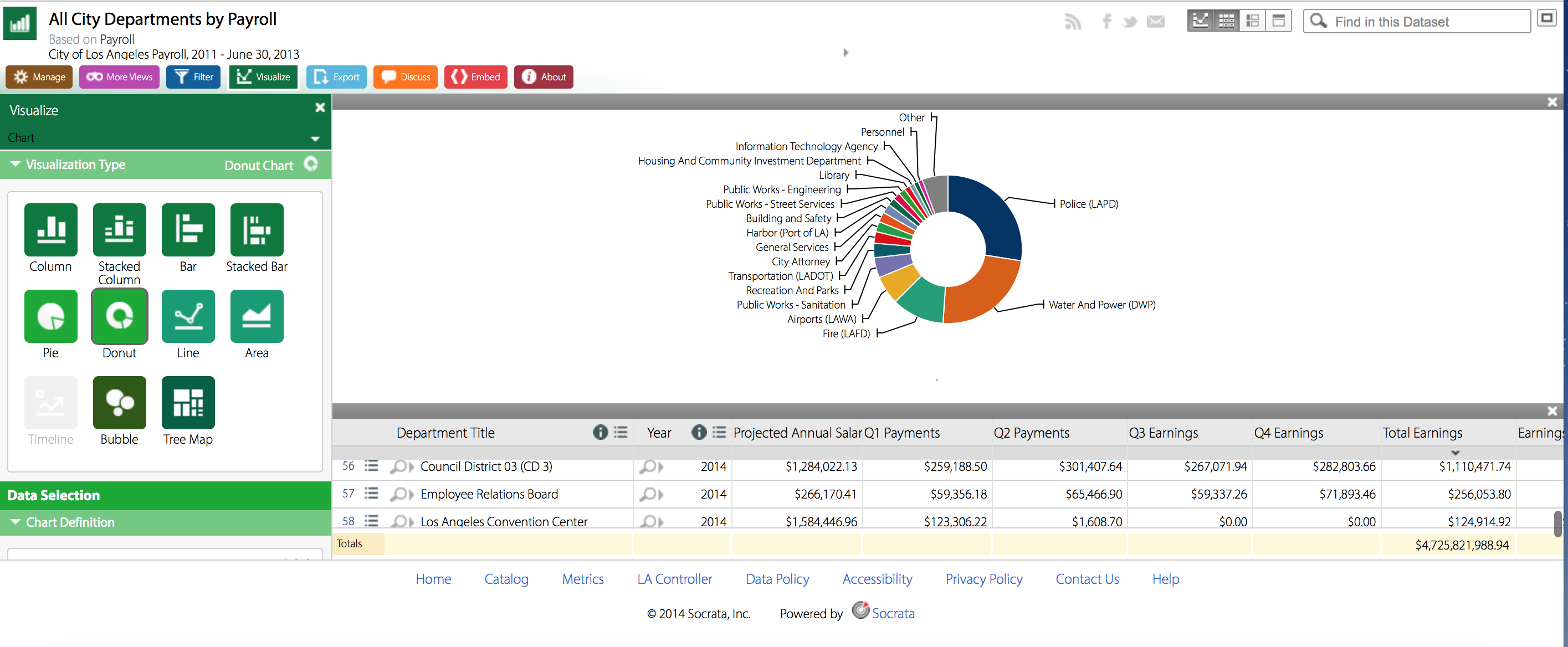
Grades are often the bane of a student’s existence, but the pressure of grading does not end with the education system; rather,  grades are assigned to many things in life, from eggs to Olympic performances. Roads also fall in this category, as evidenced by the L.A. Controller Office’s data set entitled “Street Grades.” This audit report contains information about the state and quality of roads provided by the City of L.A.’s Bureau of Street Services.

bp3 - 9

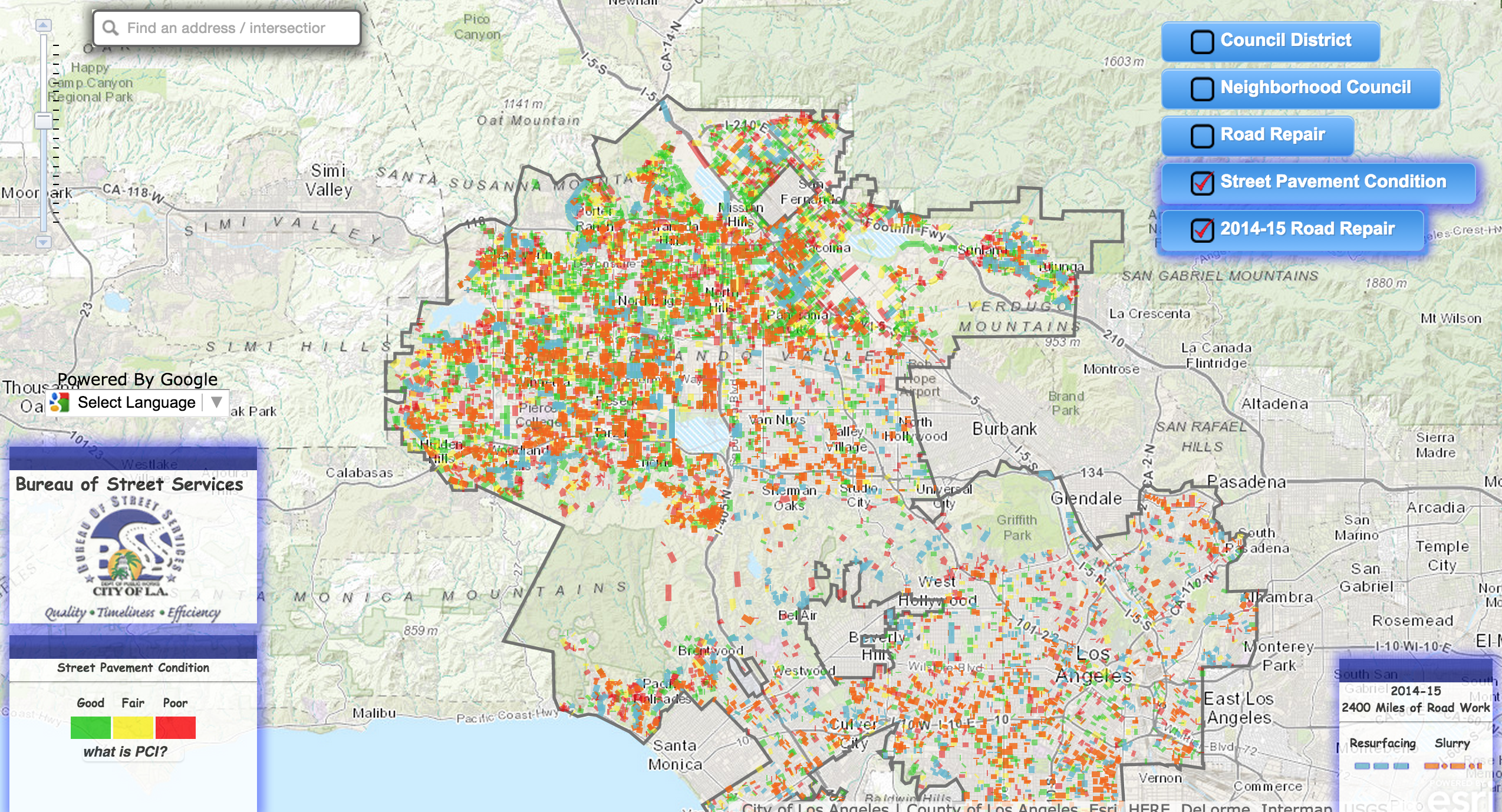
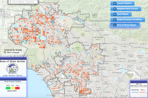
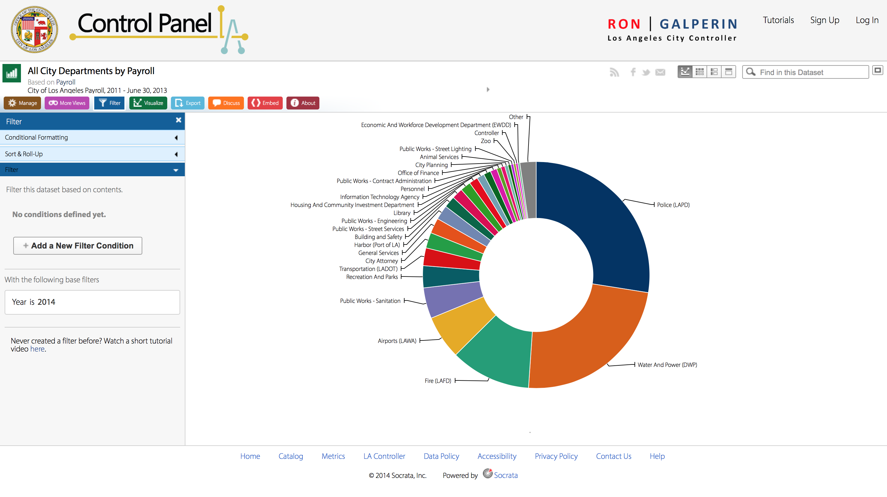
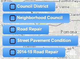
This project uses data visualization in the form of a large interactive map. It provides the ability to zoom in and out, and explore the innermost regions or outermost corners of the L.A. county. The map also has five different available features for classifying its data that can be grouped into three data types: council boundaries, road conditions, and road repair.  In the upper right-hand side of the page, these categories can be toggled on and off to present different information to the viewer. The two council boundary categories include smaller neighborhood borders, as well as larger council districts. The road repair options can either show previous roadwork completed in the 2014-2015 period, or more recent and proposed roadwork for 2015-2016.  In this data set, a record is an individual road, which can be classified by its current condition, work that has been done on the road, or work that is proposed to be completed on the road.

bp3 - 1

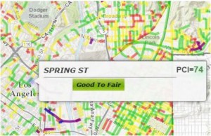
The Street Pavement Condition option is the core feature of this data set, as it provides data about the quality of the majority of the roads in Los Angeles. Each road is ranked based on the Pavement Condition Index, or PCI for short. This ranking works on a 0-100 scale that is based on combined consideration of the road’s current physical condition (e.g. whether there is cracking or base failure) and the maintenance required to get the road to an ideal condition (e.g. slurry surfacing).bp3 - 2

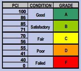
Therefore, the PCI becomes the data set’s ontology, since it falls under Wallack and Srinivasan’s definition as a system of categories by which groups order and manage information about the things around them. The PCI provides valuable information for viewers by assigning comprehensible terms that have widely agreed upon definitions to the 0-100 scale: failed, poor, fair, satisfactory, and good. By taking numerical values and equating them to terms that make sense to the general public, this data is easily understandable, and therefore useful for a wide range of people.


The groups that are most likely to find the data illuminating are encompassed by the categorized districts on the map: neighborhood and city councils. Neighborhoods are obviously invested in the quality of their home environment, and they can petition the city council to fix problems that arise, such as roadwork. If a neighborhood council or the neighborhood watch notices that some of their roads are damaged to the point of being dangerous – causing tripping hazards, making it hard for kids to ride bikes – then they can use this resource to write an informed petition for funding to fix the roads. This data provides evidence that goes beyond photographs and unhappy testimonies from people in the neighborhood. Similarly, when city roads get potholes or cracks that start to affect the driving experience of large numbers of citizens, this resource can provide necessary context for city councils to get funding to fix the roads.


Looking at this data, it can easily be discerned that many, many streets in L.A. are in poor condition. And yet relatively very few have proposals to bp3 - 5
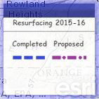
be repaired. This can likely be attributed to a conflict of public interest; people want good quality roads in their area, but are reticent to pay the fees to fund said repair. Branching off this notion, it seems that areas with high concentrations of poor quality streets sometimes do not have any proposed or scheduled repairs, possibly because the area is impoverished.

bp3 - 7

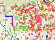
Conversely, areas with higher concentrations of “good” and “fair” streets have more reconstruction project scheduled, likely because they are more affluent areas that can afford to spend money on such projects. While this does make economic sense, seeing such patterns certainly does not feel good or fair.bp3 - 8


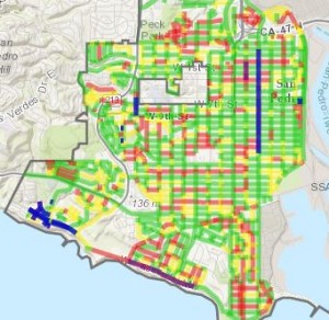
Though this data set provides a lot of valuable information, some information is still left out. There are some roads on the map that do not even have PCI ratings, like the canyon roads that run through the mountains. Even though these roads probably see less use than city or neighborhood streets, mountain passages can be more hazardous than typical roads and deserve attention. This data also does not include information about highways or freeways, or other paved areas like parking lots. And while it does contain proposed road resurfacing projects for 2015-2016, it does not contain indication of public opinion – e.g. whether some neighborhoods are trying to get propositions finalized but are facing opposition or setbacks.


If this data collection were to be redone, it could be described from a couple new different ontologies. One perspective would be that of safety organizations or neighborhood parents, who might forgo the “poor, fair, good” categorizations for terms that are directly correlated to safety, e.g. “hazardous, requires caution, safe.” While the current ontology does have implications for safety – a road ranked as “poor” logically will be less safe or pleasant to drive on than a road ranked as “good” – this adapted ontology has stronger implications. Another ontological perspective could be that of local government, who might just use two groupings based on an economic viewpoint, categorizing streets as either “requires attention” or “does not require attention.” This narrows down the classifications of road status and creates a simplified way of identifying whether funding really needs to go towards repairing a street, or whether it is usable in its current state so that attention can be focused elsewhere. Still, I believe the current data’s PCI grading system is functional and approachable for a wide range of people, and does not require an ontological overhaul.

Control Panel: Los Angeles City Controller – Week 3

http://miriamposner.com/dh101f15/wp-content/uploads/2015/10/Screen-Shot-2015-10-19-at-9.32.48-AM.png

http://miriamposner.com/dh101f15/wp-content/uploads/2015/10/Screen-Shot-2015-10-19-at-9.32.48-AM.png

The Control Panel is a website run under Ron Halperin, “an American politician and lawyer… [and, the] City Controller of Los Angeles” from 2011 to June 30, 2013. This site organizes a growing list of the payroll disbursements in the city of Los Angeles, as well as to whom they were disbursed to by job categories. The data of payroll disbursement is made into an interactive format where viewers and user are able to manage filters, different types of visualizations (such as donut charts, line graphs, columns, etc.)

http://miriamposner.com/dh101f15/wp-content/uploads/2015/10/Screen-Shot-2015-10-19-at-9.32.48-AM.png

http://miriamposner.com/dh101f15/wp-content/uploads/2015/10/Screen-Shot-2015-10-19-at-9.32.48-AM.png

The data type embedded within this site is the distribution of Los Angeles’ payroll. Furthermore, as elaborated before, the data type lies in the way such information was presented for it was far more important to show the relativity of the earnings from one job to another rather than the actual earned amount itself. When first encountering the page, a donut chart appears that makes it evident that Police (LAPD) and Water And Power (DWP) trumps all the other departments combined. Yet, it provides no numbers immediately until the viewer hovers over the sections.

Each record can be understood as a row of data under the table. Therefore, the record in this data set is the 58 different departments represented in the tables/visualizations.

From my understanding of the Wallack and Srinivasan reading, a dataset’s ontology is the communication of information that help separate entities unify as one construction. With this definition in mind, the Control Panel’s data ontology is the openness of which the payroll disbursement information is announced, so that the public is aware of where their tax money is going to as well as where the government’s priorities lie.
The point of view of which this ontology makes the most sense is most likely, the public eye — more specifically, the tax payers and citizens of the city of Los Angeles. The communication between he government to the people of Los Angeles provides a flow of information that places everyone on the same page of understanding.
This dataset uncovers the phenomenon of where all the payroll money from taxpayers go to, which is predominantly the LAPD — which may be something that not all citizens agree where their money should be spent in the Los Angeles community. However, the information is put out there to share so that we are aware than set in the dark. The information that gets left out is the story or explanation as to why the money is so focused onto the police and water/power, such as a legislation that passed, increase in crime that we should be concerned with, or lack of water resources to fix draught issues.
This data could be in a completely different ontological perspective if it was from the point of the view of the people to the government, like a reserve chart where the people could rate what the individuals feel as more valuable or where they feel their money should go to. Furthermore, the government could be more aware of where the people prefer their money to go and act upon the interest of those they serve.

Blog 3 – LA Controller’s Office

Control LA is a site in which sources where the money within Los Angeles goes, who is a top earner, etc. The focus I worked on was the Top City Earners within Los Angeles.  While ontology is the main focus of this blog, we can assume that the Los Angeles accounting office can account for a large majority of the use of this visualize data.  In addition tax payer money and pay rolls are of interest to the general public, because the knowledge and us elf hard earned money is important during a stiff economy like today.

While navigating through the page you can see that you can pick the particular year, which dates who was the top earner in addition to how they were categorized by pay.

The categories for pay are as follows: Base Pay, Permanent Bonus Pay, Longevity Bonus Pay,  Temporary Bonus Pay,  Overtime, Lump Sum Pay, and Other Pay and Adjustments.  Analyzing these data points you can find out that majority of pay is of course based on Base Pay, however the second most payed item is overtime.

The data is presented within a bar graph, which is color coated and easily highlights each item. This data is easy to visually recognize and presents itself well enough for the general public to understand without fully knowing the particular numbers for each.  However, if you would like to look at specifics you can click on the particular graph and they will give you the numbers and the actual figures for each particular occupation.

Additionally you can teach the annual earnings by each department.  For example LA DWP is one of the most populated graphs and contains a large percentage of earnings by the Los Angeles county itself.

Screen Shot 2015-11-09 at 12.11.16 PM

The ontology for this data set can be easily understood as the identification of dollars spent by Los Angeles county for its employees.  These employees can differentiate the different sums and lack of money spent within each department.

The data set can be used for things such as campaigns in order to fund more for particular departments and can utilized by the departments to gain more funding.  However the flaws within this site include, a recent change has not been made to this particular site in the 9 months which could show some form of influx or change.  Additionally it is not specified as to what Other Pay & Adjustments can be referred to. The data set should reflect more than 4 years however it only specifies 2011 – 2014.  While the data does lack some substance, visually it is understandable and communicates to the audiences it is set for.

Older posts Newer posts

© 2026 DH101

Theme by Anders NorenUp ↑