DH101

Introduction to Digital Humanities

Author: FrancescaAlbrezzi (page 28 of 38)

The Ontology of LA’s Special Funds Report

Through the Los Angeles City Controller Website, I found a dataset on the city’s special funding report. This report is quite extensive, and contains many different data types. This includes character data, a myriad of monetary data, date and time data. Personally, the extensive monetary data is the most interesting part of this dataset, as it explores the financially decision makings of the city. This dataset defines a record as the financial and logistical backing of a city project. For example, Fund 169 is an acceptable record for this dataset because it discusses the financials behind the Parks & Recreation 92A Construction Job. By placing all financial and logistical decisions within one record, this dataset makes navigating between city projects quite easy.

In the most basic sense, Wallack and Srinvasan defined ontology as the sharing of infrastructure and function in pursuit of the creation of a group, community, and/or perspective. Using this definition, my dataset’s ontology can be decidedly considered the pursuit of a fleshed out perspective on the city’s financial decisions about special projects. This dataset is grouped by data types in such a way that comparing multiple city project’s financials is the data’s primary function, and therefore its ontology stems from there.

Building off this, the point of view that would most fully embrace this ontology would most likely be the city’s financial advisor, or anyone involved or interested in the city’s financial wellbeing. The monetary focused spreadsheet obviously favors those who are similarly focused. The data will be most illuminating to those who are also interested in budgeting another special project for the city, and they can explore previously executed projects and determine if the city will approve of their project based on comparables. Another aspect of the dataset to consider is the “Source of Funds” datatype. This category would be very useful to those who are interested in the city’s budget, and perhaps would help a privatized company audit the city’s financials more easily.

The special funds report is a part of a larger narrative about the city’s overall budget, and this data set in particular attempts to reinforce the success and legitimacy of this narrative. A timeless and persistent task assigned to governing bodies is to provide the city with adequate public projects that cost within a total budget. By being as mindful and transparent as possible, the city controller is attempting to resolve this task and demonstrate to the public the completion of this task.

Understandably, those who are disinterested in the financial wellbeing of the city of Los Angeles are left out of this narrative. More importantly, the success of the project themselves, as in the success of adoption by the local community, or if the project accomplished its intended goal, is omitted from a financial report. Since these project provide no monetary income, the city controller decided to leave the projects subjective impact on a community off of the spreadsheet. This would be a very interesting aspect that I would like to add to this dataset, transitioning the data from solely that of monetary description to that of an actual digital humanities project. The success of city projects would be very helpful in this data because it can help the city what types of projects were the most successful in making a positive impact on the community, and therefore help them make more informed decisions when approving new city projects.

Week 3: database of Funds

I chose to look at the Balance of All City Funds dataset. The data types are funds, covering all funds for the city of Los Angeles, including general funds, reserve funds, and budget stabilization funds. A record in this data set includes information about the type of fund, its worth, department, its purpose, uses, and source of funding are among some of the information gathered about each fund in the database. The ontology of the database is based on the value of the fund and type.

The ontology would make the most sense to a city council worker. Overall, it highlights the most important information about a fund that someone looking for funding, i.e. a council member, would need to benefit the city of Los Angeles. Any volunteers or other members of the LA community looking to receive funding would also find this database beneficial.

Screen Shot 2015-10-19 at 11.26.00 AM

Even though the total amount of funding is extremely large, when looking closely at the data it is easy to identify that many of the funds have no money in them. The contact information, both phone number and email, are available for more information that is not given in the data. The biggest piece that is missing from the data is how someone else could get access to each fund. Only the current use I stated, not how it could be used in the future. Luckily, since there is contact information and past information about the funds, various other ways of accessing this information is possible.

If I were to start a data collection of the funds in this database, I would start with the view of the consumer. The name of the fund would be first, but after that I would focus on collecting more information on the other uses of the funds, not only the current use for them. Collecting information about a broader topic of uses would be more beneficial to a consumer trying to apply for a fund, than the current focus on information useful to political figures.

City Departments by Payroll


Screen Shot 2015-10-19 at 10.48.09 AM

http://miriamposner.com/dh101f15/index.php/2015/10/19/city-departments-by-payroll/

John Rauch

DH 101 Blog 3

DISC 1C

This database addresses how much tax payer money goes to specific city departments in Los Angeles. Essentially, this data is the number of dollars, from taxpayer paychecks, to the accounts of city departments. These number of dollars per department are separated and categorized, and then visualized online via a  number of different mediums. Above we see the “donut” shape graph, but there are several more option available.

A record in this data set is a Los Angeles City Department. These departments are owned and operated by the city, so it is paid for by taxpayers in the city to keep the city up to a certain standard (or at least try to).  In this case there are about 22 departments, so 22 records in this data. Of course, there is metadata and actual content to drive these records (number of dollars).

Simply put the definition for ontology when it comes to a dataset  ” …merely implies a distinction between groups’ mental maps of their surroundings” (Wallack , Srinivasan, 1). This definition can be applied to the LA department payrolls by understanding that this ontology is that of the city’s. By this I mean that the database is created in the point of view of the City Controller, who represents the goals and agenda of Los Angeles. This ontology is different from that of a librarian, a student, a social worker, etc. because ontologies change depending on the mental map of the creator.

I actually believe that the City Departments will find this data most illuminating. This is because all of the departments can see how their own departments stack up to those they share taxpayer money with. For example, the Recreation and Parks department can see that they receive less than 25% total earnings when compared to the top two department earners (LAPD and LADWP). This may shed light on the employees to consider other city jobs that may pay more due to a higher yield of yearly funds. Although, this data does not show how the money is distributed. Nonetheless, this data would be crucial for employees of the city to see which departments Los Angeles is making a priority.

Screen Shot 2015-10-19 at 11.09.04 AM


This dataset can tell us about the importance of certain departments for the city, through the lens of the people actually making the decisions of where they believe the money should be going. The phenomenon of wondering where all the taxpayer money really goes is attempted to be solved here by providing the data of these numbers with digital visualization and filters. While this dataset merely shows the distribution based on fact of records, many conclusions can be come to by inferring why  these numbers are the way they are.

What gets left out is specific information about what the departments actually do with their funds. We are not able to see how the money is dispersed to other employees or if most of the money goes to projects and advancement. I believe these details would be the most illuminating in how this money really is being used. My guess, however, is that information will be held from the public eye, as the spending  of some departments may be far from the opinions of the citizens. One can only wonder what this money is actually used for.

If i worked for the government for the state of California, and was responsible for comparing all city departments from all counties, my dataset ontology would be much different. Instead of being compared on just the cope of a city, the whole state would be considered. Thus, all these separated departments seen above would have to merge with similar categories from every city, until the county can be entirely spoken for. This data would look much different, be much larger, and illuminate many different conclusion as to how taxpayer money is distributed in California.

What We Buy Data Cards

The data set that I chose to analyze from the data sets found on the L.A’s Controller’s Office, was the What We Buy Data Cards. This data set provides an overview of what the city of Los Angeles spends the most on. According to this data set, there are fifteen categories of expenses that are the highest from the city of Los Angeles. These fifteen items are “AW139 helicopters, motorcycle patrol boots, golf carts, soccer balls, radar speed signs, basketball nets, ballots, thermoplastic paint, graffiti busters, TORO riding motors, Federal L.U.S.T. Tax, fire hoses, high visibility white traffic gloves, mops, and large frozen rats. After looking through all of the fifteen cards I came to understand that the data types are presented through these cards. When one clicks on one of these cards, we see that we get a quick overview of what this expense is and what it means in connection to the expenditure reports for the city of Los Angeles. As the image below shows, the cards have different informational sections that include a, “What’s this?” “Why do we buy this?” and a “Did you know?” In these data sets, we see that what constitutes a record is the number of the price in expenditures. In reference to the image below for example, we see that the cost of the AW139 helicopter, there is an estimate of $12.3 million. This sets the records because then on the right panel we see that constitutes this price.

Screen Shot 2015-10-19 at 9.39.44 AM

Wallack and Srinivasan describe ontologies as “systems of categories and their interrelations by which groups order and manage information about the people, places, things, and events around them.” I really appreciated this definition because it simplifies the understanding of studying data itself. It narrows down to patterns and relationships within the different categories of the data. In regards to my chosen data set, I believe that with this definition of ontology, the data set is very simplified and interconnected. With the idea of the data cards, it simplifies the phenomenon of expenditures in the city of Los Angeles. I thought this was important for this data set because the idea of talking about how much the city is spending is very controversial. With this card structure, it makes it very easy to understand.

What this data set is saying in regards to its phenomenon is basically, “this is what we are spending your tax money on and this is why”. I think that the idea that it is simplified is good, but some people may see it as inefficient. Because there isn’t enough information some people may see this data set as a quick informational bulletin. It is not an extensive piece of data and some readers may want to know the ins and outs of this phenomenon.

With this same idea, if I had started analyzing this data set, this would be the kind of ontology I would approach it with. I would have viewed these data cards as advertising bulletins. What I mean by this is that if you see one of these cards in a public bus, it would make sense because it is very visual, colorful, and to the point for anyone to understand. However, being a college student with the constant concept of researching, this approach lacks statistical information.


-Karla Contreras


Blog #3: LA Controller’s Office Special Funds Report

Screen shot 2015-10-17 at 3.28.41 PM

The Special Funds Report link takes us to a dataset for the balance of all the funds for the City of Los Angeles. This includes the General Fund, Reserve Fund, Budget Stabilization Fund, and Special Funds. Here, the Special Fund is titled the “Innovation Fund” in the Fund Name content type and it represents the smallest cash amount of all the funds. The definition under the Funds Purpose label, tells us that these funds are used as loans for special projects. (Though the “accounts for gifts” section of the definition is confusing).

There are 912 records or rows of information in this dataset. Each record is made up of 36 content types (or labels) including:

  1. Fund Name
  2. Cash
  3. Department Name
  4. Fund Purpose
  5. Sources of Funds
  6. Eligible Users
  7. Fund Category
  8. Ending Fund Balance
  9. Assets
  10. Liabilities
  11. Grant Receivable/Other Assets
  12. Current Collected Revenue
  13. Cash Disbursement
  14. Outstanding Commitment
  15. Date Fund Established
  16. Fund Group Name
  17. Fund Type Name
  18. Council File Link

 Using Wallack’s and Srinivasan’s definition, the ontology or the logic that underlies how the information in this particular dataset is framed, points towards our local government’s desire for financial transparency. But, it also points to a gap between the government’s understanding of transparency and how the community might define it. First, the information is only available in English. Second, it is not layman friendly. These two issues alone might leave large segments of the local population in the dark, which points to either a disconnect between the government and the real needs of its community or to the fact that the community at large isn’t the dataset’s target audience.

If the community isn’t the target audience, then who is? Who will find this data most useful and illuminating? I would answer: The City government itself (for clarity in their record keeping), lawyers (to assure legal and fiscal accountability), and anyone up the hierarchy to whom the City managers may be accountable to. The sheer number of content types is overwhelming for a normal resident who, like me, may expect to click on the Special Funds link in order to get a clear picture of what the Special Funds are, how much money is allocated to a particular project, which community stands to benefit, and past & future allocations of these Special Funds. Because this table doesn’t answer direct questions like these in a simple to understand manner, it doesn’t feel like the everyday citizen is whom they are trying to reach. And, if they are, then there is a gap between the state and local ontologies that ought to be addressed.

If I were starting over with data-collection from the community’s point of view, I would ask the community how they would define “Special Fund,” what information they would find useful, and discuss ways to present the data (design the website) in a manner that is community-friendly. I would gather information on language choices and how to involve individuals with disabilities or lack of access.


L.A. Departments and Payroll

I took a look at the L.A. Controller’s Office’s report on their city departments and payrolls, because I was interested to see how funds are allocated, and therefore, examine what is deemed the most “important” or “necessary” by the City of Los Angeles.

It can be accessed by clicking the image below.

Screen Shot 2015-10-19 at 9.38.05 AM


The Data Types


The data represents the payrolls of all city departments from 2011 to June 30th of 2013. These numbers show how much taxpayer money the departments received for their services, whether they be Parks and Recreation or LAPD.


Each record in this dataset is considered the department name, and the corresponding payroll number in dollars. There are not many dimensions to this dataset–it focuses on these two aspects, without specific breakdowns for details like number of employees. This data may be accessible elsewhere on the site, but does not show up directly on the visualizations.


There are a wealth of data visualization options here, ranging from “donut” charts to stacked bar charts to “tree maps.” Regardless of which option the user chooses, there is a clear trend in the data–departments like LAPD, DWP, and LAFD dominate the payrolls, taking up more area or larger bars than smaller departments like Cultural Affairs or the Employee Relations Board. While the UI for finding and sorting this data may not be the most intuitive, it’s great that the Office included this level of variety.

Screen Shot 2015-10-19 at 9.40.39 AM

The Ontology


According to the paper by Wallack and Srinivasan, data ontologies are “systems of categories and their interrelations by which groups order and manage information about the people, places, things, and events around them.” Ontology describes how people categorize data into different structures, based on their social, cultural, and experiential backgrounds. Though there is not a lot of raw information here, the data’s ontology divides the data into departments and payroll amounts, categorized by the City of Los Angeles. It is difficult to extrapolate on the social, cultural, or even financial reasons behind the way this website presents its data, especially because it seems so limited, but this fact in of itself may hint at the motivations.


This data is useful for any taxpayer in Los Angeles County to see where their money is going, and how it is prioritized, but may be the most illuminating to the workers in these departments. I am sure employee wages and departmental funding are sensitive topics for many, so the substantial differences in the payrolls may exacerbate frustrations or inspire change. This data may be useful to build a numerical and visual argument  for increased funding in smaller, but still important, departments.

Screen Shot 2015-10-19 at 9.40.53 AM

The Data Set


This data set elucidates the vast differences in each city department’s payroll. It is surprising, especially when displayed in such a visual manner, that LAPD receives around 25% of the whole city’s employee payroll. Meanwhile, departments like Housing And Community Investment or Libraries receive a much smaller chunk.


I am conflicted on how to interpret this data. On one hand, I understand that the safety and protection of the citizens of LA should be the highest priority. Or that without efficient water and power systems, the city would lose productivity. However, the large numbers make me question how efficient these systems even are. Large organizations tend to be slow and bureaucratic (especially in government!), and I’m curious to see how much of taxpayer money is being put to good use. Furthermore, I find it interesting that the troublesome aspects of LA, like a terrible public transportation system or education disparities, which may be handled or improved by departments like Transportation or Libraries, do not seem well funded.


However, I do think it’s important to have more contextual details and further data before coming to conclusions. Information like year-by-year funding changes, number of employees, hours worked, and sub-departmental distributions may be helpful in constructing an argument for either side.


The New Ontology


As is, this data, while interesting, is incomplete. It contains numbers that are not fully contextualized or explained, making it difficult to come to conclusions. A new ontology would include a breakdown of how the funds are spent to see how money is distributed within the department. Information about requested funds against received funds may be useful as well. These would help taxpayers understand whether the payrolls, whether high or low, are justified.

What we Buy

The ControlPanel LA aims to be a source for LA citizens to gain information about, “the city’s expenditures, revenues, payroll, special, funds and more.” I chose to explore the “What we Buy” dataset on the LA Controller’s website. The data included provides information about purchases made by the city of Los Angeles with government funds. The data set features some categories of spending on their website that include images, such as  “Fit Motorcycle Patrol Boots,” “Leased Golf Carts,” “Soccer Balls,” “Basketball Nets,””Wet Mops,” and “Thermoplastic Marking Material,” and more.

Screen Shot 2015-10-19 at 8.29.26 AM

A record in this data set is the item purchased by the city of Los Angeles and the details surrounding that purchase. This is evident when you click on a category and you come to a data table, with tools similar to OpenRefine, that is organized by “Fiscal Year,” “Department Name,” “Vendor Name,””Transaction Dollar Amount,” “Description,””Detailed Item Description,””Item Code Name,””Value of Spend,””Unit Price,””Quantity,””Sales Tax,””Discount,””Unit of Measure,” “Fund Name,” and more. The data’s ontology comes from the Los Angeles city government, and the government of the United States. The ways in which government purchases are recorded, including the types of information and details surrounding the purchases, have been systematically codified over time by the wider US government, and by local and state governments in ways that ensure metadata cohesion and facilitate their needs from the data. This data set makes the most sense from the perspective of a government agency, yet I believe it can be easily understood by US citizens, and is of interest to citizens. Two of the overarching, ontological principles that the US government was founded upon are transparency and the distribution of power, I believe that this website was created with those principles in mind in order to show citizens that these principles are still being enacted. The information provided is very comprehensive.  This website is made for LA citizens yet, under the “Activity” heading only 49 people have visited the site and none have rated it or commented on it.

More qualitative data, such as  how the purchase of a basketball net improved a local recreation center is left out because it is not of immediate importance to the records of the government. However, this type of information may be interesting to a local community or citizen. One could also create a dataset from the ontology of the facilities that purchase these items, data could include quantitative information about the purchases, and also qualitative information about the utility of the items and how they affect the facilities and departments that use them.


Gender Breakdown dataset breakdown

I chose to analyze the Gender Breakdown of City Workers by Department. The data type for this dataset is presented in a table which seems to mostly display categorical department titles with the percentage male and percentage female. Employee Payroll and male/female salary are also included within the table. A record in this dataset is the various department titles.

Screen Shot 2015-10-19 at 8.34.17 AM

According to Wallack and Srinivasan, a dataset’s ontology “act as objects” and “negotiate boundaries between groups.” Bassically they are tags that manage and organize information so that you can use it to compare to even more information. The ontology in this dataset is department title.

This ontology of breaking down city jobs will make the most sense to a person who is looking at the bigger picture of all jobs in the city and their gender payroll differences. The dataset takes a lot of information and presents it in a digestible way. It is specifically designed to possibly answer the question that is presented in its title: “Gender Breakdown.” The ontology may be too strict to answer questions on specific jobs and the different positions within that one job. For example if I wanted to just analyze the role of a police officer, there is no ontology available for me to look at the various different types and rankings of police officers. While this makes the bigger picture clearer, some details that someone may try to find gets left out.

The gender breakdown dataset seems to tell the viewer that although not true in all cases, males typically have a higher salary under the same department titles than females. The dataset can show the wage gap phenomenon by specific jobs, and possibly by taking the average of all job salaries.

As i was saying earlier specific ranking and positions within a broader job department gets left out in this dataset, along with how long an employee has been working there and how many hours spent on the clock. These factors are just additional details that could result in less conclusive correlations being made about the gender gap in salary and profession.

If I were to start over with a different ontology I could go with years employed, looking from the perspective of someone saying that the gender wage gap exists regardless of the amount of years spent at a job. I could break down the categories as less than a year at the job, one to five years at a job, five to ten years, and over ten years at the job.

Another ontology could come out of someone who didn’t want to focus on gender at all and instead wanted to take a closer look at race. It would be a similar ontology, except male/female could be replaced with black/white/asian/hispanic.

Week 3 – L.A. Controller’s Office Dataset: Top City Earners

  • Screen Shot 2015-10-19 at 1.56.54 AM
  • Identify its data types & What constitutes a record in this dataset?

I chose to analyze the Top City Earners dataset from the L.A. Controller’s Office. This dataset represents information about salary for various city  positions. The data type is essentially the salary data and, because of the way it’s organized and presented in this table, it’s also possible to compare individual records to each other based on attributes such as base pay, bonus pay, temporary bonus pay, overtime, etc. (these are color-coded, and you can see the exact amounts by hovering over with your mouse). The content model is the salaries, increasing by $20K for each consecutive column. The record for this dataset is the job title, organized from highest to lowest-paying positions, and also alphabetically and by department.  Overall, the data list is very large, but quite appealing and interactive in the way it’s presented.

  • Use Wallack’s and Srinivasan’s definition to identify the dataset’s ontology.

In their article on mismatched state and community ontologies, Wallack and Srinivasan described a ontologies as “systems of categories and their interrelations by which groups order and manage information about the people, places, things, and events around them”. Put differently, an ontology is a way of representing data so that you can see more easily if there are particular relationships and/or patterns among the various categories. The ontology for this dataset is salary amounts and types for different positions.

  • From whose point of view does this ontology make the most sense? (Another way to ask this question: Who will find this data most useful and illuminating?)

This dataset seems to be useful for community members looking at jobs and salaries in the city. It’s helpful both for people currently employed and looking for a raise, or for potential employees. On the left side, you can filter the options. The filter, however, doesn’t seem to be very well made because typing “transportation” into the simple search box, for example, yields no results although there’s undoubtedly several jobs in transportation with the city. The Advanced Filter option is programmed a little better as it allows for narrower searches.

Furthermore, the dataset could be useful for city officials to know how the salary budget is being allocated and which positions demand higher base pay and which positions rely more on overtime pay.

  • What can this dataset tell you about the phenomenon it claims to describe?

The dataset most definitely shows what it was intended to. By looking at the top twenty or so records, we can see that the top earners in the city are Chief Port Pilots. This amount, however, includes a large portion of temporary bonus pay (turquoise bars) in addition to base pay (navy blue). But if we look only at the base pay, the Chief Manager Airports actually is paid more. So, it’s important to keep these attributional details in mind when interpreting this table.

  • What gets left out?

Perhaps adding a category to organize job salaries by zip-code would be helpful. There may be notable salary differences for the same positions for people working in Central L.A. versus people working in Culver City or Norwalk.

  • Imagine you’re starting over with data-collection and describe a completely different ontology, from someone else’s point of view.

The dataset seems to accommodate both city officials to see how salary budget is being allocated and for community members looking for jobs with the city. If I were to collect the data from scratch, I would also include the average hours per week that people in these positions work. I would probably include this information in the little text bubble that pops up when you hover over the record with your mouse. In addition, I’d also look into possible gender differences and educational differences. These could be added to the records, so for each position, there’d be additional records corresponding to gender and level of education.

LA Controller’s Office: Top Earners (Payroll)

Who would have guessed that Los Angeles top city earners are Chief Port Pilots potentially making over $450K a year according to the Los Angeles City Controller’s office .  The data found on this site displays “payroll information for all Los Angeles City Departments” from January 1, 2011 through March 31, 2014.  These data were updated on a quarterly basis and contain a very interesting array of jobs and figures.   I was very curious to know who is on top of the city’s payroll, which is to say what job title earns the most!   Maybe it’s not to late to switch career paths.Screen Shot 2015-10-18 at 7.22.44 PM


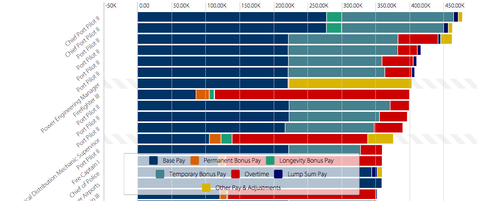
I was also curious to know who is at the bottom of the payroll scale, so I used the sort feature to resort the data in ascending order by total earnings.  This provided me with one of the most unexpected results.  I received records showing a negative amount.  A Planning Assistant, for example, showed negative earnings of more than $30K!  Looking at the chart legend more closely one can add that this amount is mostly attributed to “other pay & adjustments.”  A an even closer inspection reveals that there is a $150.00 annual earnings amount.   I feel like there is missing information because how can someone work to earn only $150 a year and owe more than $30,000?  There is more to the data than is visualized here.  Screen Shot 2015-10-18 at 8.48.24 PM


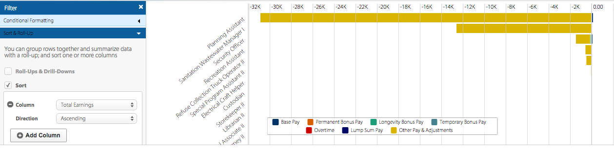
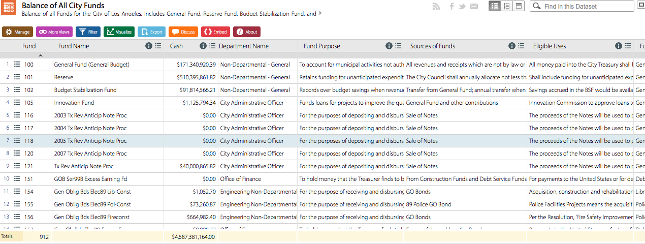
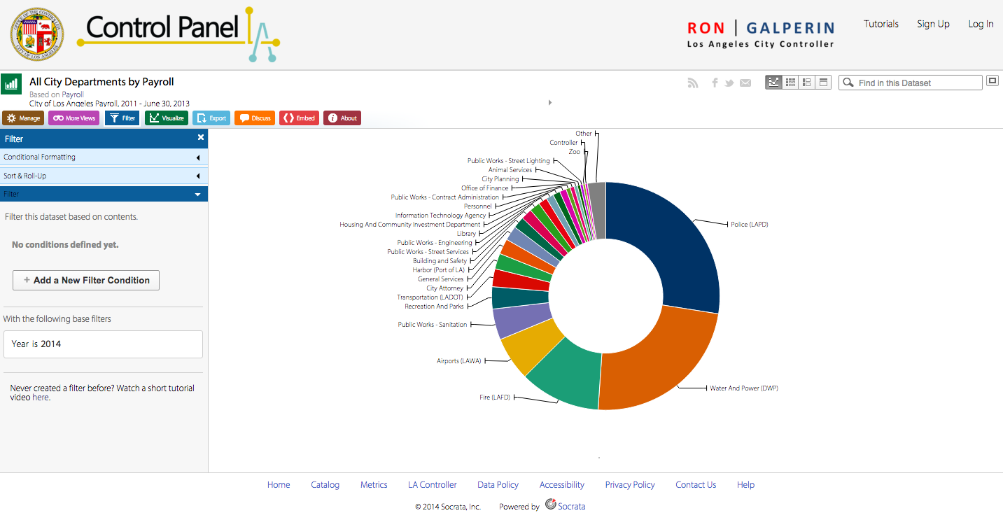
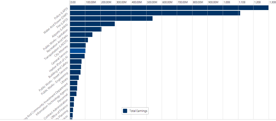
Pardoning the potential outliers, I really like that the system is intuitive enough to use quickly.  I also appreciate its power and flexibility enabling users to “slice and dice” the data.  For example, some of the available data types related to earnings that a user can sort through, filter, and compare include Base Pay, Permanent Bonus Pay, Longevity Bonus Pay, Temporary Bonus Pay, Overtime, Lump Sum Pay, and Other Pay and Adjustments.   Other data types include Year (of earnings), Department Title, Job Class Title, Pay Grade, Employment Type and more.


The system’s power derives from the flexibility to quickly change criteria to sort by and the visualizations from graphs, to tables, to list view and grid views all while maintaining the criteria you had selected.  There is a “discussion” functionality that enables users with the ability to write comments, you can embed HTML, and even save and export your data to a good number of popular formats.  The cherry on top of is that you can share any dataset on social media.  What more do you want?  Well…actually a lot more…


As powerful as this system seems to present quantitative data, it lacks in providing human data or contextual data.  I began to play with the tool by looking at the top and bottom earners.  Although I was able to successfully find them, it raised more questions because of the lack of context.  Why does a Chief Port Pilot II make the most?  I could not find data type that could point to the answer.  Looking at the top earner or record in the dataset in itself may not be enough to answer the question.  I can however, say a few things about this particular record.  Although the total earnings in this record list a total of more than $450K, we can break it down to what type of pay contribute to that sum.  According to the record, a Chief Port Pilot II makes a base pay of $258,096.00, a longevity bonus pay of $22,354.64, a temporary bonus pay of $164,429.12, a lump sum pay of $6,947.05 and an adjustment pay of $5,954.00.  This provides us with a sense that a Chief Port Pilot II needs to perform or somehow maintain a level of work in order to achieve the $450K earnings mark.


According to Wallack’s and Srinivasan’s ontologies there are mental models that encompass a system of categories that a particular group of people uses in order to experience and make sense of their world or reality.  These categories dictate how they term, phrase, and interpret their experiences.  In other words, there is a set of data types that are featured in the Top Earners data set that make up the ontology of the group that created the database: The Los Angeles City Controller’s Office.  They are most concerned with the data and it was collected and organized from their point of view.  In Wallack’s and Srinivasan’s parlance this could be considered the “state-ontology” as it seems to be a “state-created information system” that reflects the earnings of possibly a large number of “local communities” (Wallack’s and Srinivasan’s 2009:1).  These local communities may have a completely different ontology that does not feature the data types listed in this data set, but that may provide context and meaning to these data.  In anthropology this is the difference between an etic (state-ontology) and an emic (local-ontology) perspective.


On the surface the dataset does provide a very quick glance at the top city earners in the Los Angeles area.  You can see very quickly that the maritime commercial industry–one of the local communities represented in the dataset–is very lucrative, but it does not tell you why.  The context and “local communities’ representation of their contexts” is left out.  Further investigation on the Internet may provide a mental map or model that sheds light on the experiences and ontology of these top earners, namely the Port Pilots.  For example, according to a Bloomberg article written in 2011, the Port Pilots that were interviewed feel that they “perform an important function and [they] do it safely” (Palmeri and Yap 2011).  Furthermore, if we take in account the risk of a tanker such as the Exxon Valdez type vessel potentially spilling oil costing billions of dollars to clean up, we start forming a picture or setting a frame of reference that provides us with perspective and possibly understanding as to why they are paid over $400,000 a year.  These Port Pilots need to be extremely well trained, have “years of experience and detailed knowledge of the harbor, working in dangerous conditions,” and be held accountable for anything that goes wrong.  Finally, the value comes into perspective when they, the Port Pilots, state that “there’s 7 billion people in the world and less than 10,000 who do this” (Palmeri and Yap 2011).


From a Port Pilots perspective and his community of maritime experts as well as the people that depend on their skill for their lives (not to mention the environment), there are quite a few data types missing in the dataset that provide context of their work.  With out this context one can quickly draw the wrong conclusions.  One can even be tempted to be upset at the fact that Port Pilots make so much money and wonder if the tax payer is responsible for the bill.  By the way, according to Bloomberg the tax payer is not paying their wages.  From the Port Pilot’s point of view, I can imagine them wanting to include at least the following to the ontology: years of experience, locations of experience, who is paying them, risk level, exposure level, experience rating, training, education, largest vessel maneuvered, average vessel maneuvered, number of berthing operations, number of unberthing operations, and things related to their mental model of their job experience.


BIG DATA a is a term that refers to a large quantity of (sometimes complex) information, typically quantitative, and often times failing to provide a “thick description” of phenomena (Geertz).  Furthermore providing insight and matching state and local ontologies is probably another frequent failure.  We are coming up on technological capabilities and models that are beginning  to provide a contextual and digestible “thick description” out of big data.  What this means in this particular dataset is that the state-ontology and local Port Pilot communities’ ontology will be able to someday leverage the same datasets without having to learn each others ontologies thereby making the data represented richer, more relevant and meaningful.

Older posts Newer posts

© 2026 DH101

Theme by Anders NorenUp ↑