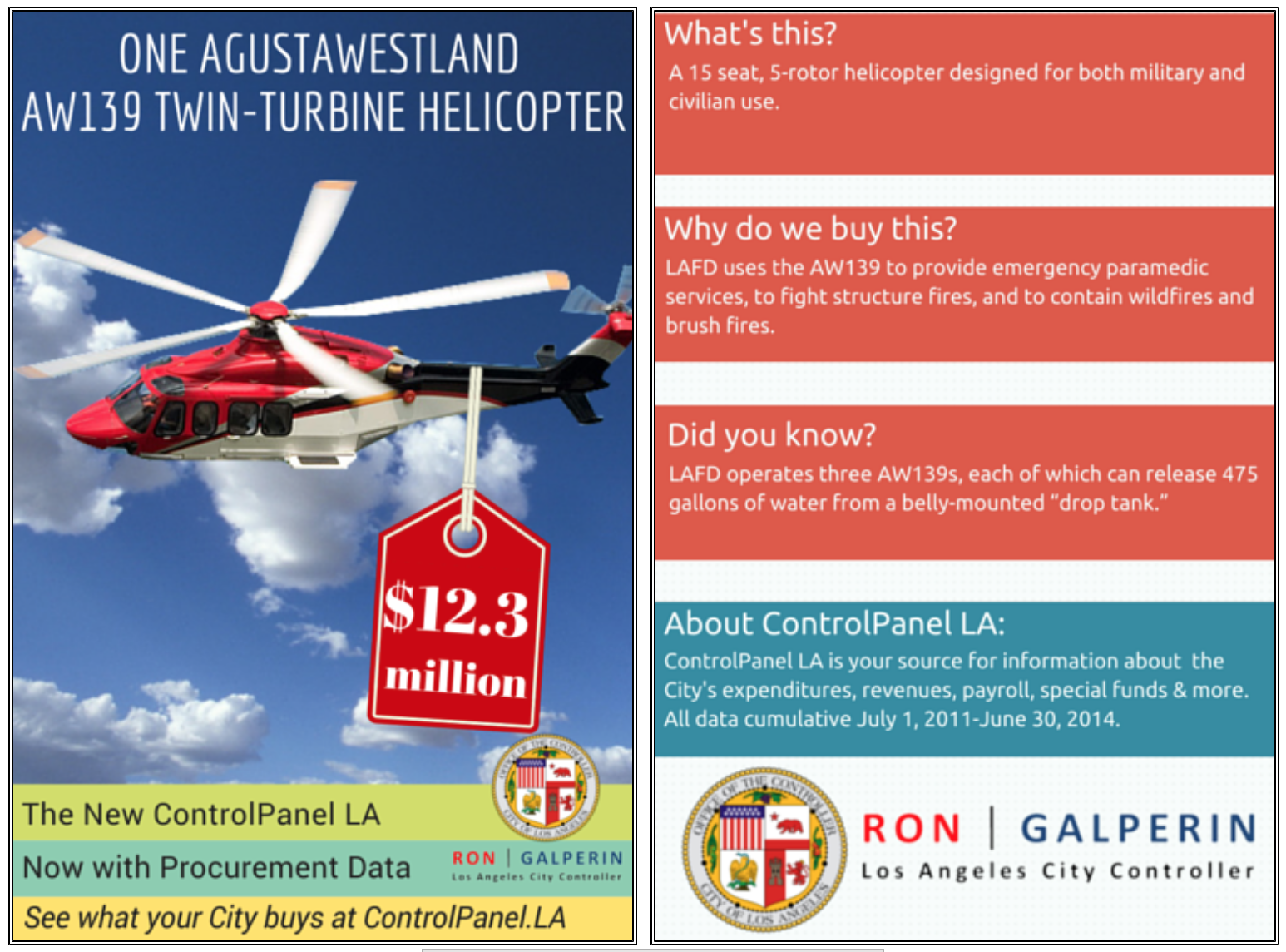
The data set that I chose to analyze from the data sets found on the L.A’s Controller’s Office, was the What We Buy Data Cards. This data set provides an overview of what the city of Los Angeles spends the most on. According to this data set, there are fifteen categories of expenses that are the highest from the city of Los Angeles. These fifteen items are “AW139 helicopters, motorcycle patrol boots, golf carts, soccer balls, radar speed signs, basketball nets, ballots, thermoplastic paint, graffiti busters, TORO riding motors, Federal L.U.S.T. Tax, fire hoses, high visibility white traffic gloves, mops, and large frozen rats. After looking through all of the fifteen cards I came to understand that the data types are presented through these cards. When one clicks on one of these cards, we see that we get a quick overview of what this expense is and what it means in connection to the expenditure reports for the city of Los Angeles. As the image below shows, the cards have different informational sections that include a, “What’s this?” “Why do we buy this?” and a “Did you know?” In these data sets, we see that what constitutes a record is the number of the price in expenditures. In reference to the image below for example, we see that the cost of the AW139 helicopter, there is an estimate of $12.3 million. This sets the records because then on the right panel we see that constitutes this price.
Wallack and Srinivasan describe ontologies as “systems of categories and their interrelations by which groups order and manage information about the people, places, things, and events around them.” I really appreciated this definition because it simplifies the understanding of studying data itself. It narrows down to patterns and relationships within the different categories of the data. In regards to my chosen data set, I believe that with this definition of ontology, the data set is very simplified and interconnected. With the idea of the data cards, it simplifies the phenomenon of expenditures in the city of Los Angeles. I thought this was important for this data set because the idea of talking about how much the city is spending is very controversial. With this card structure, it makes it very easy to understand.
What this data set is saying in regards to its phenomenon is basically, “this is what we are spending your tax money on and this is why”. I think that the idea that it is simplified is good, but some people may see it as inefficient. Because there isn’t enough information some people may see this data set as a quick informational bulletin. It is not an extensive piece of data and some readers may want to know the ins and outs of this phenomenon.
With this same idea, if I had started analyzing this data set, this would be the kind of ontology I would approach it with. I would have viewed these data cards as advertising bulletins. What I mean by this is that if you see one of these cards in a public bus, it would make sense because it is very visual, colorful, and to the point for anyone to understand. However, being a college student with the constant concept of researching, this approach lacks statistical information.
-Karla Contreras