DH101

Introduction to Digital Humanities

Month: October 2015 (page 3 of 18)

Poverty Statistics

Death Rates and GDP Analysis

For this week’s blog post, I decided to analyze the data and its visualization of the Poverty Statistics. This piece of data informs of the birth and death rates, infant mortality rates, life expectancies, and per capita GNP from 97 countries. With this data, I wanted to focus on the death rates and its association with the country’s GNP. To do this, I used Tableau Public to create two types of data visualizations. More specifically I wanted to analyze these factors in countries that were of interest to me based on living in the U.S. and based on the countries with the greatest death rates.

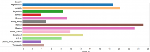
The reason why I chose to focus and use these countries to compare with is because death rates are big indicatives of poverty rates. So for the visualizations on this data, I chose to use side bar graphs to show the death rates of Afghanistan, Angola, Argentina, Bahrain, Greece, Hon Kong, Malawi, Mexico, South Africa, Swaziland, U.S.A., United Arab Emirates, and Venezuela (Image below). Visually, it can be seen that Bahrain and the United Arab Emirates have the lowest death rates, while the one with the highest is Malawi.

Screen Shot 2015-10-26 at 11.40.35 AM

By simply looking at this, we can make assumptions about the socio-economic status of the country as a whole, but we can also infer dietary, and environmental issues. However, since we are speaking of poverty, it is more useful to focus on the monetary values of these countries. For this, I went ahead and produced a table with Tableau that shows the GNP’s for these countries (image below).

Screen Shot 2015-10-26 at 11.37.36 AM

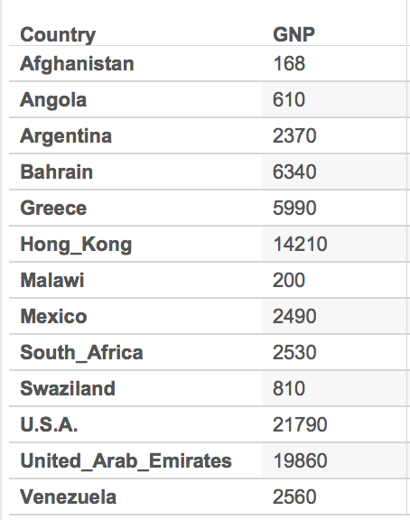
With the table as reference to the death rates, we see that Bahrain and the United Arab Emirates have one of the highest GNP’s up to about 19860. We then compare this to the one with the highest death rate, Malawi, and we see that its GNP falls low at 200. By simply looking at these pieces of data, we can quickly assume that in regards to these countries, there is a connection between the GNP and the death rates which can also be associated with the poverty. However, there is still a lot of research that can be done with just these few selected countries. For example, why is it that Afghanistan has the lowest GNP and a high, but not the highest, death rate? This is just one very obvious observation and question from this small part of the data, but like I said, there is still so much data that can be visualized and studied. Upon studying the countries’ culture we can maybe find out a link between their customs, rituals, diets, or their daily lives.

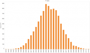
Again, this is only based on a very small extraction of the entire data because it would have been difficult visualizing the entire data set on this small interface as it can be seen below.

Screen Shot 2015-10-26 at 11.47.35 AM


-Karla C.


Blog 4 – Data Visualization

The data visualization I chose to use was Tableau because it demonstrate an easy and efficient way to graph and color coordinate data in a way that can be better understood visually then through a mess of data. I first began looking at the Data Set in relation to deaths. I decided to pick two topics in order to visually decide which was more common.  I picked Homicide and Suicide.  While morbid, it was used to see which was more of a common occurrence each year and how can it be graphed visually. Additionally it showed the distribution of age and demographics for which we can then see which was more common for a particular age, homicide or suicide, additionally so which was  more common among a particular sort of demographic.

Screen Shot 2015-11-09 at 12.51.32 PM

Screen Shot 2015-11-09 at 12.54.23 PM

I additionally included AIDS to show and distribute different forms of deathScreen Shot 2015-11-09 at 12.51.21 PM

Tableau is an excellent way to visualize a particular data tool, because there many different graphing options and ways in which to set up a particular data set.  Additionally you can upload more than one data set to the app, therefore creating data across many different variations.

Within this data set, and Tableau you can move your cursor over the bar, and It can be shown that in 6 homicides there are in fact 23 suicides.  This graph can accurately represent that suicide is the main cause in death in most of the people used throughout this study.  Additionally, you can also notice that AIDS is the lowest out of the 3 options in which death occurs.

Screen Shot 2015-11-09 at 1.06.16 PM

This graph represent Homicide in relation to Heat Attack, Flu, Diabetes, Cancer, Alzheimers, Accid, etc.

While Tableau can easily represents figure.  It may be hard for the everyday user (like myself) to figure out how to work it. Luckily, UCLA has LYNDA in order for to watch tutorials in which Tableau becomes simple.  However, for the everyday user making these graphs and downloading the app could be a bit more difficult then say, Google Fusion or Google Tables.  Google Fusion requires an online database whereas tableau you must download. I do however, believe that for this visualization both google fusion and tableau could have been utilized efficiently.

Week 5 Frosted Sugar Bombs

This week I decided to look at the Frosted Sugar Bombs data which was basically just a list of ten thousand boxes of Frosted Sugar Bombs weight. From the data presented you can see very small differences in the weight of the boxes. However, with this scatter plot:

Screen Shot 2015-10-26 at 9.31.41 AM

One can begin to visualize just how far apart the weights can vary. The line graph helps the reader see around where the mean exists in this data. From the data, I found that the median was 20.45 oz, 20.44 oz was the mode, and the range was 19.74 oz to 21.16 oz. This graph does not examine all the data but instead looks at 100 values of weight in order to condense the scope of the project. It is unnecessary to look at 10,000 boxes when statistically taking a smaller subset of that data would not affect finding the mean or variation substantially in your final analysis.

Dow Jones and S&P 500 Monthly Closing Prices

John Rauch

DH 101 Blog 4

Disc 1C

For this blog post and data visualization, I chose the Dow Jones and S&P 500 data from Dr.Rasp’s website. I chose this data because I personally trade the financial markets, and found this information relevant.

Essentially what this data is, are all the prices the Dow Jones and S&P 500 closed at, at the end of each month over 20+ years. The excel spreadsheet contains only three columns: one for date, Dow Jones, and the S&P 500. There are 254 rows, so just looking at this data in Excel, the information is not very valuable. Furthermore, it would take a long time to scroll through each and every role. Data visualization is essential to make practical use of this date. I chose to use Tableau Public as my data visualization tool for this dataset.

Screen Shot 2015-10-26 at 8.38.49 AM

This first visualization shows the price action of the Dow Jones (Dija) compared to the price action of the S&P 500 over 22 years, along with the prices each of them touched at the particular time each year. Already, this data is much more useful, and we can see things we could not have just looking at the Excel sheet. First, both of these instruments move at roughly identical averages, almost mirroring one another. Next, we can see that price consolidated and moved sideways from about 1997-2011, before experiencing a sharp drop around 2012. We would not have been able to tell this quickly from just the Excel sheet. I also included trendlines for visualization, which helps to further analyze the movement of these instruments over time, something only possible through data visualization. Traders would find this very helpful, as trendlines are a major tool used in the financial markets.

Screen Shot 2015-10-26 at 8.38.34 AM

This next chart is further confirmation of what I have analyzed above. The Dow Jones is in blue, and the S&P 500 is in orange. This again works to show the very close relationship these two instruments have to one another, moving in very similar patterns and adhering to very similar trendlines. This information would be very valuable to traders looking to invest. It would not be wise to go “long” and buy either of these instruments, as price has broken down and through all previous trendlines.

Starting from a basic Excel sheet with only 3 columns, I have turned this data into something much easier to digest, by using data visualization. This is essential to truly understanding the importance of the data, and is very helpful to be seen with these visualization tools.

Chocolate Frosted Sugar Bombs

Weights of Boxes of Chocolate Frosted Sugar Bombs

I chose to visualize the Chocolate Frosted Sugar Bombs dataset that gave the weights of 10,000 random boxes of the Chocolate Frosted Sugar Bombs breakfast cereal using a Tableau Public bar graph.

 Screen Shot 2015-10-26 at 5.47.30 AM

What does your visualization tell you that you couldn’t see from the data itself?

Just by looking at the dataset, there wasn’t much that could be concluded because the data itself is just a list of the weights that isn’t organized in any way.  There is also a huge amount of data in this set with 10,000 weights, so the bar graph really helped in organizing all the weights (gives the count of boxes under each weight category) and visualizing the range, median, and mode of the data.  From the data, I could see that the median was 20.45 oz , that the data was most concentrated around that area, 20.42 oz was the mode, and the range was 19.74 oz to 21.16 oz.  I was surprised to see that 20 oz fell pretty far left of the graph because I had assumed before seeing the graph that 20 oz would be the median and the rest of the box weights would fall closely on either side of 20.   Of course Chocolate Frosted Sugar Bombs are fictional, but it was also interesting to see that of the 10,000 recorded weights, there were only thirty-four different box weights.  Of the 34 different weights,  27 of the 34 fell greater than 20 oz.  It was also interesting that the creators gave such a large dataset and were specific enough to give weights rounded to the 100ths place for a fictional product.

Florida Lottery Data Visualization

Screen Shot 2015-10-26 at 12.04.46 AM

The data set that I chose to analyze are the winning lottery number in Florida from 1988 to 2008. The tool that I chose to create this visualization was RAW. According to Yau, data visualizations are all about noticeable visual cues that impart information. The visual cues that are evident to this data set are color hue, position, and shape.

The most obvious visual aspect of this graph is the color hue. In RAW there were two coloring options, ordinal (categories) and linear (numeric). I selected linear because when the x-axis information (winning numbers) was considered categories there were too many colors that correlated with different numbers. Using linear, the color hue progresses darker with a greater amount of that number being a winning number during that year. The colors tell us that in the late 2,000 there were a lot of repeat lower digit winning numbers.

The position of this data visualization is harder for me to decipher than the color. There seems to be a clustering of slightly more hexagons and smaller dots by the darker colors. The similarity leads me to think that the position serves the same purpose as the color cue.

The shapes used in this visualization are hexagons. According to RAW, the purpose of the hexagons is to create a more comprehensible scatterplot, when graphing something with hundreds of points. The hexagons do make this visualization easier to read, however there are still smaller points within the hexagons and I’m not exactly sure what they mean.

Some of the visual cues broken down by Yau but not used in this specific data visualization are length, area, and volume. Because the data is not categorical length is not that appropriate of a tool for the lottery information. Volume and area could have possibly been used to show when there were a lot of the same winning numbers, but is probably not the most efficient way. There are many specific graph types that also would not make sense with this data, such as pie charts, bar graphs, or any other type that caters toward categorical data.

Overall what I learned from putting my data into RAW is that from around 2006-2008 there were the most repeated winning numbers and they were lower digits. The conclusion makes sense because single digits are more likely to reappear in a number sequence than double digits. Also there were more lottery numbers drawn in the more recent years than in the past.


Best City to NOT Live In

I chose the Best City in Florida dataset to put through various data visualization tools and see what kinds of results could be created. This dataset included information for twenty cities in Florida in regards to several quality-of-life variables. These variables ranged from household income, to literacy rate, to golf, to murder rate.

Working with this particular dataset, I definitely had to think it through and do a bit of manipulation to the way the dataset was processed through certain visualization tools. Using Google Fusion Tables, I imported the dataset Excel sheet and played with the various chart options that this data visualization tool offered. Many of them really didn’t make sense to me, as I wasn’t sure which variables were being shown, what particular numbers meant, etc. I had to do some minor editing of the dataset. For example, I found that I had to change the naming of the first column, as the tool labeled the first column as “col0” when it was actually the column that identified the Florida “city,” but Google Fusion Tables didn’t catch that intuitively.

Then, I realized that for each chart/graph you had to choose which particular variables you wanted to focus on. Additionally, only certain ones made visual sense depending on the type of chart/graph. Not purposely trying to be morbid, I chose to analyze and compare murder rates and rape rates within each city. As Yau proposes in “Data Points,” data should be represented “with a combination of visual cues that are scaled, colored, and positioned according to values.” I chose to create a categorical bar chart (Chart 1) that would allow me to do just that to the data.  I was able to sort the data by city and put the murder rates and rape rates side by side. However, I first had to change the default number of  10 maximum categories to 20 so as to include all the cities that were in the dataset. After doing that, I could see which cities had the lowest rates of danger vs the cities that had to highest rates of danger. It looks like the city, P, would not be the safest to live in as it has the highest rape rate and the second highest murder rate.

Screen Shot 2015-10-25 at 10.49.06 PMI also chose to look at the data through another visualization, one that charted lines side-by-side (Chart 2). By doing so, you could visually see in another way the higher murder and rape rates in city P, as both lines relatively spike/peak for the particular P point on the graph.


Screen Shot 2015-10-25 at 10.57.31 PM

Putting this particular dataset through thses visualization tools illuminated certain aspects of the data that I couldn’t see through just the excel sheet, like which city has acquired the highest rates of danger (murder and rape), as compared to the other Florida cities included in this study.  This exercise was definitely way more challenging than I expected. I’ve learned that all kinds of decision-making goes into data visualization, way more than I initially thought.  You can’t just import an excel sheet into these tools and magically create comprehensive charts and graphs that make sense. You really have to know and understand what variables you want to focus on and visualize, as well as understand the kinds of visualizations you want to make and which make sense with the data you have on hand.

Chocolate Frosted Sugar Bombs!

Although the Chocolate Frosted Sugar Bombs dataset is quite basic, I had to choose it because it relates to Calvin and Hobbes!

chocolate-frosted-sugar-bombs

This dataset deals with a random sample of 1000 boxes of the fictional cereal, and their corresponding weights.


For my visualization, I used Tableau to map out the counts for each measured weight. Close data points are grouped together, so its a more cohesive histogram. In this imaginary case-study, the manufacturer is under investigation for whether the cereal boxes truly did contain over 20 ounces as advertised.

Screen Shot 2015-10-26 at 12.16.41 AM

Without the actual visualization, it would be unclear whether the “General Junkfoods Corporation” really did participate in active false-advertising. There are 1000 separate records, so it’s difficult to come to a conclusion with just a glance. By using a histogram visualization on Tableau, I can see that the average weight is around 20.45oz. There are cases where the boxes fall under 20oz, but that occurs for less than 10% of the products.


It’s also interesting that the data fits an approximately normal distribution. Even for an imaginary manufacturing process, there is variation in the final products–some lucky consumers get an extra ounce of sugary goodness!


Note: Sorry for the low resolution images. The original files are higher quality, but they seem to downgrade on WordPress.

Visualization of NCAA baseball data

Nathan Yau defines good visualization as a representation of data that helps you see something that you might otherwise not be able to see by only looking at the source information. It enables you to visualize trends and patterns that allow you to see the information in a new way that is like seeing it for the first time. It was information that was there all along but it was slightly hidden and is now more apparent.

Data is the foundation for the visualization and the more you understand and the stronger the data base the greater the potential for an effective data graphic. Yau explains that a lot of people miss an important point and that is that good visualization is a winding process that requires statistics and design knowledge.

For my visualization I selected NCAA BASEBALL. File Name:NCAABASEBALL.XLS. This particular data contained information regarding the NCAA Regional Baseball tournaments from 2003 to 2008. These Regional baseball tournaments determine the 8 teams that will ultimately play in the College Baseball World Series in Omaha, Nebraska. The data included the City (or the site) where the game was played, the game number, the winning team, number of runs they scored, what seed the team was listed as, the losing team, how many runs they scored, and the seed number of the losing team. For the purposes of my visualization I selected to use RAW. RAW is an open source web tool that provided the ability to use a spreadsheet from Microsoft Excel into a graphic visualization. From RAW visualizations can be easily imported in and edited, or directly embedded into web pages.

Graph of NCAA Baseball

My first step was to select the data from the year played, the ranking that each team had and whether or not they won the game.  This allowed for the chart to display whether or not there was a relationship between how high a baseball team was ranked and whether or not they won the game. It would make sense statistically that the higher a team is ranked the more likely they are to win the game.

Best City In Florida Visualization

I chose to look at the Best City in Florida data set, as taken from Dr. John Rasp’s Statistics Website. The data set contains numerous categories pertaining to the quality of life of twenty different cities in Florida. These categories include: income, commute, job growth, physicians, murder rate, rape rate, golf, housing, median age, literacy, household income and recreation. A few things stood out to me when first looking at my data. The “top city” in each of the different categories varies quite substantially city to city. For example, those with the highest income and housing do not have the nearly the highest for golf and the rape/murder rates are still fairly high.

One of the things I was interested in looking at was the income level compared to murder rates to see if there is any correlation. Those with higher incomes generally live in areas less ridden with rape and murder. I was kind of shocked to see that that’s not really the case. As expected, those with lower income levels do indeed have more instances with murder, but those who have higher incomes (ie. the 40K dots) have murder rates equal to or higher than many of those cities with lower incomes.

Income v. Murder Rate

I was also interested in looking at job growth vs. income. I assumed that job growth would decrease when higher paying jobs produced higher income. After looking at the chart, it is safe to assume that I was actually incorrect until you get to the highest income levels. Lower paying jobs appear to be highly volatile when it comes to job growth, yet once one passes those lower levels, job growth appears to be at a steady, though minuscule, incline.

Screen Shot 2015-10-25 at 11.25.19 PM

I never thought about how interesting this type of data could be until I could actually visualize it and test my hypotheses. Super cool.


Older posts Newer posts

© 2026 DH101

Theme by Anders NorenUp ↑