DH101

Introduction to Digital Humanities

Author: FrancescaAlbrezzi (page 25 of 38)

Death Data Visualization

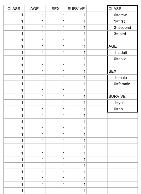
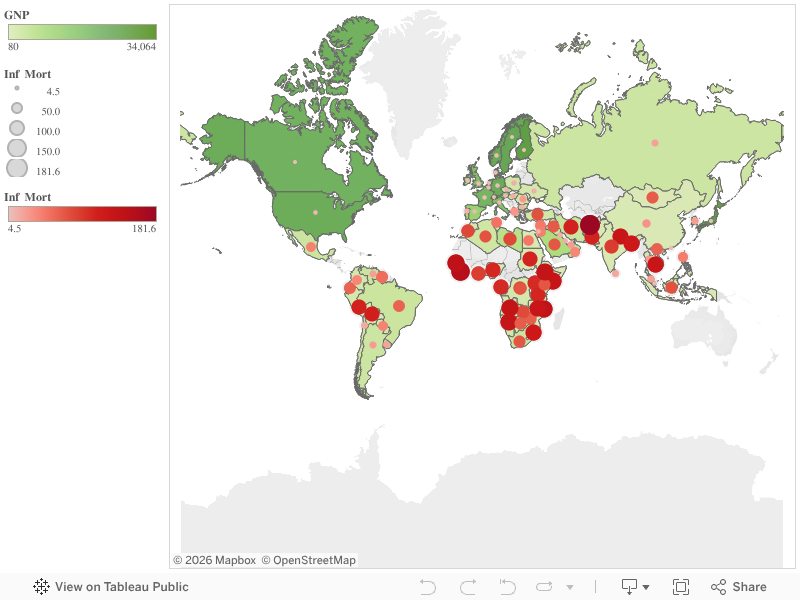
Data set’s provide our societies with valuable pieces of information that helps us understand many things about trends and norms. This information is essential to our survival in a world where things are constantly fluctuating and changing. By analyzing data set’s, our society can understand why things have happened in the past, analyze current trends and predict changes in trends to better prepare for the future. For example, when I first looked at the “Death Data” data set, it was quite overwhelming because of the multiplicity of causes of death around the country. The excel sheet alone does not help me (or any other individual for that matter) understand the data other than being able to view a bunch of numbers that correspond to each state in the United States. However, by using visualization tools to analyze the data and put it into a format that will ultimately help me draw inferences based on the visualization that has been created by a specific software.

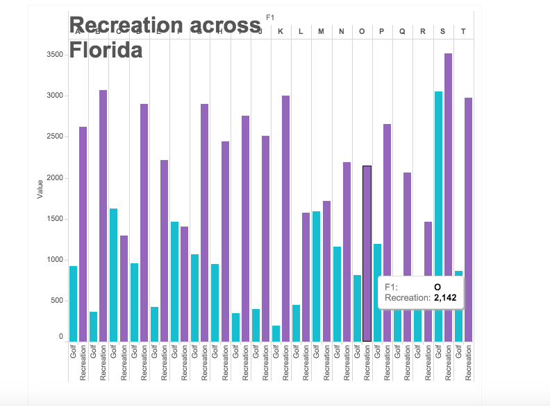
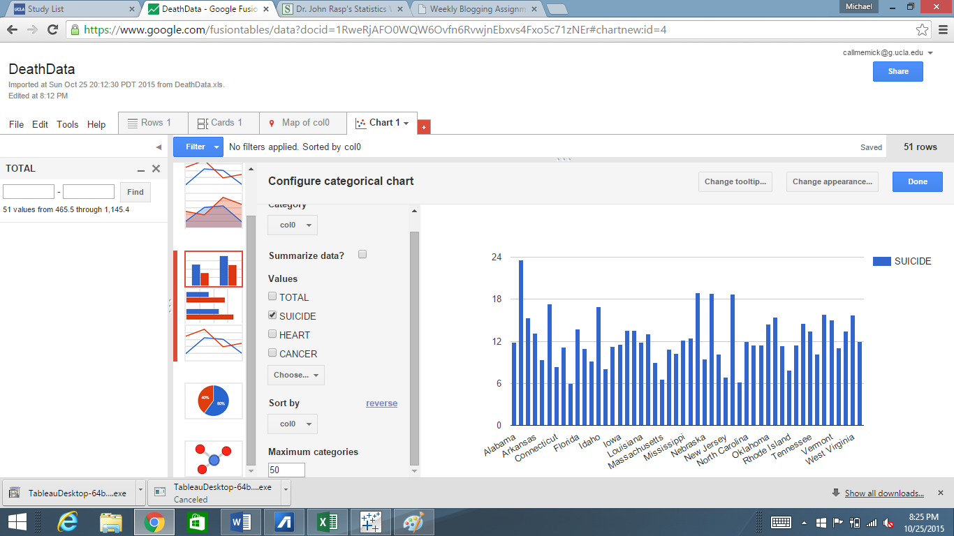
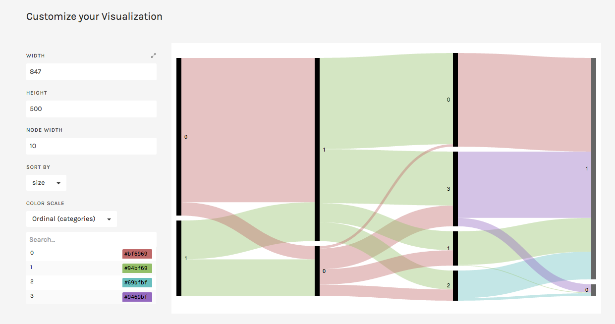
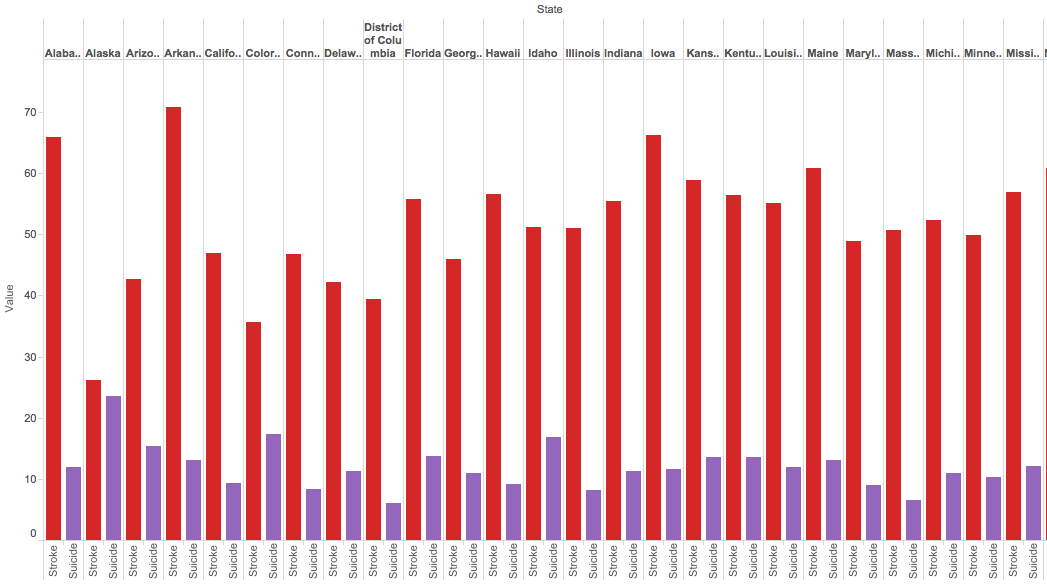
I used Tableau Public to create a visualization of my data set. Since their are so many causes of death, it was difficult to understand the raw data set on the excel sheet. One way to analyze the data, is using a simple side by side bar graph to compare the different states and the various causes of deaths that the data set provided. For example, the picture below depicts the simplest of bar graphs to analyze just a portion of the dataset. In the picture, you can see a comparison, state by state, of the amount of deaths due to suicides in comparison to deaths due to strokes. The visualization allows the viewer to immediately make an inference and conclude that their are more deaths associated with strokes than with suicides without needing to look too much into the raw data itself.

Screen Shot 2015-10-25 at 8.13.18 PM

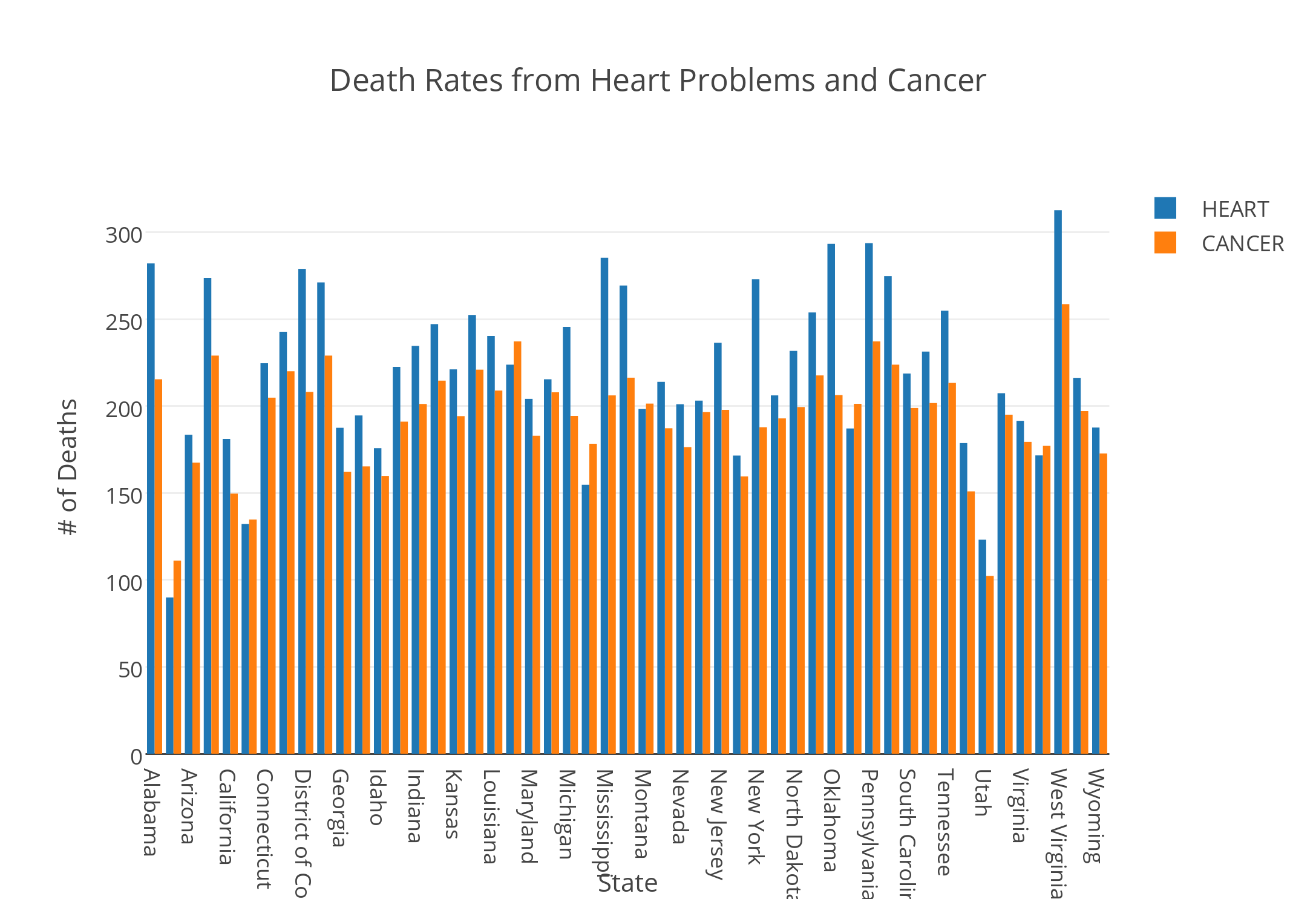
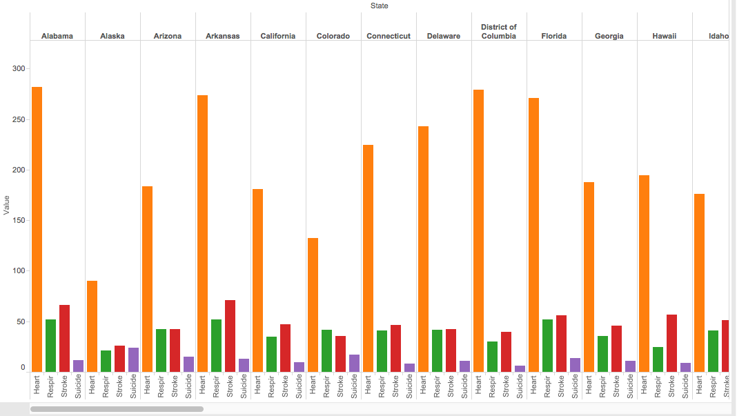
A bar graph can also easily compare more data by simply using various colors to differentiate between the types of categories, in this case types of deaths by state. As you can see in the picture below, the amount of deaths related to heart, respiration, strokes and suicide are easily compared by taking a quick glance at the side by side bar graph; yet, with the raw data from the excel sheet, one would not be able to determine this information as quickly as it is done with the bar graph.

Screen Shot 2015-10-25 at 8.18.01 PM

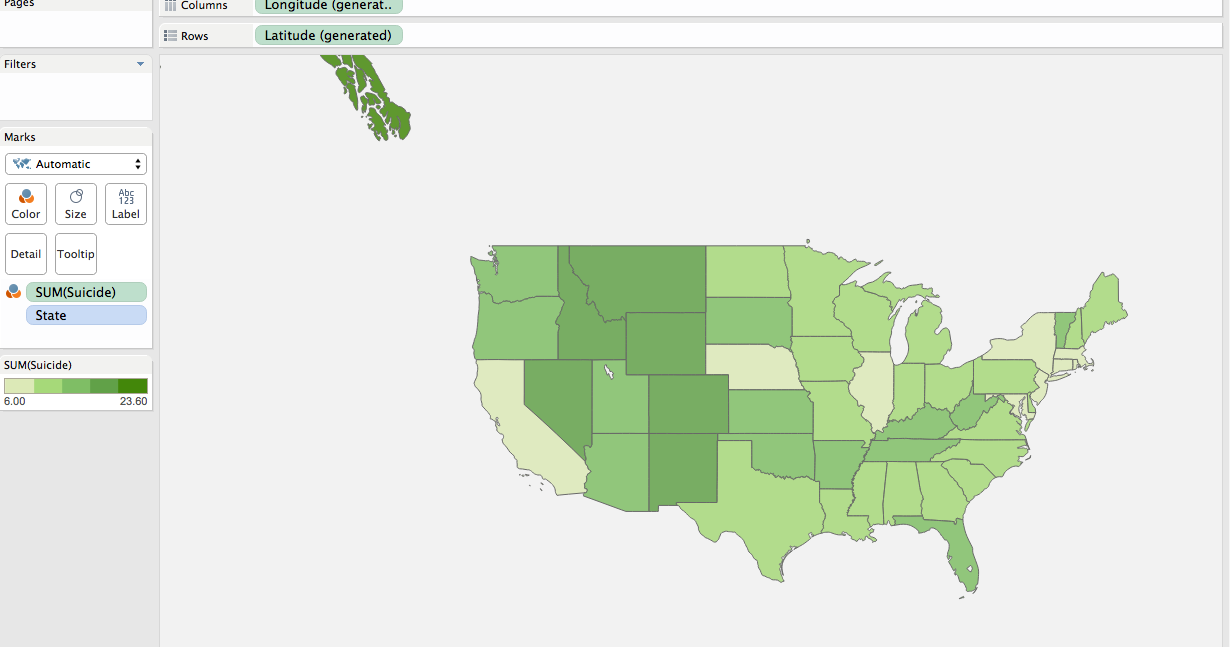
Another way the data can easily be analyzed is by using a filled map to quickly see the potential trends in any part of the world. In the case we’ve been discussing, one can see how predominant suicides have been across the country and where suicide deaths are more prevalent. After quickly looking at the map, you would find that suicide deaths are more predominant in the midwest regions.

Screen Shot 2015-10-25 at 10.20.33 PM

Overall, visualization tools are very effective because they help viewers understand data sets in a quick and efficient manner so that analysts can make inferences to help our society.

Recreation in Florida

Screen Shot 2015-10-25 at 10.31.40 PMhttps://public.tableau.com/views/RecreationFlorida/Dashboard1?:embed=y&:display_count=yes&:showTabs=y


This data shows the amount of recreation done in each city when it is compared to the amount of people playing golf. Through this visualization, it is easier to see how much golf is played as a recreation, rather than just random number that you would see through simply looking at the data. With the visualization, both the number of recreational activities and the comparison are easily seen for each of the cities in Florida.

Blog 4 – Data Fever: Visualizing Normal Body Temperature

For this exercise in data visualization, I used the data set from an article in the Journal of the American Medical Association by Mackowiak et al, which recorded data on body temperature, gender, and heart rate. Using the service Plot.ly, I created a scatter plot of the data, as can be seen below.


Normal Body Temperature

This visualization shows the data listings in a more comprehensible way, laying out all the data in a single space that combines the three components. The x-axis shows the values for Heart Rate, the y-axis shows the values for Body Temperature, and the data points themselves are color-coded to differentiate between men and women. I also created two separate best-fit lines: one for women, and one for men. These lines help to show trends in the data, as looking at scatter points alone can be disorienting and unclear. Looking at these best-fit lines, it seems that there is a positive correlation between heart rate and body temperature; typically, the higher the person’s heart rate was, the higher his/her body temperature was.


Visualizing Baseball Statistics

For this assignment I chose to look at the Baseball Statistics data. I tried a few different data visualization tools including Palladio and Raw, which found problems with the data, suggesting the need for something like OpenRefine; Tableau, which didn’t offer the kind of direct comparison I was looking for; and Plot.ly, which I ultimately decided to use. In order to create a data visualization that wasn’t a chaotic jumble of lines  I decided to focus solely on the home run records of the SF Giants and the LA Dodgers, two National League rival teams located here in California.

newplot (1)

This line plot shows both teams’ home run records from 1901-2009, with the Giants in orange and the Dodgers in blue as indicated by the key on the right. You can visualize the successes of the teams in hitting home runs throughout their long-held rivalry, directly comparing their records with ease versus looking back and forth at the numerical data on a spreadsheet. Quickly glancing at the chart, you can see that though the teams have for the most part kept consistently close to each other in their home run tallies, the Giants look to have maintained the higher count for more years, a conclusion which would have been more difficult to make just looking at the data. The graph allows you to easily see the trends not only for each team but also the sport in general since it offers over a century’s worth of data, raising questions as to why certain years saw such low or high home run counts.


A Visualization on the Presidential Election

PresElec DatasetThe given data set of the Presidential Election is data taken from 18 years between 1948 and 2012. The data set consists of voting information and party representation.


Using Google’s FusionTable, a software that creates a set of graphs from the data that the user imports. Using the Presidential Election dataset, FusionTable presented several graphs options that I could configure.

voting

This bar graph highlights the change in voting participation from 50 years ago. From bottom up, the blue bars visually represent the exponential increase in voting, with an exception in 1996, where there’s a visible dip. The surrounding years are all in the 100 million votes, while ’96 has less.

Another thing to note is the Republican/Democratic voting habits that can be taken from this graph. While the proportion of Republican and Democrats votes are around the same range, there are some notable years where one party dominated the other in votes. For example, in 1964, approximately 43 million democrats voted, while only 27 million republicans voted.

Death Rates (and especially suicide) Data Visualization

This week, I took the morbid route of examining the death rates that vary from state to state. Within each of these states, there are all various kinds of causes of death, such as stroke, car crashes, and heart failures. However, I was extremely interested in comparing the suicide rates side by side with one another that varies from state to state. The data that I received my information that I utilized can be found on http://www2.stetson.edu/~jrasp/data.htm. I decided to use the Google Fusion data visualization tool, as I feel that it does an excellent job of allowing the user to choose a way to visualize the data in order to show comparisons. I initially selected the data to be represented by a pie graph, but I felt like this was simply not sufficient in terms of grasping how the suicide rates differed from state to state. So I opted to visualize the data in the form of a bar graph which can be seen here:


Suicide Rates

One point of data that immediately sticks out like a sore thumb is Alabama. It seems absolutely wild that almost 25% of all of the deaths that occur in Alabama are due to a result of suicide. New Mexico, Nevada, and Montana are the next three states with the largest suicide rates, as they all amount to about 20% of all of the deaths there. This chart gives the user the unique ability to be able to be able to pinpoint the exact causes of death and be able to compare them to other states. This ability actually serves as a very useful function for those interested in solving these death problems. Take the way I chose to represent my data, for example. A field of psychologists now have the ability to see which states are in the most need of psychiatric treatment. They can ask, why exactly is it that Alabama has the highest rates of suicide, and what can we do to prevent it? If the data was left in the cluttered excel sheet it would be much more difficult to see the relational differences from state to state. I could have also went so many different routes with the google tools; for example, I could have decided to compare heart related deaths from state to state, and the bar chart would have immediately showed which states are in the most dire need of heart health education in as a preventative measure.

This same principle can be applied to any of the many causes of death that the data set records. By putting the data into a convenient bar graph health professionals can come to better understand which states we need to target and in these states which can kind of programs we need to enact in order to help people live a longer, fuller life. I never knew that by simply creating convenient visualizations of data, lives could possibly be saved.


-Michael Mathis, 10/25/2015

Blog #4 Poverty Dataset

Region 6

Visualizing the data immediately makes it more manageable. After trying a few different filters, I was able to see that the world’s region #6 (Africa) has the highest infant mortality rate. Then, I added the GNP filter to the same region and found that GNP does have a high correlation to the rate of infant mortality, but it is not exact. For example, Mozambique has the lowest GNP, but not the highest infant mortality rate. Sierra Leone has a higher GNP than Mozambique and a higher rate of infant mortality.

What this chart shows us is that although GNP and Infant Mortality Rates are directly proportional, there are other factors that come into play. I would want to know if this finding applies to other regions of the world.

Region 5

The above graph shows that the same pattern is true in region #5 where Afghanistan has a higher GNP than Mongolia yet it also has a higher Infant Mortality rate. Now I know that even though poverty is a high indicator of a country’s IMR, it isn’t the only factor.

Being able to visualize the data, I see nuances that were not apparent with just a table. It has opened up a series of other questions. Because of the conclusions drawn from these two charts, the question now is: What other factors contribute to a  country’s rate of infant mortality?  Is there a difference in education between these countries? What is the difference in their access to medicine? Does infrastructure play a role? Are there better roads to medical facilities in some countries verses others that may prevent timely access to medical help? Does one country lack clean water? Are there cultural differences that affect how a child is cleaned, nourished, and cared for in the first years of his or her life? Is one country at war while the other is at peace? Are both parents present? The answers to these questions can lead us to actionable solutions.

Organizing the GNP and Infant Mortality rate bars of the chart in different colors also helps us see and understand the relationship between the data more clearly. And, being able to chose the number of categories one wants to manage is also helpful. For example, even though I set my categories to fifteen, only eleven countries in region #6 fit into my predetermined filtered range.

Week 5 Blogpost

Death Rates from Heart Problems and Cancer

            The visualization tool I chose to use was Plotly. I created a double bar graph using the death rates data. The x-axis listed all of the states included in the data, and the y-axis contained values from 0 to 350 that represented the number of deaths in each state. Unfortunately, the year that this data was collected was not included in the file. I chose to represent the death rates caused by heart issues and cancer. By viewing these bars side by side, the user is able to discern a relationship or a potential correlation between the number of deaths caused by heart problems and cancer.

The juxtaposition of the two bars side by side reveal that spikes in the number of deaths caused by cancer were coupled with spikes in number of deaths caused by heart issues. States that exhibited these spikes included Alabama, Arkansas, Mississippi, Pennsylvania, and West Virginia. This bar graph could lead to more research in exploring the reasons for these spikes. I would assume that environmental factors coupled with lifestyle differences in these states led to these increases in heart conditions and cancer. However, I would need to conduct more research to confirm this.

Overall, the states have higher rates of death caused by heart conditions than deaths caused by cancer. There is one exception to this observation: Maine. Maine has a higher occurrence of cancer than heart issues. It would be interesting to explore this correlation. But, it is important to remember that these correlations do not imply causation. While a digital humanist can research factors in Maine that could lead to higher rates of cancer, these factors would not definitively provide a reason for the relationship of the data.

Despite this exception, there still seems to be a relationship between the number of deaths caused by heart problems and number of deaths caused by cancer. Both are proportionately increasing and decreasing across states. To further explore this relationship, one could research what similarities and differences persist across the states that could have caused these related fluctuations.

Ultimately, this data visualization tool revealed a relationship between the categories I plotted on the y-axis. In this way, it created new research questions and opened doors to discover more about the states themselves. Data visualization enables the researcher to view the data from a different perspective. This lens can enrich the conclusions that the researcher arrive at and answer questions that the data alone was not able to answer.

Visualizing the Tragedy of the Titanic

This week’s topics were a bit challenging, as there are quite literally hundreds of ways to create data visualizations! With so many options, it did get a bit overwhelming, but as the week progressed I found myself to understand them a little better. With data visualizations, it is important to first look at the data and find visualizations that will best interpret it. I had a chance to experiment and do this with one dataset, aptly called Titanic, which has data from the first– and last– voyage of the famous Titanic. A rather simple dataset, the file proved more difficult to interpret and demonstrate as a visual than initially thought.

Right off the bat, as I opened the Titanic.XLS file, I noticed that the data was numerical; however, the numbers actually represented qualitative, categorical data! For example, documenting the passengers’ ages with 0 for child, or 1 for adult; a 0 for female, 1 for male, so on and so forth. I thought that although pretty smart in making the records easier to read in general, especially with the legend present on the side, transferring the file into a visualization tool turned out to be more problematic than it seemed.

Screen Shot 2015-10-25 at 5.00.27 PM

According to Yau in “Data Points,” data should be represented “with a combination of visual cues that are scaled, colored, and positioned according to values.”  Keeping that in mind, I decided to use RAW for this dataset, as I felt that the multiple choices and customization options of the visualization tools it offers was fitting with the data I chose. Since the numbers in each content type did stand for something else, I felt that an alluvial diagram best fit the data, as this method of visualization represents flows and correlations between categorical data. Therefore, I went ahead and plugged the file into RAW. And that’s where I encountered some problems…

Screen Shot 2015-10-25 at 5.12.53 PM

WHAT HAPPENED?!

This is where I realized that something was wrong– well, not wrong, but off! I figured that because the original data used the 1’s and 0’s as markers for other meanings, it then translated into the alluvial diagram. Above, it’s pretty evident that although the data is there, the categories aren’t even labeled, but just left with the markers.

At this point I had also tried different visualizations on the site, but they all yielded the same results as the alluvial diagram with only 0’s and 1’s. I figured that the only way to really illuminate this data is to go back to the original Titanic.XLS file and change the numerical markers to their intended meanings; this meant that I would change the 0 representing female passengers to “Female,” and the 1 representing male passengers to “Male.”

Screen Shot 2015-10-25 at 6.44.54 PM

Luckily, I was able to do this in no time on Excel; though afterwards I realized that it may have been even more time-saving if I had used OpenRefine! So now, with the data practically cleaned and more able to be transferred onto RAW, I replugged the adjusted dataset and tried the alluvial diagram again.

titanicRAW

“Visualization is what happens when you make the jump from raw data to bar graphs, line charts, and dot plots.” – Yau, Ch.3

This time, it was a success! Now, one can view the correct categories for the content: starting with class, then age (adult or child), filtering down into sex, and finally if the individual had survived or not. Looking at the diagram, it is extremely clear to see the data, which itself was startling as I was cleaning and transferring it. Most of the passengers who had died were adult males, coming from the ship crew and most of the Third Class. What’s even sadder is that, although a very small amount, some male children did not survive.

In conclusion, I am happy to say that practicing with this dataset helped me better grasp what data visualization is and how it enhances data. By having something physically representative to put into perspective, I feel that one can really see how much of an impact (no pun intended) such data poses on human history; in this case, the tragedy of the Titanic is still as shocking and eye-opening as it was a hundred years ago.With that being said, the visualization tools presented to us definitely help to emphasize the importance of recording, archiving, and preserving human experiences of all kinds.


Poverty Statistics

Sheet 1
I made this data visualization with the 1990 United Nations data on poverty around the world. The spreadsheet included information on each country (though countries from 1990, so some names and places were outdated) and its gross national product, birth rate, death rate, infant mortality rate, and life expectancy for both males and females.

With so much data on so many countries, it would be nearly impossible to see any relationships between statistics or how one country compares to another. In my visualization, I decided to just compare GNP and infant mortality rate, and you can easily see that the countries with lower GNP have a higher infant mortality rate and vice versa.

Older posts Newer posts

© 2026 DH101

Theme by Anders NorenUp ↑