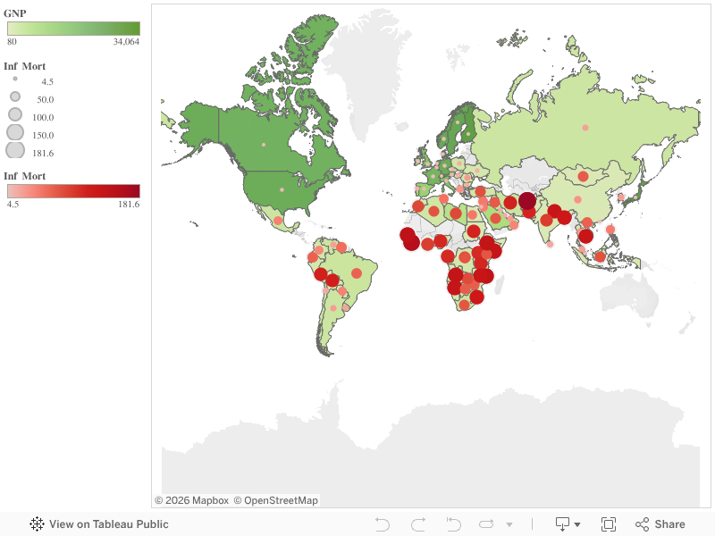
I made this data visualization with the 1990 United Nations data on poverty around the world. The spreadsheet included information on each country (though countries from 1990, so some names and places were outdated) and its gross national product, birth rate, death rate, infant mortality rate, and life expectancy for both males and females.
With so much data on so many countries, it would be nearly impossible to see any relationships between statistics or how one country compares to another. In my visualization, I decided to just compare GNP and infant mortality rate, and you can easily see that the countries with lower GNP have a higher infant mortality rate and vice versa.