For this exercise in data visualization, I used the data set from an article in the Journal of the American Medical Association by Mackowiak et al, which recorded data on body temperature, gender, and heart rate. Using the service Plot.ly, I created a scatter plot of the data, as can be seen below.
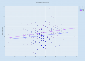
This visualization shows the data listings in a more comprehensible way, laying out all the data in a single space that combines the three components. The x-axis shows the values for Heart Rate, the y-axis shows the values for Body Temperature, and the data points themselves are color-coded to differentiate between men and women. I also created two separate best-fit lines: one for women, and one for men. These lines help to show trends in the data, as looking at scatter points alone can be disorienting and unclear. Looking at these best-fit lines, it seems that there is a positive correlation between heart rate and body temperature; typically, the higher the person’s heart rate was, the higher his/her body temperature was.