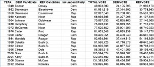
 The given data set of the Presidential Election is data taken from 18 years between 1948 and 2012. The data set consists of voting information and party representation.
Using Google’s FusionTable, a software that creates a set of graphs from the data that the user imports. Using the Presidential Election dataset, FusionTable presented several graphs options that I could configure.
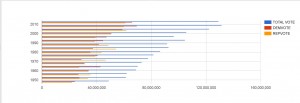
This bar graph highlights the change in voting participation from 50 years ago. From bottom up, the blue bars visually represent the exponential increase in voting, with an exception in 1996, where there’s a visible dip. The surrounding years are all in the 100 million votes, while ’96 has less.
Another thing to note is the Republican/Democratic voting habits that can be taken from this graph. While the proportion of Republican and Democrats votes are around the same range, there are some notable years where one party dominated the other in votes. For example, in 1964, approximately 43 million democrats voted, while only 27 million republicans voted.