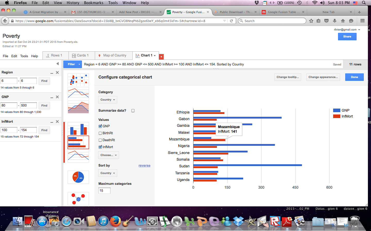
Visualizing the data immediately makes it more manageable. After trying a few different filters, I was able to see that the world’s region #6 (Africa) has the highest infant mortality rate. Then, I added the GNP filter to the same region and found that GNP does have a high correlation to the rate of infant mortality, but it is not exact. For example, Mozambique has the lowest GNP, but not the highest infant mortality rate. Sierra Leone has a higher GNP than Mozambique and a higher rate of infant mortality.
What this chart shows us is that although GNP and Infant Mortality Rates are directly proportional, there are other factors that come into play. I would want to know if this finding applies to other regions of the world.
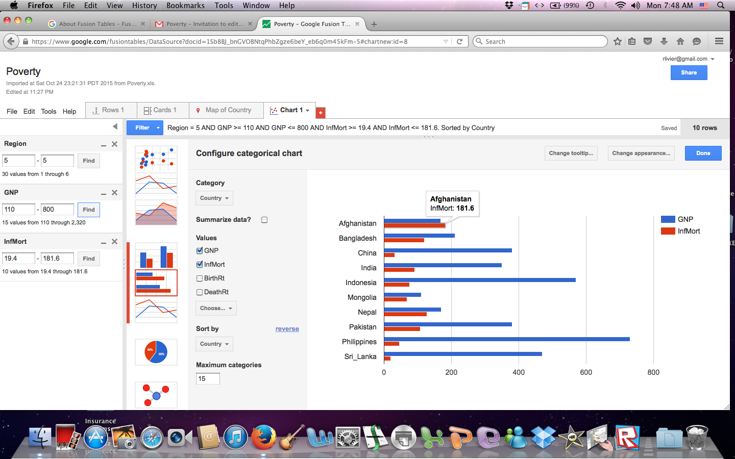
The above graph shows that the same pattern is true in region #5 where Afghanistan has a higher GNP than Mongolia yet it also has a higher Infant Mortality rate. Now I know that even though poverty is a high indicator of a country’s IMR, it isn’t the only factor.
Being able to visualize the data, I see nuances that were not apparent with just a table. It has opened up a series of other questions. Because of the conclusions drawn from these two charts, the question now is: What other factors contribute to a country’s rate of infant mortality? Is there a difference in education between these countries? What is the difference in their access to medicine? Does infrastructure play a role? Are there better roads to medical facilities in some countries verses others that may prevent timely access to medical help? Does one country lack clean water? Are there cultural differences that affect how a child is cleaned, nourished, and cared for in the first years of his or her life? Is one country at war while the other is at peace? Are both parents present? The answers to these questions can lead us to actionable solutions.
Organizing the GNP and Infant Mortality rate bars of the chart in different colors also helps us see and understand the relationship between the data more clearly. And, being able to chose the number of categories one wants to manage is also helpful. For example, even though I set my categories to fifteen, only eleven countries in region #6 fit into my predetermined filtered range.