DH101

Introduction to Digital Humanities

Month: November 2015 (page 8 of 17)

reVILNA – Vilnius Ghetto Project

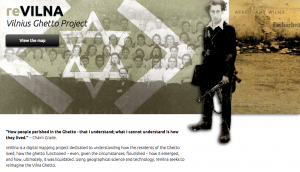
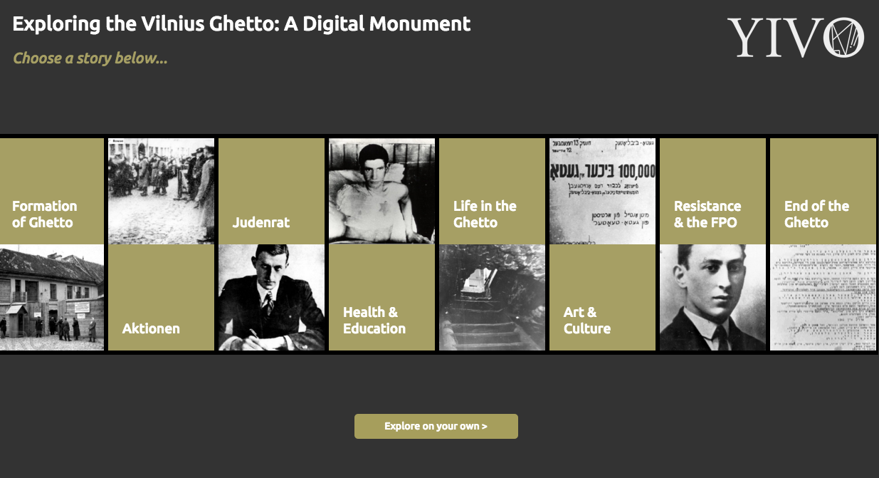
reVILNA aims to narrative, visualize, and map the Jewish Ghetto in the Lithuanian capital of Vilnius. The project explores the events leading up to, during, and after the German occupation of the city. The team uses images, interactive maps, and concise descriptions of aspects of the ghetto, from Art & Culture to Resistance Movements. The information is taken from various memoirs, artifacts, and articles. Therefore, reVILNA tries to describe the historical and cultural landscape of the ghetto from the point of view of those who suffered the injustices.

The project provides a clear picture of the ghetto (often times complemented by real pictures) without inundating the viewer with lengthy details. It successfully reveals snapshots of the lives of the residents, and successfully evokes empathy and emotion, whether it be anger, sadness, or inspiration. The numbers of deaths (“exterminations” during “purges”) in the ghetto system is especially sickening, and attaching specific dates, images, and locations to these events is very effective. Furthermore, in a book I recently read titled The Amazing Adventures of Kavalier and Clay (Michael Chabon), one setting is a European ghetto. Although the story takes place in Prague not Vilnius, this interactive project helped me contextualize and visualize the kind of desolate cityscape I imagined.

Screen Shot 2015-11-16 at 12.30.29 AM

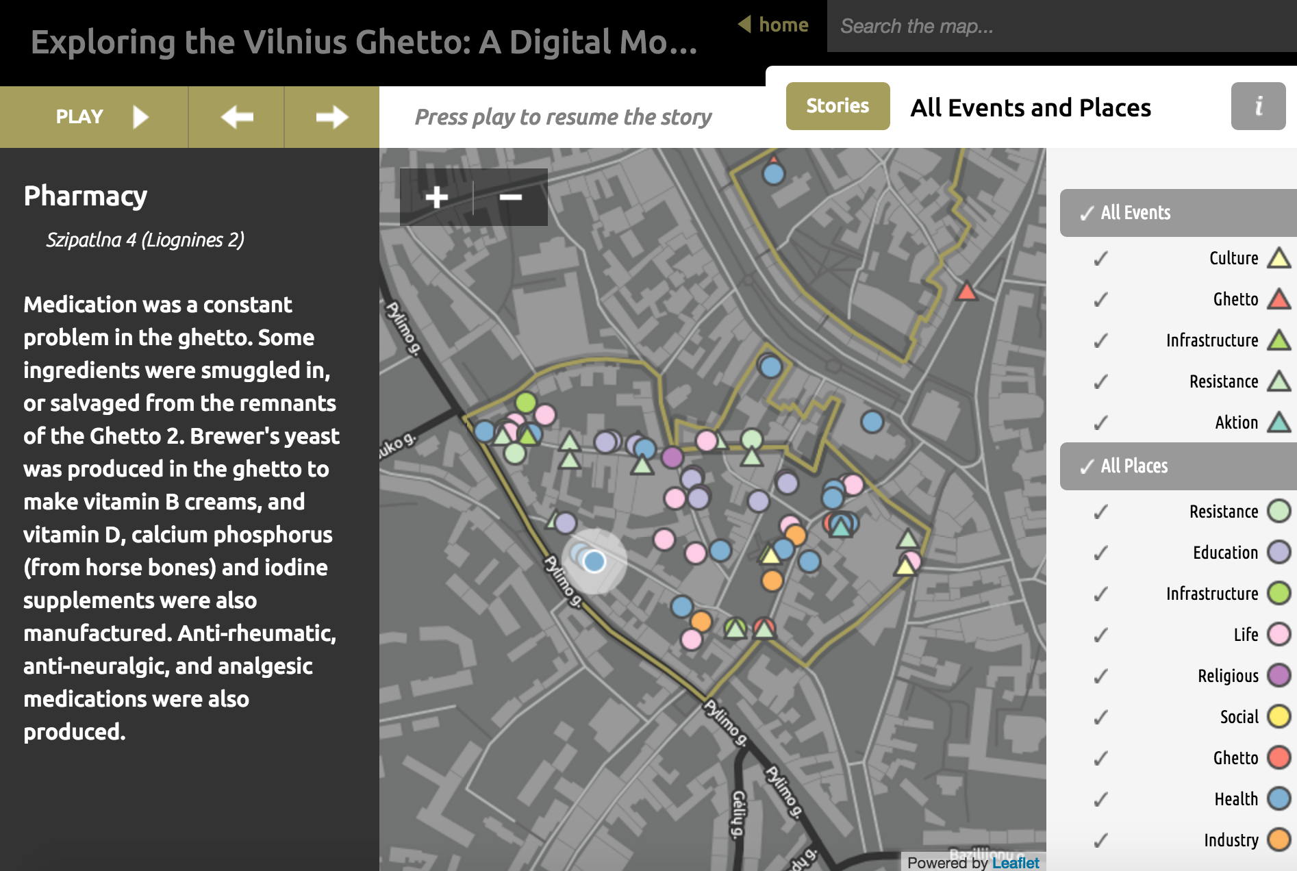
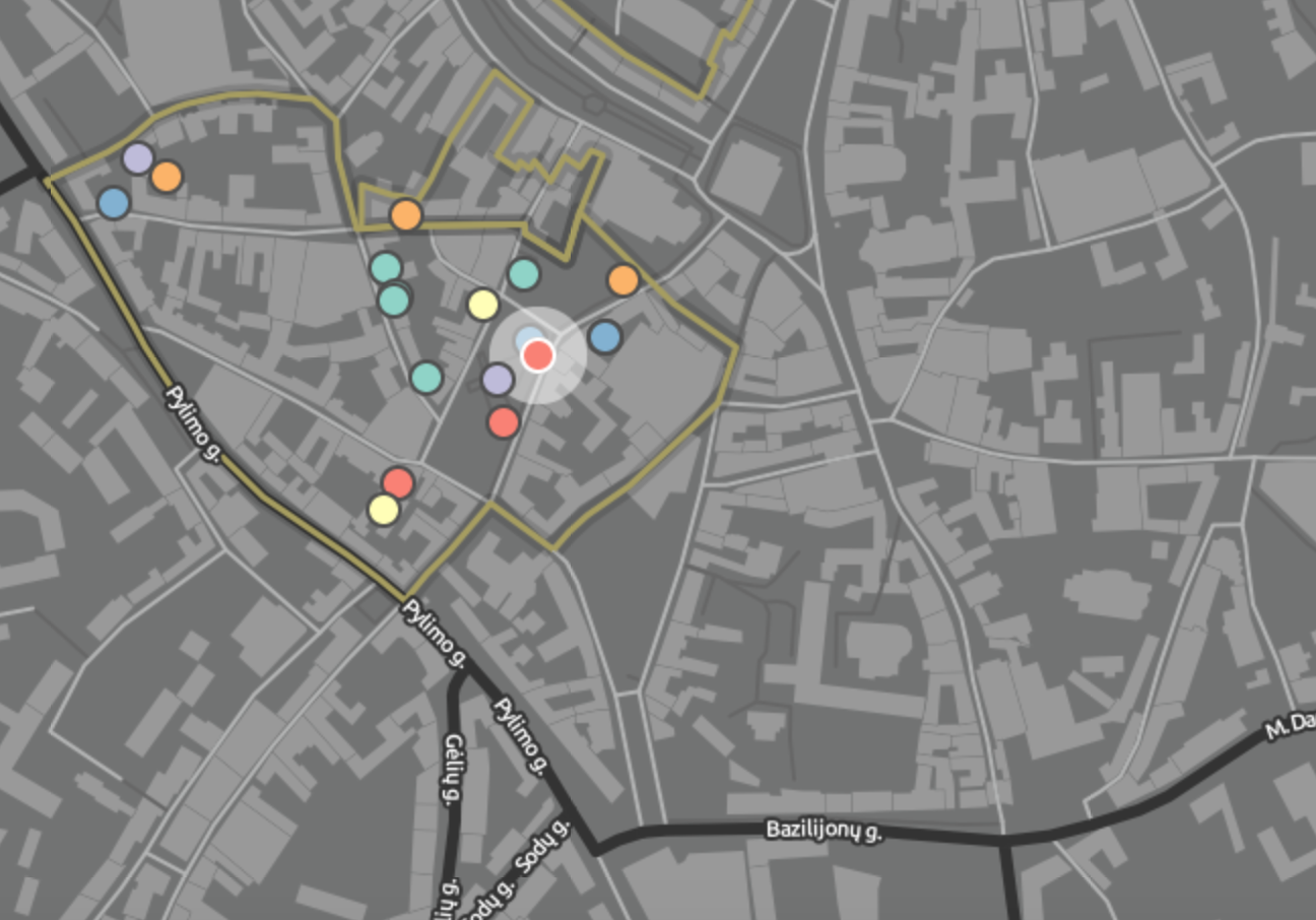
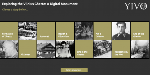
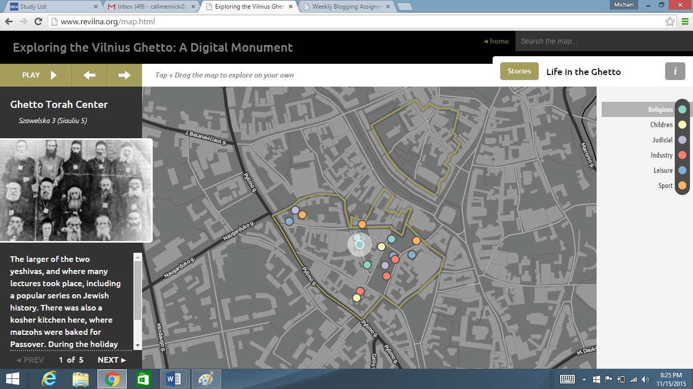
reVILNA is organized by various “stories,” that cover topics like “Formation of the Ghetto” and “Health and Education.” By choosing an option, you are eventually directed to the main map page of the story. Here, you are guided through a tour, ordered by chronology of topic. For more historical sections like “Formation of the Ghetto,” points on the map are linked to specific dates where key events unfolded. For more cultural sections like “Health and Education,” the locations are where important buildings like hospitals and schools were.

I think the project could benefit from more personal stories that follow the diary or memoir of a specific person in the ghetto, mapping out locations of key events in their lives. It would add an even more human element to reVILNA, and this kind of walk-in-their-shoes experience can enhance the emotional response.


Week 8: Digital Harlem

Digital Harlem presents the history of normal everyday african american folks who lived in Harlem from 1915-1930. The data is collected from legal records- Newspapers and Police case files- which reveal some aspects of african american culture- black language, music, family life, as well as gambling and violence.

The map shows the expansion of the  black-dominated neighborhood from 1920 to 1925 to 1930. In this boundary (bolded on the map), mini-icons can be clicked on and expanded for more detail on the record. Specific records on  weddings, arrests,and suicides can be seen around the map.

It obscures interactions with other non-black New Yorkers, and first person accounts of life in Harlem. The data is generated from third person accounts of what happened.

An alternative map would include pictures and first person accounts of life in Harlem.


Vilnius Ghetto Map

“Exploring the Vilnius Ghetto: A Digital Monument” is a digital humanities project that shows a timeline of events through separate maps of the Vilius Ghetto for each topic including the formation, Akitionen, Judennat, Health & Education, Life in the Ghetto, Art & Culture, Resistance & the FPO, and End of the Ghetto.

Screen Shot 2015-11-15 at 11.50.10 PM

Having different categories for each of the topics makes each of the maps more clean and easier to follow.  Also, within each maps for a topic, all of the points on the map are color coded by subjects like children, judicial, religious, industry, leisure, etc. All of these organizational tools make the maps easier to follow, clean, and pretty, however, the maps are so clear cut that it makes it harder for the user to discover their own patterns. In order for someone to do more in-depth research, they may want to compare the “Arts & Culture” map with the “Resistance” map, but since these topics have two separate maps, it makes it very hard to compare and contrast the two.

The map represents the people in the ghetto’s perspective considering I doubt the soldiers would take note as to a point on the map like where some of the children go sledding in the winter.

The map reveals a lot of the daily life of the people in the ghetto. It shows where people worked, food was made, religious services were held, and schooling took place. It also has a timeline and a little passage that corresponds to each point on the map. It makes it easy to understand how small the ghetto was. However, I wish the map included more pictures for each point it described. There is only one picture per point even though a picture describes better than anything overcrowding and unsanitary work environments that the tiny summaries are trying to describe.

If I were going to redo the map, I would have all the points, from every topic, on one map with the option of including whichever topic’s points on the map at a given time. This would make it so that the user can see a bigger picture, compare and contrast different topics, and still get a digestible map at the same time. I would also include at least 3 more pictures per point. Obviously the user would need to do more research apart from just this digital humanities project on the ghetto if they wanted to fully understand it, but if the goal of this project is to give a person an idea as to the layout and what the ghetto looked like, they need to include more pictures.

Overall, I think this map is really well done because of how organized it is.

Blog #7 Harlem Map

I took a look at the Harlem digital humanities map project. This projects focuses on some events that a typical Harlem resident might see during his or her day to day life. The types of event span from basketball and tennis games to various different kinds of crimes.

Capture

http://digitalharlem.org/

This project uses maps by using a layer system. What the user sees is a plain google map but on top of the map, one could choose to filter out or in certain events that one wants to see and they appear geographically on the map. Also there is the availability of adding in multiple filters and choose which ones are on display at the same time. This map in particular deals about crimes and other events that took place in Harlem from 1920 to 1930.

What stands out the most as a user is that the map has a heavy emphasis on the living borders of black settlement from 1920 to 1930 in five year increments. This map reflects the area in which black people lived and how they expanded into other areas in Manhattan rather quickly. It also reflects, to an extent, what someone of color who lived in Harlem might have seen. There was events such as basketball games to arrests and assaults. It reflects some of the most event parts of what day to day would have been like in Harlem.


What the map reveals, and implies based on the two different layers for accusation and conviction, is that once a black person was convicted of a crime, they cooked then be convicted for another unrelated offense. It reveals a great degree of injustice during the 1920s. What it obscures are the frequency of the events. The project shows what arrests were made if one selects them. It may appear as if there are lots of arrests but I think that data analytics might help put the data into perspective. I think that if the project could display what percentage of the population was accused of crime and how many were convicted of crimes, the data might seem more grounded and accurately portrayed. It also does not have any recommended correlated data sets, if you do not know what you are looking for, you only see a bunch of data points.


If I were to make an alternate map to this one I would have a page where there is interesting sets of correlated crimes. Maybe there was a correlation with a time of less accusations and the black settlement border expanding. Also, I would change the layout of the site so that when one clicks on the links at the top page on the navigation bar, you are sent to a page with detailed information instead of a pop up with descriptions written on it. I will say that I  did enjoy the fact that the right hand side of the site had saved filters so that if one wanted to, the user could do their own research on the site and compare different sets of data. I think that as a digital humanities project that this one is successful because it shows humanities scholars something that they would not have been able to see without the map. Without the map, the data seems less clear in terms of the proximity of events, common places of events and so on. Also, thanks to its filter features, once could utilize this project to conduct personal research which is what the digital humanities is about. The digital humanities is merges technology with the humanities to create tools to enhance our evolving understanding of the humanities.

Mapped: London’s Past

Locating London’s Past is an interactive website that provides an interface that allows users to map and visualize historical data relating to 17th and 18th century London. Users can overlay historical data against John Rocque’s 1746 map of London , the first accurate OS map from 1869-1880, and a modern Google map of London. Researchers can use this particular digital tool to geo-locate and visualize points, which gives them access to certain non-traditional research methods. With this website, you can layer different types of historical information together into a map that accounts for spatial attributes. The website provides a variety of digital resources and data sets to plot onto the maps provided. Data sets cover a range of topics, including poor relief, plague deaths, crime records, Old Bailey court sessions, tax records, and the Museum of London’s archaeological records. 22 of 39 document types can be visually plotted, and you can layer them over one another to see if any connections or correlations can be found.

The different historical databases you could plot onto the maps.

The different historical databases you could plot onto the maps.

This map shows the overlay of population and area data, poor relief records, and the specific point of Garden Court, St. Botolph Aldgate.

This map shows the overlay of population and area data, poor relief records, and the specific point of Garden Court, St. Botolph Aldgate.

This digital tool allows researchers to analyze data gathered and categorized by location (street, parish, etc.) and view it in a format that is more connected and concise. Researches can use this project to better engage data through its spatial features. However, as with most mapping projects, one can identify the certain assumptions and points of view reflected in Locating London’s Past. To me, it seems that the maps and data utilized within this project are geared toward governmental purposes and academics, as it includes such information as voter registration, tax data etc. It seems like it would be a bit difficult for a common person to use who just wants to know more about London’s history.

The maps reveal statistical data and how such data points are relative to one another spatially, as well as against the geography of London itself, across certain periods of time. However, the maps obscure much of the context that these data points lie within. For example, what kinds of crimes make up the “Criminal Justice” data base. The maps also obscure whether there are relationships between the different data points or changes over time. To find such context, you have to click additional links that take you to the dataset itself, where you find text on the data point in question. For me, using this interface was definitely a bit difficult at first. I wasn’t quite sure how to add data points, as the home page just gave me a blank map. I had to do some clicking around to see some results.

After clicking on a certain data point, you are taken to another page that has the data set where you can click more links to show full text descriptions.

After clicking on a certain data point, you are taken to another page that has the data set where you can click more links to show full text descriptions of the context of such a point

An alternate map would be to make the project a bit more user-friendly, one that provides an easier way to get more information and context from the data points. Making it more interactive, like adding abilities to hover over a data point on the map and having a pop-up window with pictures and background info, would make the project more complete. This would be a lot more conducive to the average person who is just trying to learn more about London’s history. Additionally, more types of databases could be included such as databases of art work, restaurants and cultural centers, etc. to widen the perspective on the project so it doesn’t seem as governmental. In any case, the alternate map would connect the information within the historical databases more completely onto the spatial map representation, instead of having them on separate pages within the website. That way, more information would be encompassed onto one platform that could show context, relationships, and connection.

19th Century Caribbean Cholera – Week 8

19th Century Caribbean Cholera

Screen Shot 2015-11-15 at 9.43.40 PM

The 19th Century Caribbean Cholera maps the series of outbreaks on both a timeline that is shown on the timeline bar provided above the map, as well as the geographic locations of which the outbreaks occurred at those time periods. Through the utilizations of maps, the viewer can visually grasp a more clear understanding of how cholera spreads amongst countries in a given amount of time and how the disease can just as easily travel across sea as it travels across land. Furthermore, the timeline presents the 3 main periods of which cholera outbreaks were particularly significant (1833-1834, 1850-1856, 1865-1872), providing the details of each individual affected location within those three periods through a brief written explanation.

Although many people may consider this data to reflect the people who were affected by the disease during these time periods, I personally feel that this map reflects a statistician’s, or medical analysist’s, point of view of cholera outbreaks. As what any type of mechanization may do, the map only illustrates the data of the numbers of people affected by cholera rather than articulating those people as individuals with agency, stories, and pain. And it is with this nuance the distinguishes the audience that this map is really meant for. The mapping does a great job with the factual descriptions of the numbers of people who have died from such outbreaks; yet, it fails to measure the humanity in which the data is supposedly supposed to reflect. Therefore, I believe that this map better reflects the outsiders who do not face the outbreaks of cholera and simply study it as factual statements.

The map reveals the way in which cholera travels across a landscape, and more importantly, how cholera seems to instantaneously arise in random locations “out of nowhere.” When scrubbing the timeline, the viewer can see the little mapping markers pop up in the various locations that cholera suddenly outbreaks in. For the most part, the markers stay conglomerated around the area of Cuba. However, after a long period of no cholera outbreaks, one suddenly appears in other countries . And to me, it reveals that no one is immune to disease and that one country’s pandemic issue really becomes everyone’s issue as well. The map does obscure certain locations, because some of the points are located in the middle of the ocean — and if no one is there, then no one can get the disease in the first place. So due to some possible location miscalculations, it does beg the question of the map’s validity.

An alternate map could potentially be a map that is more focused on the humanity of the cholera outbreaks, catering more towards the people who actually faced the hardship of these outbreaks rather than servings towards the analysts. However, as far as the visualization of the maps go, it could be more interesting to have the maps be colored in a way that there is more intensity in the color’s hue in locations with higher deaths by cholera rather than all points having the same color and marker.

reVILNA: Vilnus Ghetto Project

Screen Shot 2015-11-15 at 9.13.22 PM

This week, I had the pleasure of exploring reVILNA: Vilnus Ghetto Project and taking a look at the maps provided. The project’s overall purpose is to be a digital mapping project that helps understands how people lived in the Ghetto. how it emerged and functioned as a structure, and how it was ultimately liquidated of its residents.

Screen Shot 2015-11-15 at 9.14.15 PM
At the home page, one can click on a button that says ‘View Map’ which will lead them to a different page; the page is full of numerous ‘stories’ that users can click on. Among these stories are the formation of the Ghetto, Aktionen, Judenrat, Health & Education, Art & Culture, and so on.  Each of these stories contain a description of the content and a gallary of images over a map; once exited, users can see what significance each story has within the Ghetto. Below the bar of stories, however, there is a button to ‘View on your own’ which when clicked, refreshes the page to become the interactive map alone.

Screen Shot 2015-11-15 at 9.10.46 PM

Accompanying the map is a sidebar that acts as a timeline and description of significant locations and events, as well as a legend on the other side that one can select and deselect to view either all at once or individually.

This digital mapping project is very well done in how it takes users back to a place that many may not have even known to exist in a time of such conflict and turmoil; I myself did not know about this particular ghetto. reVILNA is thorough in the stories given and effort had been clearly made to make sure each description, image, and location is as accurate as restored as possible. Everything from the home page to the map itself is understandable and most importantly eye-opening in how it engages users to look through real-life stories on their own, to truly learn about what life was like in this place and who these people were.

On the other hand, the only thing that this project, I feel, is lacking in was a more detailed introduction to the project. I did not know that Vilnus was a Jewish Ghetto, nor did I know where it as located until I navigated the site a bit more; I think it would have been better to have that information in a more accessible place, like on the home page, so users aren’t confused as they interact with the map and whatnot. Although the interface is organized and aesthetically pleasing, the map is the only real ‘meat’ of this project, for lack of words– maybe, to complement the map’s purpose, digital 3D renditions of the living quarters, recreated recordings, and other methods of mapping and visualization would be nice.

An interesting alternate map would be to layer over other ghettos during this time to better visualize what these places did and did not have in common, as well as both conferring and contrasting facts about each place. It would also give great aid in visualizing the reality of the Jewish ghettos; by layering over images it can really show the sheer size and ethical implication they posed to the Jewish population during WWII.

Week 8: Mapping Decadence

For this week’s assignment  I looked at the Mapping Decadence site, a mapping project showing the locations of the Parisian dwellings of prominent Decadent 19th century writers as well as the publishers they worked with.

DH1

The goal of the site from what I can understand is to show how the relationship between writers and publishers was influenced by location. The maps were created using ArcGIS and in order to look more closely at the maps provided for each of the four authors or the main Mapping Decadence map the site leads you to each maps ArcGIS page where you can interact with each map clicking on the various points or lines to get more information about location or relationship. Each author has their own individually colored pin to avoid confusion on the main map, and when you click on any of the publishers on the main map it lists which author(s) they worked with.

DH3

This is the individual map that shows the places where author Jean Lorrain lived as well as the specific publishers he worked with. Of all the individual maps I felt like this one was the hardest to interepret since he had so many places where he lived and there were only a few lines drawn showing the connection from his location to his publisher’s location. It isn’t clear to me why there aren’t relationship lines coming off of all of the publisher locations, and so more contextual information would’ve been nice to help frame what the maps are actually saying since it seems obvious that a writer would work with a publisher situated in close proxmity to themselves, even though that isn’t always true as seen in with Lorrain’s life.

DH4

With the main Mapping Decadence map the user is able to see all the authors and publishers together on one map, indicating the importance of that specific area in Paris as a hotbed for Decadent writers in the 19th century. Unfortunately with this map we lack the lines drawn between author location and publisher location which offer context to the relationship. Without those lines you have to click on each publisher location to understand which author published there, an act which feels tedious.

This site doesn’t come off as very thorough or even complete since there is, to me, a lack in the clarity of the maps in terms of what they are meant to mean. The relationships that the site strives to show, when they are clearly shown, don’t say very much to me except the obvious, that close proxmity is conducive to the author publisher relationship, but not strctly necessary. My personal lack of recognition of the importance of the maps might be due to my lack of background knowledge on the topic at hand, but putting that aside there is still room for improvement in the maps. If I were to create different map I would ensure that each publishing location had a line connecting it to the author’s location at the time of publication or if the author was not in that area at the time I would make sure that was noted.  I might also increase the size of the red point denoting the location of a publisher if multiple authors used them to publish.

ReVilna: Exploring Humanities Hardships

I decided to examine the ReVilna digital map project. This project is extremely robust, equipped with a plethora of features. This is an interactive map that is supposed to give insight into what life was like in a Ghetto during the Holocaust. The site utilizes many different sources in order to provide a comprehensive map on the Ghetto. You can explore many different areas of culture; one such area is in the arts. Within the arts, you then have the option to click on many color coded tabs, such as theater, library, or sports fields. By clicking on these, one really starts to get a sense for how cramped these Ghettos were.
This map was clearly taken from the point of view of an individual who had to suffer through the extreme lifestyle that was necessary to survive in the destitute circumstances of the Ghetto. As I click through the various tabs, such as the “Religion” tab which shows religious institutions, I start to get a feeling of empathy for the people that had to live here. It is clear to see from this map that the living situation must have been very cramped and claustrophobia inducing.

Ghetto

This map does an excellent job of revealing the true hardships that Jewish people were forced to face in these dark times. This may serve as a way to make people more aware so another atrocity on this scale does not take place again.

This map does not really obscure any information. All of the information seems to be pretty objective, and additional resources are provided if somebody wants to do additional research. I tip my hat to the creators of this project for trying to keep such a sensitive matter objective; this allows people to form their own opinions about the tough subject without coming across as a biased source of information.

Perhaps an alternate map could show how densely populated each location is. For example, in the religious example the dot perhaps could be bigger relative to the other religious institutions if more people were to visit it. This could enhance my understanding of the Ghetto even more if I had the ability to pinpoint every single location on the map and say “this was more densely populated than that place.” However, the map does not fail to express the overall meaning; life in the Ghetto was very difficult, and it is important for people to understand these hardships.

Exploring the Vilnius Ghetto

I chose to look at a digital humanities mapping project called Exploring the Vilnius Ghetto: A Digital Monument. Also called reVilna, the project compiles a thorough account of what life was like in the Jewish ghetto of Vilnius, Lithuania from its creation in 1943 up until its liquidation two years later.

The project presents a map of the ghetto alongside a timeline, a description of the events, and photos of the places or people described.

Screen Shot 2015-11-15 at 6.32.33 PM

Life in the ghetto is divided up into stories, and each story is divided up into a chronology with the events marked on the map and with photos to click through. You can press a “play” button that will take you through the events and places, or you can click on your own.

Screen Shot 2015-11-15 at 6.32.57 PM

The project is very thorough and makes an effort to outline what real, everyday life was like for the people living in the ghetto. The project’s detail and easy-to-use interface makes it understandable for any viewer, but the project contains very little besides the map itself. It assumes that viewers have background knowledge of Jewish ghettos or World War II, and I think a little more context on either the home page or on a separate page could be useful.

It would be interesting to see how the Vilnius ghetto compared to other ghettos around Europe. The project reveals the surprising richness of day-to-day life, including details about governance, education, sports, and theater, and I wonder if this was especially unique to Vilnius or not.

Since this project was so thorough, its hard to imagine an alternate map. I think incorporating the photos of building onto the map itself would be interesting, kind of like how the Egyptian architecture project we looked at at the beginning of the quarter did. Another idea could be to have a different kind of story that would focus on a day in the life of a member of the ghetto. Since the project uses things like memoirs and oral histories as sources, I think it would be interesting to follow the story of a specific person who lived there. This would really underscore the project’s goal of understanding how the residents of the ghetto lived.


Older posts Newer posts

© 2026 DH101

Theme by Anders NorenUp ↑