DH101

Introduction to Digital Humanities

Month: November 2015 (page 7 of 17)

Mapping Decadence

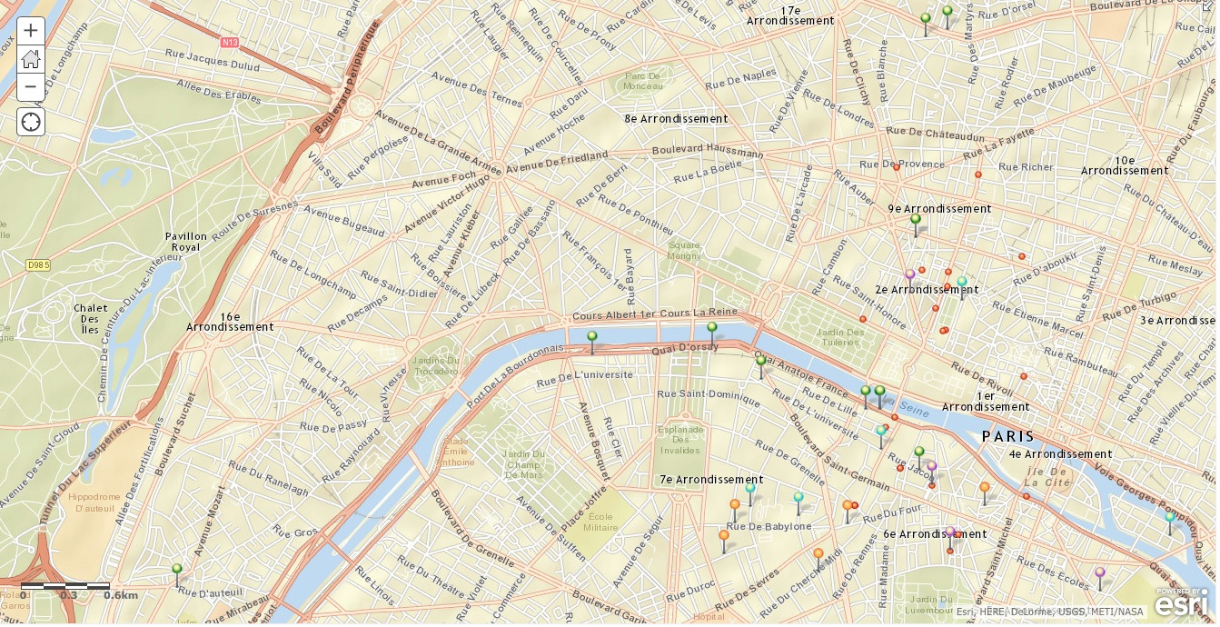
Mapping Decadence aims to show the relationship between Decadent writers and their publishers at the end of the nineteenth century in Paris, France, and how location influenced the authors’ choices in publishers. Each tab contains a map highlighting a specific Decadent writer, using the digital tool ArcGIS. These authors include Joris-Karl Huysmans, Jean Lorrain, Rachilde, and Marcel Schwob. The maps give a general overview of who lived where and when; of which books were written where and when;  of which books were published where, when, and with whom; and other details such as specific street addresses, personal timeline events, and reasons for moving.

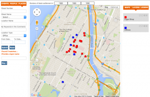
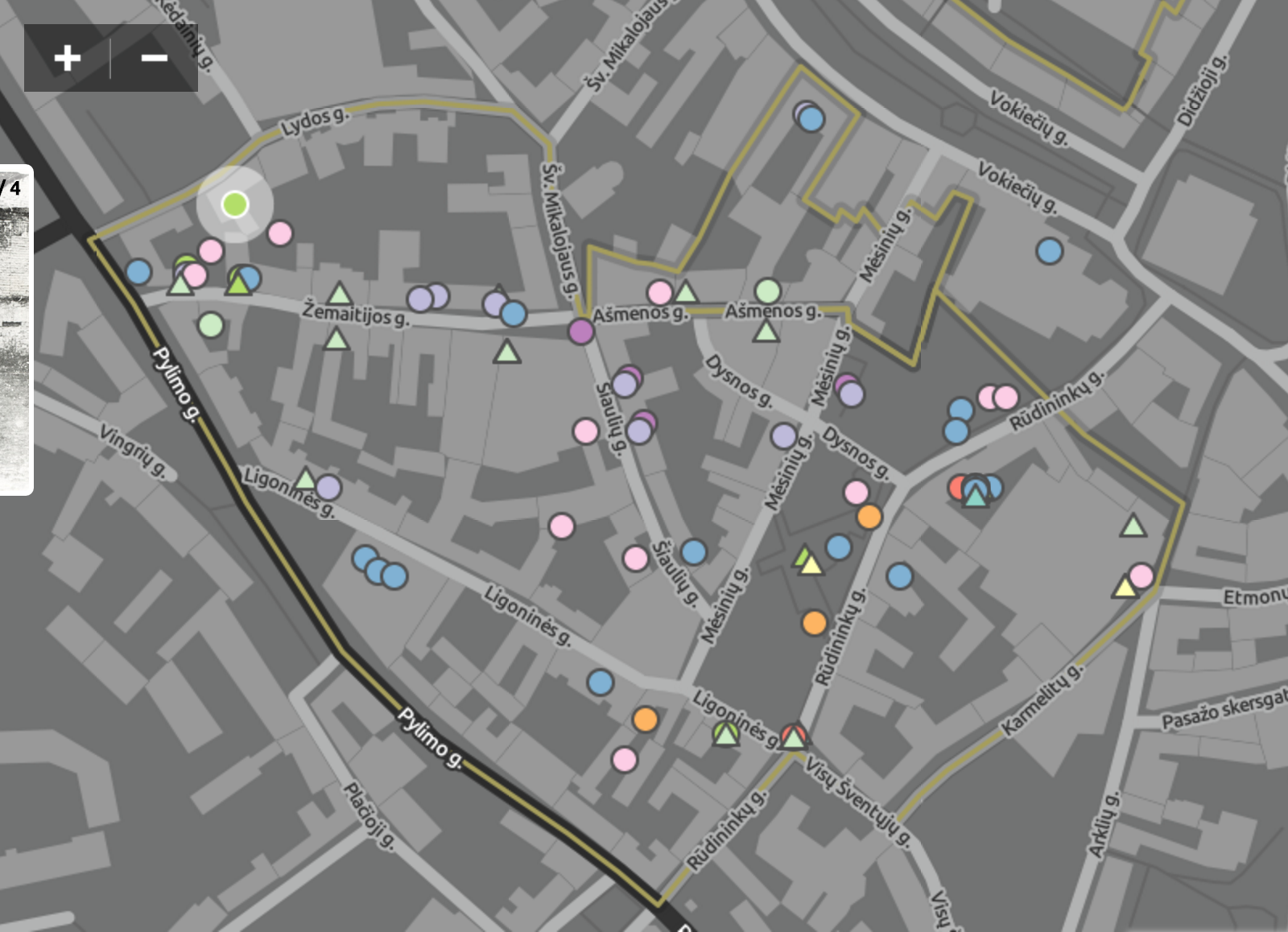
On the general overview map, each author is associated with a specific color, while the publishers are in red.

mapping_decadence_map

On each individual author map, the lines represent the connection between the author’s location at a given timeframe and their chosen publishers.

rachilde_map

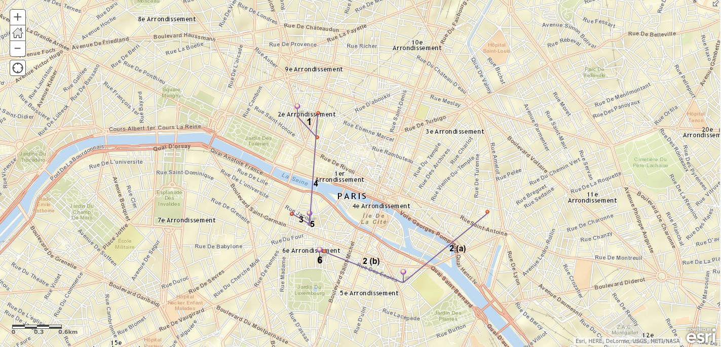
The project is from the point of view from someone like us–a scholar or academic of some sort, digging through research and presenting them visually. As far as what kinds of assumptions this project makes, the points demonstrated are relatively straightforward. The project at first hints that location plays a huge role in which publishers were chosen by given authors i.e. closer publishers were chosen as the authors moved. Upon exploration of these maps, location does and does not seem to have an influence, as some locations are further than one would expect, while other locations do follow the trend initially hinted by the project creator. The maps reveal that some authors had preferred publishers, as the site does list how many and which books these publishers produced–some producing more than others. The maps also reveal that as these authors travelled, some would choose new publishers whereas some others would stay with the same publishers. The map also reveals movements within the authors’ lives, and gave context to these movements, which I greatly appreciated and found really interesting. The map doesn’t seem to obscure much, as it covers the basics that one would expect–specific names, specific addresses, time frames, books written and published when and where, movement, and movement context.

For an alternate map, I can’t really come up with any, as the project’s maps are pretty thorough to me. Exploring different geographical regions, time frames, or literary movements could open more discussions of location centrality. Maybe including the bookstores where these books sold the best in could show interesting patterns in consumption and distribution.

Blog 7 – Locating London’s Past – DH Mapping

I chose to interpret the project, Locating London’s Past, which features John Roque’s 1746 map of London combined with modern to 18th century history.  The compliant map allows the user to search the interface based on the location of the map.  It accounts for crime, poor relief, taxation, elections, local administration, plague deaths and archaeological finds.  This map proves important because it is the first OS map of London to exist. Those who use the Roque’s map can add historical data to the map.  Additionally any user who wishes to add data  can, making it a user friendly tool in order to contextualize historical data from London.  With the plethora of data sets readily available you can constitute a full election term within 1900, as well as the tax reforms during that particular time, all while charting it on one singular map.  This multi-purpose platform opens the use and practice of this map to wide range of researchers, as well as the general public.

In order to create a version of Roque’s map, 24 separate maps were merged into a single map. Additionally, after the conversion and scanning onto one single map, the map itself needed to be geo-referranced in order to accurately depict London during that time. With the creation of this new map, came a creation of a larger data set which accompanied, 6000 streets, notable buildings, churches, and general areas. The street areas and the place polygons for this map were then digitized from first OS mapping.

These maps do obscure some of the contextualized data, in that they were taken form 24 different maps, therefore there is not 100% accuracy. Additionally, one must account for bias within the map, because of the creator of the map’s background.  Additionally, the data set accompanied with the project show the person’s locations and crime locations, but does not classify the crime.  It does however, show in which district the court proceedings took place.  The map obscures whether there is any relevance between the person’s location in accordance with the crime’s location within the “Old Bailey’s Proceedings” dataset.

The video above demonstrates how the project was put together, and how to accurately analyze the data.  This data is useful for historians, as well as city planners of today who can look at problem areas within London over time, as well as bring a sense of old architecture and history into a newer modern society.  Historians, can also add there own data to the map, which can make it more diverse as well as add more of a story to the location  mentioned.

I believe from a visual standpoint, that there could be an alternative map that reads almost like a timeline for the information.  It can highlight by color, which data et for example crime in yellow  and poverty in pink, as you highlight each point in gives a story or visual representation (a video or image) of what was occurring during that time.  This map does a good job of tying multiple relations in London together, however it can be a bit confusing for the everyday user who may be utilizing this for a project or paper.

Digital Harlem: Blog Week 7

I chose to look at the “Digital Harlem” mapping project. It aims to look at the everyday life (people, places and events) of the city of Harlem in Manhattan in New York, specifically for the years 1915 through 1930. The map is interactive and allows users to both view distinguished maps as well as search and create maps specific to the user’s interest. The information for the map was gathered from newspapers, legal records, archives and other public sources, and serves as specific search criteria that users can utilize to restrict the map to their desired specifications.

The map contains a few very interesting features. Along the top, the years of 1920, 1925, and 1930 are listed. When users toggle between these years, the borders of black settlement are shown. I found it particularly fascination to do searches using the criteria along the side and see how these borders interact with my results (i.e. what falls within the borders and what lies without). Also interesting is the toggle between the schematic of New York and the drawn historical map, which is a fire insurance map that was published in 1930. While the first map shows the city as it is now (streets and large public monuments), the second map shows the individual buildings that stood in Harlem at the time.

There are numerous possibilities to illuminate the everyday life of Harlem and its citizens between 1915 and 1930, but I found the site a little hard to maneuver at first. Luckily, there were resources that explained how to use the site. My biggest problem with the site, however, was that the maps demonstrate only part of the history. For example, the maps show the numerous crimes that occurred in the city, but ignore the positive events, if any, that happened at the time. The map also doesn’t allow users to understand the context of the crimes, such as why these crimes occurred. I’m not sure the best way to show this, but I do think it’s an important aspect considering the site wants to show the “everyday life.”

I think it would be very interesting to see first hand accounts, utilizing that information also when constructing the maps. Perhaps this would change the map or remedy the lack of positive events in the map construction. I also think it could be beneficial to see a map of today’s Harlem and compare/contrast the two to see the evolution of the city.

Digital Harlem

The “Digital Harlem” mapping project aims to illustrate everyday life in Harlem from 1925-1930. To construct the map information was compiled from various sources including “legal records, newspapers and other archival and published sources.” The map is interactive and allows the viewer to view featured maps or search for specific events, people or places, as well as create multiple layers on the map based upon what the viewer is searching for or interested in.  A legend is provided to show what each symbol on the map signifies; clicking on symbols also brings up a window which provides more information about the item selected.

The Map certainly can reveal many things and can be used to draw comparisons based upon what the viewer is interested in looking at. For example, I added the layers “Cigar Shops” and “Offices” to see if there was a correlation between these two types of buildings. Having the ability to manipulate and engage with the map makes it more efficacious for a variety of users and scholarship. However, i think the map is more useful for people familiar with the history of Harlem, as it easier to search for a specific person, place, or event, that it is to browse these topics more broadly.
Screen Shot 2015-11-16 at 9.49.25 AM


Although this project states that it aims to present the everyday life of Harlem during 1925-1930 period, it seems to focus mostly on crimes committed in Harlem and legal records. The map aimed to use legal records to show activities labeled as criminal, such as “streetlife, black language, music, family life.” However, the legal and criminal records at this time all come from a specific Western political economy that endorsed racial segregation and white supremacy. Thus what can be illuminated about Harlem everyday life through these records must be considered through thinking about how the records and data were collected given the history of the United States and this political economy.

If I were to reimagine this map,  I would construct the map primarily utilizing sources such as oral histories, interviews, newspapers, artworks created by people living and working in harlem between 1925-1930. I would maintain the interactive nature of the map because I believe being able to engage with the map on multiple levels is very beneficial for research purposes and  gaining more in-depth understandings.


The Digital Harlem

I chose to look at “The Digital Harlem” map. I found the site a bit redundant and slow to use but once I got the hang of it, the information was quite useful. The website uses a google map of New York, specifically Harlem, to display data gathered legal records, newspapers and other archival and published sources, about events, people, places, and general everyday life in Harlem between 1915 and 1930.

Users can manipulate the map based on events, people or places in order to create multiple layers and compare locations of events to one another or events to other people or people to people. There are really a lot of possibilities to illuminate geographic and cultural connections. However I did find a lot of faults in the sight.

I found it a bit confusing that the site chose to distance itself from topics like the Harlem Renaissance stating, “Unlike most studies of Harlem in the early twentieth century, this project focuses not on black artists and the black middle class, but on the lives of ordinary African New Yorkers.” I am not quite sure how they chose to delineate between the two and I found the use of the term “ordinary” very obscure and problematic. If the site is attempting to discuss the very hostile racial inequalities of the time and incidences of crime and arrest or police brutality, I think it did a poor job. And I do not thin that you can display the lives “ordinary” African Americans without also displaying the middle class and the artists of the time. I found that while there was the option to look up arrests and violence in the area, there was a lot more information on parades and parties, it made the sight seem as though they were attempting to hide the harsh realities of racial tension at that time which spurred movements like the Harlem Renaissance. There was also no mention of the Great Migration which took place during the time and could have been an illuminating component to the map.

I think that a network graph in conjunction with the map would be extremely helpful. In addition, I think that the ability to scroll over the different events and people and get background would bee more helpful for research and context. The date component of the map could be refined because I found that the parameters set when dates are distinguished are a bit confusing. A timeline would also be very beneficial to this map, if there was some way we could look up historically important, relevant topics to our search that would give more context to the other statistics we are seeing.

Digital Harlem

DH 101 Blog

http://digitalharlem.org/

This map documents a time period of 1920-1930 in Harlem and uses a query search function for crimes.

This digital map of Harlem is interesting. I do not know much about Harlem, nor have I ever been there. But from what I hear it is known as a rather rough environment. This digital map maps certain crimes and arrests that were made throughout Harlem. Furthermore, there is a relatively extensive filter function, allowing a search to be very specific for a type of individual and/or crime to be found. This kind of map perhaps makes assumptions about the community of Harlem, that they must need a filter for all their crime. This assumption is a stretch, however, as this map is also a great tool. It is very useful resource that one can learn a lot about the Harlem community with. I see this map reflecting the point of view of the Police, as it is like having access to all the police records of crimes. This also seems to serve the city governments point of view, as they would like give people access to this important information, and also use this information to understand where to improve security.

This map reveals that a fair amount of crimes, in varying degrees, occurs in Harlem. One cannot assume the rates of crime however, as this is only a study of one particular neighborhood. It also reveals potential areas that need to be invested in more by the city, as high concentration of crimes appear in particular parts of the community.

This map however does obscure the conception of how much crime and potential danger there is in Harlem. All that is being plotted is crimes, not good or positive events in the community. This can put the area in a bad light by someone using this mapping tool. Furthermore, this map only covers years 1920-1930, so it is not a current reflection of today’s crime. This would also not be helpful for current city officials to use as information. Nor would current Harlem residents be able to use this practically. I see this map being used for scholarly and archival work.

I would like to see an alternate map that is updated to todays records. This map could be compared to the older one. Also, it would be great to see the stats where Harlem is compared to other cities of similar size and demographic, to get a more rounded view of how significant the crime really is.

Looking into the Vilna Ghetto

The reVilna project: “Exploring the Vilnius Ghetto: A Digital Monument” showcased the lives of Jews in the Vilna Ghetto from its emerging to its liquidation by mapping different events and stories out using information from memoirs, archives and historical accounts.

The careful combination of maps, timelines, stories and pictures provided the readers with visual insight of how the Jews lived in the Ghettos. Because the project is coming from the point of view of the victims of the holocaust, it creates a rather intimate connection with the viewers. It is almost as if the viewers are walking down the road to the Ghetto along with these victims, fighting not to be taken away and finally settling down in this environment. At some point, the Ghetto almost turns into a functional city with a medical center, prison, restaurant, sport field, etc. It is very interesting to visualize these facilities scattered around the their area because it truly resembles a modern city that you can look up on Yelp.

What is obscured in this project is the perspective of the aggressors, which is not necessarily a bad thing. I believe the creators of the project intentionally did so because knowing too much about the German or Lithuanian perspective would distract the viewers from immersing in the experience.

An interesting thing to note is that the map used in this project seems to be based on the current Google Map.

Screen Shot 2015-11-16 at 4.31.36 AM Screen Shot 2015-11-16 at 4.35.52 AMIn doing so, the creators made the assumption that the map remained the same since the Ghetto period. Therefore, the precision of the data points they plotted may not be as accurate and the events are not in their proper contexts.

Another thing to note is that the map does not zoom out beyond Vilnius. An ordinary reader who is not very familiar with details of European history and geography will not be able locate Vilnius on the European map. In fact, the average reader might not have even heard of Vilnius the city and its ties to the holocaust. Therefore, the project creators assumed that the readers had background knowledge on the Ghettos of Vilnius. This is not surprising as the project description on the homepage stated that the mapping project is “dedicated to understanding how the residents of the Ghetto lived, how the ghetto functioned — even, given the circumstances, flourished — how it emerged, and how, ultimately, it was liquidated. Using geographical science and technology, reVilna seeks to reimagine the Vilna Ghetto.” Instead of educating the general public about the existence and conditions of the Ghettos, this project is trying to help researchers of these Ghettos to visualize and re-evaluate the conditions.

If I had the choice, I might I might have preferred to give readers a little more backstory about the Ghettos. Also, I would be very interesting to add an option to switch from the current map to the map of Vilnius during the Ghetto period that we can either find or reconstruct using memoirs, archives and historical accounts. This way, viewers can not only see the events in their accurate context, but also see a comparison between the layouts of the city back then and that of today.

All in all, reVilna is a very informative project and does a very good job of giving its viewers a whole new level of understanding of the Vilna Ghetto experience.

Locating London’s Past

For this week’s assignment, I chose to study the DH mapping project Locating London’s Past. This project aims to help people find information pertaining to modern and eighteenth century London, and map it out over either a 18th century map or a modern Google map. This site works by having the user choose from a list of data sets (ex. Old Baileys, London Lives, Museum of London Archaeology, and more) and adding this to the map so that the viewer can see the information laid out on top.


Screen Shot 2015-11-16 at 3.22.05 AM

This method lets the user see the statistical information laid out and separated in a visual way instead of having to look at a list of names, numbers, and dates. The map is very useful when wanting to discover information regarding government numbers around the city of London, and it lets its users explore their data from a vast number of years. However, it becomes quite clear that the site was designed for someone who knows exactly how to use it already. The project is built in a way that you can only see the statistical numbers when the datasets are overlaid onto the map, but in order to learn the context or information surrounding that dataset, the user has to dig deeper into the site and find the original dataset. The site also does not easily help you achieve results you may have wanted to find out by using the project. Instead they have links ready to “help you interpret your information.” This then takes you to a page that has many instructions on how to use the site and how to effectively understand what you are seeing. This can be unhelpful and misleading to people if they are just playing around with the map. A more useful map would have been one with clearer directions on what the user is looking at, and one with more information overall. Instead of just a dropdown menu for a dataset, it would be nice to have a way to see why or what information would be best to look at first, so then the user could make an educated choice in what they want to see. It would make the site a lot friendlier to use for someone who has just stumbled across the page and does not know exactly what they want to see.

Blog 7 – Cholera Time Map

bp7 - header

The map I looked at this week was the 19th-Century Caribbean Cholera TimeMap, created by the 2011 Haiti Lab of the John Hope Franklin Humanities Institute. This is an interactive global map that uses different colored markers to indicate cholera outbreaks, news articles about the outbreaks, hurricanes, and tropical storms. The user has the ability to scroll through the years of 1833 through 1872 to see how the outbreaks progressed and news spread. Additionally, each year is broken down into the 12 months, which shows the thorough representation of the data. The map itself is interactive: the user can zoom in or out, or drag the map to change the center focus.

bp7 - map

Above the interactive map is the interactive timeline; as said before, the timeline can be explored by scrolling through, or dragging the marker on the timeline. Above the timeline there are color-coded descriptions of the matching colored markers on the map (e.g. specifying the content of a news article). These descriptions are reflected in the timeline itself, too, as there are small icons on the timeline that correspond to the descriptions above.

bp7 - descriptions

Since the website has been archived, and is therefore outdated, all the features of the “About” page of the project did not load properly. The only page I could access was the one that listed the people who worked on the project, though I am assuming the project does not technically reflect their point of view. Researchers are ideally as unbiased as possible, and this project does seem to be presented from a neutral perspective. It is focused specifically on the Caribbean, so it seems the point of view for this project is geographic: looking at the spread of cholera, news about it, and severe weather patterns in the Caribbean. The map does not necessarily assume that cholera was only an issue in this region and not other parts of the world, and therefore does not imply that only the Caribbean had to deal with the repercussions of this disease.

While the map reveals extensive factual records of the spread of cholera in society and the media, as well as tropical storms and hurricanes, it inadvertently obscures the correlation between these objects. Though again, this could be due to the fact that the website has been archived and I cannot access any informational pages on the site that could shed light on the purpose for selecting these data points. Even so, this time map could use some revamping. If there is a correlation between weather patterns and the spread of cholera – though it does not seem to be clearly evident just scrolling through the timeline – then maybe the descriptions above the timeline could indicate their relationship. Instead of using solid lines or bubble bullet points as in the current version, the descriptions might be accompanied by some sort of small graph or other graphical representation of their correlation, which would make this information much more parsable to the user. Additionally, there is a strange feature of the map: you are able to scroll back to years preceding 1833, though there is no information recorded for those years. And it will just keep letting you scroll! I scrolled all the way back to 1770 before losing interest in seeing blank descriptions. So for a new and improved timeline map, I would set limits on the ability to scroll, having the timeline start and end with the years being examined. This would create a cleaner project that is less distracting and does not have pointless features.

Week 7: maps

I chose to examine the Caribbean cholera map from the 19th century. This project shows the location at which various cholera outbreaks occurred throughout the Caribbean, along with the various important news articles about the outbreaks. Large storms and hurricanes were also recorded and added to the map. It is split into 3 separate time periods, each with a timeline above, listing the date and month of the event (outbreak or storm) and placing it relative to the rest. The location relative to other outbreaks and news sources is shown using the lower part of the map, which zooms in on the Caribbean, below Florida in the Atlantic Ocean. When clicking on the location of each event, a short description of the outbreak, storm, or attached article appears, giving more information about the event. This map was created from the point of view of a scholar, wanting to share research on the topic. It assumes that readers are familiar with first of all what cholera is and that it traveled throughout the Caribbean. It shows only very specific instances that the developer wants to share. Overall, it reveals the locations of cholera outbreaks, but does not tie connections to where it could have spread. Only specific points are shown. It hides any details about the outbreaks: who started them, how they traveled, how intense they were. This map does effectively place each outbreak into a historical context, especially with the interactive timeline.

As an alternate map, I would choose to use a heat map. I believe that the timeline at the top, functioning to change the various outbreak locations as the time period changes, is extremely effective. I would keep this aspect of the current map. However, I would zoom in more on the Caribbean as a whole, rather than give simple access to viewing it compared to the whole world; nothing is recorded elsewhere and it only confuses the reader. I would also add in lines of connection, to see the pattern in which cholera traveled, affecting so many people in various countries. Seeing the disease travel would be an interesting aspect of the map that is currently not present. Using a heat map, it would be easier to see in which city the outbreak was most intense, but also illuminate areas that were less strongly affected but should still be included.

Older posts Newer posts

© 2026 DH101

Theme by Anders NorenUp ↑