DH101

Introduction to Digital Humanities

Month: November 2015 (page 6 of 17)

Week 8: Mapping Digital Harlem

Digital Harlem Map

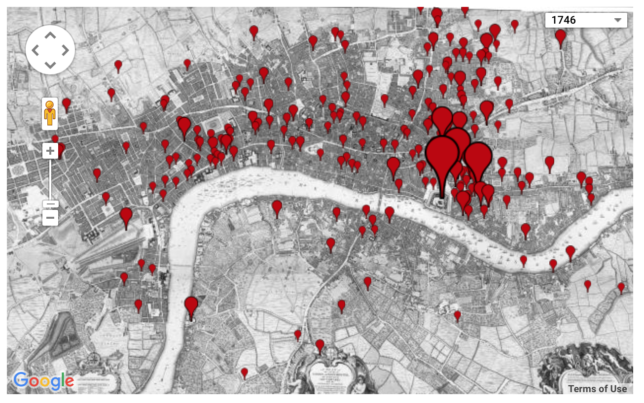
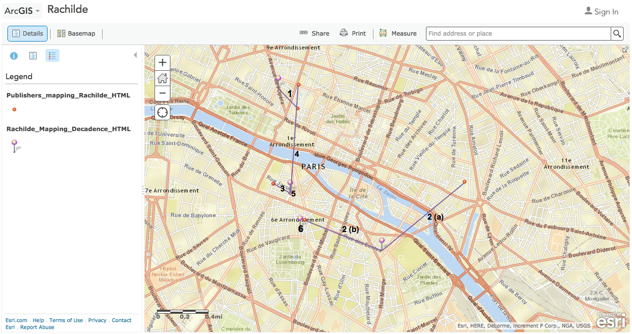
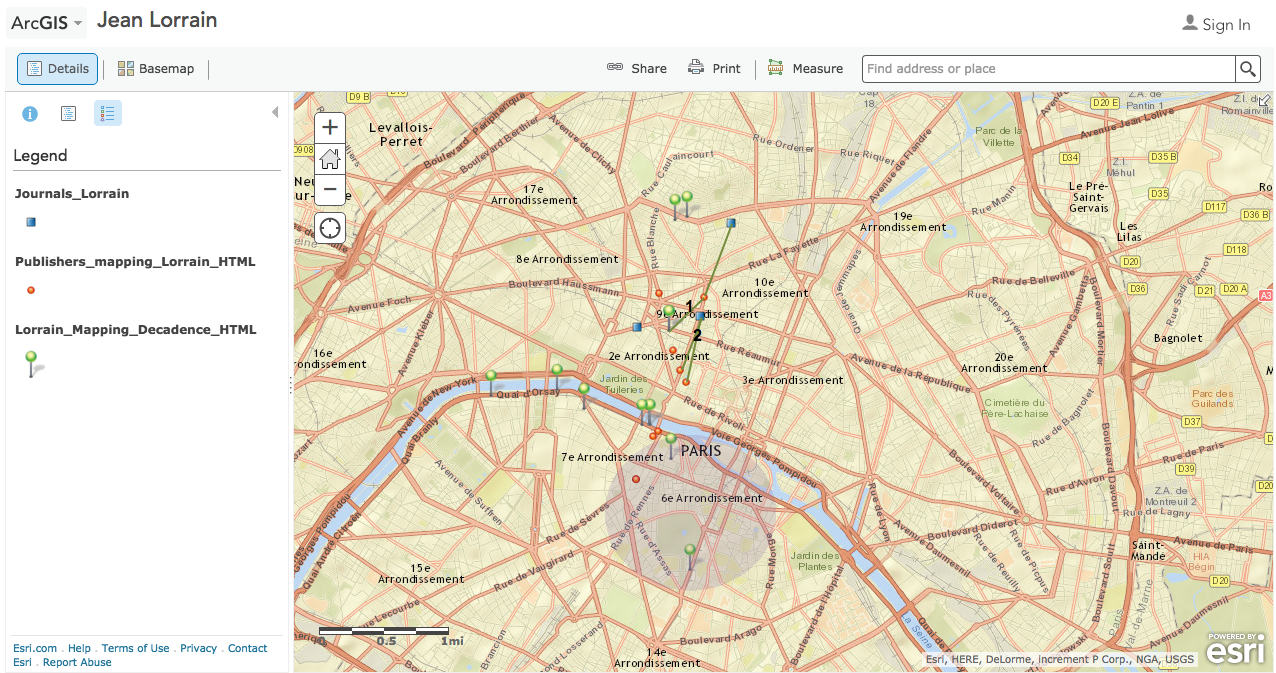
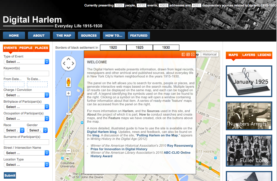
The purpose of the Digital Harlem project is to essentially provide a record of New York Harlem region’s everyday life between 1915 and 1930.  The data is compiled and organized so that it can be searched by Events, Places, and People. It looks like all of the data comes from the DA’s office, which certainly gives the data a focus on criminal activities.Using a map as a visualization for this project is an excellent choice because it successfully incorporates all important aspects of the project and presents them in a most comprehensible and appealing fashion. Despite that there is a drop-search for types of events, types of locations,  and occupations, the emphasis on keyword search filters suggest that the site is meant to be used by someone who knows exactly what they’re looking for.  Once you input a search item, the site allows you to create a layer to which you can assign a name. This is very useful as it color codes the various types of data you’re searching for, and allows you to see interactions, which would not be visible if you had to reload the map for every new search. Once you click on an icon on the map, an information window pops up above, detailing the metadata that has to do with that particular item.  That metadata is especially useful because it provides information not only about that particular item, but also about other items related, and that’s what helps the viewer connect the dots and make a story.

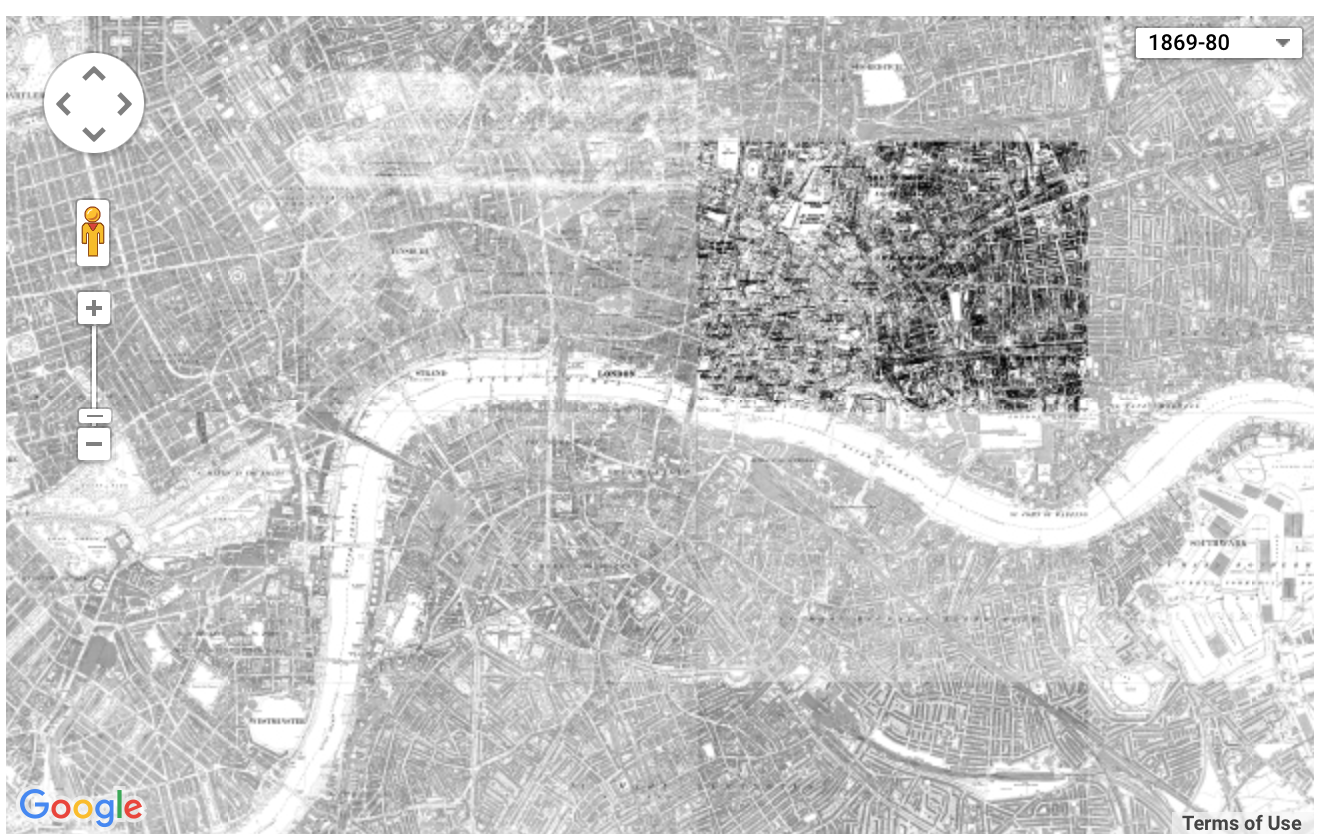
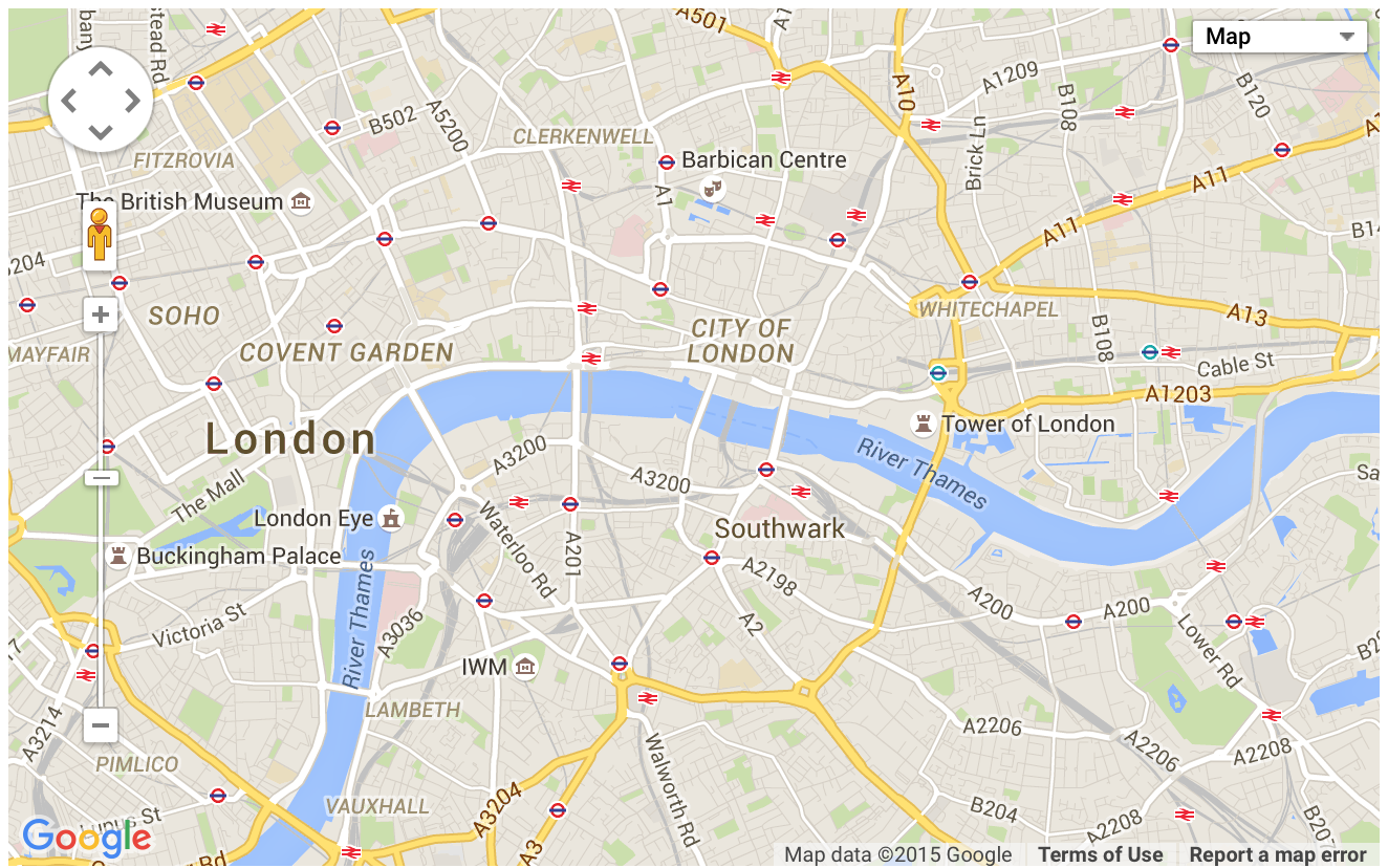
Because the project utilizes a current version of Google maps, it proves to be not only useful to a modern scholar or the general public, but it also opens another opportunity for interpreting the data. Considering that the primary sources from which data were drawn, it is apparent that the project supports the well-established perspective of Harlem by focusing on the African-American population and on crimes. As we argued in class, it seems that this project is another example of confirmation of the history we already “know” as reported by popularly accepted sources. If I were to do this project differently, I could use the advantage of laying out my information on a current Google maps in order to explore how the urban culture of 1920s harlem compares to the culture of today. For example, we could see a certain block used to be largely occupied by barber shops, today that area might be largely occupied by fashion stores. This information would reveal interesting insights about the commercial culture of Harlem then and now.


Week 8: Digital Gazetteer

The Digital Gazetteer of the Song Dynasty accompanies the book, Dividing the Realm in Order to Govern: The Spatial Organization of Song China (960-1276 CE)Much of the maps show the different hierarchies of spatial geography – differently ranked circuits, prefectures, counties, towns and markets. Much of these divisions of the time were based on authority. These maps were assumed to be changed and modified in order to match the needs of officials and emperors in power. These spatial transformations greatly affected social organization, foreign relations, revenue, and imperial power, and assumes that geography is based on social context of the time. This also reveals the authority of the time and their domestic and foreign policies, which could be seen in the ways the geographical structures of their controlled territory had changed over time.

However, for scholarship purposes historical information is commonly derived from text. The challenge is to relate many of the textbook names and entities to a lot of the ground that is constantly being changed. The map can be used for comparison but cannot directly tell us the historical changes that has been built on it prior to its existing shape and form. Maps and terrain change constantly, so we cannot assume very much of history without looking at other maps at the same time. Also, it can be assumed that these maps were changed based on the agendas of influential political figures. The ruling perspectives behind these maps can easily over exaggerate power and domain.

An alternative map would be one that morphs land over time to see how borders have changed over different ruling periods. This map could also be used to connect to prosperity at the time to see if there were local administrative trends in what worked well and what didn’t. It would also be useful to connect different maps more clearly to the ruling house of the time to fully understand the social context behind geographical history.

Mapping Analysis: Locating London’s Past

Locating London’s Past is an interactive map that uses the interface of a 1746 map, and then allows users to search through historical data sets and layer any data points they would like to see geolocated on the map. They pull from records of crime, poor relief, taxation, elections, local administration, plague deaths, and archaeological finds, some of which are from London Lives, the digital humanities project we analyzed earlier in the quarter. Being able to locate these records of events on a historical map helps make connections to the way London is today.
The map seems to make the assumption that the user is already very familiar with and understands the source data set, because there is no easy way to access the record or even a brief summary of the record directly from the mapping site, rather, you have to go directly to the data set itself and find it. For those who don’t know as much about the records themselves, the map still is pretty effective at communicating general ideas of the historical geography of London. It allows you to quickly map the locations of an entire data set, and uses location markers of varying sizes to indicate how many records had that location. I found this very helpful and interesting when mapping the poor relief records, which enabled me to easily identify the socioeconomic statuses of each area of London. However, once again, when the map compiles all the records into simple red markers, it obscures a lot of the important details of the data.

Screen Shot 2015-11-16 at 1.08.31 PM
The base map itself is a fantastic resource to build off of, but it has so many tiny details that it can be difficult to read and navigate. If I were to make an alternative map, I would use the same John Rocque 18th century map, but I would digitize and make it more interactive it so its more easily readable, so when you are zoomed out you can still see the major, important labels of the city, and then when you zoom the more detailed information is readable. Additionally, I would add a feature that makes it easier to access the actual information in a record without having to sift through the data set. I would do this using a pop-up window that featured key words and a short summary of the record, along with the link directly to the original data. These changes would make the map a better source about London’s past beyond just the geographical data.

Mapping Decadence

I decided to look at Mapping Decadence, which are a series of maps (built with ArcGIS) that are designed to help visualize the relationships between writers, such as Jean Lorrain and Joris-Karl Huysmans, and their publishers; the creators decided to utilize maps as a way to emphasize how location is important in such a relationship.

For a more in-depth analysis, I decided to focus on the “Mapping Decadence” map/tab. The map is accompanied by a legend: publishers are red and the authors have different colored pins (Jean Lorrain in green, Marcel Schwob in orange, Emile Bouillon in blue, and Rachilde in purple). Accompanied with the pins, for publisher, is the publisher’s name, address, and the books that were published. As for the authors, provided is the address, years he/she stayed at that address, and the books that were published at the respective address. Another cool feature of this map is the user’s ability to change the basemap from “imagery,” “streets,” “topographic,” to “oceans,” etc. This visualization would help track a curious user as to the paths the author may have taken to the publisher, or whether geography or distance affected the publisher’s and author’s relationships.

There is not much indication of whose point of view this map is from, besides that the creator was a student who was interested in tracking the social network of French writers in the 19th century. The assumptions, however, that can be pulled from this map is that these French writers and their publishers were pretty close; even if Jean Lorrain moved further from the centrality of the publishes, he would still go to the same publisher, demonstrating a strong relationship between author and publisher. However, what this map does not show clearly is that relationship between the author and publisher; the pins are displayed to indicate locations, but I feel like there should be connections (or edges) that should be drawn between the authors and respective publishers. This way, it would be easier to visualize that relationship and it would be easier to draw assumptions. Even though these maps do display the information and indicate location, it does not clearly indicate the relationships between the visuals and information.

If I were to create an alternative map, I would indicate those aforementioned lines/edges that display a clear connection between the authors and publishers, as a social network graph layered onto a map. I feel like it would better help in the analysis of the goal of these maps, which is to help visualize the relationships between the authors and publishers.

Locating London’s Past

Locating London Map

The home page of Locating London’s Past features a map that gives us a few optional views of that city: London in 1746, 1869-80, or a satellite version. This is an interesting way to show broad changes in the same geographical location over different periods of time. Though navigating the site will probably be a lot easier for someone who is already familiar with the topic and knows exactly what information they are looking for, the designers do offer ‘how to navigate’ the site videos for non-experts like me, but, unfortunately, the audio wasn’t working on these videos when attempted to use them.

The site’s narrative tells us that its intention is to allow us to “search a wide body of digital resources relating to early modern and eighteenth-century London, and to map the results on to a fully GIS compliant version of John Rocque’s 1746 map.” The designers of the website disclosed that Rocque’s map are biased to his view of London at the time and features details of religious institutions more readily than it offers complete information on industrial buildings, for example. Though the designers used different sources to balance this bias, the information presented on the maps would inevitably skew towards Rocque and his contemporaries’ views on what was information worth including, at the time. So this bias is something the map reveals.

There are different datasets one can choose to have featured on a map. They are:

-The Centre for Metropolitan History Datasets

-London Lives, 1690-1800: Crime, Poverty and Social Policy in the Metropolis

-MOLA Archaeological Data

-Old Bailey Proceedings

-Estimating London’s Population

What the maps obscure is the relevancy to the modern layperson who is curious about London’s history. To make it the site more user-friendly, I would start with a map of modern London with clearly marked historical sites as way to introduce the subject. I would add more view options throughout the centuries marking key historical events at those same sites. Then, after the user is comfortably situated, I offer the ‘how to use the data to navigate the site’ videos. I would offer key word options. The current design somehow assumes you’ll know what key words to type in. And, for those that don’t, it offers a pop up with an explanation. For somehow who is simply curious, the site is expecting me to do too much work. This website seems academically focused in its design, even though the information could be engaging to a wider audience.


Writers and Publishers

I chose to examine the Mapping Decadence project for this week’s blog post. It visualizes the relationship between Decadent writers and their publishers at the end of the nineteenth century in Paris by showing how location played a role in their collaborations. There are five maps that were created by  ArcGIS, and four of them focus on the authors: Jean Lorrain, Joris-Karl Huysmans, Marcel Schwob, and Rachilde. The fifth map is a collection of all the four maps. Each page has an image that can link you to the interactive map, or you can click on the link underneath the image that gives access to the map. The map shows pins with specific colors representing different authors and the red pin representing publishers. It also shows lines connecting the authors to publishers. An info box pops up once you click on a pin or a line that gives information about the residence, time of residence, published books and with whom, where they were living or working at the time, and the location of their publishers.

Screen Shot 2015-11-16 at 12.05.55 PM

Screen Shot 2015-11-16 at 12.06.08 PM

Joris-Karl Huysmans and Marcel Schwob seem to have mostly collaborated with publishers living within their vicinity since most of the pins and the connections are clustered together depending on where the authors were located. Perhaps they wanted to work with publishers as closely and frequently as possible, since they chose to work with publishers near their area.

Rachilde worked with publishers both near and far, which shows that distance wasn’t much of an issue for him when working with a publisher.

Screen Shot 2015-11-16 at 12.09.31 PM

Jean Lorrain’s map is a bit out of the ordinary compared to the other writers. While their maps show several lines connecting the authors to their publishers, Jean Lorrain has very few connections with the publishers. On the map, there are 8 publishers he worked with, but Jean Lorrain’s pins can be found all over Paris. He seems to have liked working in many different places. Interestingly, many of these places are at hotels near the Seine River. Also, the map shows that Jean Lorrain was often in the Quartier Latin indicated by the shaded circle where he collaborated with several publishers living in or nearby the Quartier Latin.

Screen Shot 2015-11-16 at 12.09.23 PM

The map assumes that the user is familiar with the Decadent writers and their works since it doesn’t give much information about the authors themselves. It gives interesting information to those who might want to know more about the relationship between writers and publishers back in the nineteenth century. Other than that, little is known about the writers, their works, and the publishers. And this makes it hard to understand the significance of this mapping project. Why was it important or interesting to know how these writers collaborated with different publishers based on their location? If there was an information box next to the map that gave a brief introduction or summary about who the writer was or the publisher was, this site would be more helpful and engaging to users who do not know much about Parisian writers during this time.

reVilna

I chose to explore the reVilna mapping project.  The project uses digital mapping to digitize and narrate what the Jewish Ghetto in Vilnius, Lithuania was like.  It narrates the history of the Ghetto from before, during, and after German occupation of Vilnius.

reVilna reflects the point of view of the Jewish community in the Ghetto who fell victim to the Holocaust.  The project aims to have its user understand how the residents lived in the Ghetto and how the Ghetto functioned.  The creators of the project geographically tagged over two hundred points of significance sourced from memoirs, archives, original Ghetto documents and artifacts, and oral and historical account.  The users can manipulate the map’s filters to events and places of interest or explore built-in stories.

Screen Shot 2015-11-16 at 12.03.03 PM

While moving through the maps, you can get a detailed perspective on the lives of the Jewish community.  You can use the filters of the map to follow stories of resistance, culture, health, education, Judenrat and formation and liquidation of the Ghetto.  When going through the stories, photos are sometimes included to show what certain places actually looked like.

The maps reveal the implications that the Holocaust had on the community as a whole.  I think where the project lacks is in personal first-hand accounts of what life was like for individuals in the community.  It also does not give any background knowledge on the surrounding area of Lithuania and what it was like to live there as opposed to in the Ghetto.  I also think an interesting feature that the creators could have added would be to enable the user to toggle between present day Vilnius and the Holocaust era Vilnius to create a comparison between the two.  This would show how Vilnius and the Ghetto have changed throughout time.

Digital Humanities Mapping: Digital Harlem

I chose to explore the Digital Harlem project for this week’s blog assignment. I lived and studied in New York this summer and found myself in Harlem a lot of my trip. Harlem has a distinct personally and palpable sense of its rich history. With rampant gentrification, Harlem’s past is in a noticeable clash with its unexpected future. When I was there, a Whole Foods was being built across the street from one of Harlem’s oldest churches. I thought the Digital Harlem project would be an interesting look back into the neighborhoods’ roots that I could compare to my summer experience.


About message

About Message


The messages explains in troublesome language:

“Unlike most studies of Harlem in the early twentieth century, this project focuses not on black artists and the black middle class, but on the lives of ordinary African New Yorkers. It does so primarily by using legal records, which encompass not only hardened criminals but also first offenders, ordinary residents acting out of desperation, poverty or anger, and which reveal all manner of things that would not ordinarily be labelled ‘criminal’– streetlife, black language, music, family life – as well as evidence of the role of gambling, violence and confidence men in the black community”

Immediately after reading this description, I was confused that if by “everyday life” they actually  meant everyday crime. While crime is a vital part of understanding the inner workings of any community, it should not be the filter by which “everyday life ” should be chronicled.  When I think of everyday life, I think of families, work, school, neighborhood events, and church.  If the projects primary source is legal records then the project will be skewed and colored by those crimes and wont include those positive parts of life. It is problematic for the creators of this site to purport it as an overall view of daily life in Harlem because it doesn’t actually encompass all of that. Not to mention the legal records were of those convicted and doesn’t provide the context of racial inequality of the time that led to many wrongful convictions and harsh punishments.

Besides the ethical problems I had with the site, it did have  a lot of layers for usability.  There are events, people, and places tabs that can be used to find specific incidents and people from 1915-1930. The map reveals exactly where incidents took place and as you hover over icons on the map it gives brief descriptions and links to related events. I did like the Featured section that linked to blogs on certain Harlem life topics. It was satisfying to see the daily life I Imagined illuminated with pictures and stories but this section was not included in the description of either the Welcome or About boxes.

Features Menu

Featured Menu


I think an alternate  version of this map, would use supplemental sources to add personal context to the legal records like the Featured section. I would appreciate if the entire map revolved around oral accounts from the past, present day interviews,videos, music, and artwork in conjunction with the legal records not just one section.

Locating London’s Past

For this week’s blog post, I decided to analyze the mapping project of Locating London’s Past. Out of all of the maps from this week’s choices, this map stood out to me because through the map, there was a sense of a unity in time. The map demonstrates the geographical and industrialization changes over time, but also sharing London’s culture throughout.

The kind of assumptions that this map tries to show is how certain key areas of London have structurally changed throughout time. The map is divided into three main maps showing London in the year 1746 and the timeframe from 1869 to 1880, and the current map of today in 2015.

Screen Shot 2015-11-16 at 12.12.55 PM Screen Shot 2015-11-16 at 12.13.08 PM Screen Shot 2015-11-16 at 12.13.24 PM

The assumptions that are made through the changes that are visualized in the maps are that these cities went from being a very simple town, to a civilized industrial city. We see that there are clearly more division among the towns and there are now more sites of entertainment. This specific map shows these changes, but there is a specific map option that is simply blank. I wasn’t sure what the purpose of this was in regards to comparing with the other layered maps. There are other smaller image maps that specifically foretell the historical occurrences of the Ordnance Survey, 1st edition map of London 1863-80 (1:2500) and John Rocque’s Survey of London, Westminster & Southwark, 1746. These maps were very parallel to the historical context provided by the event description page.

An alternative map to the main map would have the same time frames, but with specific individual’s names or images embedded to the map itself. In other words, I think it would have been very eye appealing to have made this changing map into an interactive map. This would have been more appealing because we can give a face to the event and time. It would have also been a more effective map if we had the opportunity to view the map as a full screen. Because this is such a unique map in which it shows the overall landscape of how London was geographically different throughout time, it would have been nice to see a bigger landscape in one viewing. I would have also definitely removed the blank map layer.

-Karla Contreras

Cholera and the Caribbean

For this blogging assignment, I focused on the Caribbean Cholera out break map visualization, found here. I found the site to be very intuitive and interesting. Their design decision to link the timeline to the map visual, and have the map update itself as the timeline was scrolled through, was a brilliant choice. Of course, there are a few assumptions that the digital humanists made while designing this map. I think most obvious of these assumptions is that of their audience. It seems from the lack of contextualizing of the data, that the design team assumed that the audience would have sufficient knowledge about Cholera to draw conclusions from the data. Personally, I do not know very much about Cholera, or anything about the 19th century Cholera epidemic in the Caribbean. I would have been lovely if below the map, the design team invested some resources to provide at least a synopsis of what the map is showing in context of the events that they portray.

The data also attempts to tie the outbreak of Cholera across the Caribbean to a singular variable: weather. This design decision obviously reveals the relationship between Cholera outbreaks and tropical storms, but hides any correlations between Cholera and other variables- perhaps immigration/emigration patterns of the time, or socio-economic climates of the countries that are experiences significant outbreaks. Also, I am curious as to why the design team decided to include “News Articles” as one of their pinpointed data sets. While all the articles pertain to cholera, why would they make the distinction between “Cholera Outbreaks” and news articles about cholera outbreaks? I believe this adds an unnecessary element of redundancy and confusion to the data visualization.

If I had to ascertain the point of the view of this data, I would guess it is probably that of a historian who is not from the Caribbean. I say this because there seems to be a lack of empathy or emotional consideration in the data. While data visualizations are not known for their subjective, emotional components, the lack of contextualization of the evidence leads me to believe that those who created this visual were not interested in understand the social and emotional impact of the Cholera outbreak on the people of the Caribbean. Or even simpler: the repercussions of Cholera on the islands effected by the disease. This leads me to believe that the creators were more inclined to explore the objective truth surrounding the events, and that would most likely be a historian.

If I had to imagine a new map of this data, I would first change the points used on the Caribbean map. Using the same style of marker for all 4 data sets makes it seems as though the events are related in some way- but Cholera Outbreaks and Hurricanes are not similar events at all. Also, I would like the map to shade the area affected by Cholera in addition to pinpointing the exact location. This is because it reinforces the influence of Cholera on the area it resides, and the shading would build a stronger relationship between the disease and the island of residence. Tracking immigration patterns as well as storm patterns would be a cool feature, because if these are truly factors that influence the spread of Cholera, then Cholera outbreaks should follow these lines. It would also make the map feel less stagnant, as singular points on a map are better suited for locations rather than storms. On a more subjective note, my alternate map would exclude the world outside of the area we are interested in. It is unsettling to include the entire world when we are only concerned about a small section. Even a box around the area of interest would suffice.

Older posts Newer posts

© 2026 DH101

Theme by Anders NorenUp ↑