DH101

Introduction to Digital Humanities

Month: November 2015 (page 9 of 17)

Digital Harlem

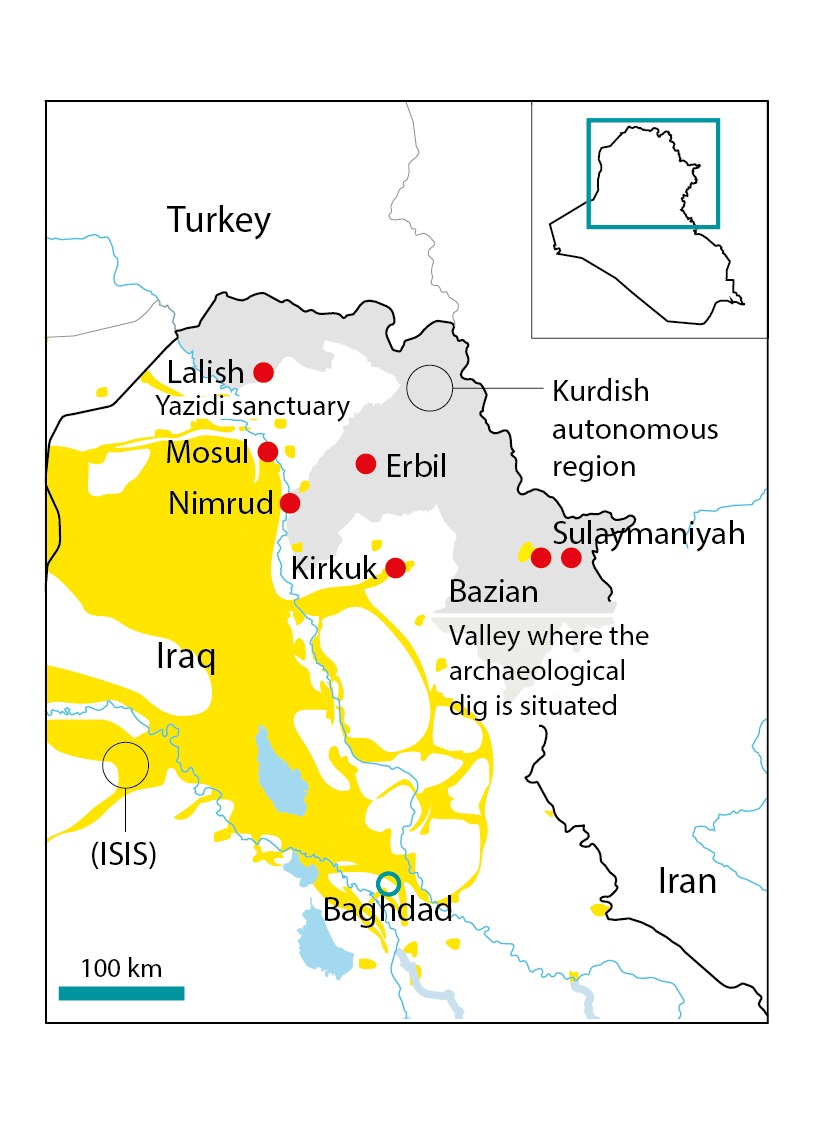
I write this blog post in a format that documents my experience using the digitalharlem.org application.  Now, I chose this mapping project because I lived in Harlem for the summer of 2015.  It is a neighborhood with deep historical roots and offers a Latin flavor that makes up the diversity of Manhattan.  It is a place screaming with life twenty-four hours a day.  I, therefore, wanted to explore a digital version of the neighborhood where I slept, ate, drank, danced and made passing friends.

When you first visit the website it displays a relatively lengthy welcome and instruction message.  My first impressions even before reading the message was that the website was difficult to operate, especially if it needed long instructions.  It was, however, helpful to know that the site provided information of the quotidian life in Harlem between 1915 through 1930.  I immediately thought of Malcom X, but he did not arrive until 1943, which was outside the scope of the website.
digitalharleminstructions

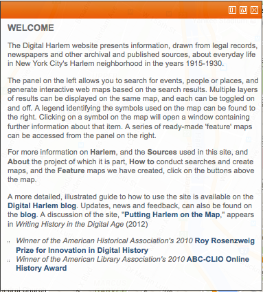
Like most users my age, I had no patience to read the instructions carefully as I wanted to start playing with the site.  My experience with most recently designed websites and applications is to learn by doing, not so much by reading a set of instructions.  Later, however, I regretted not having read them as it was not intuitive enough to make anything meaningful appear on the map.

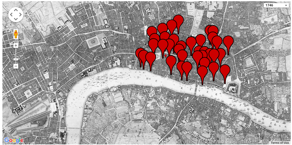
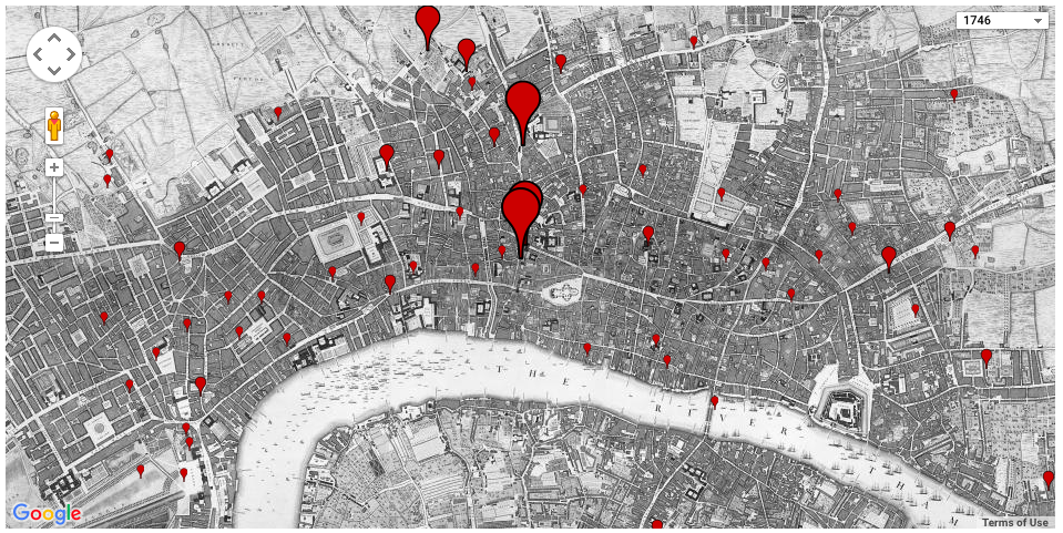
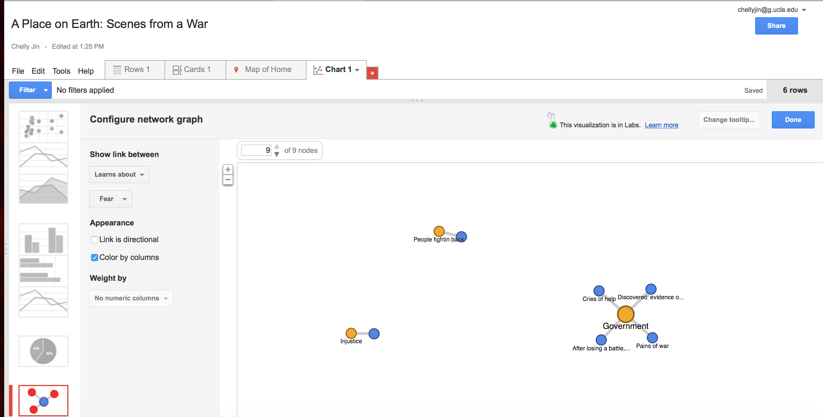
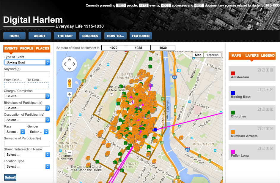
Digital Harlem features a Google map that is configurable to show events, people, and places during African-American settlement during 1920, 1925, and 1930.  You can toggle between those three years as well as change the map between a Google Map view and a historical view.

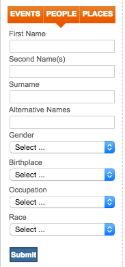
I must admit that it took me a while to learn how to operate the application’s features.  It is not as intuitive as I had hoped.  The panel on the left begins with with a blank HTML that if you don’t pay attention and click on People or Places before exploring the Events facet, you will be lost not knowing what to input in order to get something to show up on the map.

digharlemleftpanel2 digharlemleftpanel

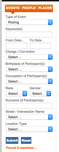
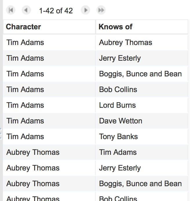
After fiddling around with the application for a bit, I discovered that I could select  events from a dropdown list under the events tab.  I then could add layers to display these events such as Boxing Bouts, Churches, or Number of Arrests in Harlem during 1920, 1925, and 1930.  On the right panel there are three tabs, Maps, Layers, and Legend.  Maps provides you with pre-configured maps or events that can be displayed on the map on the right.

digharlem
Digital Harlem was created by historians as documentation of the everyday life of ordinary African Harlemites within a specific time period.  This project was completed through the University of Sydney, Austria using legal records and has criminal activities and related events as a permeating theme or topic.  The point of view that is generated here is from a disconnected academic scholar relaying on purely documented data collected by the United States or local New York city government and authorities during that time period.

The people must know before they can act, and there is no educator to compare with the press.
-Ida B. Wells

This makes assumptions that the records used are fact, and it is a very dangerous assumption given that the ethos at the turn of the 21st century was hostile toward non-white (Caucasian, Euro-American, Anglo-saxon, etc.) individuals.  In other words, it obscures the racism and pervading discrimination against black Americans that comprise the truth.  It feels like it is a compendium of the popular truth that has somehow become the legal and documented reality that dims the light of truth.  It is a disservice to the people not to have a a caveat making note of the nature of the information provided and the strong possibility that reports and incidents, especially as they are related to those against African Harlemites, are fraught with distortion of the facts.

An alternative map would provide both emic and etic perspectives of the history within the time periods given of Harlem.  No doubt there are drugs, crime, and an underground world in Harlem today.  I do not claim otherwise, I have personally seen it.  It is well documented by African-Americans such as Malcom X  that there was a similar world in  Harlem back then as well.  However, this map leaves out the perspective and realities of African-Americans and only provides a sterile, binary, cold and authoritative view of historians who are physically and culturally disconnected from the subject.  A more compelling map would include the crimes against blacks, the known discrimination during, and all other data that explain the number of arrests, and criminal activity that is now starting to come to light.  It is a much more difficult task, but one worth completing for the sake of humanity.


Locating London’s Past

The website I choose was Locating London’s Past. Locating London’s Past is an interactive website that allows the user to overlay historical data onto maps of the city. The ultimate purpose of the operation was to enable the creation of an accurate point data set. This digital tool allows access to research methods which would normally require multiple trips to the library. There are tutorial videos that explain how to use the site. It is a nice opportunity for anyone doing research to obtain a visualization of the historical data. This is a website where you can find a cross section of information and then plot it on a modern day map. There are 22 of 39 document types that can be plotted. These records include insight into how Londoners lived during the seventeenth and eighteenth centuries.

The site “provides an intuitive GIS [geographic information system] interface enabling researchers to map and visualize textual and artefactual data relating to seventeenth and eighteenth-century London” (http://www.locatinglondon.org/index.html). The interface displays two historical maps — the standard John Rocque one from 1746, and the first accurate OS map from 1869-80, both rendered in impressive detail — and a modern Google map of London. On the left of the screen are the datasets, which cover a wide range of subjects, including parish registers, relief for the poor, voting records, plague deaths, crime records, tax records, court sessions from the Old Bailey, and archaeological records from the Museum of London.

Map of Plague

Map of Plague

This is an example of the Plague in London and places where most people had it.

Map of Arrests

Map of Arrests

This is an example of map of Arrests in London. The bigger bubbles indicate more people who have been arrested in that area and the smaller are fewer arrests in that spot.

The point data provides a valuable resource for researchers of the period, because it allows data gathered by street and parish – tax returns, average age of death, quantity of beer consumed etc. – to be plotted on a map. In short the project has created a resource whereby researchers can more easily engage with the significance of space and location.

I found the Centre for Metropolitan History Datasets fascinating. They included the hearth tax, which was a tax on wealth based on the number of hearths (ovens) in homes, the Coroner’s inquests into suspicious deaths, biographies of executed convicts, hospital records, assistance to the poor by church parishes, maintenance of bastard children records, fire insurance policies, and wills.

I learned that one shortcoming was that the data comes from a wide range of periods, and don’t necessarily correspond to the maps; for example the image above shows plague deaths in wards of the City of London in 1666. This did allow for some interesting comparisons; for example, seeing how the pattern of the city’s population growth in the 18th century was in part influenced by the plague deaths some two centuries earlier.

An alternate map would include additional databases but these are already being considered in future plans for the site. Also, if they could make the map interactive, and when you hover over a bubble for example the Arrests map it would pull up pictures and information about ho was arrested there and their background story.  The staff at the Centre for Metropolitan History are currently working on a linked project, Mapping London, which will create a geo-referenced version of William Morgan’s map of London of 1681/2.


Exploring the Vilnius Ghetto

This week I chose to analyze the ReVilna mapping project. This project focuses on getting the website user to understand the inception, functionality and demise of the Vilna Ghetto by using an interactive map and timeline to “reimagine” the ghetto which was first formed in 1941.

One unique aspect of this digital mapping project is that it attempts to not only provide the user with relevant information about the ghetto; but, also to attempt to truly show the type of environment and living situations that residents of the ghetto were in.  An important feature that contributes to the attempt to put users in the shoes of the residents of the ghetto is the interactive option to “Choose a Story.” This interactive timeline gives users the option of selecting the part of the story which they choose to explore. This is important because the choice to select the order of the narrative can be very useful for humanists exploring and researching a specific subject, such as the Vilna Ghetto. This option is essentially an interactive timeline with images and sub-headings that, when clicked on, link the user to details about the specific time on the timeline (See Figure 1). After clicking a sub-heading, the user is directed to another, even more interactive page with details and information about the lives of the residents of the ghetto, a gallery of images and an interactive map that allows users to explore the geography of the ghetto (See Figure 2).

Screen Shot 2015-11-14 at 8.19.11 PM

Figure 1

Screen Shot 2015-11-14 at 8.24.38 PM

Figure 2

 The interactive map found on the links to the sub-headings allow users to explore the borders that were placed for the ghettos. Additionally, the map shows all the street names and avenues written in German. Another interesting feature of the interactive map is the various pink dots found on specific areas of the map. When a user clicks on the dot, it displays a specific story or piece of information that is relevant to the specific location where the dot has been placed on the map. For example, since the ghetto was split into two, a dot on Ghetto 1 indicated that this was the larger of the sector of ghettos and contained approximately 30,000 residents.

Unfortunately, the map obscures specific details of how the streets and buildings looked. There are some pictures in the gallery of specific buildings and the streets; however, a better interactive map would ideally be one that allows a user to not only view the map from a birds-eye view but also to “be on the street,” just as Google maps has done. I’m not entirely sure if this type of information is even accessible but this would be a great way to improve the digital map, even if it was just in certain places on the map.

Digital Mapping

Screen Shot 2015-11-11 at 1.05.29 AM

ReVilna is a digital mapping project that narrates the stories of how life was like in the Ghetto. Using sources from documents, artifacts, photos etc., points were marked on the map based off of the location stated in the sources’ content.

One of the main reasons why I chose this map, other than its incredible aesthetics, was the concept of storytelling. The site has a play function telling stories based on a topic of one’s choice. Once a story is selected, points are highlighted on the map that correlate to the story as it is being told on the left sidebar. This map reminds me of illustrations used in books to enhance a story. So in a way, this map serves as an illustration that enhances the story being told through the site.

This map draws from the perspectives of those who are narrating the lives of the people living in the ghetto. Although it is true that the map is seen through the eyes of those who have recorded all the information in the ghetto, the true authors of this map should be the people in the ghetto themselves. After all, it is their lives that allow for the existence of the map in the first place.

The map has exposed the type of neighborhood that exists within the ghetto area. For example, there are a lot of health related points located evenly throughout the area. The large amount of health related points imply that the need for medical attention is high in this area. Another example would be the industry points on the map which are concentrated more towards the south of the highlighted area. This can imply that most people in the ghetto probably go to work in the south.

Although this map can tell us a lot, there are some flaws in it. The play function and the site’s ability to move from one point to the next within a certain timeframe provide the potential for storytelling, however, there doesn’t seem to be a story being told. Maybe there is a story and I can’t see it, but the play function, which I thought functions as a start to a story, seems to only serve as a function that starts a timer to a slideshow of random events that occurred in the Ghetto. So that was misleading and a little disappointing.


Network Graph: “Saving Mesopotamia” by Alexandra Lucas Coelho


The short story I chose to read this week is “Saving Mesopotamia” by Alexandra Lucas Coelho. Originally written in Portuguese, this short story is a detailed account of Alexandra’s experiences as part of an archeologist team in northern Iraq in May 2015 to salvage the Mesopotamian artifacts from its potential destruction by the Islamic State (ISIS). This was a dangerous expedition because the site is close to the front line of ISIS, however, in order to protect the artifacts from turning into rubbles like the ancient ruins of Palmyra, this was also a necessary expedition.

MAPAlexandra starts her story by introducing the readers to her some of her fellow teammates, Max Mallowan, Ricardo Carbral, Ana Margarida Vaz, João Barreira and André Tomé by describing to readers their struggles of carrying many surveying instruments from Lisbon to Istanbul then to Sulaymaniyah. She later describes her meeting with peshmerga Commander Ato Zibary to gives readers some backstory of in instability of the city of Mosul due to the military tensions between ISIS and Kurdistan. After the meeting, she met some female peshmergas, Kani, Sahar, Shilan and Aiwan and learned about their misfortunes. When she returned to her base, she meets the rest of her team, Awaz Shadan and Zana Abdulkarim, two Kurdish archaeologists, Steve Renette the Belgian Project Manager and Giulia Gallio, an Italian anthropologist. This team goes on to explore the artifacts of Mesopotamia and meet more people along the way.

Screen Shot 2015-11-09 at 2.26.27 PM

The table above shows the relationship between all the characters present in the short story. Because sometimes there is not direct evidence that shows the relationship between people, I made reasonable assumptions. For instance, although it was only mentioned that Alexandra was introduced to Awaz Shadan, it can be reasonably assumed that, because they are working in the same team, the rest of the team members also know Awaz Shadan.

Screen Shot 2015-11-09 at 1.42.12 PM

This network graph represents the relationships between the characters. I think this is a rather interesting and accurate depiction of relationship between the characters. Not only does it show the different independent connections that Alexandra, the narrator, has, it also shows the close interactions between the people in the same circle. We can clearly see who is in the same group and who is not. For instance, looking at the cluster of interconnected nodes depicting her team, we can tell that they work closely together. Next time, if I redo this graph, I would also note the frequency of the interactions between the characters and it might result in a more interesting graph.

Arseniy – Week 7 – Murakami – Google Fusion

“The Seventh Man” is a deeply touching story about a man recalling the trauma of the childhood death of his best friend. I’ve read a bit of Murakami before but never his short stories so this was a pleasant surprise to find among the readings. Given the very short nature of the story and the minimal set of characters I decided a Fusion Table charting the character interactions would be a reasonable project for this week’s blog.


7th man2


7th man


The narrator, never named be heavily suggested to be the titular “7th Man”, appears to be the most important character to the narrative of the story, as he interacts with nearly all the characters listed in the story, with the exception of K’s parents. K on the other hand appears to be a minor character, despite his importance to the story.

Character Network Analysis: The Girls Resembled Each Other in the Unfathomable

I happened to work together with a classmate on a story that was so convoluted that we needed each other’s help. We chose to read The Girls Resembled Each Other in the Unfathomable. It was very difficult to keep track of the characters and how they related to each other. What made it more difficult was that some names were in a state of question as to whether they referred to the same person or not. My classmate and I followed a prior article analyzing Shakespearean literature and building a bimodal network chart connecting characters that appeared in the same scene. This approach seemed sensible and a good place to start.

We used Microsoft Excel to organize our data. My classmate thought of having two columns, “characters” and the character that “appears in a scene with.” This resulted in having the same character listed multiple times in each column. This provided us with a network chart showing who is connected to whom. My classmate then took that and made further interpretations on that chart. However, I wanted to take it in a different direction.

For my network chart I added two more dimensions and then collapsed them into a bimodal network. In addition to having the number of times a character appeared with another one, I wanted to give some weight to the type of relationship between them, and also make sure that we captured a known familial relationship even thought the two characters did not appear in the same scene. I gave each dimension the following weights. If two characters appeared in a scene only once, I listed them once. If two characters had a familial relationship I listed them an additional 3 times. If they were just acquainted or business associates, I listed then an additional 2 times. This provided weight and strengths to the relationships.

What this translated to in my network chart was that each character was an node and the edge represented the strength of their relationship.  The only non pivotal node in this network analysis is Martinez Salas to Alicia Avila.  Bruno and Alicia Vivar have a high clustering coefficient.  Therefore Alicia Vivar in this network diagram has the highest degree of centrality.

Open Graph In Google Fusion Table

NetworkChart

Week 7: Google Fusion Tables

The short story I  chose was Sisters by Anjum Hasan. The main protagonist of this story is Jaan, who has a prevailing illness that is introduced in the beginning of the short. The anticipated “sister” is Jamini, in which she eventually becomes the maid and loyal friend of Jaan. Because of the turn of this event, we see that Jaan eventually recovers to the point where she goes back to work. However, Jaan had always wondered what it was that had bonded the both of them together. Jamini was extremely loyal but it did not seem so to her own family, in which she had no ambition for her kids. The short ends when Jaan realizes Jamini’s death and goes to her home to discover the reason, however the death is not fully uncovered.

Screen Shot 2015-11-09 at 1.26.04 pm

Mapping the characters and their relationships may help shed light on who we are able to track and who Jaan would be able to go to to find out. The main node is Jaan with accompanying nodes, Jamini, Jamed, Shakti, and Shankar. What constitutes a connection here is verbal dialogue, which implies that the characters know each other and have exchanged some sort of information. It can be seen that Jaan has connected with four other characters but also that two of the characters have also exchanged dialogue – Jamini and Shakti. This is valuable information that it outside the scope of Jaan’s knowledge and another story could be derived from there.

While the network graph is very simple, it also maps out the other possibilities of interaction between characters through dialogue. Its shortcomings are also apparent – that only verbal dialogue is considered here from the story. More analysis could be done to illustrate the dialogue as a positive or negative interaction to depict the biases that may surround information coming from a character. Another possibility could be to map non-verbal dialogue. This could show interaction although it is not explicitly written, which adds another layer to the characters’ connections.

A Place on Earth: Scenes from a War – Week 6


A Place on Earth: Scenes from a War by: Anjan Sundaram

Screen Shot 2015-11-09 at 1.33.23 PM

For this week’s blogpost, I have focused my study on the story of “A Place on Earth: Scenes from a War” by Anjan Sundaram, retelling a story of Sundaram’s experience of uncovering the pains and trials of the Central African Republic civil war. In Sundaram’s travels, he meets many people along his path that slowly give more and more detail to the narrative, that is the warfare between a tyrannical government and the people holding onto what is left to survive.

In my Google Fusion table, I took the main people Sundaram met on his travel across the Central African Republic and recorded who this person was, where this person was from, what Sundaram actually learned about the civil war from the person he interacted with, and the fears that they hold closely to them or the fear that motivates them. Furthermore, by illustrating the connections through a network graph, it shows a visual sense of community for most people have the similar common fear against the government. The only limitations that I feel that this network graph faces is that sometimes, it doesn’t visually express what exactly I’d like it to– in a sense that I would prefer if all the characters Sundaram met were attached to Sundaram as well as attaching the individual learnings the Sundaram gained to there respective people (making a 3-way linear connection); however, Google Fusion Tables only allows a connection between 2 different nodes rather than 3.

Screen Shot 2015-11-09 at 1.28.41 PM

Screen Shot 2015-11-09 at 1.30.35 PM

Screen Shot 2015-11-09 at 1.31.28 PM

Fox Hunting Network Graph

For this week I created a network graph based on the relationships between characters in this true story about fox hunting in the UK written by Tim Adams. To do this I created an edge list of characters. If a character knew of another character, this constituted an edge. Therefore, any two characters could have one of three types of relationships: they could both not know each other, one could know the other (but not vice versa, i.e.. a directional relationship), or they could both know each other.

Screen Shot 2015-11-09 at 1.17.37 PM

I had to make a decision whether to ‘suppose’ that some of the characters knew each other, despite this not being mentioned in the script, for the sake of creating a more complex network. For example, I assumed that Aubrey Thomas would know of Lord Burns (Burns is a public figure who has the power to affect the outcome of Aubrey Thomas’s life’s work, but Lord Burns wouldn’t know of Aubrey Thomas, considering he is a regular citizen. Similarly, I assumed that Lord Burns and Tony Banks knew each other, since they were both Members of Parliament.

Screen Shot 2015-11-09 at 1.21.07 PM

Above is the network graph. The direction of the edges are shown using small arrows where the edges meet the nodes. They are a lot smaller than I would like them to be, but Fusion Tables was proving to be difficult to customize appearances. This type of network graph fails to illuminate the nature of the relationships. Since this story was one about conflict, most of the relationships in the story are either positive or negative ones. It would be interesting to see if it is possible to add that variable into the data.

Older posts Newer posts

© 2026 DH101

Theme by Anders NorenUp ↑