I took a look at the Harlem digital humanities map project. This projects focuses on some events that a typical Harlem resident might see during his or her day to day life. The types of event span from basketball and tennis games to various different kinds of crimes.
http://digitalharlem.org/
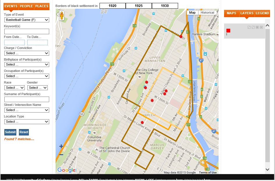
This project uses maps by using a layer system. What the user sees is a plain google map but on top of the map, one could choose to filter out or in certain events that one wants to see and they appear geographically on the map. Also there is the availability of adding in multiple filters and choose which ones are on display at the same time. This map in particular deals about crimes and other events that took place in Harlem from 1920 to 1930.
What stands out the most as a user is that the map has a heavy emphasis on the living borders of black settlement from 1920 to 1930 in five year increments. This map reflects the area in which black people lived and how they expanded into other areas in Manhattan rather quickly. It also reflects, to an extent, what someone of color who lived in Harlem might have seen. There was events such as basketball games to arrests and assaults. It reflects some of the most event parts of what day to day would have been like in Harlem.
What the map reveals, and implies based on the two different layers for accusation and conviction, is that once a black person was convicted of a crime, they cooked then be convicted for another unrelated offense. It reveals a great degree of injustice during the 1920s. What it obscures are the frequency of the events. The project shows what arrests were made if one selects them. It may appear as if there are lots of arrests but I think that data analytics might help put the data into perspective. I think that if the project could display what percentage of the population was accused of crime and how many were convicted of crimes, the data might seem more grounded and accurately portrayed. It also does not have any recommended correlated data sets, if you do not know what you are looking for, you only see a bunch of data points.
If I were to make an alternate map to this one I would have a page where there is interesting sets of correlated crimes. Maybe there was a correlation with a time of less accusations and the black settlement border expanding. Also, I would change the layout of the site so that when one clicks on the links at the top page on the navigation bar, you are sent to a page with detailed information instead of a pop up with descriptions written on it. I will say that I did enjoy the fact that the right hand side of the site had saved filters so that if one wanted to, the user could do their own research on the site and compare different sets of data. I think that as a digital humanities project that this one is successful because it shows humanities scholars something that they would not have been able to see without the map. Without the map, the data seems less clear in terms of the proximity of events, common places of events and so on. Also, thanks to its filter features, once could utilize this project to conduct personal research which is what the digital humanities is about. The digital humanities is merges technology with the humanities to create tools to enhance our evolving understanding of the humanities.