“Exploring the Vilnius Ghetto: A Digital Monument” is a digital humanities project that shows a timeline of events through separate maps of the Vilius Ghetto for each topic including the formation, Akitionen, Judennat, Health & Education, Life in the Ghetto, Art & Culture, Resistance & the FPO, and End of the Ghetto.
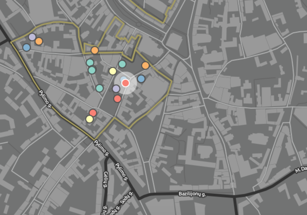
Having different categories for each of the topics makes each of the maps more clean and easier to follow. Also, within each maps for a topic, all of the points on the map are color coded by subjects like children, judicial, religious, industry, leisure, etc. All of these organizational tools make the maps easier to follow, clean, and pretty, however, the maps are so clear cut that it makes it harder for the user to discover their own patterns. In order for someone to do more in-depth research, they may want to compare the “Arts & Culture” map with the “Resistance” map, but since these topics have two separate maps, it makes it very hard to compare and contrast the two.
The map represents the people in the ghetto’s perspective considering I doubt the soldiers would take note as to a point on the map like where some of the children go sledding in the winter.
The map reveals a lot of the daily life of the people in the ghetto. It shows where people worked, food was made, religious services were held, and schooling took place. It also has a timeline and a little passage that corresponds to each point on the map. It makes it easy to understand how small the ghetto was. However, I wish the map included more pictures for each point it described. There is only one picture per point even though a picture describes better than anything overcrowding and unsanitary work environments that the tiny summaries are trying to describe.
If I were going to redo the map, I would have all the points, from every topic, on one map with the option of including whichever topic’s points on the map at a given time. This would make it so that the user can see a bigger picture, compare and contrast different topics, and still get a digestible map at the same time. I would also include at least 3 more pictures per point. Obviously the user would need to do more research apart from just this digital humanities project on the ghetto if they wanted to fully understand it, but if the goal of this project is to give a person an idea as to the layout and what the ghetto looked like, they need to include more pictures.
Overall, I think this map is really well done because of how organized it is.