Locating London’s Past is an interactive website that provides an interface that allows users to map and visualize historical data relating to 17th and 18th century London. Users can overlay historical data against John Rocque’s 1746 map of London , the first accurate OS map from 1869-1880, and a modern Google map of London. Researchers can use this particular digital tool to geo-locate and visualize points, which gives them access to certain non-traditional research methods. With this website, you can layer different types of historical information together into a map that accounts for spatial attributes. The website provides a variety of digital resources and data sets to plot onto the maps provided. Data sets cover a range of topics, including poor relief, plague deaths, crime records, Old Bailey court sessions, tax records, and the Museum of London’s archaeological records. 22 of 39 document types can be visually plotted, and you can layer them over one another to see if any connections or correlations can be found.
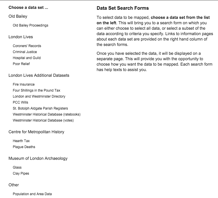
The different historical databases you could plot onto the maps.

This map shows the overlay of population and area data, poor relief records, and the specific point of Garden Court, St. Botolph Aldgate.
This digital tool allows researchers to analyze data gathered and categorized by location (street, parish, etc.) and view it in a format that is more connected and concise. Researches can use this project to better engage data through its spatial features. However, as with most mapping projects, one can identify the certain assumptions and points of view reflected in Locating London’s Past. To me, it seems that the maps and data utilized within this project are geared toward governmental purposes and academics, as it includes such information as voter registration, tax data etc. It seems like it would be a bit difficult for a common person to use who just wants to know more about London’s history.
The maps reveal statistical data and how such data points are relative to one another spatially, as well as against the geography of London itself, across certain periods of time. However, the maps obscure much of the context that these data points lie within. For example, what kinds of crimes make up the “Criminal Justice” data base. The maps also obscure whether there are relationships between the different data points or changes over time. To find such context, you have to click additional links that take you to the dataset itself, where you find text on the data point in question. For me, using this interface was definitely a bit difficult at first. I wasn’t quite sure how to add data points, as the home page just gave me a blank map. I had to do some clicking around to see some results.

After clicking on a certain data point, you are taken to another page that has the data set where you can click more links to show full text descriptions of the context of such a point
An alternate map would be to make the project a bit more user-friendly, one that provides an easier way to get more information and context from the data points. Making it more interactive, like adding abilities to hover over a data point on the map and having a pop-up window with pictures and background info, would make the project more complete. This would be a lot more conducive to the average person who is just trying to learn more about London’s history. Additionally, more types of databases could be included such as databases of art work, restaurants and cultural centers, etc. to widen the perspective on the project so it doesn’t seem as governmental. In any case, the alternate map would connect the information within the historical databases more completely onto the spatial map representation, instead of having them on separate pages within the website. That way, more information would be encompassed onto one platform that could show context, relationships, and connection.