DH101

Introduction to Digital Humanities

Month: October 2015 (page 8 of 18)

Week 3 – L.A. Controller’s Office Dataset: Top City Earners

  • Screen Shot 2015-10-19 at 1.56.54 AM
  • Identify its data types & What constitutes a record in this dataset?

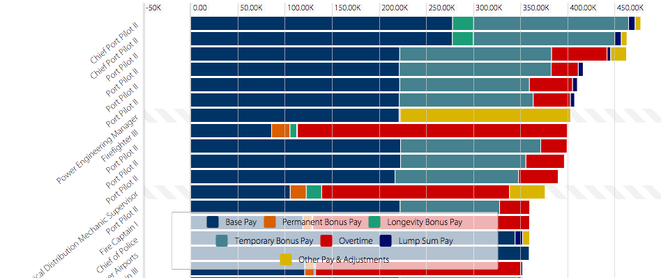
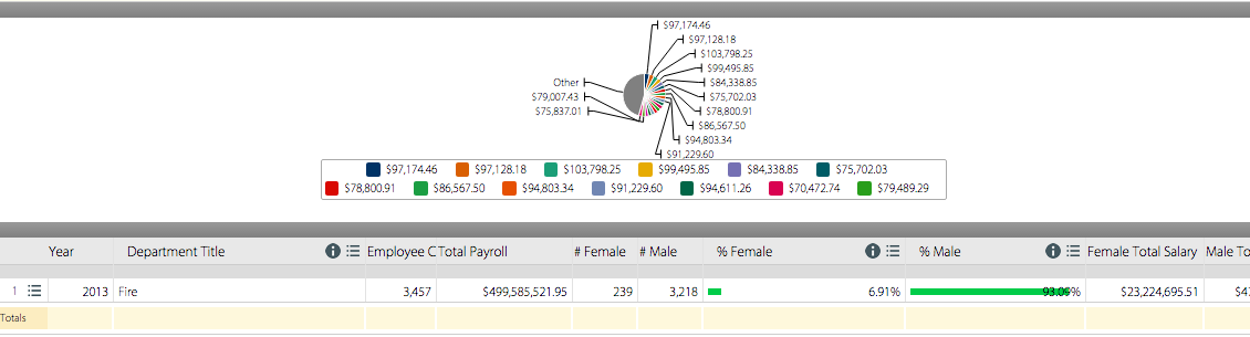
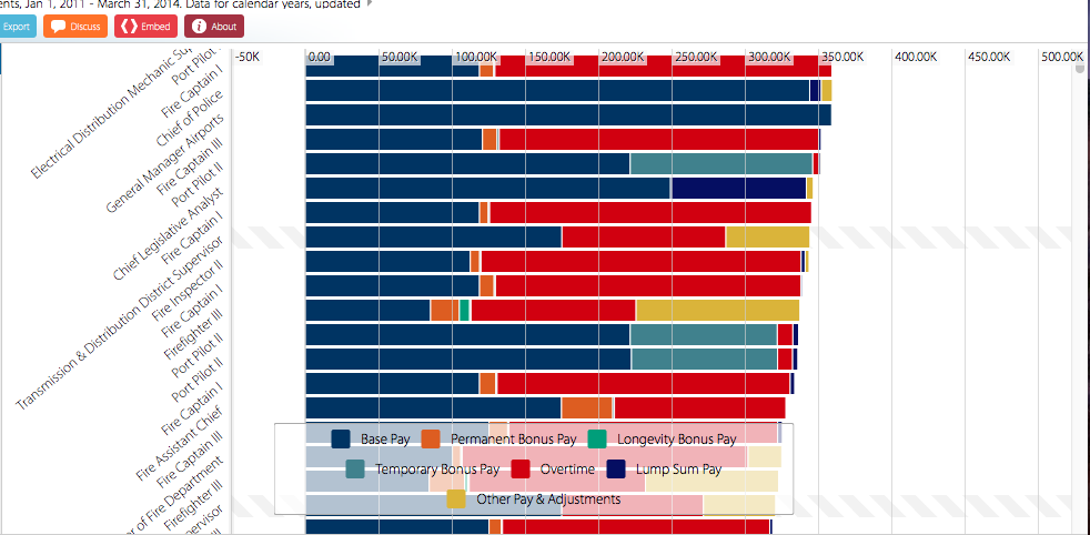
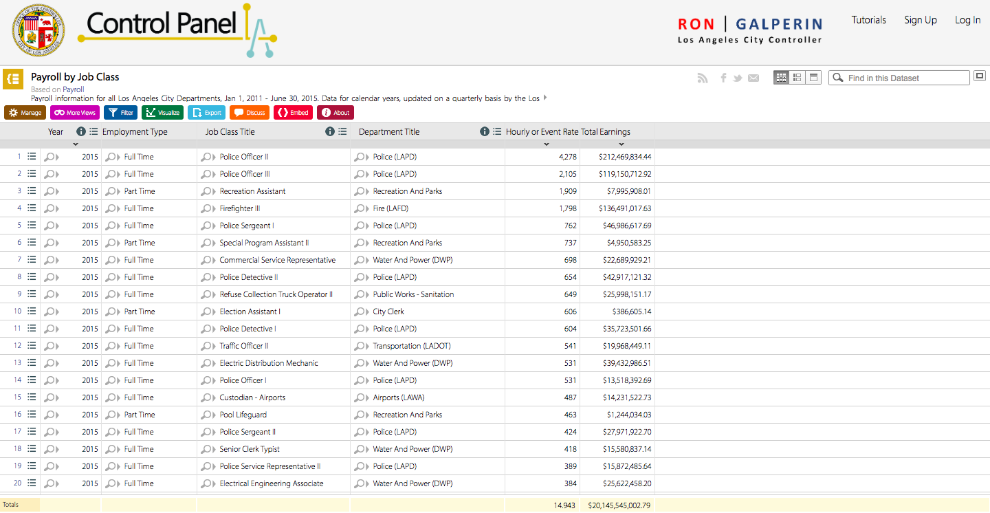
I chose to analyze the Top City Earners dataset from the L.A. Controller’s Office. This dataset represents information about salary for various city  positions. The data type is essentially the salary data and, because of the way it’s organized and presented in this table, it’s also possible to compare individual records to each other based on attributes such as base pay, bonus pay, temporary bonus pay, overtime, etc. (these are color-coded, and you can see the exact amounts by hovering over with your mouse). The content model is the salaries, increasing by $20K for each consecutive column. The record for this dataset is the job title, organized from highest to lowest-paying positions, and also alphabetically and by department.  Overall, the data list is very large, but quite appealing and interactive in the way it’s presented.

  • Use Wallack’s and Srinivasan’s definition to identify the dataset’s ontology.

In their article on mismatched state and community ontologies, Wallack and Srinivasan described a ontologies as “systems of categories and their interrelations by which groups order and manage information about the people, places, things, and events around them”. Put differently, an ontology is a way of representing data so that you can see more easily if there are particular relationships and/or patterns among the various categories. The ontology for this dataset is salary amounts and types for different positions.

  • From whose point of view does this ontology make the most sense? (Another way to ask this question: Who will find this data most useful and illuminating?)

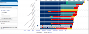
This dataset seems to be useful for community members looking at jobs and salaries in the city. It’s helpful both for people currently employed and looking for a raise, or for potential employees. On the left side, you can filter the options. The filter, however, doesn’t seem to be very well made because typing “transportation” into the simple search box, for example, yields no results although there’s undoubtedly several jobs in transportation with the city. The Advanced Filter option is programmed a little better as it allows for narrower searches.

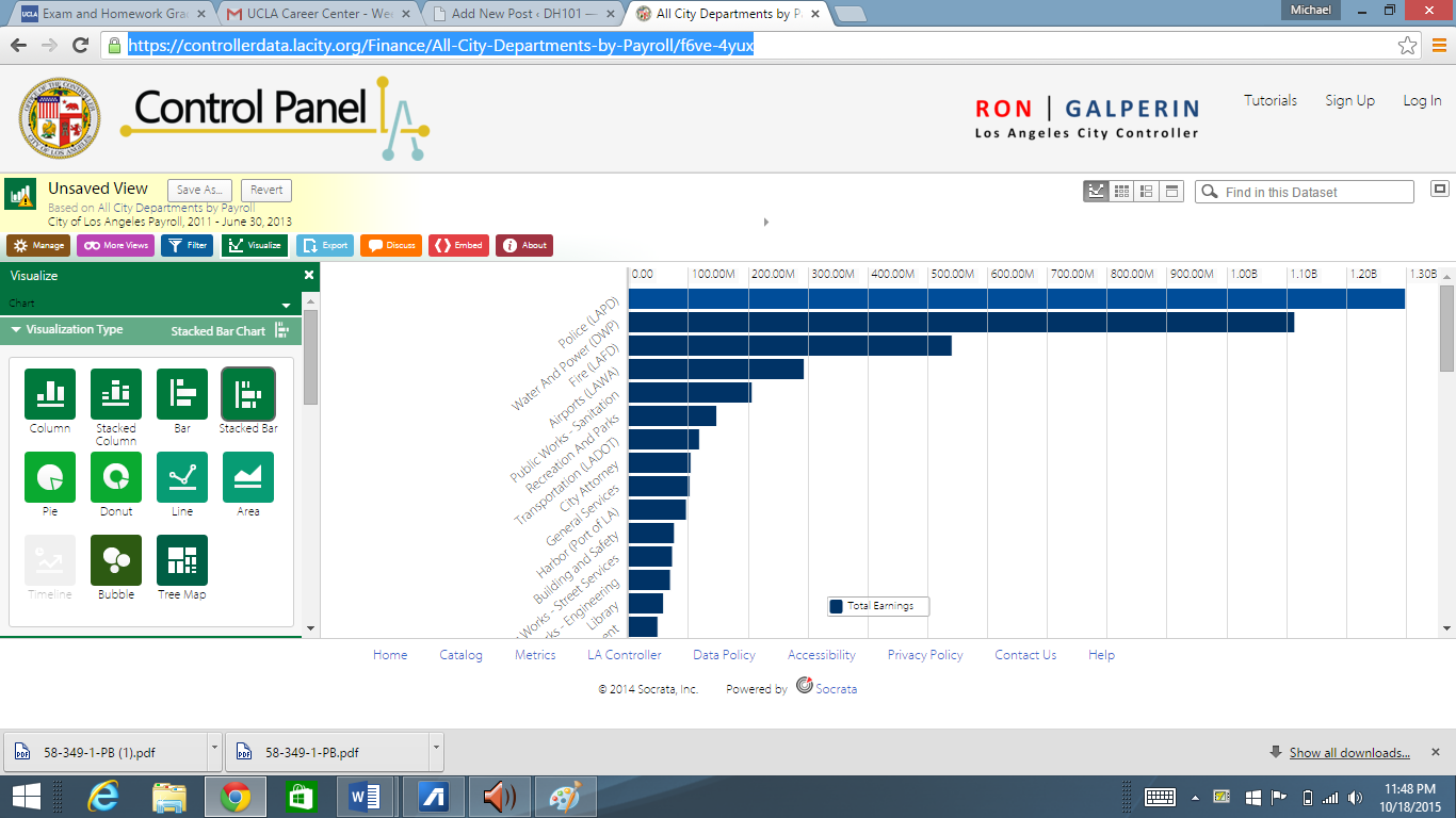
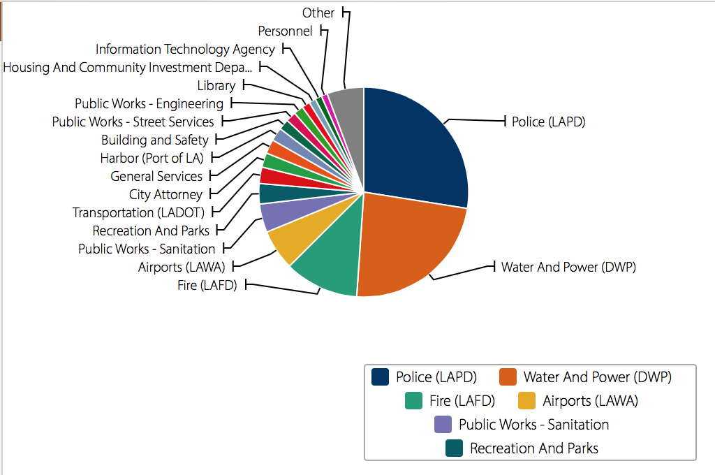
Furthermore, the dataset could be useful for city officials to know how the salary budget is being allocated and which positions demand higher base pay and which positions rely more on overtime pay.

  • What can this dataset tell you about the phenomenon it claims to describe?

The dataset most definitely shows what it was intended to. By looking at the top twenty or so records, we can see that the top earners in the city are Chief Port Pilots. This amount, however, includes a large portion of temporary bonus pay (turquoise bars) in addition to base pay (navy blue). But if we look only at the base pay, the Chief Manager Airports actually is paid more. So, it’s important to keep these attributional details in mind when interpreting this table.

  • What gets left out?

Perhaps adding a category to organize job salaries by zip-code would be helpful. There may be notable salary differences for the same positions for people working in Central L.A. versus people working in Culver City or Norwalk.

  • Imagine you’re starting over with data-collection and describe a completely different ontology, from someone else’s point of view.

The dataset seems to accommodate both city officials to see how salary budget is being allocated and for community members looking for jobs with the city. If I were to collect the data from scratch, I would also include the average hours per week that people in these positions work. I would probably include this information in the little text bubble that pops up when you hover over the record with your mouse. In addition, I’d also look into possible gender differences and educational differences. These could be added to the records, so for each position, there’d be additional records corresponding to gender and level of education.

LA Controller’s Office: Top Earners (Payroll)

Who would have guessed that Los Angeles top city earners are Chief Port Pilots potentially making over $450K a year according to the Los Angeles City Controller’s office .  The data found on this site displays “payroll information for all Los Angeles City Departments” from January 1, 2011 through March 31, 2014.  These data were updated on a quarterly basis and contain a very interesting array of jobs and figures.   I was very curious to know who is on top of the city’s payroll, which is to say what job title earns the most!   Maybe it’s not to late to switch career paths.Screen Shot 2015-10-18 at 7.22.44 PM


I was also curious to know who is at the bottom of the payroll scale, so I used the sort feature to resort the data in ascending order by total earnings.  This provided me with one of the most unexpected results.  I received records showing a negative amount.  A Planning Assistant, for example, showed negative earnings of more than $30K!  Looking at the chart legend more closely one can add that this amount is mostly attributed to “other pay & adjustments.”  A an even closer inspection reveals that there is a $150.00 annual earnings amount.   I feel like there is missing information because how can someone work to earn only $150 a year and owe more than $30,000?  There is more to the data than is visualized here.  Screen Shot 2015-10-18 at 8.48.24 PM


Pardoning the potential outliers, I really like that the system is intuitive enough to use quickly.  I also appreciate its power and flexibility enabling users to “slice and dice” the data.  For example, some of the available data types related to earnings that a user can sort through, filter, and compare include Base Pay, Permanent Bonus Pay, Longevity Bonus Pay, Temporary Bonus Pay, Overtime, Lump Sum Pay, and Other Pay and Adjustments.   Other data types include Year (of earnings), Department Title, Job Class Title, Pay Grade, Employment Type and more.


The system’s power derives from the flexibility to quickly change criteria to sort by and the visualizations from graphs, to tables, to list view and grid views all while maintaining the criteria you had selected.  There is a “discussion” functionality that enables users with the ability to write comments, you can embed HTML, and even save and export your data to a good number of popular formats.  The cherry on top of is that you can share any dataset on social media.  What more do you want?  Well…actually a lot more…


As powerful as this system seems to present quantitative data, it lacks in providing human data or contextual data.  I began to play with the tool by looking at the top and bottom earners.  Although I was able to successfully find them, it raised more questions because of the lack of context.  Why does a Chief Port Pilot II make the most?  I could not find data type that could point to the answer.  Looking at the top earner or record in the dataset in itself may not be enough to answer the question.  I can however, say a few things about this particular record.  Although the total earnings in this record list a total of more than $450K, we can break it down to what type of pay contribute to that sum.  According to the record, a Chief Port Pilot II makes a base pay of $258,096.00, a longevity bonus pay of $22,354.64, a temporary bonus pay of $164,429.12, a lump sum pay of $6,947.05 and an adjustment pay of $5,954.00.  This provides us with a sense that a Chief Port Pilot II needs to perform or somehow maintain a level of work in order to achieve the $450K earnings mark.


According to Wallack’s and Srinivasan’s ontologies there are mental models that encompass a system of categories that a particular group of people uses in order to experience and make sense of their world or reality.  These categories dictate how they term, phrase, and interpret their experiences.  In other words, there is a set of data types that are featured in the Top Earners data set that make up the ontology of the group that created the database: The Los Angeles City Controller’s Office.  They are most concerned with the data and it was collected and organized from their point of view.  In Wallack’s and Srinivasan’s parlance this could be considered the “state-ontology” as it seems to be a “state-created information system” that reflects the earnings of possibly a large number of “local communities” (Wallack’s and Srinivasan’s 2009:1).  These local communities may have a completely different ontology that does not feature the data types listed in this data set, but that may provide context and meaning to these data.  In anthropology this is the difference between an etic (state-ontology) and an emic (local-ontology) perspective.


On the surface the dataset does provide a very quick glance at the top city earners in the Los Angeles area.  You can see very quickly that the maritime commercial industry–one of the local communities represented in the dataset–is very lucrative, but it does not tell you why.  The context and “local communities’ representation of their contexts” is left out.  Further investigation on the Internet may provide a mental map or model that sheds light on the experiences and ontology of these top earners, namely the Port Pilots.  For example, according to a Bloomberg article written in 2011, the Port Pilots that were interviewed feel that they “perform an important function and [they] do it safely” (Palmeri and Yap 2011).  Furthermore, if we take in account the risk of a tanker such as the Exxon Valdez type vessel potentially spilling oil costing billions of dollars to clean up, we start forming a picture or setting a frame of reference that provides us with perspective and possibly understanding as to why they are paid over $400,000 a year.  These Port Pilots need to be extremely well trained, have “years of experience and detailed knowledge of the harbor, working in dangerous conditions,” and be held accountable for anything that goes wrong.  Finally, the value comes into perspective when they, the Port Pilots, state that “there’s 7 billion people in the world and less than 10,000 who do this” (Palmeri and Yap 2011).


From a Port Pilots perspective and his community of maritime experts as well as the people that depend on their skill for their lives (not to mention the environment), there are quite a few data types missing in the dataset that provide context of their work.  With out this context one can quickly draw the wrong conclusions.  One can even be tempted to be upset at the fact that Port Pilots make so much money and wonder if the tax payer is responsible for the bill.  By the way, according to Bloomberg the tax payer is not paying their wages.  From the Port Pilot’s point of view, I can imagine them wanting to include at least the following to the ontology: years of experience, locations of experience, who is paying them, risk level, exposure level, experience rating, training, education, largest vessel maneuvered, average vessel maneuvered, number of berthing operations, number of unberthing operations, and things related to their mental model of their job experience.


BIG DATA a is a term that refers to a large quantity of (sometimes complex) information, typically quantitative, and often times failing to provide a “thick description” of phenomena (Geertz).  Furthermore providing insight and matching state and local ontologies is probably another frequent failure.  We are coming up on technological capabilities and models that are beginning  to provide a contextual and digestible “thick description” out of big data.  What this means in this particular dataset is that the state-ontology and local Port Pilot communities’ ontology will be able to someday leverage the same datasets without having to learn each others ontologies thereby making the data represented richer, more relevant and meaningful.

Wage Gaps Between City of LA Workers

The Gender Breakdown of City Workers by Department is a dataset that has been released to the public from the L.A. Controller’s Office. More specifically, the dataset is an analysis of 2013 full-time employee earnings by gender across the various departments of the City of Los Angeles. Presented initially as a table, the site gives you other visualization options for the data, such as a bar chart, line chart, or pie chart.

Screen Shot 2015-10-19 at 1.25.24 AM

Screen Shot 2015-10-19 at 1.31.14 AM

Its data/content types include: year, department title, employee count, total payroll, number of females and number of males (in each department), the percentage of females and males, female total salary, male total salary, female average salary, male average salary, percentage of payroll to females, and percentage of payroll to males. This dataset has 41 rows, or 41 records. What constitute a record in this dataset is a particular City of LA department and its individual values for each relevant data type corresponding to that specific department.

Wallack and Srinivasan define ontologies as “systems of categories and their interrelations by which groups order and manage information about the people, places, things, and events around them” (2009: 1). In other words, ontology is the term that represents the way in which real-world matters are labeled, categorized and interpreted. This particular dataset’s ontology can be identified under multiple categories, such as economic (payroll) or more social (gender). This data has also been categorized by the LA Controller’s Office itself, as it’s been tagged under such categories as “equality”, “employees”, “demographic”, “women”, “wage gap” and more.

Those who would find this dataset the most illuminating would probably be activists for women’s rights, policymakers, and academics focusing on gender studies. More specifically, people who are interested in researching discrimination in the work place and discrimination amongst different genders. This dataset could be used as hard, statistical evidence in the fight against the wage gap, the glass ceiling, and inequality in general.

In reference to the year 2013, this particular dataset shows that female employees working in a number of departments in the City of LA earned a lower average salary than their male peers in their respective workplaces. For example, in the Department of Cultural Affairs, females had an average salary of $58,563.10 while males had an average salary of $79,172.67—a difference of a little over $20,000. Most of the records in this data set fall under this description, with females earning less then men in a high number of departments. In addition, in workplaces where females have earned a higher average salary than males, the difference is small when compared to the gap when males have higher wages than females. The dataset also shows the number of females to males in the departments, which also can have a large difference in count. This dataset definitely tells a lot about the controversial phenomenon of the wage gap between gender in this country, which exposes a type of discrimination that is still in effect in governmental departments in such an influential and progressive city as Los Angeles.

Even though the dataset is fairly complete in payroll statistics amongst females and males, there are a few data types that have been left out. For example, ages of the workers might add more valuable information to this dataset. Perhaps, seniority level/years on the job and education level of the employees would help illuminate the issue, as well.

If I were to re-do this dataset and start the data-collection all over, I would focus the ontology on age/seniority level and relevant education/experience. My data/content types would probably include age, position, number of years employed in the department, salary, and education level/relevant job experience. I would then attribute that data to the specific gender. By doing so, one can see how time and experience can affect job earnings. Changes and transitions over time, including promotions, could be interesting information to apply to the wage gap issue.

Week 3: LA Controller’s Office Payroll Top Earners

For this assignment I looked at the LA County Controller’s Office Payroll Top Earners is a dataset which shows a chart of LA city workers’ occupations and salaries recorded in 2014.

Screen Shot 2015-10-18 at 10.42.45 PM

The bar chart shows the base salaries of occupations in which you  work for the city of Los Angeles in dark blue. The graph also includes permanent bonus pay, longevity bonus pay, temporary bonus pay, overtime, lump sum pay, as well as other pay & adjustments in various colors to distinguish them from each other. You can stroll down through the vast number of top earning positions employed by the city, which was pretty eye-opening for me since I was unaware that a lot of the jobs even existed let alone their earning potential. The site offers different search features in order to filter through the expansive chart which is organized with the highest possible earning value at the top and lowest at the bottom.

If according to Wallack and Srinivasan ontologies are the “systems of categories and their interrelations by which groups order and manage information about the people, places, things, and events around them” then the information here is ordered by the position and it’s ultimate earning value for the year of 2014. The graph would be probably the most useful to prospective city employees looking for the possible earning potential or city employees seeking more information on promotion pay as well as bonus pay in the future. The ability to filter through based on department is especially useful to job seekers since it allows them to focus solely on the department where there interests are.

The dataset definitely openly informs the public of the top earning salaries for various jobs employed by the city of Los Angeles. The graph fails to provide more of what you might refer to as contextual information concerning the positions. For example, though overtime is one of the color-coded categories on a graph, we are left uniformed concerning the amount of hours in each work day for each position. Users are also left without the job description of each position which is some cases most likely unnecessary like with firefighters, but with even the highest earning position, Chief Port Pilot II, it’s unclear what the job involves on a day to day basis meriting such high earnings or if it even does merit the earnings, though that might be more of a subjective interpretation. The chart also leaves out the cost of living in LA which would contribute to what some might consider inflated salaries.

If I were starting over with data collection I might look more at the employed individuals as well as their salary. I might also try to gage the community value for each position in relation to the amount they earn to search for any discrepancies and possible instances of overpay.

Los Angeles Data Set Control Panel

The absolutely fascinating though suspicious data set can be found here from the Los Angeles Data Set Control Panel. The direct link can we found here:

https://controllerdata.lacity.org/Finance/All-City-Departments-by-Payroll/f6ve-4yux


Control Panel

Data Types

                The type of data represented in this dataset is the payroll of many of the different city departments, presumably paid for by taxes from L.A. taxpayers (the common citizen). This dataset is completely open to the public, which provides a wonderful resource for taxpayers to see exactly where there money is being distributed to. These data points take into account payrolls from 2011 to June 30 2013.  The data is represented by showing the records of how much money in total was paid to a variety of city departments; take the Los Angeles police department or the Water and Power department. Combined, these departments were paid more than the rest of the departments on the payroll put together. The data can be represented in a multitude of ways, as evidenced by the attached photograph; look at the left side of the screen. You can choose to represent the data in a pie or chart, or a bar graph, or even as bubbles. All of these methods of displaying the data help serve to illustrate the data that is accessible to the viewer, and in this regard they have done an excellent job. Have trouble conceptualizing data in a pie chart? Well the creators of this data set have been generous enough to allow the user to choose a way to examine the data in a way that makes it the most visually discernible for them. The bar graphs in particular do an excellent job of capturing the large gaps in payroll across the varying departments, as the length of the bars appear meager in comparison to that of the leading aforementioned departments.

Ontology

                Ontology is a philosophical term literally means the nature of being. In a less abstract digital humanities sense, Wallack and Srinivasan discuss ontology as multiple ways a data set can be interpreted depending on the group of individuals examining the data. Differing groups may choose to interpret the data in a way that is more compatible with the specific information they wish to acquire. There is no rigid ontology for the data set; rather each groups inherent biases will get to pick and choose the way in which they interpret their data, and how this data offers a more broad picture of the large gap between some departments and not in others.

As to who will find this ontology as making the most sense, it seems rather obvious to me that it is those who are merely slivers in the pie chart that should be most profoundly affected. It is incredible that just from bar graphs and a crunch of numbers, one can discern clear inherent gaps between various city departments. In this sense, Digital Humanities can inspire social movements in which, say, the librarians are making significantly less than other professions that are not eons more important than librarians. This may inspire the political action necessary in order for librarians to demand a more fair share of the community payroll. This is fascinating to me that merely a list of data points can reveal obvious pay gaps across different careers, and hopefully aspire to acquire more funding (it should be noted that here, I am biased. I found libraries to be an extremely important social service that seem to be slowly dying.)

Data Set

                I can infer, and am rather shocked, that so much of our tax payers money is put into LAPD. This might be a stretch, so bear with me here, but I would argue that librarians may not be quite as important as police officers in terms of protection, but is this all that matters? I would adamantly argue that the spread of knowledge is just as important as our safety. The phenomena gives me this unsettling feeling that way too much money is being put into public safety as opposed to the fostering of knowledge itself.

The main thing that gets left out is the payroll of higher state officials, and those in power. I think taxpayers would absolutely want to know how their money is being distributed, especially by those who are responsible for dishing out the payrolls. If the date set chose to include a few government officials, this may assist in taxpayers regaining a trust in their respective state officials. True, a state official is not a city department, but by including this information a common man would  be able to contrast the payroll from city departments from the state officials, which would contribute to the individuals judgment on whether these payrolls are fair and equitable.

If I were to start over I would definitely describe a different persons ontology. The ontology here, the purpose for its being, seems to merely show differences in payrolls; this is too superficial for me though. I would prefer to see an ontology that instead of showing tax payers distribution of funds, shows the inherent gaps between varying aspects across the city departments. I believe that this kind of ontology would appeal to the lower class as they are (arguably) unfairly  getting paid significantly less, and would bring attention to the disparaging gaps. This is one of the many ways digital humanities is able to inspire social reform.


City Budget Expenditures

The City Budget Expenditures Records consists of Los Angeles’s spending from the year 2012 up until 2015. There are a total of 16,001 records made since 2012 with the expenses ranging from $90.00 to $1,000,000,000.00.


Each record consists of an expenditure, including year spent, exact amount, department name, and 13 more categories. Wallack and Srinivasan’s belief that an ontology informs its community and allows individuals to work as a group. In this case, the transparency of the city’s expenditure allows individuals to account for the city’s budget and to prevent theft and corruption.


The city’s finance and treasury department would find the data sheet most useful because they help keep the city’s budget in balance. The dataset logs in detail about where the city’s budget is put. It tells the public how much money was spent, if the project needed more funding, and which department spent the money.


However, there’s no information on why the money was spent and if the project was completed. It’s definitely better if the viewer knows why the money was spent and who was in charge of the project as to protect from fraud and overspending.
If we had to create a whole new budget sheet, the budget would include date, name, expenditure, location, reason why, expected done date, and total budget of the year. This would table would be geared toward the public more, categorizing the expenses into districts, and making sure it’s reasonable.

LA Controller’s Office: What We Buy

The dataset I chose to explore from the LA Controller’s Office was the What We Buy Data Cards.  The cards provide data for the 15 items that the city of Los Angeles spends the most money on.  These items are an AW139 helicopter, motorcycle patrol boots, golf carts, soccer balls, radar speed signs, basketball nets, ballots, thermoplastic paint, graffiti buster, TORO riding motors, Federal L.U.S.T. Tax, fire hoses, high visibility white traffic gloves, mops, and large frozen rats.  The data cards in this dataset constitute constitute individual records.  Each data card explains what the item is, how much they have spent on it, why they buy it, and a fun fact about the item. At the bottom of the card, there is a button that takes you to the control panel to explore the data even further. The spreadsheet provides specific data including the date the items have been purchased, how much it costs, the amount they bought, where they bought it and more.  This data can also be visualized in multiple ways such as pie charts, timelines, and bar graphs. Screen Shot 2015-10-18 at 11.17.42 PM

Wallack and Srinivasan’s definition of ontology is a “system of categories and their interrelations by which groups order and manage information about the people, places, things, and events around them.” This data set’s ontology is organized by the data cards.  The LA Controller’s Office organized the categories by the individual item itself and within each category it dives into more depth about what/how/where the money was spent on that item.  I think this ontology would be the most illuminating and useful to the curious eyes of the general public.  The data gives a brief overview of some of the most outstanding purchases of the city without going in to extraneous detail. I think what this data set lacks is background information for why it chose the items it chose.  To me, it does not seem like they are the items that LA spends the most money on because the data cards are not ordered in any numerical order. This ontology is categorized based on the view of the LA Controller’s Office, which chose to display very specific details about their expenditures.  If the data was recollected and categorized into an ontology from a different point of view, different items might have been chosen to display expenditures. 

Blog #3: LA Controller’s Office Data

I looked into the data base of street grades from the LA controller’s office. This data base ranks all of the streets of Los Angeles based on street pavement condition.

street data

http://bss.lacity.org/NeighborhoodCouncils/Street_Assessment_Map/map.html


The data is a organized as a map that visually portrays the pavement condition  A record in this data base would be the data of a street along with a PCI (pavement condition index)  rating.  Wallack and Srinivasan define an ontology as a group of data or information. The ontology of this data is a government sponsored rating of quality of the streets in Los Angeles. A view of this ontology would make the sense to someone who is working on a city budget for the city. This way one could determine where resources should be allocated based on need. For efficiency one could also searched for contracted street cluster that the city should take care of.This data shows phenomena like what general areas have streets with better or worse street condition.

One of the major issues that I see with the chart is that it is government rated. This means that the condition of the street is biased. Also, it lacks a way to measure street usage/popularity. Without a tool like this the city might send resources to fix a street that is in poor condition even though it may not be used by anyone. That being said, another set of data that would be useful is a tally of pedestrian complaints of streets to know what streets mean most to people who use the streets. I think that  a tool like this would help the government, who are most likely the ones that are using the data to make decisions that effect an entire city, to know where resources she be relocated and the amount needed in order to improve efficiency.

I think the if I were to start over with data-collection, I would continue to survey they streets on standard that would include both the street condition . I think that way, the data would be more true to the people in terms of their point of view. That being said it would be important to survey everyone who uses the street. This way the data is altered by biased feelings.  I might also track at what times the streets are busiest so that the data might be more valuable in terms of when repair should be scheduled. In this way the data can help people by presenting information that is valuable to properly decide what the best course of action for the people who use the streets.

Payroll by Job Class on the LA Controller’s Office Website

I chose to analyze the Payroll by Job Class  dataset on the Los Angeles Controller’s Office Website which offers payroll information for all Los Angeles City Departments from January 1, 2011 – June 30, 2015. The date is organized and inputted into a table format with five content types and hundreds of records to be analyzed. The dataset also offers the option to visually compare the differences in a column, bar, pie, donut or line graph format which is effective when comparing various theories of the amount a specific job class earns. Each record, for the most part, is a different job class title. Each record in the data set has a content type of the year, employment type, job class title, department title, hourly earning and the taxable income for the year.

Screen Shot 2015-10-18 at 9.09.29 PM

Wallack’s and Srinivasan’s definition of ontology applies to this dataset because it organizes earnings information about the jobs within the Los Angeles City Departments. This is particularly important and a great asset that this dataset offers because it is a public dataset which is available to any individual seeking potential earnings information. I think this dataset is very useful to the general public because it gives job seekers a chance to analyze the different job fields and earnings potential they may have when entering the task force. This is also useful for individuals who may be in the field of advising college students about their careers because it gives them a better understanding of the job fields that are thriving versus those that are not as popular, which will ultimately benefit their immediate audience or students.

The dataset states that it will provide payroll information about jobs within all Los Angeles City Departments. After analyzing the dataset, one would be able to find that Police Officer II makes the most amount of money from the list. One foreseeable problem with this dataset is that is only offers earnings information without any demographic, gender or educational information about the individuals holding the position. This poses an issue for analytics purposes because it leaves several unknown variables which could prevent a full analysis for research questions.

Although the dataset offers a lot of relevant information, if I were to start-over with the data I would attempt to include demographic information of the individuals holding the positions. For example, gender, race, age, experience and educational degrees would be some data that I would collect and put into the dataset. I feel that this information would be useful for anyone researching more in depth into who actually holds these positions so that the current information could be brought to the attention of the community. This would be great to present to high school students so that they could analyze and see if the specific field matches their interests and potential earnings after high school.

L.A. Control Panel: City Departments Payroll

Screen Shot 2015-10-18 at 8.19.59 PM

Identify its data types.

The data presented under “All City Departments Payroll” on The L.A. Control Panel is administrative data representing the total earnings of different departments in L.A. in the form of a pie graph.

What constitutes a record in this dataset?

A record in this data set consists of a department in LA that uses taxpayers money to operate, the total earnings of that department, the year, and earnings over regular pay.  Each record is shown as a different color in the pie chart in order to distinguish them, but there are also other graph visualization options in order to see the records organized differently.Screen Shot 2015-10-18 at 8.18.52 PM

Use Wallack’s and Srinivasan’s definition to identify the dataset’s ontology.

Wallack’s and Srinivasan believe ontologies “negotiate boundaries between groups” meaning that official(meta) and community ontologies can tell different stories about the same data. Since the data on the Control Panel was organized and edited by someone working for the government of L.A., this dataset’s ontology regards the states employer’s interest.

From whose point of view does this ontology make the most sense? (Another way to ask this question: Who will find this data most useful and illuminating?)

This dataset seems to be made for the public in order to see how their tax money is being used.

What can this dataset tell you about the phenomenon it claims to describe?

This dataset shows that the police (LAPD) earns the most money and that water and power earn the second most.

What gets left out?

It’s interesting that the data doesn’t show exactly where the money goes within each department. For example, a taxpayer may like to see that the police department has the greatest earnings which implies a lot of money goes into keeping the community safe, but may not like to see that a solid portion of the money that goes into the police department is used to pay firearm trainers . I’m not saying this is the case, but I’m using it as an example to show how limiting the data to showing payroll by department could be strategic by the state.

Imagine you’re starting over with data-collection and describe a completely different ontology, from someone else’s point of view.

A different ontology option for this dataset would be to  categorize payroll by job type rather than department. It would be cool to see which kinds of jobs in each department earned the most/least money rather than just by department. Organizing the dataset in this way would be more beneficial for people looking for a state job because they can identify jobs based on skill type than on department type. Screen Shot 2015-10-18 at 8.18.52 PM

Older posts Newer posts

© 2026 DH101

Theme by Anders NorenUp ↑