DH101

Introduction to Digital Humanities

Month: October 2015 (page 9 of 18)

LA Controller’s Office: Looking at the Top Earners

Today I had a look at the LA Controller’s Office . The great thing about this site is that it is all “Open Data”– that is, data is made accessible to the public. People are able to open, download, and shared regardless of any relationship with the LA Controller’s Office.

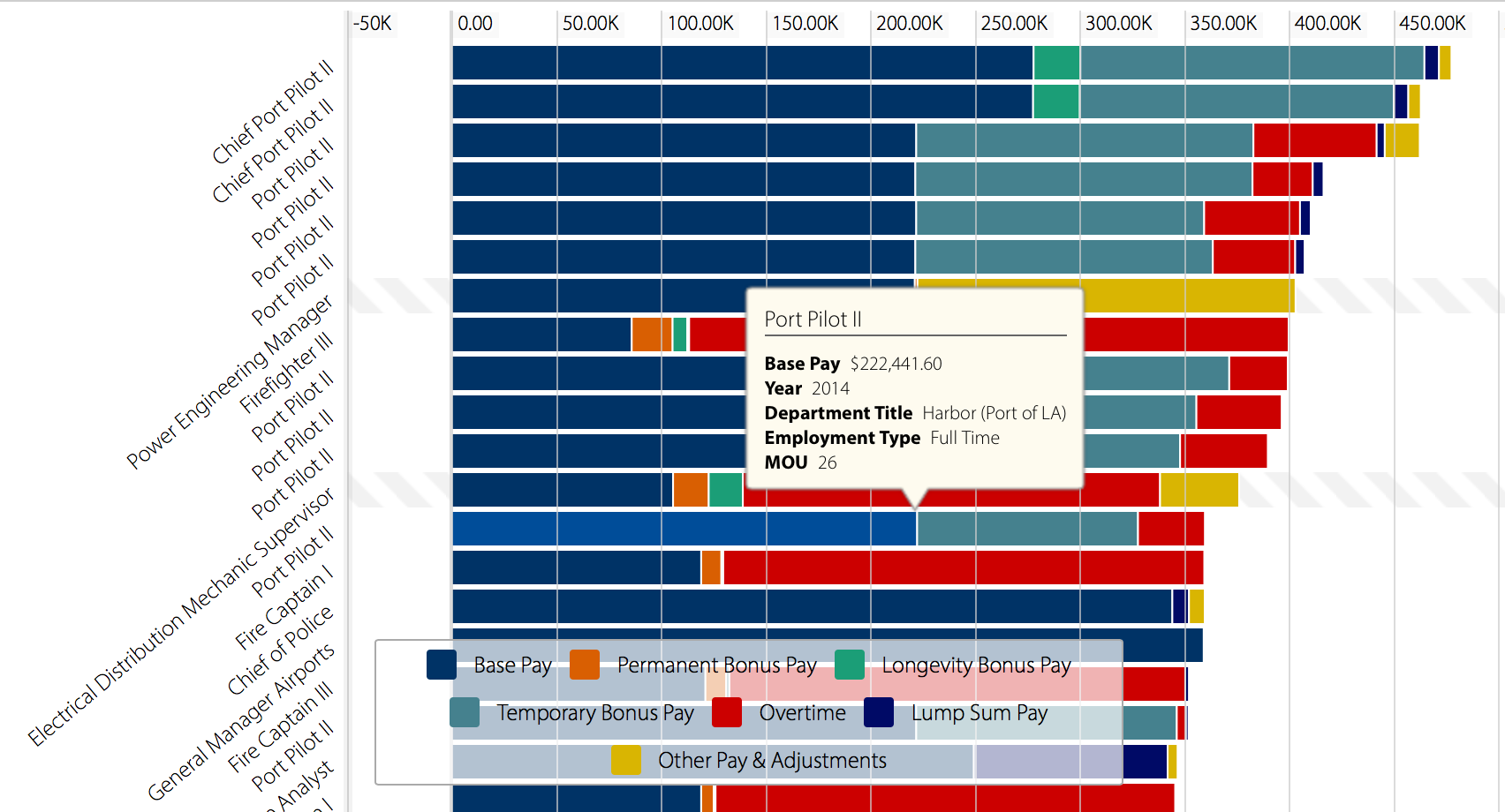
I chose to dig into the Top Earners category, and right off the bat, I can tell that this dataset would be an interesting one, given that the first thing I saw was a massive bar chart! The purpose of one of the data types being a bar chart is to demonstrate the maximum earnings or expected earnings of government workers, and the multiple colors denote different types of payment. A legend accompanies the chart to allow for readability of the bars while scrolling downward.

Screen Shot 2015-10-18 at 7.22.44 PM

What the bar chart looks like; you can scroll down it for miles! The breakdown of the legend is: dark blue for base pay, orange for permanent bonus pay, green for longevity bonus pay, turquoise for temporary bonus pay, red for overtime, royal blue for lump sum pay, and yellow for other pay and/or adjustments.

As one can see, it’s definitely a lot to take in, but the use of the legend definitely made this dataset a little more easy to understand. Furthermore, the estimates of pay constitute as records within this dataset; data has been arranged and categorized accordingly, such as the payment that applies to pilots, but taken farther by description such as “chief port pilots” and just “port pilots.” Interestingly, chief port pilots make the most pay out of all government jobs; their base pay alone is about $277,000! Another reason why this is a record is that the data set is supposedly counting yearly payment, so information had been researched and noted over a course of time; in this case, from the years of 2011 to 2014.

The dataset’s ontology is similar to what Wallack and Srinivasan described as “a descriptive and classifying system” which negotiate the limitations of two or more groups.  The dataset is certainly structured in a sense that allows for any sort of information to be arranged so that it is more user-friendly. The application of a bar chart only highlights the link between each group, such as the types of pay, with the type of job, falling under a total pay amount for the year.  I would say that many people would find this data most useful; however, this will absolutely come in handy for those trying to research the city’s top earners and why. Why is it that the top earner is a chief port pilot versus a firefighter? Could it be the different training needed, or employment rates for each job? Such questions like these can be something one may ask when looking for answers using this dataset. It also tells the phenomena of how a job market in a specific area is subject to change over the years. Looking at this dataset, one can tell the demand for a category from another just by pay alone.

What gets left out, however, are additional information that may be even more useful such as how the pay is for part time, or the amount of people they surveyed for one category. Why certain jobs are paid more in bonuses or base pay is also up for question.

If i was starting over with data-collection, I would want to do somewhat of the same ontology that this set has used; charts are just so great in how it visualizes data and maintains organization of it! But I will say that if I were someone else, I would probably look for another way to display the dataset, like a map of where different workers are located that might explain a difference in types of pay, or a little description beside each job that explains what they do. In general, however, the Top Earners dataset on the LA Controller’s Office site is well put together and thought out, and it’s nice to see that a set like this is available for public use.


LA Controller’s Office: What We Buy

The L.A. Controller’s Office provides data for the big purchases made by the city on its What We Buy data cards. The data shows 15 items that city spends the most money on in descending order, staring with a twin-turbine helicopter that cost $12.3 million, down to $129,218 spent on frozen rats for reptiles at the L.A. Zoo.

Screen Shot 2015-10-18 at 7.28.53 PM

Clicking on a card provides more information – data on what the items are, why the city buys them, and a “Did you know” section for relevant facts. From these cards, you learn that the data was collected from July 1, 2011 to June 30, 2014. This was especially helpful for something like the L.U.S.T. tax, where it is not common knowledge what the category is or why spending money on it would be necessary.

Screen Shot 2015-10-18 at 7.29.13 PM


Wallack and Srinivasan define ontology as categories that groups, like a local community or a state government, use to manage and sort all of the information around them. This website uses an ontology on the front of its cards that is mostly understandable to English-speaking members of the L.A. community. Some of the categories, like thermoplastic paint or the L.U.S.T. tax that I mentioned earlier, would only be understandable to someone on the government side rather than the community side, but the details on the cards ensure that the category has an ontology that is more familiar and colloquial. Clearly, the city wants this to be understandable for its community members.

This data would be useful for anyone looking for a general overview of the city’s purchases, and its lack of detail suggests that it is for anyone in the general public who is curious. If you were looking to do an in-depth survey of how the city spends its money, you would probably need more information.

I think the biggest thing this dataset leaves out is information about the timespan. Though it says the data was collected in between 2011 and 2014, it doesn’t give the specific year that a single purchase, like the helicopter, was bought, and something like the six million ballots the city buys would have seasonal spikes, rather than continual purchases. It isn’t clear if the city bought 100 radar speed signs at once, or if they were purchased gradually over three years. For a dataset directed at the L.A. community, I think it also leaves out the city’s large population of people that don’t speak English.

If I was starting over, I could redo this dataset for an expert’s ontology who was looking for detailed information about L.A.’s spending. I might use graphs and charts to show spikes in purchasing and I would leave out the background information that an expert would already know.

Gender Breakdown of City Workers by Department

I chose the Gender Breakdown of City Workers by Department dataset from the L.A. Controller’s Office that analyzes salaries of full-time employees by gender from various Departments of the City of Los Angeles from the year 2013. This dataset is presented in a spreadsheet format, also known as a table, and it can also be visualized in a number of ways, such as the bar chart, pie chart, and the line chart. It has 41 rows with each row constituting a record in this dataset. And all the records have year, department title, total employee count, total payroll($), number and percentage of females and males in the department, total salary for females and males($), average salary for females and males($), and percentage of payroll given to females and males, making it a total of 14 variables.

Wallack and Srinivasan define ontology as a “system of categories and their interrelations by which groups order and manage information about the people, places, things, and events around them” (2009:1). As such, this dataset can be categorized under payroll and gender. The website also includes tags for this data, such as “city profile”, “demographic”, “employees”, “gender”, “women”, “equality”, and “wage gap”. Then, this dataset’s statistically motivated ontology is for policymakers and women’s rights activists who are interested in gender discrimination in the workplace as indicated by the gender-based differences in salaries. Since the dataset is primarily focused on the gaps between females and males regarding their payroll, it would make most sense for women’s rights activists to fully utilize this information to push for policy changes and reforms, which may lead to policymakers, both in private and public sectors, working towards ending gender discrimination (someday hopefully).

This dataset tells us that in 2013, except for the Departments of Recreation and Parks, Disability, and Neighborhood Empowerment, females have earned a lower average salary than their male counterparts in their respective departments. And even when females have earned a higher average salary than males, the difference is small compared to other wage gaps across all the departments. For example, in Recreation and Parks, females earned an average salary of $66,834.60, while males earned an average salary of $66,080.69. However, in the Department of General Services, females earned only an average salary of $60,854.75, whereas males earned an average salary of $73,128.41. The purpose of this dataset seems to be to expose the gender discrimination that still exists in the Departments of the City of Los Angeles. It also shows the proportions of females and males in a department, and in some departments, the difference in the proportions of females and males is staggering, which can lead to the perpetuation of biased labeling of a job function as “too manly” or “for women”.

Although the dataset does a good job of listing statistics regarding the payrolls of females and males, it can be better by perhaps adding information about different age groups as well to compare the difference in wage between females and males within separate age groups. And, perhaps, information about education level can further illuminate the characteristics of the females and males and the significance of the wage discrimination taking place.

If I were to start the data-collection all over, I would base my ontology on education and career. Since I am graduating soon, I would love to know what kind of job I want to have in the future. I would collect data on education level, such as college degree and major, industry, position, salary, job satisfaction, and years employed and divide the information based on gender, so that job seekers can have a sense of how much they can earn with their education level.

Los Angeles City: Payroll by Job Class

I chose to explore the Payroll by Job Class data set in the Los Angeles City Departments. Los Angeles City began its data collection on January 1, 2011 and ended on June 30, 2015. The data types included are the year, employment type, job class title, department title, hourly wage and the total earnings for that specific position. For this dataset, each individual counted works in any one of the Los Angeles City Departments. All of the information collected on any one of these people constitutes a record.

Both Wallack and Srinivasan seem to characterize ontology as the organization of information and concepts into structured systems. These ontologies situate the existence of specific information into the community through which they were found. This dataset’s ontology is characterized by the data types collected, as it organizes specific aspects of the Los Angeles City Employee, especially pertaining to the professional world and the economic factors directly related to their profession. This ontology situates this profession-based data within the broader context of Los Angeles. Those represented in the data might find this information most useful/illuminating because these individuals can see how they compare to others that also work in Los Angeles City, especially in economic terms. For instance, if I worked in Los Angeles city, I would want to know whether my pay range is within the same ballpark as others who do similar types of jobs. This information could also be important and interesting for someone who is looking at possibly working in a department for the city of Los Angeles. One who is on the job hunt would likely want to know if their salary is competitive with other companies.

This dataset illuminates a few key things. It lists both the highest paid and lowest paid professions. It also shows which types of professions are the most popular or most in need. By this, it would appear that the City of Los Angeles places high priority on law enforcement. For a prospective employee, one can infer that law enforcement would likely have more jobs.

If I were to re-collect the dataset, I would include a few more details to provide a better understanding of the data. I would include the individual’s time in the profession, to see if any correlation between time and salary (i.e. long time in job, higher salary) could be made. I would also include something about the employee’s sentiment in their job field to also see if there is any correlation between job satisfaction and the higher wages. To switch the perspective around though, I would either separate by level (i.e. entry level, senior management etc.) or shift it to the individual’s point of view.

October 19th Blog Post

Identify its data types

ControlPanelLa contains “Open data” which is data that is accessible, discoverable and usable by the public. It is also free from restrictions and is released in a format that can be retrieved, downloaded, searched, shared and put to use. ControlPanelLA included data detailing billions of dollars spent by the City in various transactions, including 600 expenditure accounts. The annual expenditure figures for the City of Los Angeles includes close to 290,000 disbursements paid out for a total of about 5 billion dollars.

What constitutes a record in this data set?

In computer data processing, a record is a collection of data items arranged for processing by a program. Multiple records are contained in a file or data set. The data set I selected was for Purchasing-what we buy. This was one of the featured data sets in the site that displayed the City of Los Angeles’ revenues and spending and makes them accessible, searchable and downloadable by the public. Users can search for tens of thousands of payments made by the City of Los Angeles to external vendors by department, vendor name, or expenditure type.

Use Wallack and Srinivasan’s definition to identify the dataset’s ontology.

Ontologies may or may not classify things, but they organize information and concepts into a structured system. Wallack and Srinivasan stress that ontologies are the use of classification and description systems that “act as objects” and “negotiate boundaries between groups.” They also state that they function as “mental maps of surroundings.”  ControlPanelLA is set up with featured data base options.

Untitled

What we buy-Purchasing ,contained these colorful photographs along with dollar figures with annual amounts. This was a nice break down of very specific items graphically arranged for visual effect.

From whose point of view does this ontology make the most sense? (who will find this data most useful and illuminating?)                                                                                                                                                   The target audience of this information is the general public. Everyone who pays taxes or lives in Los Angeles has an interest in knowing how the tax revenue is spent in the City. ControlPanelLA, provides the public with unprecedented, user‐friendly, one‐stop access to LA’s financial data.

What can this dataset tell you about the phenomenon it claims to describe?   What gets left out?

The information and features of ControlPanelLA includes CheckbookLA, (which is a virtual City “checkbook”) that enables users to search payments to external vendors by department, vendor name, or expenditure type. There are search tools which allow for multiple ways to explore and view the data line‐by‐line, or in the form of charts, graphs and other visualizations and Developer tools. It also contains interactive options for users to create their own apps, and to save or to share them on the site with others.

The data provided on ControlPanelLA includes information about expenditures dating back to July 2011, ‐ when the City launched its current Financial Management System. ControlPanel LA – It is a source for data and information about the City of L.A.’s revenues, expenditures, payroll, purchasing, accounts, assets, services. The question of what is left out is a different perspective, other than the City of Los Angeles. These are the city’s expenditures and records displayed from their point of view.

Imagine you are starting over with data-collection and describe a completely different ontology, from someone else’s point of view.

This information contains billions of dollars in expenditures by the City of Los Angeles and it is a databased that they present and control. There are budget decisions, processes for selecting vendors and analysis of the appropriateness of these expenditures that is not addressed. A different ontology might incorporate a different perspective for example that of a tax watchdog group.

Week 4 Top City Earners

This week I took a look at the Top City Earners dataset and found out a lot of interesting facts. In this specific dataset, the viewer is presented with a bar chart that shows the max earning potential of city/government jobs. It has updated salaries for the year 2014 on the city’s top earning jobs, and to my surprise L.A. Port Pilots claim the top spot. The bar graph is color coded as to denote all types of pay these city jobs receive. Here you can see how the bars are colored:

Screen Shot 2015-10-18 at 2.11.37 PM

Blue refers to base pay, orange is permanent bonus pay, green is longevity bonus pay, teal is temporary bonus pay, red is overtime, dark blue is lump sum pay, and yellow is other pay and adjustments. Essentially it was the L.A. Controller’s Office that has compiled this data overtime and through the years they have been constantly updating it to keep it relevant. It contains the payroll information for all Los Angeles City Departments, from January 1st, 2011 through March 31, 2014.

Anyone interested in working in the public sector of Los Angeles would most likely find this data fascinating as it could help them find what kind of job they want if money is their top concern. If they wanted to be a L.A. Port Pilot, they might want to consider another job because breaking into that industry is very difficult without any connections and entering the Longshoreman’s union is almost impossible. What this dataset tells me is that the city of Los Angeles spent about 4.5 billion dollars on public jobs last year which is a substantial amount of money. I’m not sure what this project is missing. It accomplishes its goal of listing the various L.A. City Department jobs and their respective average salaries. I don’t know what else could be added to make this project more comprehensive. I like it just the way it is.

Anyone can find the project here with this link: https://controllerdata.lacity.org/Payroll/Top-City-Earners/78mt-gezm

LA County’s Top 10 Employers

I chose to look at the dataset of Principal Employers (Non-Government) in the County of Los Angeles, which compares the top top 10 employers in the county in 2005 and 2014. The data types consist of year, name of employing entity, rank, number of employees, and percentage of total count (of all employees in the county). A record consists of the relevant data associated with the individual employers, along with, for comparative purposes, the aggregate information for all other county employers.

While Wallack and Srinavasan do not define ontology as such in their paper, it appears that what they mean by the term is the philosophical underpinning of the way in which real-world events are labeled, categorized, and interpreted (2009:1). In the case of this dataset, then, the ontology appears to derive from a big-business standpoint, in which large entities–whether corporations, universities, or health care providers–employ masses of individuals to provide services or sell things to other individuals. It’s an ontology based in capitalism, and implicitly, as the title indicates, in a bigger-is-better mentality. It also seems to grow out of the the idea of a “company town,” where there are a few big employers and then a host of smaller companies/industries that support them. But given that this is a dataset produced by a local government, the ontology may also reflect the need for the provision of public services: how do all these employees get to work, where are they going to need to live to have reasonable commutes, how much water, electricity, and other utilities are these large centers of commerce going to require to operate? Also, it may be presumed that companies that employ large numbers of people are equally out-sized in terms of their tax contribution to the county coffers.

If number of employees is a sign of a successful business, then this dataset indicates not only what are the most successful businesses in Los Angeles County, but what kind of businesses are successful: this is a set that skews toward a service economy, not a production economy. Although there are only two time periods represented, you can see that, while most of the names remain the same, it’s probably significant that AT&T and Vons, which were on the 2005 list, do not appear on the 2014 list, and are replaced by Home Depot and Providence Health, which probably reflects larger trends in their respective industries as much as it represents the rise and fall of individual companies. However, it’s also significant that these 10 employers constitute only about 4% of all employers in the county, as the “All Other Employers” category represents just under 96% of employers in both years.

This does lead you to wonder why “number of employees” has been chosen to represent–what? Sheer size? Whoever “owns” the most working bodies wins? Is bigger better? The inclusion of USC and Cedars-Sinai on both lists may indicate a need for public transportation to help get employees to and from a limited number of work sites, but there are Home Depot, Ralphs, and Target stores all over the county. Also, there is no breakdown of what kind of employees these are. Boeing and Northrup appear on both lists, but are these manufacturing jobs or management? If this dataset stretched over many more decades, what kinds of trends would we see emerge? Would the big movie studios of the 1920s-1950s appear in the top 10? Would the top 10 employers constitute a larger percentage of the employer pool at different points in time?

If I were starting from scratch, I would be inclined to categorize employees by what kind of work they do rather than who they work for–not only larger categories of industries–health, education, sales, manufacturing–but also job types–for instance, another dataset, Gender Breakdown of City Workers by Category, includes categories like paraprofessionals, technicians, protective services, skilled craft, etc. Given that the top 10 only constitute 4% of employers, this would shift the ontology from a bigger-is-better mindset to a reflection of what citizens are actually doing during their workday. It would also better incorporate data from smaller companies, individual entrepreneurs, and freelancers in an increasingly fragmented economy.

Week 4 – Payroll in LA City Department

The dataset I explored was payroll for employees in all Los Angeles City Departments. The data ranged from January 1, 2011 to June 30, 2015. The data types included in the set were year, employment type, job class title, department title, hourly rate, and total earnings. In this dataset, a record is an individual working in the Los Angles City Department. The record contains the individual’s values for each data type.

Srinivasan and Wallack generally agree that an ontology is a method of classification of information. This categorization results in bias as the mere act of separating knowledge into groups creates a narrative. The narrative likely subverts the knowledge and manipulates it into a structure that is characteristic of the more powerful knowledge structure. Srinivasan states that an ontology is used to situate knowledge into a community. Regarding this dataset, the ontology is characterized by the data set listed above. It is contextualized around Los Angeles and is very Westernized as it uses terms, like dollars and mayor, that seem to be endemic to the United States. Ultimately, this ontology makes sense as it reflects the topic of the dataset.

This dataset will likely be most interesting to employees within the Los Angles City Department. Since the data is so limited and specific, it will cater to a smaller audience. Most individuals would not be interested in this data. It caters to an audience already interested or invested in the Los Angeles City Department.

The data illuminates the highest paid employees in the city department and the lowest paid. Employees of the police and fire departments are the highest paid, and veterinary aids and council aids are the lowest paid employees. This dataset elucidates that the Los Angeles society places the most importance on law enforcement. This fact may change according to different societal environments. For example, if the same data was collected in a country where law enforcement was not valued or it was not as highly developed, then the numbers would be vastly different.

However, the data does not include many factors that could widen its audience, such as job satisfaction and intensity. Under the same dataset, I would explore job satisfaction and perceived job intensity. I would either survey the individuals or access previous research. I would attempt to discern whether job satisfaction evolved over the years within the same jobs and if perceived job intensity correlated with pay and job satisfaction. Including these data types could garner more interest from a larger audience and be more universal. I believe more people are interested in job satisfaction and its relationship to job intensity. Therefore, this expansion of data would also widen the target audience. Furthermore, this data would be from the point of view of the individual rather than records from the department, therefore providing a new perspective.


Shannon Martine Week 2-City in Mind: A Lyrical Map of the Concept of Los Angeles and My Search For Its Actual Exsistence


unnamed

“City in Mind: a Lyrical Map of the Concept of Los Angeles”

la-map-libros

 City in Mind: a Lyrical Map of the Concept of Los Angeles is a 23 foot long and 5 foot high hand drawn map of Los Angeles highlighted by portraits, quotations and lyrics from writers, journalist, historians, poets, and musicians that are all centered around our fabled city. The map is the brain child of contemporary artist J. Michael Walker and features  geographic snapshot of LA from Santa Monica to Downtown. It was first shown at a downtown coffee shop art exhibit then Hammer Museum and eventually bought by UCLA. The map is not exactly topographically correct and is more so focused on providing various perspectives of Los Angeles. With quotes from Will Rogers to Charles  Bukowski to Tupac and Joni Mitchell, the map shows a loving portrayal of the city.

“I thought there was a lot of potential for discovery and resonance inherent in making it a map that used literary references…Particularly by authors who lived in Los Angeles–if we used some of the most powerful quotes we could lay our hands on.” – Artist J Micheal Walker

DSCN0444

As a 28 year Angeleno native, this imagery resonated so much with me. Walker spent time talking to several ethnic communities in Los Angeles and aimed for the map to be a representation of Los Angeles beyond the stars but the soul of it as well. I chose this from the list of UCLA repositories on the color pencil thumbnail of Joni Mitchell alone.  But sadly none of the pictures would load. So I searched all I could find out about it at home and then planned to see it here on campus at Powell Library. No one knew what I was talking about. Every Powell librarian and assistant told me to go to Young Research Library and everyone at YRL told me to go to Powell. I was devastated.

If I were to write on this piece. I would focus on its inception and its journey from a coffee shop to UCLA (allegedly). The piece encapsulates the parts of Los Angeles that locals love. Our history told by us, in our language and art form. For more on the piece please listen to this Daily Bruin Podcast.

Index of Medieval Medical Images (IMMI)

The Index of Medieval Medical Images (IMMI) is a digital collection of drawings, sketches, paintings and manuscripts about medicine and human biology from Medieval Europe. Examples include physicians’ and surgeons’ diagrams of the brain function, manuscripts about instruments used for head and rectal surgery and instructions on how to make an incision in a person’s ankle. Metadata about the source of data, date, place of origin, content, dimensions and type of data  are provided on the website.

Based on the archive, one research question worth delving into is, how advanced was Medieval Europeans’ knowledge about the human body? Based on the descriptions of the manuscripts provided, we can get an idea of how they visualized the human brain and conceptualized its function, for instance. Of course, outside research is necessary to crosscheck how accurate their understanding of organ functions, illnesses and surgeries was. Given that many of the manuscripts are illegible (because of the handwriting) or written in another language, it might be difficult to extract meaning from the manuscripts ourselves. For some of the images, not enough description is provided to get a good understanding of what the images mean. Outside research on the content of the manuscripts might be necessary to fully comprehend the extent of their knowledge.

The logical follow-up question to ask would be, were they able to treat patients effectively based on their understanding? So what if their theories were accurate? Did they work in practice? How much trial and error did physicians go through to come up with a working theory? It would be difficult to find out how successful the surgery processes were and how effective the surgical instruments were simply based on the archive. We can determine what they knew, but the archive does not provide information on the repercussions of their understanding as well as the behind-the-scenes story about how the physicians came up with their theories. One way to remedy the lack of information is to conduct some outside research on the efficacy of their medical theories. Taking keywords from the description of the images (such as the name of the drawing, name of the artist and the institution that owns the collection), we can branch out our research and retrieve more information about the data in question. It’s possible that the institution provides more information about the data or that the artist has a body of work that has been analyzed by medical experts today.

It’s important to know that we can go beyond what has simply been given to us.


Older posts Newer posts

© 2026 DH101

Theme by Anders NorenUp ↑