DH101

Introduction to Digital Humanities

Month: October 2015 (page 5 of 18)

Visualizing the Tragedy of the Titanic

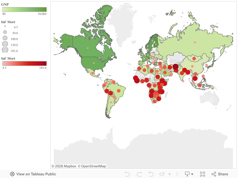
This week’s topics were a bit challenging, as there are quite literally hundreds of ways to create data visualizations! With so many options, it did get a bit overwhelming, but as the week progressed I found myself to understand them a little better. With data visualizations, it is important to first look at the data and find visualizations that will best interpret it. I had a chance to experiment and do this with one dataset, aptly called Titanic, which has data from the first– and last– voyage of the famous Titanic. A rather simple dataset, the file proved more difficult to interpret and demonstrate as a visual than initially thought.

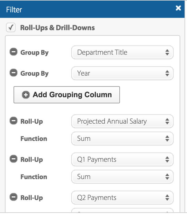
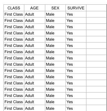
Right off the bat, as I opened the Titanic.XLS file, I noticed that the data was numerical; however, the numbers actually represented qualitative, categorical data! For example, documenting the passengers’ ages with 0 for child, or 1 for adult; a 0 for female, 1 for male, so on and so forth. I thought that although pretty smart in making the records easier to read in general, especially with the legend present on the side, transferring the file into a visualization tool turned out to be more problematic than it seemed.

Screen Shot 2015-10-25 at 5.00.27 PM

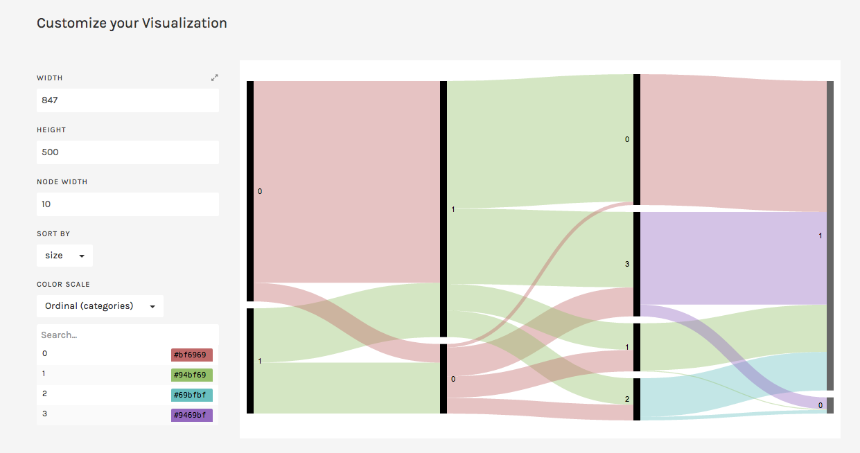
According to Yau in “Data Points,” data should be represented “with a combination of visual cues that are scaled, colored, and positioned according to values.”  Keeping that in mind, I decided to use RAW for this dataset, as I felt that the multiple choices and customization options of the visualization tools it offers was fitting with the data I chose. Since the numbers in each content type did stand for something else, I felt that an alluvial diagram best fit the data, as this method of visualization represents flows and correlations between categorical data. Therefore, I went ahead and plugged the file into RAW. And that’s where I encountered some problems…

Screen Shot 2015-10-25 at 5.12.53 PM

WHAT HAPPENED?!

This is where I realized that something was wrong– well, not wrong, but off! I figured that because the original data used the 1’s and 0’s as markers for other meanings, it then translated into the alluvial diagram. Above, it’s pretty evident that although the data is there, the categories aren’t even labeled, but just left with the markers.

At this point I had also tried different visualizations on the site, but they all yielded the same results as the alluvial diagram with only 0’s and 1’s. I figured that the only way to really illuminate this data is to go back to the original Titanic.XLS file and change the numerical markers to their intended meanings; this meant that I would change the 0 representing female passengers to “Female,” and the 1 representing male passengers to “Male.”

Screen Shot 2015-10-25 at 6.44.54 PM

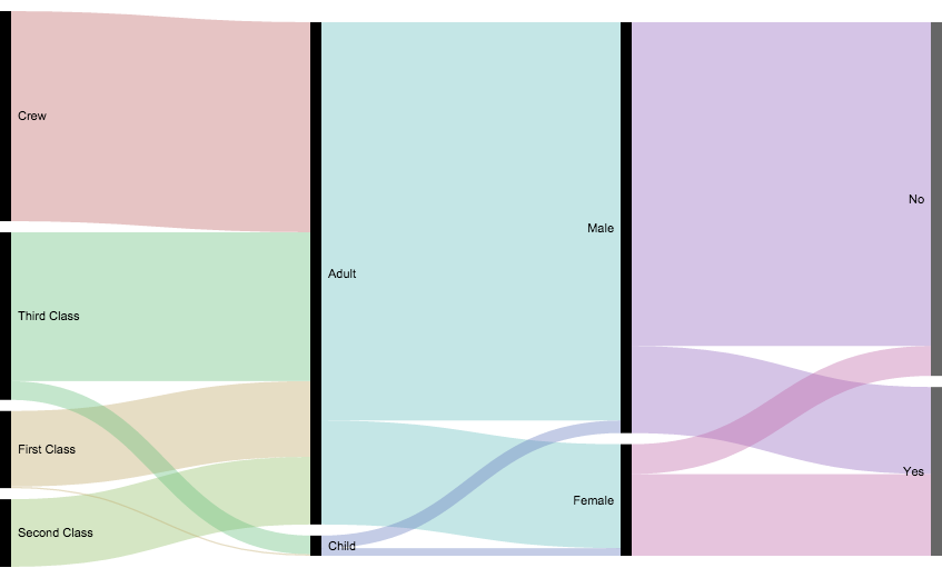
Luckily, I was able to do this in no time on Excel; though afterwards I realized that it may have been even more time-saving if I had used OpenRefine! So now, with the data practically cleaned and more able to be transferred onto RAW, I replugged the adjusted dataset and tried the alluvial diagram again.

titanicRAW

“Visualization is what happens when you make the jump from raw data to bar graphs, line charts, and dot plots.” – Yau, Ch.3

This time, it was a success! Now, one can view the correct categories for the content: starting with class, then age (adult or child), filtering down into sex, and finally if the individual had survived or not. Looking at the diagram, it is extremely clear to see the data, which itself was startling as I was cleaning and transferring it. Most of the passengers who had died were adult males, coming from the ship crew and most of the Third Class. What’s even sadder is that, although a very small amount, some male children did not survive.

In conclusion, I am happy to say that practicing with this dataset helped me better grasp what data visualization is and how it enhances data. By having something physically representative to put into perspective, I feel that one can really see how much of an impact (no pun intended) such data poses on human history; in this case, the tragedy of the Titanic is still as shocking and eye-opening as it was a hundred years ago.With that being said, the visualization tools presented to us definitely help to emphasize the importance of recording, archiving, and preserving human experiences of all kinds.


Poverty Statistics

Sheet 1
I made this data visualization with the 1990 United Nations data on poverty around the world. The spreadsheet included information on each country (though countries from 1990, so some names and places were outdated) and its gross national product, birth rate, death rate, infant mortality rate, and life expectancy for both males and females.

With so much data on so many countries, it would be nearly impossible to see any relationships between statistics or how one country compares to another. In my visualization, I decided to just compare GNP and infant mortality rate, and you can easily see that the countries with lower GNP have a higher infant mortality rate and vice versa.

Dow J Time Series

There is an overwhelming number of data visualization solutions out there.  I really wish someone could put together a comparison report of a good number of them listing their features, appropriate application, and user critique.  In order to learn about the application and make things simple for me, especially during midterms week, I opted to visualize a time series chart of the Dow-Jones Industrial average between 2000 and 2014. This was, however, not an easy task since I still needed to pick the right software application and learn how to use it.

I opted to create my time series chart with Tableau because I believe it is used quite often out there in the “real world,” so it is a good skill to develop. Although it is a relatively simple tool to use, it did take me a bit to learn how to create my first chart. Once you get going become the least bit familiar with it, I really like that through usage you are able to find out what you can and cannot do with the data. Tableau will simply disable charts and options that do not make sense with your data set. Although this may seem logical, it is extremely helpful to analytic neophytes, like myself.

I decided to go beyond a simple time series chart and possibly add a bit more information and a political twist to it. Since we have been learning how charts and data visualizations can be manipulated to show, well, whatever the creator wants to show, I laid out the data points in a discrete (non-continuous) time series chart. On the y-axis I have the Dow-Jones Industrial Average Closing Prices and on the x-axis I the years broken up by financial quarters, which is what the business world uses as a standard to report financial information.

Sheet 1


The political twist comes in pointing out that a person can potentially focus on one discrete year and report a trend to their benefit. For example, you had presidential elections in 2000, 2004, 2008, and 2012 within the data. Presidential candidates can point at the prior year’s trend upward or downward and make claims as to the competence of the incumbent in order to rhetorically attack them, while in truth holistic snapshot of the economy between 2000 and 2014 shows an overall upward trend. Furthermore, the time series can be cross-referenced with historic events that may have affected the Dow-Jones Industrial Average.

US population visualization

US Population Data Visualization

Screen Shot 2015-10-24 at 5.49.16 PM

https://www.google.com/fusiontables/DataSource?docid=1uchWvXdmwwuk-4k0aLVyTJUjuVFoBUuYiW69u6p2

I chose to use the census dataset, which contains information about the population of the United States from every decade since 1790 until 2010. While the data on its own is relatively simple to read, it is difficult to conceptualize what all those numbers representing millions of people actually mean. When I put the data into a data visualization, in the case, a line graph, it allows users to see much more clearly the trend in the growing population of the country. Seeing this trend visual also makes it possible to easily predict future population growth patterns, which is massively helpful and important to know for those interested in public policy and government. Additionally, this graph shows some of the discrepancies in this overall trend; for instance, we can see a drop in the growth rate of the population in the 1940 census due to the Great Depression which occurred in the 1930’s. This line graph also has an additional feature which allows the user to highlight a certain time period to focus on and allows for closer analysis of fewer data points. Overall, the data visualization makes the data so much easier to work with and reveals the real meaning behind all the numbers.

Best City in Florida

Screen Shot 2015-10-23 at 3.51.32 PM

I looked at the “Best City” data set which has an assortment of data for 20 cities in Florida relating to quality of life. The data involves everything from the number of restaurants and average income to the murder and rape rate of each city.

After looking at the dataset on a spreadsheet, I decided to look at Literacy and Income within all the cities via a scatterplot to see if I could see a relationship. I saw that once the average income in a city reaches 25K, the literacy rate is all over the board, 1.5 through 9.5–no obvious relationship. However, once the average income is greater than 30K, the literacy is always greater than 4.5. Before looking at the data visualization, I would have guessed that literacy would increase linearly as income increases, but the graph proved me wrong.


The dataset used to make the graph:

Screen Shot 2015-10-23 at 4.06.25 PM

Shannon Martine Blog 3-Control Panel LA “What We Buy”

LUST-TaxLUST-Tax-Back
ControlPanel LA is the city’s source for information about expenditures, revenues, payroll,  and special funds.  The What We Buy   data shows which items L.A. spends our money on like   $21, 929 on custom  boots  for police on motorcycle patrol  or the $13,363 L.A. spent on the unfortunately named  L.U.S.T. Tax, short for Leaking Underground Storage Tank.

The data is presented in clickable card sets that provide relevant and easy to understand information on each expenditure .  The cards aren’t extremely in depth but provide a clear starting point for those who are interested in what L.A. does with tax revenue.


“(Ontologies)…act as objects that create and negotiate boundaries between groups…communities and states represent the realities around them through distinct ontologies, or systems of categories and their interrelations by which groups order and manage information about the people, places, things, and events around them.”

This site uses this definition of ontology to be easily understood by the community.The boundaries set are what information the L.A. Controller’s office chooses to give freely.

This data set could be more specific. The exact time range for purchases are missing. The ” What is this” and “Why did we buy this” descriptions can come off a bit patronizing in sections like the LA Fire Department where they explain “firefighters use hoses to pump water from trucks and hydrants… fire hoses are essential tools for fighting fires protecting property and saving lives”. We know that but why did our fire hoses cost $1,348,566 and what exact date was that purchase or when will you have to purchase more because that only paid for 7,617 hoses.

If I was starting over, I would allow for more links to deeper examination of spending.

Payroll by City Department

L.A. Controller’s Office breaks down the total earnings of each city department in this data set.  The Office uses monetary data, each record consisting of the total earning of a city department, to increase transparency about the department that most heavily relies on the tax payers’ money. The data set can be visualized in multiple ways: pie chart, bar graph, line graph, donut chart, etc. Users can also customize the filter to reorganize the data by year, projected annual salary, quarterly payments,  department title, etc.

Screen Shot 2015-10-19 at 1.52.30 PM  Screen Shot 2015-10-19 at 1.53.07 PM

According to Wallack and Srinivasan, a dataset’s ontology is a “system of categories and their interrelations by which groups order and manage information about what’s around them.” In other words, ontology is a way of organizing information in a dataset through categorization. Ontologically speaking, this particular dataset is categorized by department title, which serves as the “boundary” that enables us to compare groups of information. This ontology makes the most sense from the point of view of U.S. citizens who reside in Los Angeles. It is through their tax money that the city’s departments sustain operations that benefit L.A. residents, making them the stakeholders of the departments’ finances. It is critical that they are aware of how much each department makes because only then can you make judgements about your “money’s worth.”

According to the data set, LAPD has the highest payroll with total earnings of $1,299,609,453.87, followed by the Department of Water and Power, with total earnings of $1,114,504,612.43.

Screen Shot 2015-10-19 at 1.52.50 PM     Screen Shot 2015-10-19 at 1.52.56 PM

More than half of the total sum of departmental payrolls goes into supporting these two departments, which hints upon the high crime rate and severe drought in Los Angeles. The task of curbing crime in a major metropolis such as Los Angeles is costly. Also, it makes sense that a large portion of the tax payers’ money is going into providing water for local communities, given that water is in high demand and short supply in Los Angeles these days.

The data set leaves information about why payroll is distributed in such way. From the perspective of a politician who may be interested in learning more about how to more efficiently distribute funds to each department, it would be helpful to organize the data according to use – use meaning, the reason for which the department was designated a certain amount of payroll in comparison to other departments.


LA Control Panel: Street Grades

The LA Controller’s Office features data from the City of LA’s Bureau of Street Services that composes an interactive map containing a data set called Street Grades. This data set provides information about the quality and state of LA’s roads, and can be manipulated using this interactive map. The data presented on the map can be filtered using five different criteria: council district, neighbourhood council, road repair, street pavement condition, and 2014-15 road repair, and filters can be applied at the same time, if the user desires. Within these categories there are only three data types: geographic boundaries based on city council, road conditions, and road repairs, both past and scheduled. Therefore a record is a single road and its variables represent the data associated with that record.

Wallack and Srinivasan define ontology as a system of categories by which groups order and manage information about the things around them. In this case therefore, the Street Pavement Condition is the dataset’s ontology, as is provides clearly defined categories into which roads can be assigned. The road conditions are quantified using the Pavement Condition Index (PCI) which runs from 1-100 and is the sum of the road’s present physical condition and how much repair is necessary to restore the road to perfect conditions. The PCI then categorizes each road into five groups based on score: failed, poor, fair, satisfactory and good.

In my opinion, the people who will find this information most useful and illuminating are industries that rely on road transportation networks, such as taxi, courier and shipping services and navigation software. This is because roads that are in good condition tend to provide more efficient traffic flow than, since they are easier and less challenging to drive on. On the other hand, roads that are in poor repair slow down traffic due to drivers avoiding potholes and other nuisances in the road. Additionally, real estate companies can also find this information useful as they can rate geographic regions’ quality of living using this information.

This dataset does a very good job at describing that many of LA’s roads are in poor condition and are in great need of repair. It also succeeds in showing that while many are in need of repair, very few of these roads are actually scheduled for such repair. It also illuminates that more affluent neighbourhoods tend to have better quality roads.

There are some cities within LA that withhold their data on their roads conditions, such as Santa Monica and Beverly Hills. This is an inconvenient gap in the data and it would be nice to have the entire map covered with interactive data.

LA Control Panel’s Payroll By Department

I chose to look at the LA Control Panel’s Payroll By Department.  I was somewhat surprised to see how funds were distributed and what departments required the most funding. The dataset shows the amount of funding each city department received from 2011 to 2013. It shows how much funding the departments have received over time in different graph formats.

According to Wallack’s and Srinivasan’s definition, the ontology of the dataset is the City government and the larger United States government because the data displayed is the city government’s payrolls and allocation of funds which is also representative of the US government as a whole . The site clearly maps out where all of its funding is distributed and in that way it represents its interests and activities of the city. The ontology of the data represents the interests of the government because it was sorted and published by a government agency. The way they display their data is cognizant of how they would like to be perceived. However, the data is held accountable by its viewers, the public, and there is a section for leaving comments so in that way the community also contributes to the site’s ontology. I found the data very illuminating because it was so clearly laid out and did not seem to have much of an agenda. However, I did find that the lack of breakdown in what the money is going towards in each department was troubling

The Dataset shows me where my taxes are going and how much funding each department receives. It is clear from the charts that LAPD, Water and Power, and Airports receive the most funding while many other departments that seem to be struggling receive a small fraction of funding. There is no description of what the section labeled other is. I am not sure what departments are in that section and the fact that they receive the least funding and are not named is worrying. There are also no descriptions of the agencies or what they do, although a quick google search can show you.

I would gather information from different communities and see how they thought or wished their tax money was being spent and then compare it to how it is actually being spent. Or I would get the different departments budgets and cost needs and reference that against the funds being allocated. It would be interesting to see how the departments divided up the funding if they all had a say in it.

Older posts Newer posts

© 2026 DH101

Theme by Anders NorenUp ↑