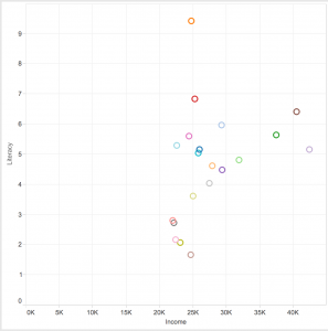
I looked at the “Best City” data set which has an assortment of data for 20 cities in Florida relating to quality of life. The data involves everything from the number of restaurants and average income to the murder and rape rate of each city.
After looking at the dataset on a spreadsheet, I decided to look at Literacy and Income within all the cities via a scatterplot to see if I could see a relationship. I saw that once the average income in a city reaches 25K, the literacy rate is all over the board, 1.5 through 9.5–no obvious relationship. However, once the average income is greater than 30K, the literacy is always greater than 4.5. Before looking at the data visualization, I would have guessed that literacy would increase linearly as income increases, but the graph proved me wrong.
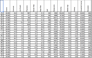
The dataset used to make the graph: