https://www.google.com/fusiontables/DataSource?docid=1uchWvXdmwwuk-4k0aLVyTJUjuVFoBUuYiW69u6p2
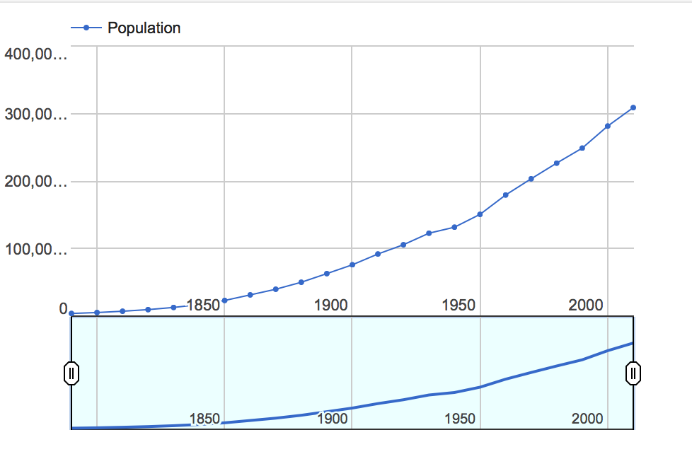
I chose to use the census dataset, which contains information about the population of the United States from every decade since 1790 until 2010. While the data on its own is relatively simple to read, it is difficult to conceptualize what all those numbers representing millions of people actually mean. When I put the data into a data visualization, in the case, a line graph, it allows users to see much more clearly the trend in the growing population of the country. Seeing this trend visual also makes it possible to easily predict future population growth patterns, which is massively helpful and important to know for those interested in public policy and government. Additionally, this graph shows some of the discrepancies in this overall trend; for instance, we can see a drop in the growth rate of the population in the 1940 census due to the Great Depression which occurred in the 1930’s. This line graph also has an additional feature which allows the user to highlight a certain time period to focus on and allows for closer analysis of fewer data points. Overall, the data visualization makes the data so much easier to work with and reveals the real meaning behind all the numbers.