DH101

Introduction to Digital Humanities

Author: FrancescaAlbrezzi (page 34 of 38)

Blog #2: racial census data in Los Angeles in 1940 – Jose Ramirezgomez

Los Angeles Racial Distribution 1940 1

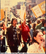
http://digital2.library.ucla.edu/viewItem.do?ark=21198/zz001d0fwd

I took a look at archival repository of maps showing the distribution of racial and national groups in Los Angeles, according to the 1940 United States  Census. From this archival collection, one can see how different racial groups were geographically divided in 1940. Each record in the archive is a separate map that focuses on a single or set of demographics. For example, one of the archives focuses on the distribution of Chinese while another on foreign born Canadians that occupied Los Angeles in 1940. From the archive one can tell that the data came from the US census data in 1940 but was not normalized until 1943  due to the time to process all of the surveys.

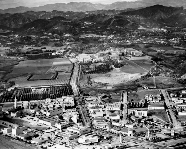
If I were going to write a paper based on this archive I would focus on the concentrations of certain racial groups and try to explain why certain communities center around different areas. Although it does take some work to compare each pair of graphs, there are some interesting trends in the data. The archives show that there was a dense population of Mexicans and “Negroes” (the term the census data uses) that is mostly limited to East Los Angeles. I would compare this data with data such as the distribution of foreign people  born from Russian, Finland, and Lithuania which in comparison had a more evenly spread distribution across all of Los Angeles including West and Central Los Angeles. The background Los Angeles map is the same in all of the manuscripts which makes it easier to compare multiple manuscripts when side by side.

Los Angeles Racial Distribution 1940 2 Los Angeles Racial Distribution 1940 4

I think that the visualization of the census data can aid a report on sociology or racial tensions in the US. The manuscripts show racial segregation or even class segregation.

While I enjoyed going through the 1940 census data, I think that there is so much room for improvement in terms of how a researcher might be able to learn and interact with the data. The manuscripts are very interesting but in order to compare between different racial groups, one has to have the open side by side. I would enhance this feature by making it possible to overlay several of these manuscript charts and use different color to represent different racial groups. Also I think that if there was way to also compare the census data to that of other years, one could better understand certain migratory movements as they align with history. I would remedy this by creating some kind of slideshow option so one could compare how certain racial groups grew in size or migrated. The manuscripts themselves are already processed metadata but I think that digital humanitarians could further process this data to give it depth and greater usability.


UCLA Historic Photographs

The UCLA Historic Photographs repository is a collection of 278 black and white photos depicting the development of UCLA in the early 20th century.  The photos were taken by photographer Thelner Hoover in order to document the early beginnings of the university.  The collection has photos of notable figures, various campus events, dedications of buildings, commencement ceremonies, alumni events, and aerial views of UCLA and Westwood Village. Screen Shot 2015-10-11 at 2.30.33 PM

The collection of photos tells the narrative of UCLA’s early history starting in 1928 at the Vermont Avenue campus near downtown Los Angeles before the university moved to its current Westwood location.  In 1928, it also shows the construction of Royce hall and Powell Library exactly as they stand today.  In 1930, UCLA had it’s first registration of classes on the new Westwood campus and Hoover photographed students walking through Royce.  In 1931, Hoover photographed the dedications of multiple buildings such as Hershey hall, Kerckhoff hall, and Royce hall. Hoover also photographed various events such as commencement ceremonies, alumni events, and sporting events.  In 1930, he took aerial viewed photographs of UCLA and Westwood from the Goodyear Blimp that depict what the early campus looked like.

If I were to write a paper based on these archives I would be able to describe the early development of the UCLA campus. I think it is really fascinating to see how the university went from it’s four original buildings in Royce quad to the massive, iconic landmark that it is today. I could also discuss the events that Hoover photographed on campus although, the descriptions of the photos do not go into too much detail of what exactly was happening at the events.  The metadata descriptions below the photos do not give personal accounts of what the university was like in the early 20th century.  In order to remedy this I would have to do outside research that could be in the form of old newspaper articles or journal entries from the 1930s to get an idea of what the culture was like being an original Bruin.


UCLA Historic Photographs Repository

The UCLA Historic Photographs digital archive preserves much of the school’s earliest history and events. Historians and leisure users alike can look into the past through the 278 black and white photographs. The images range from 1925, while the school was still in its earliest formation stages, all the way through 1982. The main photographer is Thelner Hoover, who wanted to document UCLA’s history. In these photos, we can see the physical changes made to the campus that makes it what it is today, notable figures from the school’s past and important events that have shaped the path to today.

Each photo encapsulates in a frame a single moment of a specific point in time. Each photo tells a story of its own. Take for instance the “Basketball NCAA Championship UCLA v. Duke, 1964.” In the photo, both teams appear engaged in a high intensity moment. As the viewer, I place my own experiences watching a basketball game to help create the visual experience, of the past, in my mind. However, this projection of experience is unnecessary as the photo provides details that create the story of the moment. UCLA has the ball and the Duke players appear anxious. The metadata below the photograph even provides more details, stating that the photograph shows the undefeated Bruins in one of the plays that lead them to their NCAA victory over Duke University. The story is in the photo in and of itself.

Yet these photos can also be read as a collective. We can see the school’s journey. This is most prevalent with the aerial shots of the campus. Hoover photographed the campus from the air in 1929, 1930, 1936, 1938 and 1952. We see the transformation of the school in increments, almost like a checkpoint to fill the gaps of UCLA history.

Campus as viewed from the Goodyear Blimp. Photo taken by Thelner Hoover.

Campus as viewed from the Goodyear Blimp. Photo taken by Thelner Hoover. (Copyright UCLA Library)

UCLA’s narrative is limited however, due to lack of personal documentation about the people, the culture and the events of UCLA in its youth. It can be challenging to weave together such specific historical moments and can lead to a loss of integrity of the events. To fully understand the past that these photos depict, outside research needs to be done. Who are these people in these photographs and what led them to that moment? How do these specific moments all weave together to guide us to an understanding of the way things are today? Research could help answer these questions. Yet, even with these important questions unanswered, the UCLA Historic Photographs digital archive provides necessary context and begins our narrative as an institution.

Week #2: UCLA Architecture and Urban Design Digital Repository

Screen Shot 2015-10-11 at 11.55.34 AM

The digital collection I selected is the UCLA Architecture and Urban Design repository. This repository houses various projects, that consist of images of buildings and other architectural structures. The website can be searched by keyword, architect, subject, title, or location. Furthermore, the site can be browsed either by  architect’s name or by subject/type of structure. In this Browse section, architects’ names are listed alphabetically by last name. The subjects are also organized alphabetically, and they are categorized into compounds of two to four parts. For example, a subject can be “architectural drawings – landscapes,” or “architectural drawings – ornaments,” or “built works – infrastructure – transportation structures.” Both the “Search” and the “Browse” functions allow to aggregate the results either by project or by individual image (result titles are also organized alphabetically). “Project” in this repository basically seems to mean a mini-collection of images that belong to the same author and are about the same subject (This is my own understanding of it, since the site didn’t have an “About” page).

When you aggregate results by project, and then click on “Display”, and it will show you all of the images that are in that project. Next, when you click on a specific image, on the left you will have the option of zooming in to view, and on the right there will be details about that particular image, including name of architect, title of project, location of the building, date, building type, subject(s), and additional notes (all of these are also hyperlinked, which makes it easier and faster if you’re looking for similar works). All of this information on the right is descriptive metadata since it gives us more information about that one particular piece of data – the image.

The repository seems to be quite easy to operate and allows to link to relevant material with minimal effort. Based on the information and the search tools available in this repository, I could explore and write about the types of buildings that were built by a particular architect if I browse by his/her name. I could gain insight into how a particular architect operates, what types of projects he/she has been working on throughout his/her career, and see if perhaps the artist has been actively involved internationally, if he/she has designed buildings in multiple countries. Likewise, by using the Advanced Search option, I could also explore and write about, some aspect of a building’s architecture, for example, I could look at various interior designs of buildings by typing “interior” into the keyword search.  There are, however, interesting stories I would like to tell about, but will not be able to, or it would take me too much work because of the way that the images are stored on the website.

What’s missing is some key information about the buildings themselves – What were they built for? Who used them? Were they ever abandoned? What function did they serve? Who sponsored the project? Let’s say I want to tell about department stores’ construction in 1950s. Based on the information provided, I could find out the various architects involved and look at various countries, and perhaps find structures with similar features. However, I would not know anything about the buildings themselves, aside from the title, which oftentimes reveals very little. I would not know which corporation the construction was initiated by, how much it cost, and how long it took to complete, for example, if I were interested in the allocation of resources for these buildings.

The way to remedy this omission is by either including an additional piece of metadata with more detailed descriptions and notes, or, perhaps to partner with another repository thats specializes in the historical context of architectural buildings, and which would also contain other types of documents regarding the construction of these buildings.

Overall, the UCLA Architecture and Urban Design repository is quite well organized and structured. It seems that it was made simply for examining images of architectural buildings, and for being able to search for those and similar images quickly and conveniently.  The additional materials and information that I suggested the site should have would be “extra”, in case they wanted to appeal to more expert audience of scholars interested in the buildings, and/or, perhaps, real estate agents exploring the history and designs of these architectural structures.

Blog #2: The Frontera Collection

Screen shot 2015-10-11 at 8.12.20 AM

If I were writing a paper on this website, I could tell you that it is a collection of over 100,000 Mexican and Mexican American recordings; a joint project by the UCLA Chicano Research Center, the Arhoolie Foundation, and the UCLA Digital Library. I could also give details on who owns, runs, and funds the collection, what the data sets are, the source material, how it’s presented, what artists are included, how to navigate the site, and who has what kind of access to the information. I could also write about its blog and the stories contained therein. Including the guest blog from the owner of the Frontera Collection titled: Chris Strachwitz’s 50 Favorite Frontera Recordings.

What is missing from the site is a narrative that bridges the archive to the Mexican and Mexican American communities from which it originated. It is not clear how this collection is important to the community or if they are even aware that this collection exists. It feels as if the project’s primary audiences are scholars, collectors, and academics. But, given the lack of comments, it’s difficult to assess what level of interest it has actually generated within those groups. It seems as if the audience who would be most excited about this collection hasn’t been considered in the development of this website.

As a Mexican native who grew up listening to some of this music, I was immediately curious about the collection, but turned off once I began to navigate it. The approach to the presentation of this collection feels sterile and extremely removed from my real experience of what these artists and their music represent within my community. The Frontera Collection has left the community out of the conversation. Even their level of access to the information is minimized. The Copyright and Access page tells us that due to “copyright restrictions the digital collection is only fully accessible from computers on the UCLA campus.” This restricted access keeps the Mexican and Mexican American communities from participating in their own narrative. And, keeps every other community from learning about our cultural contribution to this art form.

I would remedy the issue by taking a cue from Michelle Caswell’s paper Seeing Yourself in History: Community Archives and the Fight Against Symbolic Annihilation and SAADA’s approach to community inclusion. Following their example, I would develop an outreach program to generate community participation. I’d open up the site for the community to share their stories, like SAADA plans to do. And, I’d research examples of projects that have been successful at bridging scholarly archiving with community participation. I’d include a bridging narrative to the home page and answer questions like: What was the environment that gave rise to these artists’ work? What is their historical significance? How is it relevant?

Unfortunately, from what I found, it doesn’t seem like interacting with the community was the project participants’ main objective.

Week 2 Blogpost – WAVAW Collection

The Women Against Violence Against Women Collection chronicles the progress of the activist group through documents, newsletters, and various other files. The organization led many campaigns to end violence against women, specifically in the Los Angeles area. They targeted mass media avenues and sought to correct the inhumane representation of violence against women.
Screen Shot 2015-10-11 at 2.56.09 AM

The collection contains documents from several of their successful campaigns, including their involvement in shutting down “Snuff” and the Black and Blue Campaign. Based on this information, I would be able to write about the intensive planning that led to the organization’s take down of these two campaigns. The collection includes documents such as national meeting minutes, press releases, and flyers used in the campaign. Thus, if I were to write a paper, I would be able to reference these sources and create a timeline of how the whole effort to take down “Snuff” and the Black and Blue campaign unraveled.

The narrative would be largely based on the events, in hopes of providing an explanation for how Women Against Violence Against Women chose certain campaigns and certain methods of attack. It would be highly factual, based largely on what the documents say, rather than further analysis of motivation and member sentiments.

21198-zz001760q5-1-thumbnail

The narrative would be limited by the lack of anecdotal and personal documents in the archive. As stated in the White reading, re-contextualizing history into a narrative can be dangerous and often misleading. Forming a story, or narrative, can reduce authenticity of the transgression of events because often it provides “moralization” for the actions that transpired. If I were to write a story from the collection of documents, I would not feel comfortable infusing the history with analysis because I would not want to sacrifice the integrity of the events. If there were more personal documents included in the collection, I would add more analysis of their intent into the story. However, since this is not included in the collection, I would not include it in the story.

In order to remedy this, I would search for outside sources that do have analysis of the members of the Women Against Violence Against Women group. I would find other archives that contain supplemental documents, such as the experiences of the members during their meetings or the public’s opinion of the group. This would provide an alternative perspective to the factual documents presented in the collection at UCLA. If I found documents that sufficiently described member’s experiences or other citizens’ views of WAVAW’s efforts, then I would include that in the story to create a more well-rounded chronicle of events.


Stories from Walter Edward Bennett’s collection

Screen Shot 2015-10-11 at 2.47.29 AM

Walter Edward Bennett is a photographer who is known for his collection of pictures on presidents, politicians, and other notable figures. He was born in England and discovered his passion for photography when he went to high school in Los Angeles. He was a photographer for the Los Angeles Time and became the first salaried paid photographer. He then went to work in Washington D.C where he stayed for 30 years taking pictures.

Bennett’s photos provide snippets of major historical events that occurred during the 1960’s to 1970’s. As the saying goes, “pictures are worth a thousand words”. With these photos, many stories can be told of what life was like in the US at the time the pictures were taken. For instance, there were photos of anti-war demonstrators protesting against the Vietnam War outside the capital in Washington D.C on May Day. There were also pictures of the Beatles and astronauts Gus Grissom and John Young, all of who are notable people that revolutionize US culture in their respective field.

Based on Bennett’s photo collection, he seems to focus his attention on United State’s presidents.  More specifically, he has lots of pictures of President Kennedy, Johnson, and Nixon. All these pictures can tell the story of presidential life as the Unites State leader. For instance, one can infer that there is a good relationship between President Lyndon B. Johnson and Upper Voltian President Maurice Yamego with the photo of them smiling at one another. This would indicate a good relationship between the two countries.Screen Shot 2015-10-11 at 1.43.09 AM

Although Bennet’s photo illustrated and narrated the United State culture and possible presidential legacy, the archives have excluded a possible category in the list of metadata to tell stories of the photographer himself. For what reason is the photographer taking these photos? What is Bennet’s goal/ mission? Is taking picture of notable figures something he does as a passion or for work? To answer this, a good category to include in the metadata are a list of sources that legally uses Bennet’s photos with his permission. In other words, where did Bennet’s publicize his photos? Online? Magazine? Newspaper? Having this information can give audience an idea as to why Bennet’s are taking the photos that he has taken. Understanding the reasoning behind taking photo and publicizing it in certain media can give us insight into the minds of the photographer.

Screen Shot 2015-10-11 at 1.45.21 AM

Blog 2 – Dealing Drugs: A Look at The Patent Medicine Trade Cards Collective

In the present day, we are overloaded with media and advertising, and the field of health and medicine is no exception. Whether you are muting a bizarre Mucinex commercial or hearing your sick friend count down the minutes until they can take their next dose of DayQuil, you intake suggestions from media and people about which medicine you should use – like any product, it needs to be advertised in order to create revenue. Before the invention of TVs and even public radio, remedies were publicized through simpler means, as shown by the Patent Medicine Trade Cards Collective: an archive that contains 247 trade cards that advertise medical compounds in circulation from 1860-1906. The front of the cards are embellished with a colorful illustration and the title of the medicine or company, and occasionally feature a brief description or slogan, and the back has a description of the topic being advertised. They’re almost like advertisement flash cards; the key term is on the front, the definition is on the back, and the image on the front helps create an association with the term so you won’t forget it.

bp 2 - card 2 frontbp 2 - card 2 back
If you were to write a paper based on this archive, you would be able to choose between a few different paths. One essay you could write is a comparison between the advertising techniques for a certain kind of ailment or disease – e.g. looking at all the trade cards for dyspepsia and see what commonalities or differences they have in their use of illustrations and language. This would be expedited by the ability to search the archive by “Subject,” which provides an alphabetical ordering of all the topics on the cards. However, this search function is slightly confusing, as its categories list actual diseases like “Anemia,” but then also has categories like “Angels” and “Dogs.” The latter categories actually refer to descriptive topics – the illustration on the front of the card – rather than the actual concept topic.

blog post 2 - descriptive vs concept topic

This somewhat baffling organization does lead into another possible paper story: the card art. By perusing these descriptive categories, it would be interesting to see what patterns emerge. Does a prevalent use of dogs in illustrations indicate their significance to the audience, or do they have some correlation to medicine? While this archive would provide the primary sources of art for such an essay, outside research would be necessary to back up any claims made about themes that can be traced through the illustrations. The archive could fulfill at least part of the need for context by providing a section of historical background, and a timeline of revolutionary medical advances or relevant global events.

This archive is not well-suited for writing an essay analyzing geographic patterns of medical compounds – for instance, whether some areas featured a certain type of medicine more than other areas, and whether that has environmental or societal implications – because there is no way to search by the “Place of Origin.” While the cards do list an origin once you click on them, clicking on each individual card to see where it is from is not a feasible method for writing a research paper. An interactive map would be useful in this case since it could pinpoint geographic origins of each of the cards, thereby providing a better idea of where the highest distribution concentrations were. As is the case with place of origin, there is no way to search through the cards by date. This would make it challenging to write a paper tracking the changes in types of medical compounds, and/or methods of advertising such compounds over a period of time. Both of these problems could be fixed by creating headings that group the cards in different ways: alphabetically by name (the current system), and then by year, place of origin, publisher, descriptive topics, concept topics, etc. This would provide a streamlined and effective method of grouping data and assisting visitors in pursuing the content path they wish to follow, rather than forcing viewers to virtually shuffle through cards.

Mapping the Republic of Letters


Screen Shot 2015-10-05 at 1.10.26 AM

Mapping the Republic of Letters is a digital project that maps out and connects the network of scholars that corresponded with each other, otherwise known as The Republic of Letters. The project, created by Stanford University scholars and professors in collaboration with international partners,  is made up of case studies that you can go into and explore to see the deeper connections.  The user can go into the project and discover the correspondences between great thinkers and study in further detail, the Republic of Letters.

Sources:

The digital project is based on The Electronic Enlightenment Database which is an archive of over 50,000 letters from the correspondents during this period of time.

Process:

The information was separated by author and location, and then put into a timeline, in order to see the time between each letter and connection.

Presentation:

The project was presented and separated by different case studies which are divided into difference categories, such as Correspondence, Publications, and Travel. However, as you go further into the website, you are able to explore the different connections between individuals, the project turns into a data visualization which lets the user see the number of correspondences between certain individuals against each other in a visual way.


Personally, I did not like this project very much. There was too much information trying to be handled, and the way that it was presented was not to the project’s advantage. If the project could have been simplified, or more focused on certain individuals instead of trying to fit in all of the information regarding the Republic of Letters, I think the website would have been much easier to understand. The amount of information provided was too much for a person to understand, and I spent more time trying to understand how to learn how to use the site than learning about the actual Republic of Letters.

I also did not enjoy the way that the project was presented. After clicking on the top tabs, the blog, and the contact tabs were no longer functioning which meant that the project had not been kept up to date. The way that the website was also designed was very confusing to me. I kept clicking buttons and exploring the site, but instead kept going into a deeper and deeper rabbit hole into the site, and wondering how I had ended up on a certain page. The site had too much information that was not made very clear, and therefore, the website itself did not help me understand the project, but instead, confuse me.

Deconstructing Virtual Paul’s Cross Project

Purpose and Product

Virtual Paul’s Cross Project is a multi-layered project that aims at enabling the viewer to see and experience the November 5th, 1622 (Gunpowder Day) sermon by John Donne at Paul’s Cross.  The project produced two separate models, visual and auditory, which are integrated and put into context with a textual description of the various aspects of the event.  This sermon was chosen because Donne’s Gunpowder Day sermon is well documented and enables the exploration of early modern London preaching, which was done as a public performance.

VPCP

Sources

Digital Model

The digital model finds sources in things ranging from archaeological documents to various drawings of the surrounding structures and even to descriptions of Paul’s Cross itself.  Archaeological findings provide concrete dimensions of the foundations of Paul’s Cross and the surrounding structures.  While the elevation can be seen in drawings, the dimensions were determined from textual descriptions that roughly described the height and space available inside Paul’s Cross.

Audio Model

The acoustic model incorporates an actor reading the sermon, the sounds of various estimates of attendees, and other ambient sounds.  The model itself was influenced by the visual model which was taken into account to be as accurate as possible with the actual acoustics of Paul’s Cross.

Textual Descriptions

The textual descriptions of the sermon, environment, and preaching style of John Donne find their sources in various contemporary descriptions of Donne, a manuscript of the speech, and other documentation of Paul’s Cross.  The speech manuscript was found at the British Library.

The environment depicted in the digital model and described in the textual description was created from a source that deduced the weather and sun’s position during the speech.

Processes

The digital and auditory models were created with Google Sketch-up and an acoustic simulation software.  The architectural model was created first and was then used in the acoustic simulation to ensure the accuracy of the acoustics.

Presentations

The project is segmented into various parts for presentation.  The physical model and acoustics each get their own sections of the site.  Sections were made for describing the Preacher, Occasion, and Sermon separately.  This is separation allows for easy access to the specific sections of the model which can be viewed largely as independent parts.

The presentation of the physical model is done primarily through a video which gives fly around views of the model in black and white.  The video pauses in various locations where the image then becomes colored and filled with detail as a painted scene.   While this presentation is effective, it does not enable the visitor to interact with and explore the model.

The acoustic model presents various sound clips of the sermon and ambient sound from various locations around the churchyard.  The sound bites also enable the visitor to experiment and listen to the various attendance estimates that the project explored.

The Preacher, Occasion, and Sermon sections are presented in their own sections as essays.  These sections provide context for the sermon and its importance in history and why it is being researched so thoroughly.  It is also on these pages that Donne’s style is described along with an explanation of the environmental research.


Older posts Newer posts

© 2026 DH101

Theme by Anders NorenUp ↑