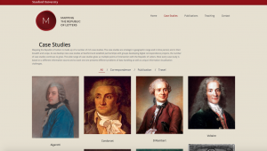
DH101

Introduction to Digital Humanities

Author: FrancescaAlbrezzi (page 35 of 38)

Week 1: Reverse Engineered Virtual Paul’s Cross

Introduction:

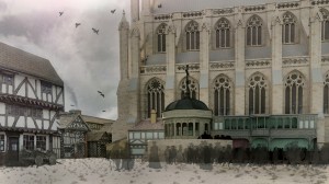
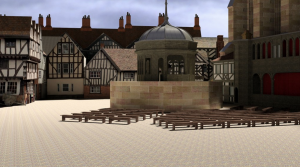
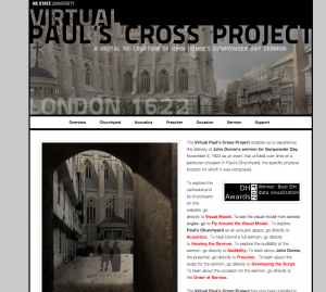
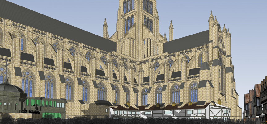
The Virtual Paul’s Cross Project is an award-winning DH data visualization project which enables an interactive experience with a historical event. In particular, this project delivers John Donne’s sermon for Gundpower Day from 1622. The project serves to present users with the live experience of a sermon by digitally reconstructing the physical and acoustic spaces. A virtual representation of the physical space can be seen:
Long-iconic-side-view-for-WWW

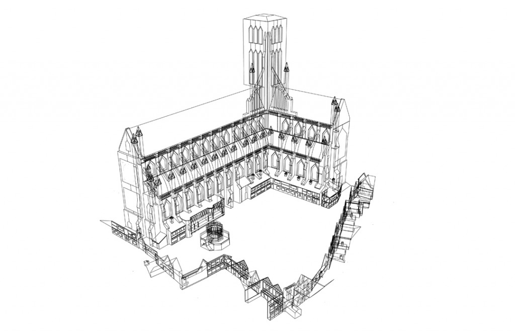
A representation of the acoustic space can be seen:

WireframeHD-V3-for-WWW-1024x662

Sources (assets):
The acoustic model is firmly supported by the first hand sources of the script of the preaching. The manuscript copy of the sermon in 1622 is identified and used with a voice actor to re-enact the preaching. Most of the construction of the acoustic models are based on the resources used to reconstruct the buildings of the physical space. These sources range from excavated models from historical data, or from contemporary sources like 16th-17th century maps of London.

Alongside many primary resources used, the team also relied on secondary resources like scholarly articles and publications to retrieve cultural and historical background. These helped enable the team to accurately recreate the context and experience of the sermon in 1622. The sources were presented between primary and secondary resources, and between individual buildings and segments of the models.

Processes (services):
The project was compiled using 10 projectors and 21 speakers to provide a 270 degree all-inclusive angled images of the physical space and acoustic space.  It can be seen that wireframed images were used for the acoustic models to channel the flow of noise and sound that is in imitation of what one would hear during the  sermon. The original materials of the building were taken into consideration to trace the pathways of noise – either in absorption, reflection, or dispersion – when they traveled through the physical space. These models were extremely important in providing the ‘ambient noise’ for its acoustic space, enabling real-time sounds like horses, birds, and dogs to be included in the background.

The physical space was reconstructed using measurements of the remains of the structures, and from previously surveyed excavations. For example, it can be seen that the Paul’s Cross Preaching Station is grounded in the excavated drawings of Francis Penrose in the Archaeologica in 1883. Through a range of difference sources, the models seem to be detailed with measurements that agree through historical data. The overall reconstruction of the physical space ranges from the 1500s to 1600s alongside recent images of the structures – evidence is all-encompassing in this project.

Presentations (display):
The display of the project was divided between the introduction, physical and acoustic spaces, and the content of the preaching. The project offered distinctive services for its users – exploring the models, understanding the construction of the models, and presenting the sources and data backing of the models. The user is offered an interactive experience of the preaching but also, is able to understand its technical and cultural context.

The other major part behind the presentation of the website is in the actual content of the sermon. Much work has been put in to retract the original and translated manuscripts of the sermon, and gives the user both a digital and written option of receiving the information. There is also background information that is given in terms of John Donne, his preaching style and contemporary records of these preachings. Most of the information is supplied with data visuals that help explain its sources, giving the user a more visual and interactive experience.

Reverse Engineering “The Republic of Letters”

Screen Shot 2015-10-05 at 1.11.28 PM

The Republic of Letters Case Studies page

The website I decided to reverse engineer is The Republic of Letters . It acts as a network analysis of correspondences sent throughout Europe during the Renaissance. It is similar in purpose and material as the website Kindred Britain that we reviewed in class this week. In fact, both sites were developed through Stanford’s Digital Humanities program, and therefore both projects may have been worked on by some of the same people.

The three levels of a digital humanities project are Sources, Process, and Presentation. Each plays an integral role in the development of a site, and each of the three levels can be observed within The Republic of Letter digital humanities project.

Sources (assets): The Source Level can be defined as the data points a team uses to create a project. It is the foundation of any digital humanities project. The sources used for this project was a collection of correspondences between Enlightenment thinkers in 17th Century Europe. Interestingly, the website does not contain the actual sources, and the only way in which I knew that these correspondences were the foundation of the data provided was through a video introduction on the front page. The data bank CKCC is listed as a partner, but it is not certain that this is the original location of the website’s sources.

Another aspect Source Level information found on the site is from scholarly work relating to the topic. The team in charge of this project gathered a large collection of publications and presentations that relate to the topic at hand.

Process (services): The Process Level can be defined as how data is organized, quantified, and or digitized into a Digital Humanities Project. Within the Republic of Letter’s project, the process level is quite abnormal, due to the lack of overt source level information. The data provided by these unseen correspondences are organized into varying categories. Firstly, the scholarly publications and presentations are grouped together in a tab labeled “Publications,” while the information contained in the case studies is presumably grouped by person in a tab labeled “Case Studies.” Any other modifications to the data falls into the final level of website development.

Presentation (display): The Presentation Level can be defined as how processed data is visualized, mapped, or interacted with. The team clearly spent the most amount of time considering the level of project development, as this is the most fleshed out of the three levels.

Screen Shot 2015-10-05 at 1.02.00 PM

Narrative Panorama of Project

The site opens with a graphical timeline of important events and people, entitled, “Narrative Panorama of Project.” The data is colored and paired with exciting drawing of the people and places referenced in the timeline. Unfortunately, the photo is formatted poorly, and so it is incredibly hard to read the data presented. The opening page also has a video introduction to the site, which showcases the DH team as they revisit their reasoning’s behind the project. It has the TED musical score behind it, giving the video a sense of intrigue and ingenuity typically reserved for TED talks.

Scrolling through the various case studies, it becomes clear that visualizing data was a primary concern of the developers. In only one case study involving Galileo Galilee, there was a histogram depicting the amount of correspondences he sent through his life, a pie chart about the recipients of his letters, and an interactive map on the relationship between him and Voltaire’s correspondences. The site is visually impressive, and through these visuals users can easily see patterns and draw conclusions that would not have seen had they sifted through 20,000 letters themselves. The site pairs a painting of each thinker next to his/her name, adding a human element to the correspondences and data.

Shannon Martine Blog 1: Salem Witch Trials Project

image

Salem Witch Trials Documentary Archive and Transcription Project

Introduction:
The infamous Salem Witch Trials were a series of prosecutions sparked by rampant Puritan fear of witchcraft. The trials began in the spring of 1692 after several young women in Salem, Massachusetts claimed to be possessed by the devil and accused other locals of being responsible for their conditions. Widespread accusations and hysteria followed and eventually more than 150 individuals including children were put on trial for suspected witchcraft. The Salem Witch Trials led to the hanging of 19 people and lasted until early winter of 1693. The Salem Witch Trails Project is an online archive that includes public records, personal documents,maps, and images to provide a comprehensive overview of this dark chapter in colonial history.

Sources:
The archival site was produced by Professor Benjamin C. Ray of the University of Virginia in partnership with Professor Bernard Rosenthal of Binghamton University. The collection was also made possible with research aid and funding of organizations that include American Academy of Religion and the UVA SpecLab. Together, the project group complied court records, record ledgers, images of original court documents, diary entires, letters, sermons, and maps to give an overall view of the trials and the historical context they occurred in. The sources of these items were found in the archives of the Boston Public Library, Massachusetts Historical Society, Massachusetts Archives, Judicial Archives Boston, Peabody Essex Museum,Maine Historical Society, and the New York Public Library.

Processes:
The project is a result of digitally transcripts or scans of originally handwritten documents plus computerized timelines, maps and text analysis. The site does well by including two large interactive components with the Important Persons in the Salem Court Records and the Map of Salem pages. Several prolific names are hyperlinked to more in depth biographies and images that are relevant to the individual. The Map of Salem allows further exploration by showing the houses of the accused and accusers plus the chronological spread of the trial across the Village. There is also a text search option that allows users to navigate the site with specific research in mind.

Presentation:
On first glance, the site is extremely dated and suffers from a drab gray, blue and burgundy color scheme. The first page lacks compelling use of images and opts for texts to be the main focal point instead. But where the sites fails in aesthetic, it makes up for in organization instead. The document categories are separated and are easy to navigate. The actual project and the production behind it are sectioned and distinguished clearly from one another as well. The archive is presented in a way that can be utilized by the average curious user or distinguished academic. I would definitely recommend the site to others because it offers great indepth representations of the period and vital information surrounding the individuals involved. Its only real fault is it was just made during a less pretty time of the interrnet.

Virtual Paul’s Cross Project

Churchyard-side-view-WWW1

Virtual Paul Cross’s Project is a digital recreation of John Donne’s Gunpowder Day Sermon. It provides virtual models, audio, and historical background information on the Sermon given November 5, 1622 in Paul’s churchyard. It is a historical project that focusses gives a comprehensive understanding of what it would have been like to be present on the day of the sermon.

o Sources (assets) : To create the sight they first used the original manuscript from the sermon given that day, in addition to sketches and paintings that depict the sermon. They also consulted analytical texts on the sermon and the conditions that day. Using different preaching venues like Paul’s cross, they constructed a virtual model of the sermon and texts that give the historical and cultural background.
o Processes (services): The website provides a variety of services tat give the user context and historical background. Users can experience different virtual reproductions of the churchyard. They have provided images and a video to give you an in depth view of the site of the sermon. The website also contains an acoustic model of the sermon with reconstructed audio of what the it may have sounded like from different areas in the churchyard. They have charts and graphs explaining the distance to noise ratio. In addition, the users can find historical paintings and sketches along with the digital recreations.
o Presentations (display): Virtual Paul Cross’s Project is organized into drop-down menus that show the different services of the site. The site links to different youtube clips that give you the ability to fly around the recreation. It has a header that can connect you back to the North Carolina State’s website and below that an image of Paul’s Coss with the Project’s title. You can click on just the designated topic headers for a simple image and description of that service or you can use the drop-down menu to learn more.
Overall I really enjoyed this project. I found it to be innovative and extremely informative. I really enjoyed the audio from various positions in the courtyard as well as the digital recreations that can be looked at against the historical paintings and texts. The website is easy to use and clearly laid out, the “scroll to the top” function on each page makes looking through the site fast and easy. They clearly lay out all of their sources and processes. However, I didn’t like how the video links took you outside of the site and that it was possible to select both the header and drop-down menus, I feel that all of he information should have been in the drop down menu because you may have missed clicking on the header. I think it would have also been nice to move around the digital recreation on the site using your mouse, instead of just watching a video.

Reverse Engineering: Virtual Paul’s Cross Project

I chose to explore and reveScreen Shot 2015-10-05 at 11.41.25 AMrse engineer the  Virtual Paul’s Cross Project. The project has a visual model and a web accessible model that is a digital re-creation and visualization of John Donne’s Gunpowder Day Sermon. The interactive visual model is installed in the Teaching and Visualization Lab at NC State’s James B. Hunt Library.  The model uses 10 projectors and 21 speakers to provide a 270 degree image of Paul’s Churchyard.

Sources:

The main source of the project was John Donne’s Sermon.  The sermon was sourced through original manuscripts and published works.  The visual data of the the Church of England were sourced from engravings and paintings dating from the 16th and 17th centuries.  They also collaborated with various preaching venues to gather data about the acoustics of the church.

Processes:

John Donne’s sermon itself was recreated by a voice actor and linguist to replicate how it would have sounded in an early London accent.  A 3D online model was created on the website where visitors can interact with the imaging as if they are moving through the church and the courtyard.  Acoustic engineers created audio effects that give visitors the experience of what the speech would’ve sounded like from different locations in the courtyard.

Displayed:

The visual model of the church was made web-accessible and interactive with the use of 3D imaging.  The project can let a user interactively fly around the Church and courtyard and also has audio features to hear the Courtyard’s acoustic space and the audibility of the sermon.  The website can be navigated through the tabs across the top of the page.  They also gave a description of  the process of construction.  The project presents information through the 3D model, writing, audio samples, photos, videos, and graphs.


Arseniy K Blog post 1: Salem Witch Trials

salem witch

Last week, with the rest of my discussion group, we explored the Salem Witch Trials Documentary Archive and tried to pick apart its innards to gain some understanding of how the site was put together.

The website uses a number of sources, from which its creators pulled documents, texts, maps, and more, in order to create a comprehensive archive of the Salem Witch Trials and a timeline of the events and accusations preceding and surrounding the trials. All the sources and documents are categorized according to type, such as transcriptions, maps, and books. The sources are pulled from a number of reputable museums and libraries from the East Coast including the Boston Public Library, Massachusetts Historical Society, Peabody Essex Museum, Massachusetts Archive, the New York Public Library, and more.

The website uses a number of digital humanities tools and techniques to archive and present the numerous documents. The maps of Salem and the surrounding areas in which witch accusations occur have been digitally scanned, but a number of computer-crafted maps are included as well to supplement the collection. All documents have been digitally scanned and/or transcribed from handwritten to computer-printed English. Best of all it provides a text search function to help prospective scholars quickly find the documents they need for their research.

While a comprehensive and well-put together archive the Salem Witch Trials Documentary Archive suffers a bit from its aesthetic. It has a very 1999-esque web layout that is a little jarring to the eye in the modern age, but given the quality of the large number of sources, and the simple-to-use methods of categorization and search, it does not harm the overall presentation from an academic point of view.

Don Quijote Interactivo

Don Quijote Interactivo

Screen Shot 2015-10-05 at 10.22.04 AM

The digital humanities project that I chose to investigate was the Don Quixote interactive project located on the Brain Pickings website. El ingenioso hidalgo don Quijote de la Mancha or as its translated version, The Ingenious Gentleman Don Quixote of La Mancha, was written in 1605 (part I) and 1615 (part II) by Miguel de Cervantes Saavedra. These pieces of literature have become very influential pieces from the Spanish Golden Age and are very popular in many literature cultures and studies. Due to its popularity and importance, an interactive project like this one can facilitate not only in the understanding of the story’s plot, but the lessons, symbolism, and themes can also be fully understood.

The primary source for this website consisted of the book itself, part I and II. Spain’s National Library was a secondary source of information that contributed with general historical information in form of text and video, but also with a collection of essays and articles from different authors. By clicking on the knight’s helmet on the left panel you will be presented with these additional essays (image below). The site also includes music that was gathered by Orphénica Lyra directed by José Miguel Moreno.

Screen Shot 2015-10-05 at 10.34.21 AM

The process for this digital humanities project is what I was extremely impressed with. The developers of this project were able to digitize the original version of the book while also, making the modern Spanish language version accessible by clicking on the “T” on the right bottom panel (image below).

Screen Shot 2015-10-05 at 11.00.20 AMScreen Shot 2015-10-05 at 11.00.31 AM


In the book, Don Quixote embarks in several journeys where he comes across different individuals. What the developers did to make this an important element of the interactive website was including a map with this pinpointed quests. Colors, numbers, and images within the descriptions of the journeys differentiate the different journeys from the book by clicking on the compass on the top left panel (image below). This was my favorite process because they didn’t just digitize a document from one form to another; they created a visual representation of an important literature element that is missing from the book itself. It becomes a digital aid because it provides the information, and at the end it tells you where in the book to reference it back to.

Screen Shot 2015-10-05 at 11.10.36 AM

The project also contains an interactive timeline of the book and contains images related to the book or just to the culture in the 1600’s. In all, this project is packed with so much processed content in a digital and interactive form that I would go passed the limited number of words for this blog post.

The presentation of this project is what made it so great. There are many digital projects that have so much useful content, but the way it is presented makes it difficult to appreciate it. This project however, made it easily to navigate. The web –based interactive project was made searchable, printable, and can even be shared through social media web sites such as Facebook. This accessibility makes it easy for you to immerse yourself in the different features, whether it is the videos, the music, the images, the timelines, or simply reading the digital version of the books. It was easy to open and close certain features of the website and it allowed for the users to not get lost in opening so many pages.

My final thoughts on this project are that it was made with the reader in mind. Everything that is included is so that the reader understands the simple plot, but with historical features included, as well as other people’s interpretations through their essays. Because the book can have so many twists and turns, features such as the map can help the reader stay on the same pace of the plot. If there is one thing I would suggest for this project is to simply recreate it in an English version. However, I truly loved this project and since I am in the Spanish and Portuguese department here at UCLA, I am going to share this wonderful project so that it is of benefit for students, TA’s, and even professors.

-Karla Contreras

Salem Witch Trails, Reverse Engineered

John Rauch

DH 101 Blog Post 1

DISC. 1C

Intro:

This is a very unique and interesting project brought to us by the University of Virginia. This website serves to do many things, but its main goal is to allow users to explore all the information and sources available on the topic of the infamous ‘Salem Witch Trials’. This website is unique because it has gathered texts, media, maps, etc. from many different original documents that would other wise be very hard to locate. The information on this website can be explored more interactively and organized than attempting to cultivate this kind of topic synthesis at the library. This website serves as a good example of the possibilities and goals of the Digital Humanities.

Sources:

The creators of this website used many different sources, or assets, to produce all the content. If the user visits the “Archives” section on the website,  they will notice the great variety of places that these original sources were pulled from. These creators had access to several libraries, state archives, and museums.  This is where all the maps, archives, documents, books, painting, and information of people came from. These sources ranged from different states across the United States, so attempting to find all of these sources on your own, physically, would be nearly impossible. This goes to show the importance and significance of digital humanities work such as this one.

Process:

A few ‘newer age’ processes were used to modify and enhance the sources being worked with. These authors used document scanners to transform physical originals to computerized copies. Once these documents are computerized, they can then be analyzed, modified, enhanced, and explored by a computer’s software. A user can also interact with these documents in a new way, being able to zoom in, view things side-by-side, and even save these documents to their own computer is permitted by the authors. The creators of this website also used transcription as a process, as they transcribed many documents from hand written text to computerized text. Again, this digital transformation opens up a whole new world of possibilities of how to view, analyze, and study these documents. A computer can now analyze text with clever coding to look for similarities or common themes, and also show how certain documents are connected that otherwise would have gone unnoticed. The last big process used is the mapping. While there are some scanned original maps, there are also maps made completely digitally in some kind of GIS software. These maps are unique because they are interactive, having points of interest that can be clicked on, and use a wide variety of visual elements to better visualize the importance of certain geographic and topological features in why these witch trials may have happened, and how the city may have looked and operated during this time of history.

Presentation:

This website used many different presentation tactics. They used tables for organization, indexing for search ability, and source aggregation. What these presentation tools do is helps to organize a large archive in a way that opens up the work to the public to be viewed easily. The creators also use certain colors and images to help guide the eye around the website and facilitate the navigation of information.


Week 1 Blog Post: London Lives

Screen Shot 2015-10-05 at 9.45.38 AM

Intro: The project London Lives is a digital archive that aims to represent the lives of London commoners in the 18th century. The website claims having “over 240,000 manuscript and printed pages from eight London archives and [being] supplemented by fifteen datasets created by other projects, [and providing] access to historical records containing over 3.35 million name instances”. The goal of this digital project is to allow interested users to recreate the lives of London plebeians by using the documents, images, and manuscripts that the project has collected and organized either by individual’s name or by the type of record. As of 2012, the update to the website allows users to search for people by name, or to search for documents by keyword.

Source: The site developers point out that individuals’ lives are often linked with institutional documents (e.i. criminal justice system, medical records), thus, a large part of their primary sources come from these institutional records, which were available for digitization and which were most likely to contain information on the same individuals. In addition, they have also included links to externally created databases, which include tax and voting records, fire insurance registers, and urban dictionaries, allowing to make more connections about the same individuals throughout different sources.

Process: The developers of the project stated in their methods for source selection that whenever possible, the entire archives were included; however, they excluded sources that were too large (e.g. parish rate books), or, in some cases they used representative examples with “good record survival”.  The manuscripts were scanned to create high definition, 400dpi JPEG files. And a useful feature is that there is an automatic HQ zoom view available just by hovering the mouse over the image. The makers also used text analysis to process their data: the manuscripts were manually typed up by using a procedure called “double rekeying” where two typists independently transcribed the text, and then the computer looked for differences, which were then resolved manually.

Audience & Presentation: All of the data and the records in the entire website are available free online to the public. However, by registering with the website, users can get access to special features, such as saving their searches, creating a workspace and group sets. In addition, registered users can assign roles to individuals in the records, by which they can later also search. The website interface itself seems quite static, however, since it  includes many hyperlinks, it allows the users to dig deeper and deeper into each layer of information. It is a somewhat laborious process, but doable after spending some time on the website. The way that the project has organized all of this data is somewhat confusing, however. By clicking on the “Lives” tab, users are taken to a page with about 50 individuals’ names organized alphabetically. On the right, there is a box with hyperlinked keywords, such as “attorney, hospital, pauper”. By clicking on the individuals’ names, we can dig deeper to some manuscripts of external sources. However, by clicking on the keywords, we access links to additional individuals’ names which were not included on the original first page. It is confusing why not all of the names are there initially. The good thing, however, is that the website allows to search by person’s names, keywords, and type of source, which is organized by location and social institution.

Additional Critique: Reflecting on how the makers collected their data (excluding records that were too big), we can guess that their dataset may not be as complete and have significant omissions for achieving their grand mission of reconstructing individual Londoners’ lives. Nevertheless, the project does seem to achieve building a system which in some way links people’s names to institutional records, common themes (e.g. apprenticeship, theft, illness) and vice versa. Considering such linkage of individuals to these institutions and events, one improvement for the project would be to perhaps create a visual representation of these links focusing on time, place, and/or type of event that connects these individuals, places, and events in some way – somewhat like the Kindred Britain project. Perhaps the individuals aren’t linked at all, but we won’t know until some visual representation allows for such interpretation of the data.

Virtual Paul’s Crosss Project

Screen Shot 2015-10-05 at 9.19.54 AM

I chose to reverse engineer NC State University’s “Virtual Paul Cross Project,” which aims to explore the practice public preaching in early modern London, through specifically examining the sermon John Donne delivered at Paul’s Cross on November 5th, 1622 on gun powder day. The site focuses on recreating the experience of the sermon as a performance event by utilizing architectural and acoustic models, in order to, “simulate the original conditions of delivery as fully and as accurately,” as they can.

Sources:

The assets included in this website include John Donne’s sermon, which was sourced from original manuscripts; visual data about St. Paul’s Cathedral, sourced from multiple engravings and paintings from the 16th and 17th centuries;  as well as acoustic information gathered from the drawings of the cathedral.

Processes:

John Donne’s sermon was recreated through the use of a voice actor and a linguist, who attempt to present the speech as it would have been performed in an early modern london accent.  3D models were created to give the visitors of the site a physical recreation of Paul’s Cross, as well as access to various vantage points within Paul’s Cross. Translucent black figures were placed into these vantage points to give scale and an idea of how many people were in the audience. Two acoustic engineers generated the acoustic models that site visitors are able to play from different vantage points to get an idea of the speech being delivered in real time and space.

Presentation:

Data is presented to the site visitor through 3D and acoustic models, writing, drawings, graphs, and videos. The visitor is able to navigate the website by clicking on different tabs based on the information they are seeking. the 3D and acoustic models give the site visitor multiple options for exploring the physical and aural landscapes of Paul’s Cross.

I really like the emphasis this website put on visual and aural forms of knowledge, in order to best recreate a performance event that happened in real time and space. I enjoyed that they allowed the site visitor to engage with the 3D and acoustic models by placing themselves in different areas of Paul’s Cross. I thought that the site could have been organized a little more clearly. For example, when you click on the tab headers you are taken to a picture with no information; you have to click on a sub-header to get more information, which confused me when I first interacted with the site.

Older posts Newer posts

© 2026 DH101

Theme by Anders NorenUp ↑