Class Blog

Digital Harlem

The website for Digital Harlem is headed with Digital Harlem: Everyday life 1915-1930. Its homepage outlines the sources from which content is drawn to create mapped data. These sources include the District Attorney’s Closed Case Files, Probation Department Case Files, investigation reports, W.P.A. research on institutions and life in Harlem, compiled in the late 1930s, and two weekly newspapers from Harlem in the 20s, the New York Age, associated with Booker T. Washington and promotional of middle-class respectability, and the New York Amsterdam News, which published more sensational stories. The maps can be filtered through categories such as “race”, “gender”, “occupation”, “types of event” or “charge/conviction”, each referring to a categorical ontology.

That these maps are based on data that is largely drawn from penal system records asks crucial questions about the assumptions and biases that all maps reflect. Given that the penal system has historically perpetuated violence against marginalized groups, a system to which a historically Black neighborhood like Harlem would be especially vulnerable, any record of its making will only reflect a version of history which benefits those in power and therefore exclude those who are not. Such records cannot adequately tell the story of “everyday life”, rather, they often do work to erase it. To move in the direction of the project to which the title of the website refers, the creators might have sought out to centralize, along with the W.P.A. files and African American newspapers, family records from Harlem during that time and used that kind of content to create mapping categories.

Week 7: The Digital Gazetteer

The map I chose to analyze this week was the Digital Gazetteer of the Song Dynasty. The maps on this website are static screenshots of the team’s research, created in Inkscape and Gimp. It documents Sinologist Hope Wright’s 1958 work that details the geographical names in Song Dynasty China. Wright’s work is also derived from another three works: “the Song History (宋史Song shi) Geography Monograph, the 980 Records of the Universal Realm in the Taiping Era (太平寰宇紀Taiping huanyu ji), and the 1085 Treatise on the Nine Territories in the Yuanfeng Reign (元豐九域志Yuanfeng jiuyu zhi).” (Taken directly from the website)

screen-shot-2016-11-07-at-12-59-35-am

(The pictures wouldn’t load properly on my browser, they came out with this weird dark grey overlay that obscured a lot of the image and its details, and I couldn’t scroll down to read the rest of the description either.)

Just by looking at the map I inserted above, you see how the researchers have assumed a few things about us as viewers. Firstly, they assume we know what exactly those red dots mean and why they’re sized the way they are, as there is no legend (as there are in their other maps). While it does show how the population was distributed around the Song Dynasty, it is also confusing because unless you are familiar with that particular dynasty, the border of the country is not actually depicted.  Even when they do have “county/country lines”, such as below, they are not often put in context.

screen-shot-2016-11-07-at-1-01-04-am

Due to the nature of their research, they may be making these assumptions because it is geared toward a niche population of people studying the Song Dynasty in detail. Considering that Wright is a Sinologist, and that Ruth Mostern, the head of this digital project, specializes in Chinese history, that assumption may not be too far off.

Since the data is taken directly from Wright’s work, one can say that these maps reflect the culmination of Wright’s own research, transcribed, translated, and understood twice: initially by Wright during her analysis of the three source books, and by Mostern, who takes Wright’s book to create this project. They look at published and preserved works that reflect what was seen and recorded as a city/county/province/street etc, and so it may obscure what was deemed unimportant by government officials during the Song Dynasty. As there is no time traveling machine that would allow either one of them to go back to the Song Dynasty, they (and subsequently us) can only put their faith in these three source documents.

It would be interesting to see an interactive map, similar to the first image in style, where you could hover over the dots and see the information about the township/particular population of the region. As this also goes into the abolition of townships, it would also be cool to see why these townships were abolished.

Mapping Decadence

I chose to analyze the Mapping Decadence project. These maps were created with the digital tool ArcGIS and show relationship between Decadent writers of the 19th century in Paris and their publishers based on location. Authors included in the maps are Joris Karl Huysmans, Jean Lorrain, Rachilde and Marcel Schwob. The different authors are located on different tabs and are designated with a specific colored pin, while publishers are labeled in red. Clicking on a pin opens up a pop-up box with details on books published, where the author was living or working and other information. The pins are linked based on certain time periods in that author’s life. A separate tab also puts all of the authors together on one map, along with publishers.

The map reveals details about the location of a particular author, which books were published at that time and place and which publisher was utilized. However, this map only reveals a very cut and dry version of location data and publishing timeline from the perspective of an outside observer. It obscures any detail on why an author moved, or why certain books were written at a certain time or why different publishers were used for different books. It makes very little assumptions about the author, which makes the mapping a very objective look at the author, but does not link together a narrative about the Decadent authors’ lives.

Turnball’s point about mapmakers determining what is and, more importantly, what isn’t in the representation is very clear here because I am learning a lot about how the authors moved around spatially but nothing about the authors themselves. The tab with all Decadent authors on one map is also extremely interesting but I don’t see any descriptions on how the authors interacted or connected.

An alternate map would definitely have more of a narrative angle. In particular, I would include a blurb about each author in their respective mapping tabs. In this blurb, I would make sure to have a timeline and relevant biographical details during significant timeline points. I would also expand on each pop-up pin in an attempt to relate each pin to major works and include how location might have impacted each work.

Perhaps a tab with a publisher emphasis might be useful as well. I would see if there were common publishers between Decadent authors and try to find linkages between the certain locations and popular publishers in that area.

Locating London’s Past through Mapping

For this week’s mapping exploration, I chose to look at Locating London’s Past, mainly because I do not consider myself well-versed in London’s extensive history and I thought it would be indicative of Turnbull’s arguments to see how this map would be received from someone who has little/no contextual knowledge of the subject.

Locating London’s Past was created by a team of different UK-based universities and offers a virtual exploration of life in “early modern and eighteenth century London” through a variety of different digital databases with records of crime, poor relief, taxation, elections, local administration, plague deaths and archaeological finds sourced from resources from the Old Bailey Online, London Lives, and the Centre for Metropolitan History. In turn, the different data sets are able to be

John Rocque's 1746 Map of London on Locating London's Past
John Rocque’s 1746 Map of London on Locating London’s Past

mapped on three different maps—a GIS compliant version of John Rocque’s 1746 map of London, the first accurate OS map of London (1869-80), and a current Google Maps version.

1869-1880 Model of London on Locating London's Past
1869-1880 Model of London on Locating London’s Past

The project does not claim to offer an exhaustive account of London’s history nor to showcase a particular demographic, but rather leaves data exploration and narrative construction up to the user because truthfully, little guidance is given on what to do. That being said, this mapping project is still largely

Current map of London via Google Maps presented on Locating London's Past
Current map of London via Google Maps presented on Locating London’s Past

an operating example of Turnbull’s contention that all maps are perspectival and subjective because “what is on the map is determined not simply by what is in the environment but also by the human agent(s) that produced it” (Exhibit 2, Page 1). For example, the contributors to Locating London’s Past chose to only include data from legalized sources and the data is limited for it only includes records for crime, taxation, elections, etc. Moreover, the project cites information about each data set on the Historical Background page. For the Old Bailey Proceedings Online data set, the project notes that the original public collections were “inexpensive and targeted initially at a popular audience”, meaning the original versions were designed to sell—not give completely accurate information. Additionally, it cites more “significant limitations” because only half of the editions survived and the recorded transcripts were “selective.” It took a little bit of digging to find this information and it is not openly asserted that the information used for the mapping is largely inconclusive. Nevertheless, the project still chose to use this data for mapping purposes.

This map largely reflects a government’s point of view because the included data has origins from the governing body—using tax, death, crime, and poor relief records as historical indicators. I think it also reflects the point of the view of the group of universities that chose the particular databases as they deemed the particular records as important by choosing them to be a part of the project. A team of different universities might have chosen completely different digital resources to map for a different agenda. The maps operate more as an accessory to the data rather than vice versa because the user must choose a dataset to map rather than to use a map to explore data. Also, not all data records are able to be mapped at all.

This project is able to reveal how certain records are spatially relative to one another and how they could compare in different representations/interpretations of the landscape for a given time period. It obscures how these events are historically relative to one another and contribute to the London’s development. I think “Locating London’s Past” tries to operate on the basis of representing information in an “objective” way to present history (although Turnbull argues this is impossible to do) and thus provides little-to-no narrative on how the maps and datasets relate to one another. As of now, I feel as though I’m just clicking on different data sets and looking at random points. If I were to reimagine a new map, I would provide a narrative on what the map is designed to be used for, and how its presence could be utilized for the understanding of an occurrence without trying to remain neutral because there’s no way to do so anyways.

Digital Harlem

For this assignment, I chose to explore Digital Harlem: Everyday Life 1915-1930. This project presents information about different types of events occurring in New York City’s Harlem from 1915 to 1930 in the form of a map. The information was collected from legal records, newspapers, archives, and other print sources. A search panel is included on the left of the map, which allows users to specify their event, date, location, or person of interest. Multiple searches can be layered onto the map with different indicators of different colors, which enables users to easily compare different events. In addition to the street map, there is an overlying historical map that displays individual buildings during that time period. Another interesting feature is the section above the map, which illustrates the boundaries of the area in which the black population inhabited in 1920, 1925, and 1930.

I agree with Turnbull’s contention that all maps are perspectival and subjective because each visual project presents a different narrative that reveals some information from the dataset and obscures other information. In this particular project, the narrative was influenced by the law enforcement system and its perspective of the criminal acts. In spite of the details provided about each crime, the narrative disregarded the perspectives of the people involved in these acts because the details were gathered from legal records and case files. In addition, since the data was collected from newspapers and other print sources, the narrative only displayed the reported news, which would mainly consist of stories on bigger events because newspapers most likely only print stories that would sell. The information presented appears very impersonal because of the sources of the dataset. Therefore, the title of the project is very misleading because these events did not represent everyday life in Harlem during that time period, but only represented a selected portion of what was going on.

While I found the features of the map very fascinating, the information that was displayed on the map was not portraying the narrative that the project contributors intended to, according to the website’s “About” section. In order to truly capture everyday life in Harlem, there should have been a bigger focus on its culture and history, rather than its criminal background. The project contributors could gather data from older residents about how their days in Harlem were spent and from younger residents about their family histories. What could also be helpful to include on this map is an outline of the Harlem neighborhood.

Blog Post Week 7

For this week’s blog post I looked at the 19th Century Caribbean Cholera Timemap. This map includes information about cholera outbreaks, hurricanes, tropical storms, and news articles in the Caribbean region from 1833-1872. There are two ways to view this information: one representation is a geographical map of the caribbean with bubbles indicating the various points of interest; the other representation is via a timeline which indicates the precise month and year of different events. More information about the events can be gleaned by clicking on the colored bubbles on both the timeline and the map.

This map is really useful to see the spatial and chronological order of events. The coloration of the indicator bubbles allows the reader to make draw insightful trends regarding the timing and location of cholera outbreaks and natural disasters. As Turnbull points out about maps, this map is very subjective. As said in the article we should be sure not to assume our interpretation to be the only interpretation. The makers of the map clearly seemed to think that tropical storms and hurricanes were the strongest, if not the only, causes of cholera outbreaks. This is a huge assumption as there is a lot of literature available linking several other reasons with cholera epidemics. Additionally, the makers of this map must have used some criteria to determine which natural disasters and which outbreaks were significant enough to make it on the map. The reasoning used to make this differentiation is very subjective and must be publicized so the reader can understand the criteria and inherent bias prevalent in the map. The news articles presented on the time line all seem to point to cholera as being mostly within the black community. This map seems to reflect a white researcher’s point of view and looks at events from a very  narrow lens.

While the map does do a good job of revealing the chronological order of the the different outbreaks and natural disasters, it fails to present the local people’s viewpoint. The map gives the reader precise dates and locations but obscures the impact on the Caribbean people.  In order to counter this, I can imagine an alternative map which also provides information that would provide the reader with a glimpse of the effect of cholera on the Caribbean people. Such pertinent information could include medical consequences as well as personal stories relaying the impact. Additionally, it would be interesting to see the impact of the natural disasters on peoples’ food supply and water because this information could provide additional insights about the relationship between the natural disasters and cholera outbreaks. Furthermore, this alternative map would include narratives from people of all backgrounds.

Overall, this map provides some interesting information presented in a way that enables geospatial visualization by the reader. However, I feel that this map is extremely subject and only looks at things from one perspective. Therefore, this map could be enhanced by incorporating information that would shine light on the local people’s view on disease and natural disaster.

Week 6: reVilna Map

reVilna is a digital mapping project that focuses on how the residents of the Vilnius Ghetto lived during World War II. It uses over 200 sources from memoirs, archives, and documents and matches them to photographs to tell a story with an interactive map.

The map is divided into nine sections called “Stories”: Formation of Ghetto, Aktionen, Judenrat, Health and Education, Life in the Ghetto, Art and Culture, Resistance and the FPO, End of the Ghetto, and All Events and Places. The map uses a chronological storyline approach to navigate users through the various parts of the map. Users have to the choice to start from the beginning of the narrative and let the site navigate them throughout, or to explore the map on her/his own.

screen-shot-2016-11-06-at-9-02-34-pm

The map reveals a lot about the conditions of the Vilnius Ghetto and tries to show a more positive light about the unfortunate circumstance of being forced to live in the Ghetto by discussing the arts, culture, education, and health resources that was provided to the residents. While the map does discuss the positive aspects the Ghetto had, it inevitably is forced to discuss the formation and liquidation (moving the Jewish people to concentration camps) of the Ghetto which reinforces the situation to viewers about what it actually stood for: the mass discrimination and massacre against Jewish people. The map adds a different understanding to the narrative of Jewish lives in Ghettos during World War II. It adds some knowledge for people who would have never thought it was possible that Jewish people were allowed some type of “normal” aspects to their daily lives.

The creator of the map does a powerful in telling the story of how the Jewish people in the ghetto lived and functioned, despite the grave conditions they lived under, and discussing the drastically unfortunate end of the Ghetto. The project does a profound job at telling the story of the Ghetto; however, the map itself was not so significant as, besides knowing the location of the ghetto and placements of places within the ghetto,  there was no heavy geographical data. It seemed insignificant to have just have a map in the background when navigating through the narrative. Personally, I forgot that I was even looking at a map at all when going through each section of the project. I feel as though focusing more on a timeline visualization would have benefited this project more as it tells a story in a chronological order.

ReVilna – Blog Post 6

reVilna,” or “Exploring the Vilnius Ghetto: A Digital Monument,” maps the Vilnius Ghetto in Lithuania, which Nazi officials forced Jewish Lithuanians to inhabit beginning in 1941. The interactive digital map allows the viewer to click on over two hundred geographically tagged points of historical significance and to apply filters to find certain places or events.

After clicking on “Explore on your own,” all events and places appear on the map. The viewer can then click on each point for more information, or subtract certain categories of events or places from view in order to focus on other categories. For instance, the viewer might choose to remove all categories except “Culture” for events and “Life” for places, in which case an almost idyllic picture of the ghetto appears:

screen-shot-2016-11-06-at-11-28-06-pm

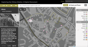
These filters exclude the places and instances of oppression that permeate the ghetto, and even imply access to high culture among ghetto residents through events like a theater show and places like the library. While viewing these factors in isolation paints a two-dimensional and inaccurate picture of life in the ghetto, the viewer is able to create this narrative from a larger set of data, rather than passively receiving it from a storyteller with an ulterior motive (perhaps a Nazi enthusiast).

However, the category names indicate the role that the map’s creators still play in shaping its narrative, even when the viewer uses the “explore on your own” function. Names like “Life” and “Culture” are vague enough to encompass a variety of meanings and implications for ghetto residents, yet they seem to designate specific kinds of experiences. For instance, while I would anticipate some negative associations with life in a ghetto, the places under the “Life” category seem to refer to locations where cultural or leisure events occur. The kinds of narratives the viewer can create through this map thus depend on the creators’ ideas about what the category names mean. Though this is the least unbiased section of the site, the creators’ ontology the map’s subjectivity are visible even here.

The site also provides story maps, which help the viewer to track certain narratives like “Formation of Ghetto,” “Art & Culture,” and “Resistance & the FPO.” These stories are helpful for viewers unfamiliar with the Vilnius Ghetto, who would find it difficult to create a narrative out of events for which they have no context. Stories like “Life in the Ghetto” provide cohesive and relatively unbiased accounts of life in the ghetto, jumping from point to point on the map and providing written descriptions and photographs for each place or event. The stories are organized either chronologically or by topic, depending on how subjective the narrative is. For instance, “Resistance & the FPO” follows a very specific chronology, and multiple points on the map sometimes occur on the same day. By contrast, “Life in the Ghetto” jumps from location to location and does not need to follow a certain sequence. Though the latter story gives the viewer more control over how to interpret the narrative, there are still a limited number of sequences built into the story.

Because the geographically tagged events and places are taken from “memoirs, archives, original Ghetto documents and artifacts, and oral and historical accounts,” the site’s narrative is told at least ostensibly from the perspective of those living contemporaneously with the Ghetto. However, it remains unclear whether those providing the sources were Jewish people living in the Ghetto, other Lithuanians, German officials, or others. Those providing the sources likely imbue them with certain perspectives, and perhaps biases, which may change the meaning of the digital map we see. Yet notably, the website claims that the project is “dedicated to understanding how the residents of the Ghetto lived… using geographical science and technology.” In this way, the project presents itself as an attempt to understand the Ghetto factually rather than to make an ethical or political statement.

Regardless, I would interpret this map as sympathetic to the suffering of the Jews who lived in the Ghetto. The same paragraph that describes the project’s factual nature also reveals its subjectivity: “how the ghetto functioned – even, given the circumstances, flourished.” The reader is likely to interpret “circumstances” in this context as implicitly negative, and thus to view the Ghetto residents’ achievements as remarkable. While I agree with this view and am less inclined to question it, any subjectivity in a map’s design is worth considering.

Week 7 Blog Post: Analyzing the Caribbean Cholera Map

For this week’s blog post, I decided to look at the Caribbean Cholera Map. Opening the site, I was first struck by the very simple layout, consisting of a map constructed with Google, a timeline above ranging from 1833 to 1872, and a “map key” on the right side detailing what each colored landmark on the map signified (either cholera outbreaks, specific hurricanes, tropical storms, or news articles).

However, this simplistic map actually turned out to be quite troublesome. Although the purpose of this map was to portray the cholera outbreaks throughout the caribbean during the nineteenth-century, it seems to be told in the perspective of someone simply trying to tally the number of cholera outbreaks instead of expanding on the implications that it had on both the Caribbean as an economic society and a cultural one. By hovering over the “News Articles” button in specific locations, the main focus is put on showcasing articles that deal with slaves, creating the assumption that the Caribbean was a mostly slave society with nothing else to offer. In addition, many of the news articles focus on the effects that the cholera outbreaks had on the large plantations that held many of the slaves. Thus, many personal stories of hardships within the slave community as a result of the cholera outbreak are obscured, instead revealing the hardships of the plantations.

In addition, hovering over the cholera outbreaks, one is presented with only numbers regarding the numbers of deaths in the population. This undoubtedly takes away from the “human experience” aspect of disease, equating a human passing as just another death in the multitude of lives that cholera took.

The map also reveals a weather aspect such as hurricanes and tropical storms, but it is not made entirely clear the reason that these measures are included. The map nonetheless obscures the impact many of these catastrophic natural events had on the places they struck, only giving us the date and location of where the natural disaster occurred.

As Turnbull points out, all maps are perspectival and this becomes clear when exploring this map. Whilst exploring, I felt that I was looking through the eyes of the white colonizers at the time and their views of natives as “savages.” It is disappointing that the Caribbean painted by the creators of this map is one that is equated with slavery and nothing else. I would have loved to have been presented with particular stories that highlighted the suffering that is disease, especially during a time with such limited medical knowledge.

Week 6-Mapping decadence

I chose to analyze “Mapping Decadence: Visualizing Relationships Between Writers and Publishers” due to its relevance to my major of literature. This set of five digital visualizations investigates the correlation between four authors’ residences and locations of the publishers of the decadence genre in the end of the 19th century in Paris. With the digital tool of ArcGIS, although the author attempted to present certain objective connection between the two data types, her view was somehow pre-determined by her assumptions of the topic.

First, the author believed the spatial factor determined the interactions between the authors and publishers. That is to say, there is interdependence between the physical proximities of the authors of decadence literature and of the publishers who were prone to publish decadence literature. If this assumption was true, the authors had to often communicate with the editors face to face. Visits to the publishers needed to become part of the authors’ routine life. On the other hand, it may indicate that the publishers published based on the distance from the authors. The closer to the authors the more likely the authors’ works would get published. So validity of this assumption depends on the deficiency of public transportation/postal service and on the frequency of intimate interactions between the authors and editors. However, this may not be necessarily true. There could be other reasons to influence the locations of those two parties. For example, perhaps the authors decided to live in the neighborhood for economic reasons or convenience rather than considering the distance to the publishers.

The visualizations also select a unidirectional visualization to reveal the connection between the authors and publishers. The maps only geocode the four authors’ locations in relation to the locations of their preferred publishers but did not show all the authors who the publishers chose to publish. It is possible that the publishers also published works by authors writing decadency literature who lived far from the locations of the publishers or by authors in the provincial areas.

Moreover, she assumes the authors’ and publishers’ locations were static over the years in Paris. On the maps, we could see that one author could have several locations while one publisher only stayed in one dot. There is no timeline for the changed locations even though I assume the various locations of the authors could mean they moved over the time. Fortunately, on the “About” page, there was a link to her presentation on this project in a conference. She acknowledged the problem of chronological limitations and probably she will address it in her future research. “Photogrammar” the data visualization I analyzed in Week One is a contrast which relatively successfully combined timeline and geocoding.

The maker also expects viewers understand the background of the decadence movement in French literature because the website did not offer much information of the statuses of those writers and publishers in the Decadence Movement. A viewer would hope to get more knowledge of the authors or the publishers presented in the maps. The makers’ interpretation of the maps and her intentions with the mapping should also be revealed through more textual explanations. So far it is still only the visual part of her dissertation project rather than inclusively contains all aspects of her dissertation.

This mapping project came from a scholar who was preoccupied to prove the interdependence of the locations of authors and publishers from the perspective of the authors. It reveals the four authors’ one possible motivation of choosing residences, namely the proximity with the locations of the publishers. But it obscured many other factors that could cause the correlations of those locations such as economic considerations, cultural atmospheres etc. it also ignored one important factor in the literary market, namely the readers. How could the works inspire a literary movement after publishing without the locations of the readers?

An alternative mapping could be made after the makers define to what extent the proximity to the publishers determined the locations of the four authors and how the publishers made decisions on publishing. The maker also needs to make a timeline. I would add two more bar charters to explain the authors’ and the publishers’ statuses in the Decadence Movement. One is to explain the four authors’ statuses in terms of their works’ quality and quantity. The other is to list all the publishers who published decadency literature at the time and compare them with the publishers who published the four authors’ works. The locations of markets of this literature could also be mapped.