Blog Post Week 8

screen-shot-2016-11-14-at-9-33-55-am

For this week’s blog post, I decided to look at the story “Kashmir’s Forever Wars” by Basharat Peer. This story looks at the India-Pakistan War in Kashmir and the impact it has had on families in Kashmir. The narrator travels throughout the region and meets with families who have had family members join the militants. The narrator specifically explores the motivations and reasons behind people joining the militants and how it has impacted the communities in which they lived.

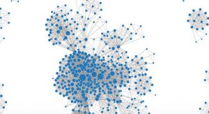
I chose to make a network graph with edges between characters who appear in the same scene. This network graph helps illuminate several interesting things. Not surprisingly, the narrator is the central character of the story connecting all the other characters. This graph also illuminates which groups of characters tend to interact with one another. Just by looking at this network graph, someone who has not read the story could still make inferences about which characters might belong to the same family or community.

While this graph allows one to make basic inferences about the story and the interactions between characters, many important aspects of the story are not represented by the graph. For example, since this graph is not weighted, it treats every interaction between characters to have occurred only in one scene. However, the reality is that several characters interacted multiple times throughout the story. This graph is limited in that it does not express the strength of relationship between characters. Furthermore, one should be careful to not judge the importance of characters based off of this graph. There are a few characters that appear in the fringes of this graph, but in reality are actually driving forces to this story.

Another thing lacking from this graph is a distinction between the nature of the characters. Given the backdrop of a war and storyline of Kashmir being a war torn state, most people can be categorized based on which side of the war they believe. This story is also about reconciling those differences and about people who made surprising choices of which side they identified with, despite their family’s beliefs. This graph could better show the conflict of the story by coloring the nodes of each character based on the side with which that character identified with. This would further highlight to the reader the different sides present in one family or community, and would drive home the author’s point more directly.

Blog Post Week 7

For this week’s blog post I looked at the 19th Century Caribbean Cholera Timemap. This map includes information about cholera outbreaks, hurricanes, tropical storms, and news articles in the Caribbean region from 1833-1872. There are two ways to view this information: one representation is a geographical map of the caribbean with bubbles indicating the various points of interest; the other representation is via a timeline which indicates the precise month and year of different events. More information about the events can be gleaned by clicking on the colored bubbles on both the timeline and the map.

This map is really useful to see the spatial and chronological order of events. The coloration of the indicator bubbles allows the reader to make draw insightful trends regarding the timing and location of cholera outbreaks and natural disasters. As Turnbull points out about maps, this map is very subjective. As said in the article we should be sure not to assume our interpretation to be the only interpretation. The makers of the map clearly seemed to think that tropical storms and hurricanes were the strongest, if not the only, causes of cholera outbreaks. This is a huge assumption as there is a lot of literature available linking several other reasons with cholera epidemics. Additionally, the makers of this map must have used some criteria to determine which natural disasters and which outbreaks were significant enough to make it on the map. The reasoning used to make this differentiation is very subjective and must be publicized so the reader can understand the criteria and inherent bias prevalent in the map. The news articles presented on the time line all seem to point to cholera as being mostly within the black community. This map seems to reflect a white researcher’s point of view and looks at events from a very  narrow lens.

While the map does do a good job of revealing the chronological order of the the different outbreaks and natural disasters, it fails to present the local people’s viewpoint. The map gives the reader precise dates and locations but obscures the impact on the Caribbean people.  In order to counter this, I can imagine an alternative map which also provides information that would provide the reader with a glimpse of the effect of cholera on the Caribbean people. Such pertinent information could include medical consequences as well as personal stories relaying the impact. Additionally, it would be interesting to see the impact of the natural disasters on peoples’ food supply and water because this information could provide additional insights about the relationship between the natural disasters and cholera outbreaks. Furthermore, this alternative map would include narratives from people of all backgrounds.

Overall, this map provides some interesting information presented in a way that enables geospatial visualization by the reader. However, I feel that this map is extremely subject and only looks at things from one perspective. Therefore, this map could be enhanced by incorporating information that would shine light on the local people’s view on disease and natural disaster.

Blog Post Week 4

unknown

For this week’s blog post I decided to make an alluvial graph using my group’s data set. Our dataset looks at the characters of DC and Marvel comics and various attributes associated with them. I made the graph solely using DC’s data set. This alluvial graph was made using RAW.

One of the interesting attributes listed int he DC data is the alignment of the characters (whether they are good, bad, neutral, or what they label to be “reformed”.) Several of the other columns in our data set list physical attributes of the characters. In our society today, there is a big emphasis placed on physical looks and characteristics. There are most definitely certain stereotypes and appearances that are associated with specific moral characteristics. I thought it would be interesting to look at what hair color is associated most with each moral category. We could then draw inferences on what society thinks a “bad” or “good” person looks like.

This data visualization helps the reader visualize the strength of the associations between the different hair colors and character alignment. It is interesting to see that the there are roughly the same amount of good characters with black hair as bad characters with black hair. This is surprising because dark hair many times has a notion of being associated with evil . There are of course many flaws with this. The first being that while the raw number of good and bad characters with black hair might be the same, we cannot draw any inferences about the proportions. There might be a disproportionately higher number of one type of character and this would influence the proportions. Another important thing to consider is what constitutes a good and bad character. Before understanding the true nature of these data types it would be foolish to draw conclusions based off of this graph.

This graph also illuminates several other connections between hair color and character alignment. For example there seem to be more good characters with blonde hair than bad characters. What is also interesting is that there seem to be more good characters with red hair than bad characters as well. Another interesting revelation by this graph is the diversity of hair color types. By just looking at the data one may not realize that there are characters with strawberry blond hair, reddish brown hair, gold, and pink hair. This graph makes it easy to spot the variety. Overall illustrations like this are really useful in seeing interesting trends, but one must be careful to understand the data types behind them.

Blog Post Week 3

For my blog this week I chose to look at the data set titled “Payroll by Job Class.” The general purpose of this data set is to show the amount paid to different job types. This naturally lends itself towards a comparison between and analysis of what job categories get paid the most and why that may be.

There are 34 data types including: year, department title, payroll department, projected annual salary, payments over base pay, base pay, overtime pay, average health cost, pay grade, benefits plan, and several more. A record within this data set would therefore be a new row which includes an entry under each these 34 data types.

In their paper, Wallack and Srinivasan explain how a lack of compatibility between ontologies used by the government and those used by communities can result in serious consequences. They also provide several strategies that can be used to combat these “mismatched ontologies.” After consulting the definitions which they provide, I believe that this ontology was created from the state’s point of view and very much mimics government records and the ontology used to create them. This ontology makes the most sense of the government’s point of view. It documents mostly quantitative measures on the amount of pay for different employees. The fact that it takes into account the cost for the city to provide insurance and other benefits for the employee is an indicator that this data set would be most useful from the state’s point of view as it addresses information that the state would be interested in.

This data set attempts to explain several different phenomena. It looks at what kind of roles get paid the most and which departments have the higher paid employees. Information about which roles tend to cost the state the most in insurance and health benefits can also be gleaned from this data set. Furthermore, a person viewing this data set can clearly see which roles tend to receive more bonuses and extra pay.

However, while this ontology caters to the information needs of the government, it fails to provide some points of information that the community citizens would find to be useful. Especially interesting data points would be the demographics of the employee including gender and ethnicity. Also interesting would be the level of education of the employee because then the viewer of the data set could analyze the relationship between level of education and pay. If I were to construct this data set using a completely different ontology I would construct it from the viewpoint of the citizens and I would address all the data types that were left out. Particularly, I would emphasize the age and education levels of employees. Also, I would want to have a clearer idea on the proportion of taxes being spent on the paying of government employees.

Blog Post 2

I chose to look at Walt Disney Productions Ephemera. This collection includes the different printed materials and photographs related to Walt Disney Productions films. The collection includes paraphernalia associated  with 150 distinct films and is organized in alphabetical order based off of film title. The materials included in the collection are press books, press kits, publicity stills, lobby cards, and publicity biographies.

The container list provided gives very little information about the digitized items. Other than the box number, folder number, title of piece, and date, nothing else of value is provided. Additionally, since the titles are listed in alphabetical order, it is very difficult to piece together information about time period and any relevant trends regarding dates.

There are, however, a few narratives that can be gleaned from the collection list. Since the list is ordered alphabetically by film title, all the ephemera surrounding a given film is grouped together. This makes it easy to see which films were publicized heavily and which films were not as heavily or prominently publicized. Of course, these conclusions could be heavily biased given that the selection of digitized items available may not be a random sample. Another thing which can be understood from this finding aid, after a little organization of the data, is what publishing techniques were used during what years. If one were to sort the listings based on date, one could also examine the tendencies of film subjects across the time period.

If my narrative was to be entirely based off of the container list, there would be several aspects left out of it. First of all, the list provides no context on why a particular film title was used or what the methodology in choosing advertising material was . There is no data about the public reception of movies and the effectiveness of the different printed materials. It would also be helpful to know what kind of marketing techniques were used in which geographical regions and what demographics the techniques had as their target audiences.  The fact that the even a few sample materials cannot be viewed online further frustrates researchers who are trying to get an understanding of this collection for their narrative.

There are several ways of remedying this missing information. One thing that can immediately be done is that there can be a option added that would allow people to view the listings sorted by date. Additionally, a small description can be added to each listing to provide some context. Outside of the collection itself, researches can look at other sources of information on Walt Disney Productions. This could be done by taking interviews of people who were involved with the films and by looking through other documented transcripts. Additionally, there may be records of film attendance in theaters, which would provide some insight into public reception of different films.

Overall, Walt Disney Productions is a very interesting topic and is something that played a part in so many kids’ childhoods. This collection list provides some details to create a narrative. But by supplementing this collection with other records, a really powerful and meaningful revelation could result.

Blog Post 1

2

The “Early African American Film” project explores the history of silent race films from approximately 1900-1930. The project focuses on a segment within film history that is seldom examined: the silent films created prior to 1930  for African American audiences. This is a topic that not many are familiar with and therefore proves to be a very intriguing.

The project acknowledges that the term “race film” itself has no strict, defined boundaries but instead encompasses a large variety of films based on different criteria such as having an African American cast, produced by an African American owned company, or made for exhibition in African American audiences. Using some basic criteria, the project team started with a wide set of films and then reviewed film by film to reach a narrowed down list. The primary and secondary sources used to create this project were gathered from several archives from the George P. Johnson Negro Film Collection in UCLA’s Special Collections, Mayme Clayton Library and Museum, and other centers.

The aim of this project was to create a database of these silent race films and their accompanying details. Relational databases were made using Airtable. The database includes four different tabs with information about the people, films, companies, and sources. Specifics such as actor and director names as well as the race of the production company owner of each film is provided. The site has the option of filtering and grouping entries to make searching and seeing connections between entries all the more easier. Furthermore the database comes with a data dictionary so there is no room for ambiguity.

The presentation in this project is done through a variety of visualizations.  Information about the production date of films is presented in a histogram format which was made using plot.ly. Two very appealing network diagrams show the connections between different people associated with the films, and the connections between people and the films themselves. It is very easy for users to visualize not only who is connected to who, but also the strength of connection (depicted by the thickness of the connecting line) and people who have the most number of connections (depicted with larger nodes). This visualization is very easy to use and facilitates the visualization of the web of connections among various people in the industry. It was created using Cystoscape. To see this network diagram, click on the image. Additionally, the project uses a time map created with CartoDB to demonstrate trends of when production companies were founded.

blog1

Overall, this project does a wonderful job educating users about the silent race films produced before 1930. The site is well organized and very intuitive to use. Especially unique about this project is that it encourages people to download its data and perform their own modifications on it. Furthermore, the site actually provides tutorials detailing how to make the different graphs and visuals they created. This is a great learning opportunity and allows for users to understand the data at a greater level by actually reproducing the visualizations.