Network graph for “Whatever Happened to Interracial Love?”

For this assignment, I chose to explore the short story Whatever Happened to Interracial Love? by Kathleen Collins from Granta Magazine’s 136th edition Legacies of Love, which was published on July 13 of 2016.

The story is set in 1963 and is about interracial romantic relationships. It focuses on these two roommates living on the Upper West Side—one ‘white’ and the other ‘negro’—who were in love with people of another race. It is told from the perspective of the ‘negro’ girl named Cheryl, but in the third-person narrative with the exception of several bracketed sections, which reveal her thoughts in the first-person narrative. Cheryl was 21 years old and the only ‘negro’ in her graduating class. She was in love with a ‘white’ freedom rider named Alan. Her ‘white’ roommate was named Charlotte and 22 years old. She had just graduated from Sarah Lawrence. She was in love with an Umbra poet named Henry. Cheryl and Alan had considered getting married, but Cheryl’s father couldn’t understand their relationship because of how much he had fought and struggled for freedom. Alan’s parents also disapproved of their love and forbad him from marrying her, which resulted in the end of their relationship.

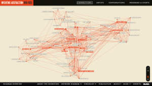
The characters in the story include the two roommates Charlotte and Cheryl, Henry, Alan, Cheryl’s parents, Alan’s parents, the ‘negro’ heroin addict named Skip, Charlotte’s friends Adrienne and Derek, the Father of the Movement, Mrs. Drexel who was Cheryl’s old librarian, the ‘negro’ photographer, the ‘white’ women from the prayer vigil, and the ‘negro’ women en route to Itta Bena. A connection is formed between these characters through an interaction or the sharing of a space.

screen-shot-2016-11-14-at-11-07-26-amscreen-shot-2016-11-14-at-11-07-44-am

The network graph consists of circles representing each character from the story. It centers around the main character and forms a line between the characters who formed a connection. When a circle representing one of the characters is clicked on, his or her connections are bolded. The circles are of different sizes, depending on the number of connections that each character had, which was very interesting. However, I thought it would make more sense to differ the sizes of the circles according to the character’s involvement and significance in the story. For example, since the story is primarily about Cheryl and her relationship with Alan, the circle that represents Alan should be made larger to bring more emphasis to their connection. Another limitation about the graph is that viewers can’t tell what type of interaction occurred or how strong each connection was. For example, the interaction between Cheryl and the photographer was very minimal and one-sided because they merely shared the same space and Cheryl spotted him heading towards a pawnshop.

Digital Harlem

For this assignment, I chose to explore Digital Harlem: Everyday Life 1915-1930. This project presents information about different types of events occurring in New York City’s Harlem from 1915 to 1930 in the form of a map. The information was collected from legal records, newspapers, archives, and other print sources. A search panel is included on the left of the map, which allows users to specify their event, date, location, or person of interest. Multiple searches can be layered onto the map with different indicators of different colors, which enables users to easily compare different events. In addition to the street map, there is an overlying historical map that displays individual buildings during that time period. Another interesting feature is the section above the map, which illustrates the boundaries of the area in which the black population inhabited in 1920, 1925, and 1930.

I agree with Turnbull’s contention that all maps are perspectival and subjective because each visual project presents a different narrative that reveals some information from the dataset and obscures other information. In this particular project, the narrative was influenced by the law enforcement system and its perspective of the criminal acts. In spite of the details provided about each crime, the narrative disregarded the perspectives of the people involved in these acts because the details were gathered from legal records and case files. In addition, since the data was collected from newspapers and other print sources, the narrative only displayed the reported news, which would mainly consist of stories on bigger events because newspapers most likely only print stories that would sell. The information presented appears very impersonal because of the sources of the dataset. Therefore, the title of the project is very misleading because these events did not represent everyday life in Harlem during that time period, but only represented a selected portion of what was going on.

While I found the features of the map very fascinating, the information that was displayed on the map was not portraying the narrative that the project contributors intended to, according to the website’s “About” section. In order to truly capture everyday life in Harlem, there should have been a bigger focus on its culture and history, rather than its criminal background. The project contributors could gather data from older residents about how their days in Harlem were spent and from younger residents about their family histories. What could also be helpful to include on this map is an outline of the Harlem neighborhood.

Data Visualization for Death Rates within the US

For this assignment, I chose to explore death rates of each state for various causes: heart disease, cancer, stroke, respiratory disease, accidents, vehicle-related accidents, diabetes, Alzheimer’s, flu, nephritis, suicide, homicide, and AIDS. The dataset also provides information on population, age distribution, and urbanization, which may allow viewers to find correlations between these factors and the various causes (e.g. higher deaths caused by respiratory disease in more urban regions). However, the time period on these death rates was not provided so I was unable to tell which year these deaths occurred in.

Since the data was already categorized by state, it would make the most sense to present it on a map. However, as the data contains various data types and measures, it may be difficult to present all the information without overloading too much on a single map. What I have done to divide up the dataset is separate each data type into different maps, which would make it easier for the viewers to comprehend the data. In addition, the maps are color-coded with the darker-colored circles showing higher rates and the lighter-colored circles showing lower rates. The size of the population is proportional to the size of the circle. Thus, the bigger the circles are, the larger the populations are and the smaller the circles are, the smaller the populations are. Hovering over each circle can offer more details about each state.

screen-shot-2016-10-24-at-10-57-10-pm

screen-shot-2016-10-24-at-11-01-33-pm-2

screen-shot-2016-10-24-at-11-02-01-pm

While geocoded maps are great at pointing out which states have the highest death rates for each cause, they make it difficult to establish correlations between the causes and the factors such as age or urbanization. In addition, in order to better determine these relationships, more information would be necessary. For example, data on other factors, such as air pollution or vehicle use, would be very useful in order to figure out if urbanization contributes to higher rates of respiratory diseases and related deaths. Since the dataset covered so many various causes, but lacked detail on the factors that could play a role in these deaths, it was difficult to create an overall visualization that would sum up the dataset. Perhaps a stacked bar graph would have been a good option for data visualization because the comparison of the ratios of deaths to the populations would be more visible.

Exploring Los Angeles Payroll

I chose to explore the City Payroll Data of Los Angeles, which provides the payroll information for all the city departments since 2013. The information is organized under various data types and is put into a spreadsheet, which is updated after payments for each quarter are made.

The data types include year, department title, payroll department, record number, job class title, employment type, hourly or event rate, projected annual salary, Q1 payments, Q2 payments, Q3 payments, Q4 payments, payments over base pay, % over base pay, total payments, base pay, permanent bonus pay, longevity bonus pay, temporary bonus pay, lump sum pay, overtime pay, other pay & adjustments, other pay (payroll explorer), MOU, MOU title, FMS department, job class, pay grade, average health cost, average dental cost, average basic life, average benefit cost, benefits plan, and job class link. Details about the data types can be found by hovering over the information button under the column headings. Each row of the spreadsheet presents a record of each city department employee in this dataset.

According to Wallack and Srinivasan, communities and states present information about people, places, things, and events around them, organized in the form of ontologies, which are essentially “systems of categories and their interrelations”. The dataset is a meta ontology, as it is a community-based ontology and a large-scale dataset with numerous quantitative indicators, looking at payroll for the Los Angeles departments.

This data would be most useful and illuminating to city department employees, enabling them to explore and compare the payroll of other employees in various job titles and departments. It would be easier for them to go through the information, as they are able to understand the financial data types and terms used in the dataset. I think it’s also important for residents to explore this dataset and grasp a better understanding of the payroll of city employees and the imbalance of taxpayers’ contributions amongst the departments.

If I had to reorganize the dataset, I would focus on the annual salary and the hourly rate, organizing them from the highest to the lowest. It would also be interesting to organize the data according to job titles. The reorganization of the dataset could make it more focused on identifying which departments are being more favored in terms of payroll. As for data collection, I would like to include gender and race indicators to gain insight on how these data types influence payroll for city department jobs and how sexism and racism still exist in the workforce.

Exploring the Finding Aid for “Walt Disney Productions Publicity Ephemera”

For this assignment, I chose to explore the finding aid for Walt Disney Productions Publicity Ephemera, which is an archival collection provided by the UCLA Library of Performing Arts Special Collections and stored off-site at the Southern Regional Library Faculty (SRLF). The collection consists of a total of 280 pieces–photographs, press books, press kits, film stills, and other print resources of the Walt Disney productions and films from 1938 to the 1980s. Many of the pieces come from over 150 Walt Disney films, which were mostly produced from 1950 to the 1980s.

The finding aid for this collection was processed by N. Vega and includes a descriptive summary of the collection, as well as information about the Walt Disney company and a container list of the projects that are organized in an alphabetical order. The container list specifies the boxes and folders in which the collection pieces are stored at SRLF. The finding aid also provides contact information for inquiries about the collection and requests for access to the collection, which allow viewers to learn more about the earlier productions of Walt Disney and gain deeper insights on how the company came to be one of the global leaders in animation production and family entertainment.

While the scope of the collection covers a large number of the early works of Walt Disney Productions, I found that the finding aid is quite limiting and may not be very helpful for viewers to further look into the collection. Although the finding aid comprises of a biography section that briefly mentions the development of the animation films, it does not provide any images of the pieces from the collection nor any detailed descriptions, making it difficult for viewers to fully understand the narrative that the collection is trying to portray. In addition, the projects are indexed alphabetically, which viewers may find confusing, as it would make more sense to view the collection chronologically. This would enable viewers to follow the progress that Walt Disney Productions has made in the film and entertainment industry, and examine the incorporation of technologies, such as color and sound, into these productions.

Reverse Engineering “Inventing Abstraction”

Inventing Abstraction, 1910-1925 was originally an exhibition at the Museum of Modern Art that celebrated abstraction as a new and bold style of art. It ran from December 23, 2012 to April 15, 2013. It was then made into a digital project that explores the early history and development of abstraction through presenting a network of modern artists and their productions of art.

screen-shot-2016-10-02-at-11-52-08-pm

The content of the project consists of various sources, such as photographed images, and audio and video recordings, which build up the portfolios of artworks by the featured artists. Brief texts and captions describing the artworks are included, as well as additional audio commentaries by other artists for selected pieces found under the tab “Conversations”. The original artworks were gathered from the Museum of Modern Art and other art institutions, and processed into digital sources for web accessibility. Paintings and sculptures were photographed, while poems and other performances were audio- or video-recorded. Information about abstraction, the artists involved, and their works were put into texts and the artists’ names were organized alphabetically. Relationships between the artists were identified by the connecting vectors on the diagram.

The website was built and designed by Second Story. It firstly provides an introduction to abstraction, and then leads to an interactive diagram with a simple click on “Explore Connections”. The diagram illustrates the connections between the artists who were featured in the exhibition at the Museum of Modern Art for having influenced the development of the new artistic style. These relations are shown through the connecting vectors and the names of the artists with the most connections are highlighted in red. The artists’ biographies, including their works, their birthplace, the places they worked in, and their interests, can be found on a separate page by clicking on their names. In addition to the diagram, the website organizes further information about abstraction and the project into different tabs for easier navigation. While the diagram is a helpful visual that emphasizes the connections between artists, the complete list of the featured artists, along with their information, is also provided under the “Artists” tab on top for a more thorough exploration of the project. The Museum of Modern Art also hosts performances and events, which can be found under “Programs & Events”, in order for viewers to experience abstraction first-hand. The bottom tabs include an overview of the diagram, PDF files of the network diagram and the checklist of all the artworks featured in the exhibition, information about the exhibition and the publication, links to related music and the blog, and the credits for the online project. The intuitive web design produces a user-friendly website and the categorizing of information into various tabs allows viewers to gain deeper insights about the project and its topic.