Origins
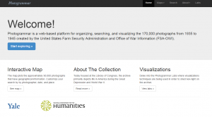
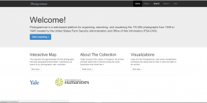
Photogrammar is a site created by Yale which seeks to be a digital platform that organizes the 170,000 photographs from 1935-1946 created by the United States Farm Security Administration and Office of War Information (FSA-OWI). These photos were originally taken as method to building trust and support for government programs for the Roosevelt Administration during the Great Depression Era. They were undertaken by the Historical Section of the Farm Security Administration as way of documenting the United States at one of its worst periods of time, as well as a way of documenting the successful administration of aid relief.
In terms of raw navigation the site starts out with a helpful welcome page that lists options for how to begin exploring the collection, finding out about its background, and for finding new experimental tools as well.
Sources:
The collection used to build Photogrammar includes 170,000 overall photographs. 88,000 of these are printed and placed in the office of the FSA-OWI. 77,000 of the photographs were printed by Roy Styker’s Historic Division of the Farm Security Administration. The other 11,000 come from other sources.
In terms of overall collection origins, the database has grown to include six different collections. The majority of the photographs from the Farm Security Administration collection and Office of War Information collection. The other collections include the Office of Emergency Management-Office of War Information Collection, the American at War Collection, the Portrait of America Collection. All these collections are overall organized and cataloged by the Library of Congress.
Processes:
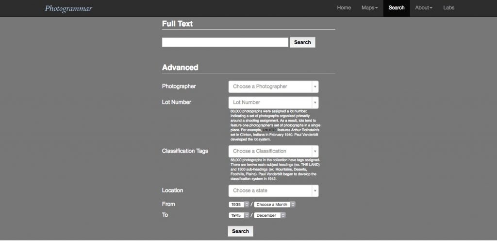
In terms of data processing, the Photogrammar tool had a lot of help with the fact that the Library of Congress had already digitized the photograph collection for them. The team instead had to to organize the overall data into a database that could then sort out geographic and classification information into an easily searchable format.
Presentations:
The Photogrammar team uses a variety of tools to organize and display the large amount of data that they are using.
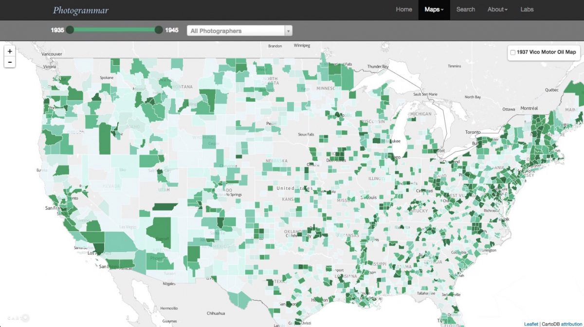
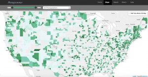
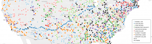
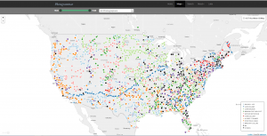
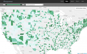
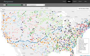
In terms of the main visualization used, the Photogrammar site uses two different versions of its mapping visualization to show the photograph locations in county and dot format.
County:
Dot:
One of the tools they use is CartoDB which is used as a database that serves as the primary mapping mechanism for the site due to its scalability and balance of raster and vector data formats.
A second tool that they use is called Leaflet. This is used for its capabilities as an Open-Source JavaScript Library for Mobile-Friendly Interactive Maps. The library provides an excellent general library for creating dynamic graphs.
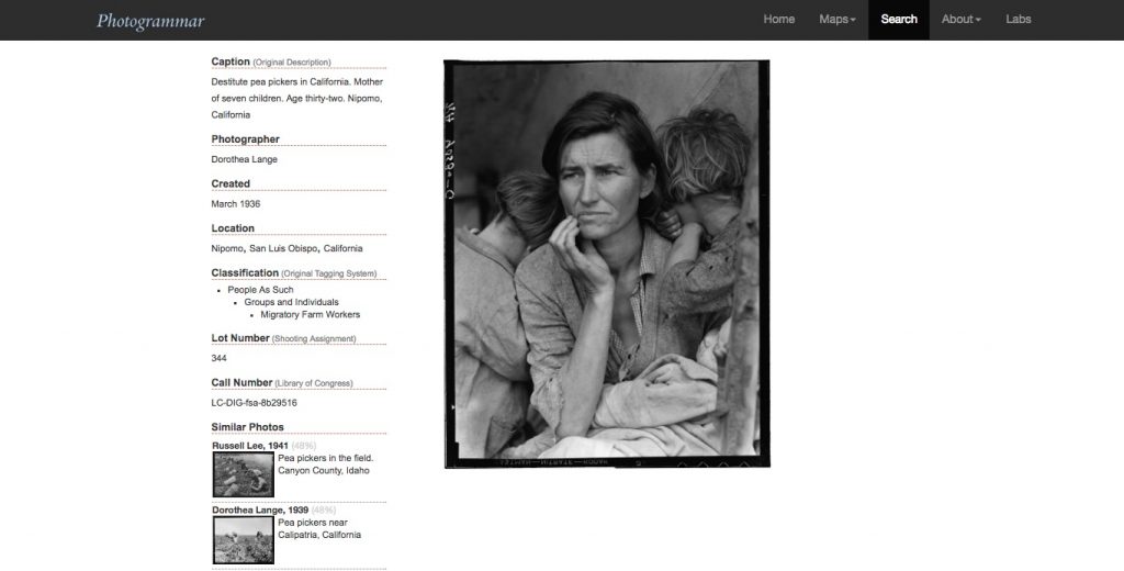
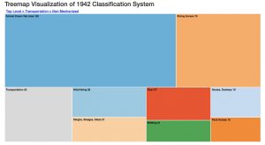
Another tool they use is a Treemap to serve as visualization of the original classification system designed by Paul Vanderbilt in 1942. 88,000 of the photographs were assigned using this classification system which uses 12 main subject headings and 13000 sub-headings which lead into various sub-sub headings.
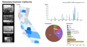
A fourth major process/tool used on the Photogrammar site is the Metadata Dashboard. The dashboard is used as an interactive tool to display the relationship between date, county, photographer, and subject in photographs from individual states using the already categorized metadata of the photographs.

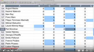

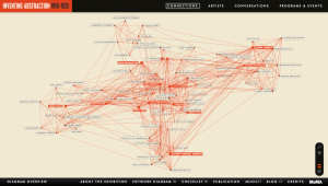
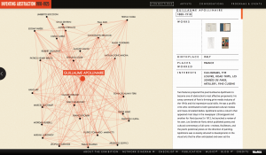
 Inventing Abstraction, 1910–1925 offers a multimedia visualization of the origins of abstraction. Suggested in a diagram, the spread of abstraction is about relationships and collective participation. The website presents a dynamic, 3D diagram of the connections between the artists, so that as visitors interact with the diagram, they can explore detailed networks, view artist portfolios, and draw their own conclusions about influence, impact, and invention.
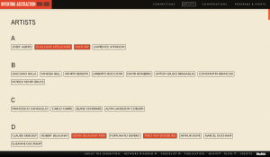
 The home page offers a brief introduction of the exhibition theme and the diagram to the viewers. By clicking Explore Connections, the viewer will enter the most essential part of the website – connections in between the artists. On the left and right side of the website, there are two virtual buttons available for control: return to the previous page and a changeable scale. Such designs facilitate users’ experience when switching from different connections. There are two navigation bars at the top and bottom. The primary navigation includes links to Connections, Artists, Conversations, and Programs & Events, while the secondary navigation leads to About the Exhibition, Network Diagram, Checklist, Publication, Music, Blog, Credits and MoMA.