The Waiter’s Wife

I chose the short story titled, “The Waiter’s Wife“. This is about a married couple, Samad and Aslana, who immigrated to London from Bangladesh in 1975. They moved in order to live closer to a friend of Samad’s, Archie whom he had served in the war with. Both Samad and Archie are married to much younger women, the before mentioned, Aslana and Clara. Samad works as a waiter in his cousins restaurant, alongside other distant family members. His job is hard as he works long hours and receives little pay for it. His struggles continue when Aslana violently confronts him about their low income and her concerns about feeding their unborn twins. After the confrontation, she meets with Clara, who is also pregnant, and her cousin, the shoemaker, Neena. The three sit on a bench in a park and discuss their lives. Aslana reveals that her and Sadam had a arranged marriage and she dislikes him more as time progresses. Neena tries to console her by giving her advice to communicate more with him in order to solve problems together. Aslana disagrees with this, as she maintains her traditional role in the marriage. As the conversation about Aslana’s life and her expectance of two twin boys continues, Neena mentions the idea of abortion. This completely shocks and appalls both Aslana and Clara so much so that a nearby park keeper comes by to inquire if everything is alright. Aslana states that because her and Clara married older men, their children will always struggle with having roots in both the past and the present, which seems to be an underlying theme throughout the short story.  When they affirm that they are alright, the male park keeper retreats through the park trees as the women wave goodbye to him.

the-waiters-wife

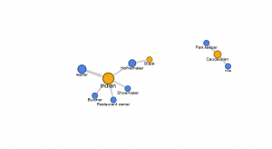
This short story deals primarily with the struggles between time and age  and the differences that those factors can have on daily life. I  entered the following information in the column tabs of my edge list, “name, job, ethnicity, gender, married” in order to categorize the characters. When I plugged them into the Fusion Table, I found that the graph is most illuminated when I compared ethnicity to job type. This created a more cohesive graph in which I was able to visualize the connections between ethnicity and where the characters worked. Because this short story deals with subtle, but complex, issues regarding the tensions that arise between generations the impact of this graph was greatly minimized because I could only compare two  elements at a time. It would have been far more engaging to incorporate more elements or another type of software in order to create a more robust network of relations that span across multiple categories.

Locating London’s Past

I chose to examine the map Locating London’s Past. This mapping project compares two early maps of London, John Rocque’s 1746 version and the 1869-80 Ordinary Survey map, which was the first accurate map of London. These geo-referenced maps were then indexed with historical databases that documented various records such as taxation, elections, coroners’ records, parish registers, and archeological evidence. The user is able to navigate between drawn and modern maps of London and individual sets of data. The user is asked to choose a base map on which to begin mapping data. When a specific data set is selected, the map feature digitizes the area of most concentration on the map itself or provides pin points to indicate the precise location of a data set. The represented data is color coordinated and David Turnbull writes in his project, “Maps are Territories” that maps are generally defined as selective, as the cartographer or printer maker can decide what to include or exclude. Locating London’s Past, I believe, gives a pretty well rounded representation and as Turnbull states, allows the data to be indexical as it recognizes its connections to humanity.

untitled-picture

The data sets on the site allow for the user to both interact with the map, and cross reference early drawings of London with modern day maps while providing extensive information on the data set themselves. I would make the argument that this site largely focuses on the data presented, rather than the graphical interface of the map. This is also attributed that the interactive map is displayed on its own individual tab on the site and the user is expected to go back and forth between this and the “Data” tab. The data tab is important to have because it provides citations of information, however I think that it would be more been more effective to have the data and maps on the same page in order to see changes made on the map as you play with data sets.

Data Viz

I used the data set that my group was given for this blog post. I believed that by doing this, I would better familiarize myself with the data set and it would allow for a better understanding of how to work with the data itself. Due to the data set of the New York tenements, the options for data visualization were very limited as the data types consisted of static records, for the most part, when it came to the categorization of dates assigned to the photographs, which volume the images are collected in, where the image came from. The variables within the record set were the description of the item and the URL link to the image itself. I uploaded the data into a Fusion Table first and found that the visualization was messy and did not allow for a deeper understanding of the values. After uploading the data to Tableau, Palladio, Plotly, and RAW with no success,  I uploaded that data to Wordly, which actually did work. I only used the “description” column of the data set which contained the locations of the photographs. From here I learned that the largest concentrations of photographs were taken in Manhattan and Brooklyn. This is very important to know because I may be able to adjust my research question to better reflect these two specific cities in New York. Seeing the visualizations of location really helped me to understand where each photograph was taken and I can now consider how to compose a humanities research question based on location. In order to work further with the data, it is very important to clean the data table itself especially in the “description” column. It would be very useful to split the information provided in terms of city (Manhattan, Brooklyn, Bronx), specific types of housing (row houses, apartments, tenements) and if it’s either labeled as a interior or exterior image.

wordle

LA Controller

I chose to examine a data set from the L.A. Controller’s Office that focused and describes L.A. Procurement This category is under the label of “Purchasing” and when I followed the external link, I was prompted with a page that was titled, “Data Cards”. This data set is comprised of fifteen categories, each labeled by the name of the expenditure, the quantity of what was purchased, and lastly the final cost. A record set in this particular data set is comprised of a description, cost and date of purchase of a specific type of item. These records, constituted through a detailed description of the procurement detailing the date of purchase, cost, description of the item, and supplier. According to Wallack’s and Srinivasan’s definition of identification of a data set, this digital representation of various categories that are related to the Los Angeles Controller’s Office, of which there are records that detail the specific datasets within each category. However, Wallack and Srinivasan mention that the different representation ontologies may shape reactions to them in varying ways, so that it is very important to consider ontologies, their completeness, in addition to their overall quality for comprehension.

I believe the person that would find this data set more illuminating is someone who wants to know about the expenditures of the city. The ontology provided is completely monetarily based and someone searching for a deeper narrative may want to consider additional information to better understand the community itself and what that community requires as vital resources. This information would also be helpful to someone to is attempting to understand what the city government is allotting money for, and the exact quantities which could be cross referenced with a list of community needs so that someone could visually see what is being asked for and in turn, what is being provided.

Walt Disney Productions Publicity Ephemera

I chose to examine The Walt Disney Productions Publicity Ephemera collection from 1938-198x. I chose this because it seemed like the most enjoyable website to comb through while gaining a better understanding of the publicity materials used by the Walt Disney Company in its early years and through its massive expansion as a leader in the entertainment industry. This collection of publicity ephemera is an archived resource provided by the UCLA Special Collections Library that indexes the company various projects alphabetically. This collection of ephemera consists on photographs, press materials, such as press kits and books, stills, and other unique printed publications related to the film projects during this time. Based on this website, the historical narrative that is presented is one that is purely based on physical documents that are kept at an off-site location. Unfortunately, this site does not allow for any deeper understanding of the collection as it does not provide images or even descriptions of the content listed.


Due to the list of contents arranged alphabetically, the dates of each of the projects jumps around and it is hard to place which project may have been associated with which film. The descriptions are vague such as “Peter Pan – press kit material and still 1952”. Without images or descriptions of the images, it is hard to understand the full narrative of the collection. As Disney deals in visual representation primarily through animation, an imageless website does the collection a severe injustice. It would provide the viewer of the site more entertainment to see documents pertaining to this material in order to understand the marketing initiatives of the company, the changing visual representations of characters. This type of content does more than simply make a website more enjoyable to look at and explore, it provide the viewer with vital information.


Seeing art and materials is more than just ars gratia artis for the viewer. It provides a vital narrative of the historical time period and objectives of the company itself. It would be interesting to see if changes in press kit and character designed changed and how it did so through the time period of 50 years. Perhaps if the documents listed on the website were categorized by date, substance (press kits, photographs etc.), or project the overall data would be more easily read and therefore better understood. It would be very difficult to conduct thorough research based on this website alone.

Inventing Abstraction

picture1


The interactive website, Inventing Abstraction, visually represents the connections abstract artists had to other artists, writers, and performers  between 1910-1925. The website is reliant on it’s sources which are the information of each artists represented on the site. These sources are from common histories and research of each of the individuals and on how these individuals were connected or inspired by one another. In order to begin reverse engineering this website, one must consider the goal of the website designer in order to create a user friendly experience for visitors to interact and learn from the page.

I am unsure what specific platform was used to create the site, but it is presented to the viewer much like a sociogram that a communications researcher would create. The programmer would first need to create a template in which multiple nodes could be represented, then begin drawing connections between them. When the user hovers over a name, the name is enlarged along with each of its connections.

The interface of the website is created, as previously stated, as a sociogram in which each individual is represented by a node that states their name. Each name is connected to another node by a line. This creates a complex digram of connections between each artist. When the user clicks on one of the nodes, a new window pops up in which the user can see a more intimate sociogram of connections. In addition to the diagram presented, on the right side of the display screen contains important information to further understanding the artist and the work they produced. This right side display contains the dates the artist was alive, where they were born, where they worked, artists interests, a truncated biography, and examples of their art. When the user clicks on example artwork thumbnail, a new page appears that depicts a larger verison of the work, it’s title, date, and the medium used. This presentation, I believe, is quite successful as art is often a product of influence. Abstract art, as mentioned on the website, began with just a few number of abstract artists who portrayed their world in a completely new way than previously seen, and then quickly expanded into a new art movement. The website fully examines how this expansion occurred through the visualization of connections and therefore inspiration. Because of the influence artists had to one another through geography, time period, or personal connection created what Art Historians now refer to as Modern Art.