Network Graphing

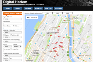
This week, I read a short story by Callan Wink, entitled “One More Last Stand”, and created a network graph using Google Fusion Tables.  This network graph serves to visualize the relationships between characters in the story.  If characters mentioned or interacted with one another, I considered it a connection and used such data points to build an edge list.  Network graphs are a neat way to display associations in a more understandable way.  But, as with any graphic, there are restrictions to the amount of detail and accuracy included.

screen-shot-2016-11-13-at-11-04-43-pm

The resulting network graph [pictured below] successfully illuminates the frequency certain characters saw each other and accurately demonstrates who spent the most time together.  However, it failed to accurately represent the closeness of all the relationships.  For example, the story follows the main character, Perry, and the Indian women he is having an affair with, Kat Realbird, at an annual historical war reenactment.  The graph clearly shows the weight of Perry and Kat’s affair, because they spent so much time together (they have 14 connections).  However, it does not necessarily show the true importance and influence of other relationships they have – Perry to Andy, his wife, and Kat to John, her husband.  Even though these are marriages and therefore close connections, the network graph only illustrates their weight as 4 and 2, respectively (as opposed to the affair that had a much stronger weight). 

screen-shot-2016-11-13-at-11-03-52-pm

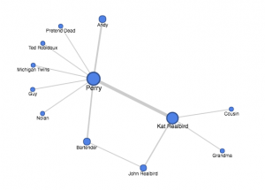
Another example of this type of graph’s limitations can be demonstrated regarding the relationships with the weight of “1”.  Since I built the edge list around anytime characters interacted or mentioned each other, some connections seemed to have equal “weight”, when in fact the true relationships were very different.  For instance, in the beginning of the short story, Perry asks about Nolan, and old friend who he has known for years.  Later, Perry encounters a random stranger (labelled as “Pretend Dead”) who played dead in the war reenactment.  Perry doesn’t not even talk to this stranger- he only shares a scene in the reenactment with him.  However, both of these connections are given a “1” weight, and therefore seem equivalent on the network graph when they, in fact, are not.  Mathematically, the relationships are the same, but in reality, Perry was close friends with one man and had never spoke to the other.  These examples demonstrate the clear limitations to how much detail a network graph can really serve to show.

Digital Harlem

The Digital Harlem project is used to display the “everyday life in New York City’s Harlem neighborhood in the years 1915-1930” (Digital Harlem “Welcome”.  The creators chose to source information primarily from legal records – District Attorney files, Probation Department files, investigation reports – newspapers, and W.P.A. Writers Program Collection.  They present the data as a map. 

screen-shot-2016-11-05-at-5-31-59-pmAlthough maps are often viewed as universally understood, factual, and objective, this is not the case.  As discussed in the Drucker reading, humanities visualization is not without interpretation and bias – even in a map.  The subjective perspective of Digital Harlem stems from its limited and very specific sources.  This map focuses on crimes (police and investigation sources) and events deemed newsworthy (newspaper sources), clearly reflecting the perspectives of the police and reporters of the time.  Though the subtitle of this project is “Everyday Life 1915-1930”, it really can not be an objective depiction of everyday life if the focus of its data centers on sensational events.  How can an holistic depiction of “everyday life” consist only of criminals that broke the law and events that were reported in the paper?  David Turnball asserts that “maps are selective: they do not, and cannot, display all there is to know about any given piece of the environment” (Maps are Territories exhibit 1, page 3).screen-shot-2016-11-05-at-5-31-27-pm  Digital Harlem exemplifies exactly what Turnball says.  It is not inaccurate per se, it merely leaves out important information that should have been considered.  This map reveals the noteworthy events that shaped life in Harlem, but obscures the ordinary happenings that also played a large role.  While life events like “Wedding”, “Bowling”, and “Party” are included, it leaves out the common school, work, and home life that makes up the majority of “everyday life”.  Digital Harlem makes the assumption that the most influential happenings in everyday Harlem are those 72 that it lists and maps.  This is, of course, a subjective decision.

An alternate map could be one that did include more daily events, such as school, work, birthdays, cooking, laundry, etc – events that are more frequent in everyday life.  However, these can not necessarily be pinpointed on a map, so perhaps a written section on the side could describe characteristics of daily happenings and include pictures.  This would give a more well-rounded, comprehensive illustration of what daily life for “African New Yorkers” looked like.  I also imagine that the map could include a photo or newspaper clipping of the events, when a viewer clicks on a map datapoint.  By providing this, the viewer may be able to further visualize, empathize, and understand the history of life in Harlem.

New York Tenements and Ethnic Locations

ethnic-locations

        I chose to build a visualization of the New York Tenements dataset.  I selected only a portion of the data to map, knowing that visualizing all of the data would have been a challenge.  Using ZeeMaps, I depicted the restaurants, businesses, etc, that were clearly identified as a particular ethnicity.  For example, “Gessi Antonicelli Italian American Groceries” was clearly indicated as catering to Italians in New York.  I wanted to map this data to see if locations catering to certain ethnicities were clustered around the same area, potentially depicting that Italian Americans grouped together in one part of New York, while Chinese Americans grouped together in another.  While the New York Tenements dataset is not comprehensive of all ethnic locations that existed in the city around the 1930s, it is a good starting point to see the distribution of ethnic tenement communities. 

screen-shot-2016-10-23-at-3-57-17-pm

        ZeeMaps provided a way for me to visually represent the geographical point of each location, as well as which ethnic locations were in the vicinity.  The data itself would not have been able to convey this as well as a visualization.  Nathan Yao’s principles, outlined in Data Points, discuss important aspects of data visualization.  He asserts that visual cues work “because your brain is wired to find patterns, and you can switch back and forth between the visual and the numbers it represents”.  Taking this idea of patterns into consideration, the main visual cue I used was position.  With a clear position indicated for each location on the map, the data was much easier to understand.  The viewer would not need to know where certain streets or Manhattan or Brooklyn were, or even how close they were in relation to each other.  Instead, the viewer could just see all these things -and comprehend them much more quickly -on the visual map provided.  The map would be a way to see the patterns, as Yao mentions, clearly.

screen-shot-2016-10-23-at-3-49-23-pm

       The other visual cue I utilized in this interactive map was color.  According to Yao, “differing colors used together usually indicates categorical data, where each color represents a group”.  This is exactly how I chose to organize my data points: red, purple, blue, yellow, bright green, and black represented Chinese, Italian, French, Hungarian, Czech, and Romanian, respectively.  This way, the viewer sees each color and easily understand where certain ethnicities tend to be clustered, as well as the number of locations there were for each ethnicity (based on this dataset).  Although Yao mentioned the problem with red and green, and the potential colorblindness of many people, I chose to keep red and a bright green.  There were already 6 colors being used, so it was difficult to find another very distinct color, as well as the fact that I thought the bright shade of the green may help differentiate it from the red.

L.A. Controller’s Office: Health, Environment and Sanitation

The “Funds relating to Health, Environment and Sanitation” dataset collects information on government money made from various health and environment-related municipal services.  Data types recorded include the Fund Name, Cash amount, Fund Purpose, Sources of Funds, Ending Fund Balance, Assets, Liabilities, Current Collected Revenue, Currently on Budget, and more.  These data points make up a record that is distinctly aimed at recording each fund’s monetary information.

In “Local- Global: Reconciling Mismatched Ontologies in Development Information Systems”, Wallack and Srinivasan discuss how “ontologies represent reality, but this representation of information may in turn become the basis for actions that in turn shape reality…Any actor’s effectiveness in achieving their goal thus depends on the quality and completeness of their ontology” (3).  Therefore, the success of any public policy is partially dependent on the “completeness” of a dataset on which the policy is based.

The “Health, Environment and Sanitation Funds” dataset has an ontology, in which its data is directed primarily at the monetary spending, sources and revenue for municipal services.  For example, this dataset displays the astonishing amount associated with the “Solid Waste Resources Fund” – more than $200 million!  As a result, this ontology makes the most sense to provide information for  any city department in charge of keeping track of profits, expenses, and the movement of funds. This system is an effective way to follow where large amounts of money are being both spent and received.

screen-shot-2016-10-15-at-9-09-58-pmAs Wallack and Srinivasan state, “States’ attempts to promote “development” are thus limited by the information loss between the community ontologies that define development and meta ontologies that guide their actions” (3).  This “information loss” is a result of each dataset’s particular ontology, and how it may not be able to tell any other narrative than the one it was created for.  This can be seen clearly in the ontology of the “Funds relating to Health, Environment and Sanitation”, and how it is directed at tracking government spending.  The ontology of a dataset greatly influences the policies for which the dataset is being based on.

Since the fund highlights the money aspect of health and environmental services, it does leave out other data points.  For example, this dataset does not take into account the success or customer satisfaction of the services.   Projects for “street drainage improvement”, “Air Pollution Reduction Projects”, a “center to provide drug use education”, and more could be evaluated to see if actually made a difference in improving the city.  This could be an example of a useful ontology from someone else’s point of view.  For instance, an environmental organization would shift the emphasis from money to one of city betterment and improving the health of citizens.  They would be interested in questions like, how was the city’s solid waste sorted to be as environmentally-friendly as possible? How much did the “Air Pollution Reduction Projects” actually reduce L.A. air pollution? These are examples of others questions that could be asked, and were not addressed in this dataset ontology.

Bonnie Cashin Collection

The Bonnie Cashin Collection of Fashion, Theater, and Film Costume Design is an extensive archive of the renowned designer’s work, personal papers, illustrations and more.  This archive, personally collected by Bonnie Cashin herself, documents her long and influential design career.  The photographs, letters, designs and other materials are enough to fill 318 boxes and 4 garment racks.  However, as detailed and inclusive as this Cashin collection truly is, there exists a limit the kinds of stories that it can tell.  As comprehensive as any historical catalog can be, there are always the stories told and those lost in the past.  In “The Narrativization of Real Events”, Hayden White discusses the process of turning real events into remembered narratives, and states that “every narrative, however seemingly “full,” is constructed on the basis of a set of events which might have been included but were left out” (White 14).  This concept can be seen in any collection, but I will be looking at it specifically with the Bonnie Cashin Collection.

screen-shot-2016-10-09-at-11-09-22-pm

Since Bonnie Cashin’s archive includes both a large number and large variety of records, it has the potential to tell many stories.  If based solely on the files in this collection, the historical narratives that could be told would center on Cashin’s design work.  We could see the progression of Cashin’s fashion style changed from when she began designing, around the 1920s, to the later part of her career, around the 1960s.  We could also study the similarities and differences between Cashin’s designs for different purposes.  She produced pieces for chorus girls costumes, film, ready-to-wear, WWII women’s civilian defense uniforms, rainwear, and more.  Each of these designs had to take into account different needs for functionality and glamour-appeal.  Scholars could research her designs for different brands, and consider how they appealed to different consumer audiences.  The archives also provide a glimpse into Cashin’s personal life, since it includes vacation photos, travel journals, personal letters and more.  Although none of these narratives could be a holistic depiction of Cashin’s extensive work and life, they could serve as representations and examples of the whole. 

In contrast, narratives that could not be told singularly through this collection include anything related to the fashion industry overall. Cashin’s personal archive could not tell her lasting influence on the industry, or specifically, how her original design for the Coach handbag may have influenced its later and current designs.  This could be remedied if designs from contemporary society were compared, and analyzed to find similarities.  Also, it may not be able to accurately depict the popular fashion style during her time.  Although it likely could give a general idea, we would not be able to conclude that Cashin’s designs reflected all of the time’s trends.  This could be changed if other high-end design archives from the mid 1900s were used to recognize the most popular styles.  It is true, historical documents- no matter how “full”- are crucial to remembering the past, but we must understand that they can not and do not represent all stories.

DH101 Photogrammer Blog

photogrammar1_baoli

The Photogrammer project is an online visual and organizational site used to view 170,000 photographs from the 1935-1946 U.S. period.  These photographs were taken across the nation, documenting American life during the later Great Depression and through World War II.  Developed by the U.S. federal government’s Farm Security Administration and Office of War Information, this photography project was designed to increase domestic support of government relief programs.  Photogrammer includes an interactive map and archive, both of which utilize classifications tags that allow the viewer to search for specific photos within the expansive collection.

The primary source of data for the digital Photogrammer project is the FSA-OWI Collection.  However, it also includes a number of  photographs from the Domestic Operations Branch, Overseas Operations Branch, Office of Emergency Management- Office of War Information Collection, American at War Collection, and the Portrait of America Collection.  On the “About” page, the Library of Congress is also thanked as a source for “maintaining and cataloging the collection”.

After finding sources for the photographs, the Photogrammer team had to process the data.  One major organization process had already been completed by Paul Vanderbilt who developed the “Lot Number system and Classification Tags system”.  This three-tier classification system categorizes photographs by subject (ex: “work”) , activity (ex: “social and personal activity”), area (ex: “The Land”), and more.  More ways of categorization were added for this project, including date, specific location, and photographer.  Besides this, the photographs had to be scanned in order to be viewed digitally.  Also, detailed data on each photograph’s geographical location had to be computed to create the site’s interactive map.

Lastly, Photogrammer is mapped w/ Leaflet and CartoDB attribution.  This interactive map plots geographical information of the photos.  Users can customize their search by selecting a specific photographer, time period, and/or place.  The points on the map can be viewed by county, which is the default, or by dots, which is specific to each artist and their location. 

screen-shot-2016-10-03-at-1-07-56-pm

screen-shot-2016-10-03-at-1-08-06-pm

The county view gives a more holistic, overarching glimpse of number of photographs per location because the counties depict a larger area and specific artists are not taken into account.  Meanwhile, the dots view is much more precise because each dot pinpoints the location of where each particular photographer captured their photographs.  The lab visualizations include Treemap, Metadata Dashboard, and ColorSpace (which is coming soon).  Treemap is an interactive depiction of Paul Vanderbilt’s 1942 tiered classification system.  As the user clicks on each square, the photo search classifications become more and more specific.  The interactive Metadata Dashboard of California uses a 1935-1946 timeline presentation, subject classification bar graph, photographer pie chart, and map of California as another means to search for and see connections between photographs.  Finally, the Photogrammer blog, which gives extra insight into the process and thought behind the project, is powered by WordPress.