Class Blog

MoMA’s “Inventing Abstraction”

The project I chose to explore was the Museum of Modern Art’s “Inventing Abstraction” (1910-1925) because my mother is an abstract artist, as well, and it is interesting to be able to take a look into the beginnings of the abstract art world. Growing up, I was always dragged around to museums to view artwork without being able to appreciate the art because I did not understand its historical or cultural significance. However, this website may aid in being a bridge for younger and more digitally-minded patrons of art museums because this interactive website exhibits abstract art from the period of 1910 to 1925, and many of these works can be found in the New York City Museum of Modern Art today. This website also exhibits abstract artworks from across many various media platforms–from poetry to dance, and from painters to photographers… Abstract art is both an artistic movement as it is a historical and theoretical rejection of narrative subject matter in artworks that had become so commonplace to artists and patrons of the past. I began searching through this website on its title page, which fittingly displayed an abstract painting in the background of some text that described the background and purpose of the art movement’s website. I then clicked the “Explore Connections” button on the title page, and began sifting through the site from there.

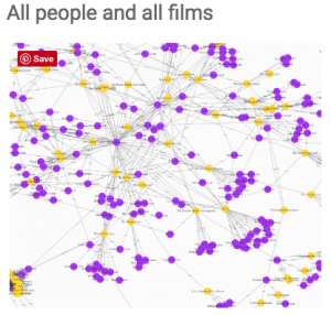
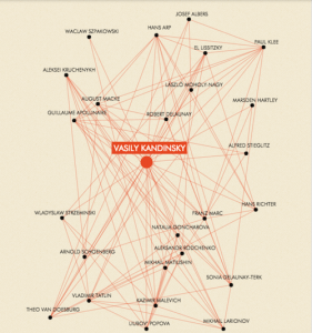
It is clear through the primary diagram display on the “Connections” tab that the abstract art movement did not start from a singular source, but was much more networked over a period of time and in different locales across major cities in Europe and the Americas. The diagram display is interactive, and shows just how interconnected each artist was to a group of at least four or five other artists. Once one clicks on one of the artists named, it will bring them to another page, where the artist selected is of main focus, seen in the featured image of this post. The site then organizes and exhibits the artist, the years he was alive, his birthplace, places worked, and artistic interests, which all contribute to the images of works he or she produced. One may even click on the works provided, and be linked to another web page that displays the image in a larger format, and gives information such as the year it was produced, the title, and a description about the work. While this is a great way to exhibit the collaboration between artist networks and later show individual progress in the abstract world, I did not appreciate how certain artists (such as Kandinsky) had long paragraph-form descriptions about them in this section, while others had none. Although this may not have been avoided due to lack of information given to the museum, I think the museum could have done a better job at creating a more streamlined view of each artist’s background. An example of this is how prolific and influential artists such as Georgia O’Keeffe did not contain long text descriptions on their artist page, despite their importance to the abstract art movement.

On the “Artists” tab, all of the artists presented are organized in alphabetical order by last name, and clicking onto an artist’s name will bring them back to the same artist’s diagram page, as previously discussed. Again, some artists have their names highlighted in orange, while most of them do not. Those with orange highlights seem to be important actors in the abstract world’s initiation and foundation because long paragraphs are written about them in the white space provided below the “Interests” category. Though this can be easily deduced, I wish it had been explicitly noted why the orange highlighted names were presented in such a manner, for those who may not be so technologically savvy. It also bothered me that certain players’ “Interests” sections, such as Max Weber’s, were left blank, when clearly he had many artistic interests that influenced his career and the movement itself.

I thoroughly enjoyed the “Conversations” tab, which displayed videos mainly of artists speaking about important abstract artists and their works from this period. Abstraction can truly be an interactive process, despite its variation in medium. The videos are informative and a more personal way to examine information to be learned from this exhibit. However, I did have trouble playing a couple of the videos, and I am not sure on what end this may have been a problem from…

Finally, the “Programs and Events” page displays upcoming events at the MoMA that relate to these abstract artists described in the movement, whether it be through an exhibition or a dance performance. This page includes images of the work, text about the artist and the work itself, and hyperlinks to purchase the tickets, and/or the artist’s website. Everything is categorized by event in a clear manner due to color. Overall, this page allows the digitally interactive website to come to life with real events that people can interact at and discuss more of the works. While I liked the abstract display of the title page a lot, I wish the rest of the site’s page used colors and background displays that perhaps reflected the work of the artist themselves, as the title page did.

Early African American Film

For this week’s blog post, I’m choosing to analyze the DH project, Early African American Film. This web-based database is a compilation of early African American silent race film information gathered from primary and secondary resources. Information on these films created before the 1930s include details on specific actors, directors, production companies, among others. The purpose of this database is to promote awareness about this period in film history and to educate interested individuals on how this data is presented. As can be seen below, this database is presented with an easy to use navigation, with tabs distinguishing different aspects of the project and outlining the process of presentation. The different tabs give visitors a walk through the thought process of the team, as well as types of data used and how the data was reorganized using data visualization tools to fit the purposes of this project. In addition, the home page gives links to tutorials on how this project was put together.

eaa-home

I thought this project was extremely easy to navigate and understand. I really enjoyed the use of tabs and clearly depicted data visualizations. The tutorials and links to how the data visualizations were created were also extremely helpful. The time map in particular was one of my favorite visualizations because it showed how early African American film production companies have come and go over time. I thought it would have been even cooler if they had associated this rise and fall with any specific event in relation to African American rights.

Source

Source of data includes records on early race films produced from 1909 to 1930. Record information includes details on associated peoples and production companies. Primary sources such as notes, correspondence and conversation were also used. Data collected was filtered and cleaned up based on whether the film had African American self-determination. This database also defines early African American film as having some combination of the following aspects:

  • African American Cast
  • Produced by an African American owned company
  • Intended for exhibition to African American audiences
  • Produced outside the Hollywood system
  • Designed to counter prevailing caricatures of African Americans on film

Process

This data was processed using data visualizations based on connections the team saw within the dataset. Before the visualization, the records were cleaned up and filtered based on their working definition of Early African American race films. It was then sorted into a relational database for easy navigation, pictured below.

eaa-data

Presentation

Data presentations include charts made with plot.ly, time maps and a network graph made with web-mapping platform CartoDB shown below. The nodes signify entities and the lines signify a connection between them. The network graph includes all associated people in relation to silent films selected by the team. The people include actors, directors, producers, writers, cinemtographers and “otherwise involved”.

eaa-network

The charts include the number of films premiering every year, with a peak in 1921.

eaa-chart

The time maps show the locations of African-American based production companies by founding year. The still maps show the geographical expansion of African American film related companies, signifying a strong Eastern influence.

eaa-time-map

Blog Post #1: Early African American Film

The Early African American Film project is an online scholarly database constructed by undergraduate and graduate students apart of the Digital Humanities Program at UCLA. The project aims to build a comprehensive archive of early African American silent race films– the films produced from 1910-1930 for African American audiences. The project collects and organizes information on the early films, actors, production companies, and other components related to this film history. While only a few of these early films survive today, the research work done by the EAAF project and other media scholars helps highlight the importance of this filmmaking community, and how these race films functioned to articulate the narratives of African American identity in the 20th century.

Circular advertising Nobody’s Children (Maurice, 1920), held at the Middle Georgia Archives.

The project pulls content from a number of primary and secondary sources. The Early African American Film database is grounded in records and documents chronicling the films of the era, as well as the people involved. The dataset was formulated using information from major archives, including the George P. Johnson Negro Film Collection, the Mayme Clayton Library and Museum, the UCLA Film and Television Archives, and so on. Central secondary sources include a number of essays and publications examining this moment in Black American film history.

The dataset is made accessible via a downloadable Airtable database embedded on the website. The project also uses Zenodo, a research data repository that allows researchers to deposit datasets online. Zenodo is linked to the software-sharing platform Github, which allows scholarly users to interact, modify, and alter data. Github also works to compile and track the transformation of data, even crediting all contributors.

The content is organized and methodized, materializing in the form of various data visualizations. One such data visualization is the network graph. In the network graph, the circles represent individuals, while lines refer to connections between the individuals. The network graph allows users to visualize associations between actors, directors, producers, and all those involved in a given project. Another visualization tool utilized is the time map. The time map offers a clear depiction of trends seen throughout early African American race film history. This includes where African American production companies were based, the year founded, and etc. The project also features histograms created using plot.ly. The histogram visualization shows the number of race films premiered per year, allowing viewers to note peak years of production, or a decline in output. 


Inventing Abstraction


inventing abstraction

Inventing Abstraction is an interactive historical web project that elaborates upon the vast network of artists, musicians, choreographers, and poets who contributed to the birth of abstraction — a radical element of modern art  that was critical in the development of post-modernism. As a supplementary web document to the Inventing Abstraction exhibition at the Museum of Modern Art in New York, this illustrated network of artists serves as additional context for the curatorial statement, which names a few key players in the 1910’s and 20’s whose relationships formed this conceptual movement.

This web project features the following sources, processes, and presentations:

Sources (assets): Scans (images) of original paintings, drawings, scores, and books are included in this web of artists, in addition to copious amounts of background text (such as birthplace, affiliated studios, interests, and short bios). Each artist’s node in the interactive web map has additional links which describe in detail the production, inspiration, and conceptual trajectory of selected works from their careers, in addition to mp3’s of their compositions (if musical). There also exists a PDF checklist of all work included on the site.

Process (services): The home page of the website is embedded deep within the MoMA website infrastructure, nestled within the interactive exhibition folders circa 2012. The direct link provided by this class to this web page is convenient, as it simplifies the visitor’s ease of access. The network diagram of artists featured on this website is the main point of interest, and offers a minimal amount of interactivity via clicking on the nebulous, bobbing nodes, which then link the visitor to additional information about each artist. This complex node network system was made possible by the design company Second Story in collaboration with MoMA’s curatorial and design team. Upon further inspection of the html code, one will find that the node network uses a google analytics node script, which offers the visitor a dynamic and accurately linked experience at which they may explore each artist’s web buried within the larger network infrastructure.

 
Presentations (display): This site utilizes general design motifs and color schemes that mimic those of the Bauhaus style, which was an experimental art school (1919 – 1933)  placed at the latter half of the timeline focused on in the Inventing Abstraction exhibition (1910 – 1925). The layout of the node network page is generous and avoids any claustrophobic pitfalls of a cramped page that tries to fit too much into the window at one time; whenever a node is selected, the network narrows in size and focuses on a much smaller web of related individuals to give the subsequent text room to breathe.  

Inventing Abstraction

Inventing abstraction is an interactive website site based on MOMA’s 2013 exhibition that explores the trajectory of abstraction through modern art. The site consists of information on artists influential to the movement spanning from 1910-1925. With the information provided audiences are able to construct comparisons of participating artists, and understand the movement itself as an agglomeration of changing ideas that originally sought to undermine and challenge concepts related to how we construct and understand imagery.

Much of the Site’s source material is derived from the exhibition itself, as well as the exhibit catalogue, featuring in-depth information about the artists included within the show. The site also features videos and audio samples of contemporary artists speaking about specific works within the show and curatorial director Leah Dickerman explaining her intentions as they relate to the contextual history of abstraction.

Leah Dickerman’s main argument within the show is to emphasize the interconnectivity of artists involved within  the movement, to dispel to the idea that abstraction was contrived in a space of isolation. The main bulk of the website supports this claim as it visually shows how many artists were in dialogue with one another.

In order to process this material, Dickerman sat down with her team of researchers and placed all of the artists in a Microsoft Excel spread sheet. From there, they would go through each artist and see if they were acquaintances of or in dialogue with any of the other artists within the list. They would then draw a line connecting the artists, quickly creating a complex web of interconnectivity.

The information is presented with an interactive map that allows the user to click on each individual artist to view who they had been in dialogue with. Artists who appear to be connected to a severe degree are labeled with a red font.


Vasily Kandinsky being the ‘most connected’, much of which can be attributed to his published works and the circulation of these writings. As the user clicks on each artists a new page appears that allows a more centralized and specific account of interconnectivity.

screen-shot-2016-10-02-at-10-50-15-pm-copy

As well as this complex web, the site lists each artist individually in alphabetical order, when a name is clicked on it will provide the web that displays the contextual role that each artist played within the movement, listing the work exhibited within MoMa’s exhibition as well as where they worked and art historical movements that they were invested in.

The website itself allows a helpful visual argument to Dickerman’s main point, which suggests abstraction evolved as a conversation and experimentation among artists within the early 19th century. The interactive quality allows the user to engage within this experience. However, the site does not seem to specify exactly what constituted as ‘being connected’ with another artist as it can be assumed that some artists may have been more direct dialogue than others. Regardless, the website is able to paint a comprehensive picture of the complex evolution of abstraction.

Reverse Engineering: Inventing Abstraction MoMA Exhibition

screen-shot-2016-10-03-at-12-45-42-amInventing Abstraction: 1910 – 1925 is a website accompanying a MoMA exhibition by the same name that showed in New York City from December 23, 2012 – April 15, 3013. When browsing this URL, the user learns about the artists and artworks that brought about the abstraction movement. Every page educates the user with another layer of context and historical significance about Abstraction’s inaugural years.

Sources (assets)

In the MoMA Department of Painting and Sculpture, Curator Leah Dickerman along with Curatorial Assistants, Masha Chlenova and Jodi Roberts curated Inventing Abstraction: 1910 – 1925 both in the MoMA’s physical museum space and online in the digital space. The curators were responsible for selecting what would be presented in the exhibit: paintings, drawings, books, sculptures, films, photographs, sound poems, atonal music, and non-narrative dance. After researching active artists between the years of 1910-25, they selected a total of 92 artists to be featured in the exhibit, and catalogued which artworks to include. Throughout the process the art had to be photographed, scanned, transcribed, recorded, restored, shipped, and installed until it was fully integrated into the exhibition.

Processes (services)

The process of creating the exhibition and website required the MoMA’s staff to reach out to people beyond the museum’s walls including collaborators (i.e. Columbia and Second Story) and sponsors for funding. The main participants in the making of this website and its contents were people from the New York MoMA, Columbia Business School, and a digital design agency, Second Story.

The Artist Network Diagram lives as a 16 ft by 25 ft diagram upon a wall in the exhibit, an interactive interface on the “Connections” page, and as a downloadable PDF on the website. Before becoming an interaction diagram on the website,  the diagram was a collaborative effort by curators and designers from the MoMA, and data scientists from the Columbia Business School including Paul Ingram, Kravis Professor of Business and Mitali Banerjee, doctoral candidate.

In the Behind the Scenes: Inventing Abstraction, 1910 – 1925 YouTube video, Curator Dickerman explains how the network was constructed. The motif of a network represented how abstraction was constructed through a conglomeration of relationships where artists influenced or were influenced by one another. Dickerman was fascinated by the the social networks within the early abstraction artist community. The curatorial team created a spreadsheet (most likely in Excel) with 92 artist, and marked whether artist X knew artist A, B, C etc with 1 or 0 (yes or no respectively). Paul Ingram and Mitali Banerjee analyzed and graphed the collected data. In this initial data visualization, each node represented the artist and the diameter of the nodes corresponded to the number of relationships.

tumblr_mgu56brrh81s3xom1o1_1280

Designers Hsien-yin Ingrid Chou and Sbine Dowek from the MoMA Department of Graphic Design received Ingram and Banerjee’s data visualization and iterated 10 other variations in order to find the most appropriate form. The final diagram seemed to be designed in Adobe Illustrator, and was inspired by a hand-drawn chart from 1936, illustrating the development of modern art by MoMA’s first Director, Alfred H. Barr, Jr. As information designers, Chou and Dowek chose to limit the nodes to two possibilities: beige or orange. The diameter for both node types were the same. Beige nodes indicated that the artist had fewer than 24 connections, whereas orange nodes indicated that the artist had more than 24 connections. The number 24 became the data cap for the amount of information represented by each node. Although I appreciate the simplicity of this approach, I wish the Connections page would indicate the exact number of connections for the selected artist (rather than having to manually count all the names presented in the network).

Second Story fused the aggregated data, MoMA’s design, and code, activating the information into an interactive narrative. Second Story’s portfolio website credits the team members who developed Inventing Abstraction, including Michael Godfrey, User Experience Design Director, Mike Henderson, Senior Interaction Designer, Matthew Faro, Senior Interactive Developer, Elizabeth Bourke, Producer, and Michael Neault, Content & Media Producer. From my personal background in web development, I can assume that this website uses HTML (content), CSS (styling), JavaScript (behavior), and D3 (data visualizations) programming languages. According to the project description: “A flexible data structure gives curators the ability to update and add content, and responsive programming allows the site to be viewable across multiple devices.”

Presentations (display)

Inventing Abstraction is a data dense digital humanities project with organized information architecture, a cohesive interface, and intuitive user experience. No page is too overwhelming with the amount of information it presents. The goal is clear: to enable users to learn about Abstractionism by freely exploring relationships among the movement’s artists and artworks that are contextualized by accompanying text and media.

The initial splash page provides the user with historical context about the exhibition and Artist Network Diagram. In order to access the meat of the website, the user must click Explore Connections, an orange button that contrasts against the black background. One can return to this page by clicking Inventing Abstraction in the top left corner.

There are two navigation bars. The primary navigation (Connections, Artists, Conversations, and Programs & Events) is situated at the top, and the secondary navigation (About the Exhibition, Network Diagram, Checklist, Publication, Music, Blog, Credits, MoMA) is located at the bottom. This initial distinction in information hierarchy guides the user’s attention towards the crux of the exhibition: the relationships among the 92 artists.

Connections is where users should spend most of their time on the website, as reflected by the user flow of the website. The Diagram Overview text box overlay is a wonderful way of preparing the user for the interactive diagram. Without reading more about the project’s development process, it’s difficult to know why certain artists are highlighted in orange. The animated transitions between network paths make the experience more dynamic and engaging. The selected artist is accompanied by their portfolio with their name, lifespan, works, birthplace, places worked, and interests. Most artists have captions; selected pieces have “About the Work” descriptions or relevant recordings by art historians. Overtime the formation of the information as networks become Abstractionist artworks in their own right.

The Artists page offers the user an alternative way of viewing everyone from the network as an alphabetized lists, and every name links back to their profile in the Connections page. The website offers multiple ways of experiencing the exhibition other than the network. In the Conversations page, the user can listen to a a series of audio recordings where contemporary creatives highlight pieces from the exhibit. The Programs & Events page promotes performances at the MoMA and online music on WQXR, adding another dimension to experiencing the exhibit.

The bottom navigation, though less important for the average user, nevertheless contains important information regarding the exhibition, and contributors to its research and development. I appreciate the icons embedded in the navigation to indicate downloadable PDF files for Network Diagram and Checklist with a downward arrow, and external links to Music (WQXR) and Blog (Tumblr) with a diagonal arrow.

Colored Conventions Blog Post

Sources (assets):

Colored Conventions is a project that includes documents containing the minutes from free and fugitive Blacks’ “Colored Conventions” dating from 1830 to after the Civil War, striving to create awareness and social justice activism by educating scholars through research opportunities. These documents allow the voices (fighting for justice both nationally and locally) of influential figures in the movements – including writers, organizers, church leaders, editors, etc. – to be remembered through compiled materials, many of which are rare or even out-of-print.

Processes (services):

It is interactive in that it allows the option and instructions for any user to contribute to transcribing the minutes for an easier reading format (and bars indicating what percentage is completed). This gives us a different and more modern way at looking at historical nineteenth-century Black organizing documents that would otherwise be buried.Transcribe

There’s also a whole teaching section with dropdown tabs dedicated to the pedagogic goals of teachers using the site as a guide. It is designed to help teachers with curriculum, transforming the minutes of a convention into engaging cultural biographies, visual artifacts, and interactive media; even includes sample assignments, resources for students to publish online through a digital humanities platform so they can further explore and engage, along with research guides.

Sections for each exhibit cover different topics surrounding the convention – one example includes black boardinghouses, black wealth, and African American women’s economic power. In addition, a symposium page that links us to the participants’ abstracts, bios, and videos, as well as the itinerary and a recap of Twitter activity during the symposium. This allows us to relive the experience (or experience it for the first time) in a sense that it incorporates social media and tools of the digital age that creates a bridge of communication and connection with scholars studying historical racial topics. The website uses online tools like Storify – making a slideshow that allows users to navigate through Twitter posts, which are compiled by searching for the hashtag #2015ccp.

Presentations (display):

Conventions are organized by year and region/national/state. The website is accessible and user-friendly for both students and teachers. Each link to a convention has a document viewer featuring the scanned PDF version of the minutes, in which users can scroll through the pages and zoom in if needed, followed by a user-friendly typed transcription.

The exhibit page consists of an introduction discussing the issue at hand and exposure to the forms of political activism during the conventions movement, then an outline mentioning factors like where the participants are from/how far they travelled to get to the convention and which particular conventions the exhibit will focus on. Users can navigate the exhibit with the right-hand menu bar which has interactive maps and menus, and biographical entries on the people, places, and culture of the conventions movement. By panning around the interactive map – jumping from one location to another and naming the participants – we are able to grasp somewhat of an idea of the limitations/obstacles participants may have faced regarding travel routes and transportation. This is important to learn about the lives and social networks of the delegates – the processes that made the conventions possible.

Interactive map

Slideshows on the African American attendees’ boardinghouses and dining menu gives information paragraphs with the option of clicking on specific items to find out more about it – a glimpse into their daily lives.

Menu

Pages of the exhibit are organized with a transitional statement that refers back to the recently discussed topic and how it relates to the next. Users can either go in chronological order or jump back to the beginning to access information.

Blog Post 1 – Photogrammar

The Photogrammar website is a Digital Humanities data visualization project that organizes FSA-OWI (Farm Security Administration and Office of War Information) photographs from 1935 to 1945, and plots them on a map of the United States. The photographs are organized geographically but can also be organized by photographer, date and subject matter by the user.

Photogrammar map by counties

The creators of Photogrammar used the photographs that were taken during this time period as their primary sources, and were able to access them because the various photo collections are maintained and catalogued by the Library of Congress. The FSA-OWI photos were taken to document the resettlement and relief programs, specifically for farmers across the United States, that began during the Great Depression.

The Library of Congress stored the photographs with their original Lot Number system and Classification tags, which the Photogrammar team incorporated into their website, allowing users to search for photos taken by specific photographers, on specific dates, or during specific photo shoots. Therefore, the primary sources for this project include both the photographs themselves and the original data used to organize and classify the photos.

As part of the processing of this project, the photographs were already digitized by the Library of Congress. The Photogrammar team members quantified how many photos were taken in each county of the United States so that information could be represented visually on the map. Organizing the photos depended entirely upon their lot numbers and classification tags, so that the photos could be sorted in a variety of different ways on the website: by date, by location, by subject matter, by photographer, or by photo shoot.

In presentation, the team created two different interactive maps: one that presents the United States counties and uses color gradients to signify how many photos were taken in each county, and one that uses colored dots to indicate photo shoots taken by different photographers. In both cases, the user can click on a county or a colored dot to view the photos, which are organized chronologically and display the time frame for that particular set of photos. Users can also limit the data on the map by restricting the time frame or only viewing the dots for a specific photographer. Aside from the maps, the website includes an advanced search function that enables users to search for more specific photographs or collections. Additionally, the website has a “Labs” page for data experiments to interpret the FSA-OWI photographs, including a three-tier treemap and a metadata dashboard – only for California – that displays data from the photographs through a pie chart and bar graphs.

Dissecting Photogrammar

Yale’s Photogrammar site aims to digitize the 170,000 photos taken between 1935-1946 that are maintained and cataloged in the Library of Congress. Photogrammar allows users to search these photographs using Paul Vanderbilt’s Lot Number system and Classification Tags system. The collection available online includes photos from six different collections.  Most of the collection is the Farm Security Administration Collection and the Office of War Information Collection (including Domestic Operations Branch and Overseas Operations Branch photograph files). However, there are also photos from the Office of Emergency Management-Office of War Information Collection that focuses on the News Bureau photographs, the American at War Collection, and the Portrait of America Collection.

The Photogrammar website is clearly labeled and easy to navigate through. The homepage begins with a breakdown of what is offered on the site: what the collection is about, an interactive map and data visualizations. The tabs at the top can also get you what you want immediately. You can toggle through the maps that trace the routes and the locations of where each photographer took his or her photos. There is even a start exploring button that will bring you directly to the maps. 

2016-10-03

Sources: The collection is comprised of six different collections currently housed in the Library of Congress. Those collections are listed above but a majority of the photos are comprised of the Farm Security Administration Collection and the Office of War Information Collection.

Processes: The creators of the site used the photograph collection to create amazing data visualizations of Paul Vanderbilt’s classification system (Treemap) and an interactive dashboard showing the relationship between date, county, photographer, and subject in photographs from individual states (Metadata Dashboard). They are currently working on analyzing the colored photographs based on hue, saturation and lightness which should be out soon (ColorSpace). They used the information from the classification system as well as the photographs themselves to create these. The maps utilized and referenced Photogrammar’s own site and digital collection when referring to the photographs each photographer took (bringing you back to a different part of the site).

Their own blog provides more context and background content of the photographs and sources they used. It also goes through their research process, thoughts and deeper analysis of the photographs while exploring certain aspects of their collection.
Presentation: The presentation of the interactive maps were made on Leaflet, an open-source JavaScript library for mobile-friendly interactive maps. The creators also used CartoDB attribution. They allowed their site to be web-accessible and the content that they displayed searchable on Photogrammar. It was also made interactive by including interactive maps and an interactive dashboard which allows users to search and explore the collection on their own. Although there were 7 people working on the site, the information that they displayed was unified and unless I clicked on the About Team page I wouldn’t have known the number of people that collaborated on it.

Blog Post #1: Early African American Film

As part of the Digital Humanities 101 course at UCLA, undergraduate and graduate students reconstructed the history of silent race films from 1909-1930, a period often neglected. There exists no clear or consistent definition for the term “race film” amongst scholars, and thus the students discussed the extensive process they undertook to arrive at a suitable definition for their project. For them, a race film was a film with African-American cast members, produced by an independent production company and discussed or advertised as a race film in the African-American press. From there, they create an intuitive and interactive database predominantly containing information on films, actors, and production companies.

Sources:

Although very few of the early race films survived, historians over the last 4o years have painstakingly pieced together evidence from various paraphernalia generated by the industry, including posters, newspapers, advertisements, theater programs, and handwritten notes. As a result, the students’ database drew from a wide range of sources, including 12 primary sources and 15 central secondary sources. Two of the key sources included the George P. Johnson Negro Film Collection, a donation to UCLA containing 71 boxes of material related to African Americans in the US film industry and the Mayme Clayton Library and Museum, which included over two million rare books, films, documents etc chronically the history and culture of African Americans. Historians have meticulously corroborated over the years to create an intensive collection of sources for the students.

Processes:

In compiling the dataset, the students first begin with an extensive process of studying the historical context of race films and then defining it- a crucial step in narrowing or expanding the sources they will work with. From there, they organized their data into a relational database spreadsheet, hosted by Airtable and categorized into People, Films, Companies, and Sources. Additionally, they provide a data dictionary to help navigate through controlled vocabulary used, including field name, data type, and description.

Presentation:

To better display connections across the data, the students create visualizations. Specifically, they utilize plot.ly to create a histogram to demonstrate the peak of race film production in 1921. They created two network graphs representing connections between all people associated with films and one depicting how the people all connected and the films they worked on together. Lastly, they utilized maps to show geographical expansion and locations by year for African American production companies.

screen-shot-2016-10-03-at-10-18-24-am
Overall, I really enjoyed the presentation and display of the students database. The organization and tabs were extremely clear and the content pointed out some interesting new connections and analysis about African American race films- a topic I never particularly was interested in before. I think they did a great job in appealing to the general public and making traditional and complicated scholarship relevant to the average Joe. The dataset the students assembled has been licensed under a CC-BY 4.0 license, which allows the public to work with the data as long as they credited for their work. Additionally, they provided detailed guides on how to download, modify and cite the data and how to best present the data using graphs, maps, and other visualizations.

Link: http://dhbasecamp.humanities.ucla.edu/afamfilm/