Inventing Abstraction: 1910 – 1925 is a website accompanying a MoMA exhibition by the same name that showed in New York City from December 23, 2012 – April 15, 3013. When browsing this URL, the user learns about the artists and artworks that brought about the abstraction movement. Every page educates the user with another layer of context and historical significance about Abstraction’s inaugural years.
Sources (assets)
In the MoMA Department of Painting and Sculpture, Curator Leah Dickerman along with Curatorial Assistants, Masha Chlenova and Jodi Roberts curated Inventing Abstraction: 1910 – 1925 both in the MoMA’s physical museum space and online in the digital space. The curators were responsible for selecting what would be presented in the exhibit: paintings, drawings, books, sculptures, films, photographs, sound poems, atonal music, and non-narrative dance. After researching active artists between the years of 1910-25, they selected a total of 92 artists to be featured in the exhibit, and catalogued which artworks to include. Throughout the process the art had to be photographed, scanned, transcribed, recorded, restored, shipped, and installed until it was fully integrated into the exhibition.
Processes (services)
The process of creating the exhibition and website required the MoMA’s staff to reach out to people beyond the museum’s walls including collaborators (i.e. Columbia and Second Story) and sponsors for funding. The main participants in the making of this website and its contents were people from the New York MoMA, Columbia Business School, and a digital design agency, Second Story.
The Artist Network Diagram lives as a 16 ft by 25 ft diagram upon a wall in the exhibit, an interactive interface on the “Connections” page, and as a downloadable PDF on the website. Before becoming an interaction diagram on the website, the diagram was a collaborative effort by curators and designers from the MoMA, and data scientists from the Columbia Business School including Paul Ingram, Kravis Professor of Business and Mitali Banerjee, doctoral candidate.
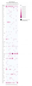
In the Behind the Scenes: Inventing Abstraction, 1910 – 1925 YouTube video, Curator Dickerman explains how the network was constructed. The motif of a network represented how abstraction was constructed through a conglomeration of relationships where artists influenced or were influenced by one another. Dickerman was fascinated by the the social networks within the early abstraction artist community. The curatorial team created a spreadsheet (most likely in Excel) with 92 artist, and marked whether artist X knew artist A, B, C etc with 1 or 0 (yes or no respectively). Paul Ingram and Mitali Banerjee analyzed and graphed the collected data. In this initial data visualization, each node represented the artist and the diameter of the nodes corresponded to the number of relationships.

Designers Hsien-yin Ingrid Chou and Sbine Dowek from the MoMA Department of Graphic Design received Ingram and Banerjee’s data visualization and iterated 10 other variations in order to find the most appropriate form. The final diagram seemed to be designed in Adobe Illustrator, and was inspired by a hand-drawn chart from 1936, illustrating the development of modern art by MoMA’s first Director, Alfred H. Barr, Jr. As information designers, Chou and Dowek chose to limit the nodes to two possibilities: beige or orange. The diameter for both node types were the same. Beige nodes indicated that the artist had fewer than 24 connections, whereas orange nodes indicated that the artist had more than 24 connections. The number 24 became the data cap for the amount of information represented by each node. Although I appreciate the simplicity of this approach, I wish the Connections page would indicate the exact number of connections for the selected artist (rather than having to manually count all the names presented in the network).
Second Story fused the aggregated data, MoMA’s design, and code, activating the information into an interactive narrative. Second Story’s portfolio website credits the team members who developed Inventing Abstraction, including Michael Godfrey, User Experience Design Director, Mike Henderson, Senior Interaction Designer, Matthew Faro, Senior Interactive Developer, Elizabeth Bourke, Producer, and Michael Neault, Content & Media Producer. From my personal background in web development, I can assume that this website uses HTML (content), CSS (styling), JavaScript (behavior), and D3 (data visualizations) programming languages. According to the project description: “A flexible data structure gives curators the ability to update and add content, and responsive programming allows the site to be viewable across multiple devices.”
Presentations (display)
Inventing Abstraction is a data dense digital humanities project with organized information architecture, a cohesive interface, and intuitive user experience. No page is too overwhelming with the amount of information it presents. The goal is clear: to enable users to learn about Abstractionism by freely exploring relationships among the movement’s artists and artworks that are contextualized by accompanying text and media.
The initial splash page provides the user with historical context about the exhibition and Artist Network Diagram. In order to access the meat of the website, the user must click Explore Connections, an orange button that contrasts against the black background. One can return to this page by clicking Inventing Abstraction in the top left corner.
There are two navigation bars. The primary navigation (Connections, Artists, Conversations, and Programs & Events) is situated at the top, and the secondary navigation (About the Exhibition, Network Diagram, Checklist, Publication, Music, Blog, Credits, MoMA) is located at the bottom. This initial distinction in information hierarchy guides the user’s attention towards the crux of the exhibition: the relationships among the 92 artists.
Connections is where users should spend most of their time on the website, as reflected by the user flow of the website. The Diagram Overview text box overlay is a wonderful way of preparing the user for the interactive diagram. Without reading more about the project’s development process, it’s difficult to know why certain artists are highlighted in orange. The animated transitions between network paths make the experience more dynamic and engaging. The selected artist is accompanied by their portfolio with their name, lifespan, works, birthplace, places worked, and interests. Most artists have captions; selected pieces have “About the Work” descriptions or relevant recordings by art historians. Overtime the formation of the information as networks become Abstractionist artworks in their own right.
The Artists page offers the user an alternative way of viewing everyone from the network as an alphabetized lists, and every name links back to their profile in the Connections page. The website offers multiple ways of experiencing the exhibition other than the network. In the Conversations page, the user can listen to a a series of audio recordings where contemporary creatives highlight pieces from the exhibit. The Programs & Events page promotes performances at the MoMA and online music on WQXR, adding another dimension to experiencing the exhibit.
The bottom navigation, though less important for the average user, nevertheless contains important information regarding the exhibition, and contributors to its research and development. I appreciate the icons embedded in the navigation to indicate downloadable PDF files for Network Diagram and Checklist with a downward arrow, and external links to Music (WQXR) and Blog (Tumblr) with a diagonal arrow.


 In the non-temporal stories, such as “Health and Education,” the points are color coded by type of place, people, or activity (i.e. Soup Kitchen, Sport, Ghetto Police ). Certain locations can more objectively be categorized as “Hospitals.” Other categories such as “Life” are more broad and can include varied locations. These groupings create certain assumptions about the types of locations they include and impose different meanings onto the locations.