The Photogrammar website is a Digital Humanities data visualization project that organizes FSA-OWI (Farm Security Administration and Office of War Information) photographs from 1935 to 1945, and plots them on a map of the United States. The photographs are organized geographically but can also be organized by photographer, date and subject matter by the user.
The creators of Photogrammar used the photographs that were taken during this time period as their primary sources, and were able to access them because the various photo collections are maintained and catalogued by the Library of Congress. The FSA-OWI photos were taken to document the resettlement and relief programs, specifically for farmers across the United States, that began during the Great Depression.
The Library of Congress stored the photographs with their original Lot Number system and Classification tags, which the Photogrammar team incorporated into their website, allowing users to search for photos taken by specific photographers, on specific dates, or during specific photo shoots. Therefore, the primary sources for this project include both the photographs themselves and the original data used to organize and classify the photos.
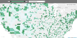
As part of the processing of this project, the photographs were already digitized by the Library of Congress. The Photogrammar team members quantified how many photos were taken in each county of the United States so that information could be represented visually on the map. Organizing the photos depended entirely upon their lot numbers and classification tags, so that the photos could be sorted in a variety of different ways on the website: by date, by location, by subject matter, by photographer, or by photo shoot.
In presentation, the team created two different interactive maps: one that presents the United States counties and uses color gradients to signify how many photos were taken in each county, and one that uses colored dots to indicate photo shoots taken by different photographers. In both cases, the user can click on a county or a colored dot to view the photos, which are organized chronologically and display the time frame for that particular set of photos. Users can also limit the data on the map by restricting the time frame or only viewing the dots for a specific photographer. Aside from the maps, the website includes an advanced search function that enables users to search for more specific photographs or collections. Additionally, the website has a “Labs” page for data experiments to interpret the FSA-OWI photographs, including a three-tier treemap and a metadata dashboard – only for California – that displays data from the photographs through a pie chart and bar graphs.
I really like how you talked about the maps page very thoroughly and explained where the source of the images specifically came from. I also did my blog entry on Photogrammar as well, but I don’t think I was able to find as much information about the source and processing as you did. Thanks for sharing!