Class Blog

Blog Post 1 – Early African American Film

screen-shot-2016-10-03-at-8-31-59-am

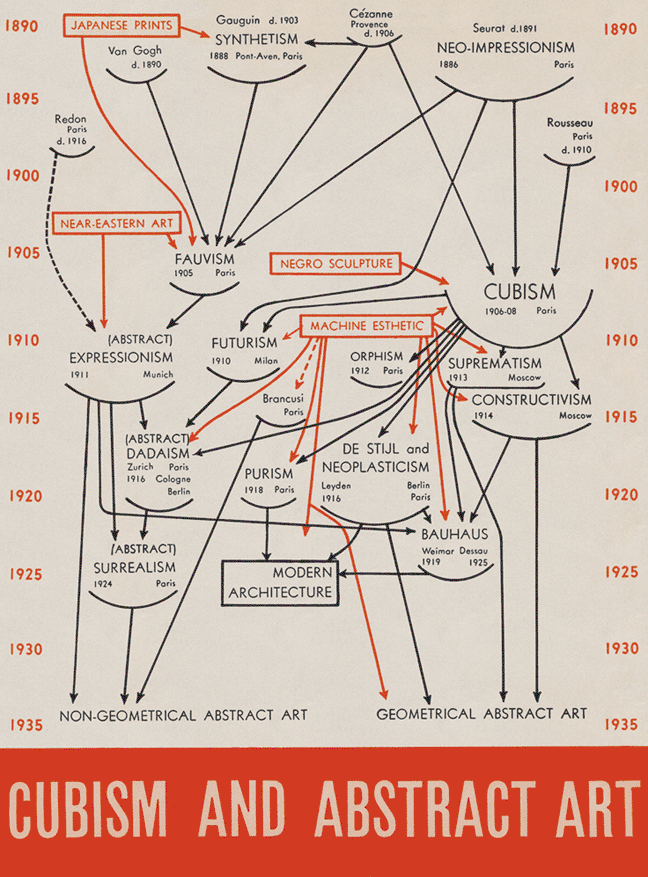
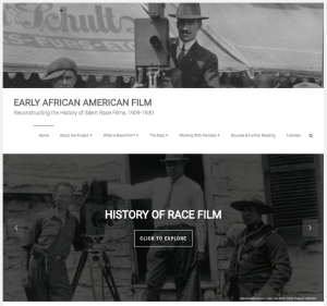
I chose to reverse engineer the website Early African American Film, which aims to reconstruct the history of African American silent race films, before the 1930s, through a database. This database was put together by drawing from multiple primary and secondary sources and consists of the films, the actors involved, and the production companies. Race films are essentially movies created for African American audiences featuring an all African American cast.

The team created the database using multiple primary and secondary sources like the George P. Johnson Negro Film Collection in UCLA’s Special Collections, Mayme Agnew Clayton Collection of African-American History and Culture at the Mayme A. Clayton Library & Museum (MCLM), and so on. These collections consist of varied media such as production documents, newspaper and magazine clippings, and posters. The team personally went through these and noted which items fit their criteria of a race film.

After filtering through the sources and digitalizing the data that was required for this project, the team presented the data in a table format. The team also documented pictures of the items they deemed necessary. The database was created using Airtable, and consists of four main tabs: People, Films, Companies, and Sources. This table provides easy usability through features like ability to filter, group and modify the data to download for the user’s own purpose. There are also tutorials on the website to help the user create their own visualizations with the data.

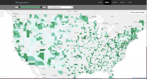
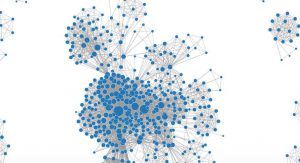
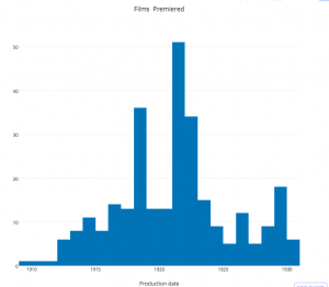
The data is presented in multiple ways on this website and is categorized by films, people, and production companies. The films are illustrated by a histogram depicting the number of films premiered each year during the specific time period. The people are depicted in two interactive visualizations, one where you can view which people are connected through films and the second where you can see how they are connected. The production companies are represented by a time map that shows the regions where production companies were founded each year.

screen-shot-2016-10-03-at-9-37-08-am              screen-shot-2016-10-03-at-9-37-22-am        screen-shot-2016-10-03-at-9-37-34-am

Overall, this website is extremely user oriented and encourages the user to work with the data and expand on it. It is very efficiently organized and easy to use and understand. It also does a very good job of explaining the data and increase interest in the subject of African American silent race films.


Weekly Blog #1 – African American Film


 Early African American Film cropped-header

This project attempts to catalogue and articulate the African American Silent Race filmmaking tradition from the onset of the major motion picture industry in 1909 until the coming of sound in the late 1920’s, effectively limiting the scope of study to films made 1909-1930.  The team examined the unique challenges faced by black filmmakers during this period with an eye toward understanding the production cycle, audiences, actors and other attribute of a filmmaking landscape that is often overlooked in contemporary and historical cinema studies.   While “Race Film” is a designation that applies globally to films produced in the first half of the 20th century for black audiences, the team limited the date range of the study to better examine the early silent film years of this particular genre.

Source material for the project reveals a set of challenges that are endemic to the study of the silent film era but magnified exponentially in the study of this less-documented and studied subgenre; a great deal of the films themselves have been lost to time.  The team attempted to create a window into the genre through the use of historical archives (sources),  preserved footage (see film), and to create through the exploration of past and current scholarship a comprehensive definition of what constitutes African American Race film (definition).

The data was presented in an Airtable spreadsheet searchable by filmmaker, film title, production company or source material used (see table here).   The project team included a comprehensive set of tutorials to help users sort and filter data according to their individual needs (tutorials).  These tutorials guide users in the particulars of using the spreadsheet data, creating individually tailored maps reflecting the research, or the creation of a network graph to model the information.

Presentation of the information is particularly effective in the capacity of site visitors to interact with the material and extract what they need in different forms.   Information can be filtered and presented in histogram, network model or map form in addition to the data tables presented in the spreadsheet.  The information can be sorted along a timeline as necessary to have a more exact idea of the industry trend in a specific year.  The home page of the website contains a direct link to the history page that contextualizes the history and ongoing study of this silent Race filmmaking tradition and facilitating in some ways greater specificity in subsequent searches by providing background information on the movement and major players.

Week 1 Blog Post Reverse Engineer

For my first post, I chose to reverse engineer MoMa’s “Inventing Abstraction” digital exhibit. This exhibit presents works by acclaimed abstract artist made between 1910 and 1925.

The primary assets of the website is the artwork from MoMA ( Museum of Modern Art), and the 86 artists who are presented on the website. Many people contributed to the design and development of the website which was made possible by by Hanjin Shipping. The Art Institute of Chicago also helped contribute and Acoustguide provided the enjoyment of music on the site. 

Presentation: The home page utilizes an abstract composition, already fitting with the theme of exhibition. While the page is text heavy, it’s important for the user to holistically comprehend the context of the exhibit. Because the web page is based off of visual works, it makes sense that the reader would be asked to process the majority of the page’s text before the artworks are introduced.The connections tab at the bottom allows you to immediately be taken to their most interactive page. 

screen-shot-2016-10-02-at-7-55-10-pm

The visual aspect of the website also makes defining it a unique challenge, but MoMa makes a point to refer to the interactive experience as an exhibition (“This exhibition examines key episodes abstractions inaugural years, exploring it both as a historical idea and an emergent artistic practice”). This language is combined with other stylistic choices that make the site modern, minimal, and sleek–translating the museum experience to a webpage while still maintaining the integrity of the MoMa brand.


screen-shot-2016-10-02-at-7-55-45-pm

The literal map of connections is overwhelming but you can zoom in and out. “Diagram Overview” explains how to interact with the diagram and what it means visually. There is little writing on this page which allows the user to focus on the visual web presented and the artists connections. This is extremely responsive, which is good because your mouse would likely get lost in all of the intersecting lines

Services: By clicking the “artists” link, you can view an alphabetized list of all artists featured in the exhibit. This is useful if someone is looking for one artist in particular, or finds the interactive diagram too confusing. Important artists are highlighted in red to draw attention.

The website has a link that takes you to MoMA’s webpage as well as listen to music while you explore the artwork, giving a more enjoyable user experience. You can view their blog and see a list of programs and events happening at the MoMA in a visual manner.

The actual art pieces can be seen by clicking on an artist’s name first. Once the user clicks on a thumbnail, it becomes clear that the purpose of the site is to present the art. The pieces are presented with the standard MoMa caption, and more iconic pieces, such as Picasso’s Woman with a Mandolin, are accompanied by extensive interpretations.

MoMa’s mission statement is “helping you understand and enjoy the art of our time.” To help users understand the art, MoMa included a “Conversations” page on the website. This page includes commentary from current relevant artists regarding the works in the exhibit. These conversations, in addition to the other features of the site, ultimately serve the purpose of helping the user better understand the art. Putting these resources in a responsive and clean website makes the experience enjoyable to the user, which allows them to focus more on what matters: the art.

cubism and abstract art

Inventing Abstraction is a project that attempts to document some of the origins of modernist abstraction between 1910 and 1925.

The dataset that they’re using for this project imagines 1912 as a radical break from tradition, and forms data around this thesis, naming Kandinsky, Kupka, Picabia, and Delaunay as the people who “presented the first abstract pictures to the public”, which then circulate through figures such as Duchamp, Mondrian, and Malevich. To do so, it uses images of the artists’ works, information about birth and death, birthplace, regions where the artist was active, information about which artists/writers that they encountered, and a couple of ideas that they may have been associated with, or taken inspiration from. (largely, white men)

In terms of how the information is presented, the visual design of the site owes a lot to Alfred Barr’s curatorial/design work from a 1936 exhibition of cubism and abstract art.

The designers of the Inventing Abstraction page clearly use the same color palette, typeface and general strategy of linking together nodes, but they make the key change of eschewing the teleological tendencies in Barr’s chart.

Rather than flowing from past to present, from “less sophisticated” to more, it presents a rhizomatic network of relations. In doing so, it doesn’t make a key mistake of Barr’s chart, which creates hierarchies and flattens the contributions of people of color into single nodes that are only relevant as originary sources for modern (western) art. (note the total non-specificity of “Japanese Prints”, “Negro Sculpture”, or “Near-Eastern Art”- as if they weren’t hugely diverse bodies with competing schools of thought.)  By contrast, Inventing Abstraction does away with the use of arrows, and settles on lines as a less loaded signifier of connections. It also uses specific names instead of attempting to produce a single moment out of an entire ethnically-associated tradition, and has the decency to be specific about its date range.

As far as the interaction itself, it’s a well-designed thing. clicking on a node produces a name, works, birthplace, location, and interests, and maps a direct network of related individuals. The information tends to be somewhat narrow, but probably encompasses most of what a layperson would want to have immediately available.

Blog 1: Photogrammar – KTran

The FSA-OWI, Farm Security Administration – Office of War Information, was a program created by Roosevelt during time of the First New Deal as a reaction to the Great Depression to assist poor, displaced farmers for resettlement. The FSA compiled an archive of photos demonstrating daily life in order to challenge rural poverty. The main source of pictures were gradually compiled and stored in the Office of War Information in Washington DC. The Liberty of Congress helped contributed through reorganizing, cataloging, and maintaining the photos for the collection. The interface Photogrammar makes it user friendly to view these primary sources and categorizes each individual photo based on time, location, and photographer.

capture1111


Under Maps, Photogrammar does a wonderful job tracing these photos based on location, over the United States, and time, from 1935-1946. Using the leaflet program, the creators of Photogrammar’s interactive map tell a story about the various photographers’ journey as their work illustrate the lifestyle of the many displaced farmers to depict the repercussions of the post great depression. The map organizes the pictures in ways where you can filter it based on artist and time. It also has two subcategories, the “countries” and “dots,” which demonstrated where a certain photographer’s work was heavily concentrated at, or if a photographer traveled to a certain destination as evident in Jack Delano’s. Once you click on a specific spot on the map after filtering the year and photographer, you can view their collection of photos specifically on that time and place. As the photos accumulate over time and among other photographers, it forms a very grand compilation of photos for people to view.

capture1111

If the user is trying to find something specific, one can easily utilize the search feature in Photogrammar. This feature is catered to people like historians to trace back something that they are looking for in particular, such as images from a specific city during a specific year. Rather than clicking and waiting for the page to load after every distinguished filter on the map, the search feature has many categories so that one can filter the archives of images to help you find what you’re looking for within a click, given that all the desired information is inputted.

capture1111

What I found really interesting about the website was the very last tab labeled “Labs.” It thinks outside the box and gives these pictures a different type of interpretation. For example, for the Treemap feature, it starts of with very general list of keywords to describe an aspect of human interaction on a daily basis, such as transportation, religion, etc. Once you click on a specific aspect, it creates a new set of subcategories that falls under it. As you continue to narrow down your search, you are able to find a collection of photos that fall under that specific topic. It allows many individuals to expand their search if they are focusing on a certain topic, rather than limiting themselves to a time, place, and photographer. The Photogrammar website make is a lot easier for historians, researchers, and students navigate and learn about the social issue of rural rehabilitation.

Week 1 Reverse Engineering: Early African American Film

Early African American Film is a digital humanities project created by students at UCLA. The group constructed a database on African-American silent race films that focused on films created before 1930 for African-American audiences. It contained information including films, actors, and production companies and how they all are connected. Since this topic is seldom discussed, I enjoyed exploring this project and learning about film history.

homepage

Sources

The workgroup gathered information from many primary and secondary sources. One major archive used was the George P. Johnson Negro Film Collection, which can be found at UCLA’s Young E. Research Library with items such as documents and newspaper clippings related to early Black films, companies, casts, and notable figures. Another major archive was the Mayme Clayton Library and Museum, which contains collections such as manuscripts, rare books, film and recorded sound archives, photographs, and much more that document race films. An example of a secondary source used for this project is a collection of essays that examine the work of Oscar Micheaux, an influential African-American filmmaker, and the relationship his race films had with the black press. A full list of sources used can be found here

Processes

A database of information was created and presented as a spreadsheet, hosted by Airtable. The data could be sorted many different ways–by people, films, companies, and sources. Clicking on a data entry would give you information such as their full name, relevant notes, films appeared in, films worked on, sources, associated production companies, and more. The data could also be filtered and grouped for the user’s ease. Also, a glossary and many different tutorials on how to build graphs, maps, and other data visualizations were included to help users familiarize themselves with the information and to encourage users to engage with the data.

Presentations

This project presented the data in a way that allowed users to not just look at the data, but also modify and use the data. The site is very interactive and presented information in various ways.

On one page, there was a histogram (created by plot.ly) of when films were being produced, and users could highlight certain areas to zoom in on a certain area to study.

histogram

There was also a network graph that visually connected people and films. If you double clicked on a data point, it would reveal people they were connected to by working on films together. The network graph included all of the people in the database associated with films, such as actors, directors, producers, cinematographers, and others. It gave context into who the larger people were and what the larger networks were.

visual-network

To help visualize production companies, the project included a time map (created by Carto) of the location of African-American production companies throughout the year, which gave more insight on the trends of race film production.

time-map

The ways in which the data was presented visually helps users explore African-American race films in many different contexts.

Reverse Engineering Photogrammer

screen-shot-2016-10-03-at-12-36-20-pm
Screenshot of the Photogrammar counties map feature.

Photogrammar compiles a collection of nearly 90,000 photographs from the Farm Security Administration – Office of War Information (FSA – OWI). These photographs were taken throughout the years 1935-1946 and include photos of farming communities throughout various regions of the United States.

Photogrammar presents the photos amongst several mediums; a map, of which a user can explore various locations of a photo, a treemap, where the user can browse the collection by keywords that group similar photos together, and a metadata dashboard, which displays the photos on a map and groups them by location, date and relationship between subjects within the photos.

When President Roosevelt’s Resettlement Administration received great criticism, the FSA-OWI set out to document the success and relief that the Act brought to farmers. The photos that are compiled date back The Great Depression and extend to the end of World War II. The entire project was the largest government funded project that the FSA-OWI had ever undertaken.

When utilizing the map to discover photos, the user can choose between “dots” or counties. Dots displays locations on the map where specific photographers’ photos were taken. I believe counties offers a more expansive and insightful view of the project, however. Counties displays a map of the United States, the user can then click on a county and view all photos in the database from the selected location. When viewing the photos, one can gain an intuitive feeling for the hardships that the individuals underwent. Some of the most telling photos included crowds enjoying their favorite past times. It is not difficult to recognize the great disparity between pastimes in 2016 and pastimes in the late 1930s. For example, here is a photo of a crowd lined up in front of a ticket office for a rodeo show, whereas today one might see intensely larger crowds lined up at a venue such as the Staples Center to see a basketball game.

by Russell Lee. Found via Photogrammar.

Another thing to note is the progression of technology as you browse photos taken at the beginning of the project and photos taken towards the end. At the beginning, photos were largely black and white whereas photos taken in later years begin to show greater color and detail.

Search feature on the Photogrammar website.

In addition to a browse by location feature, Photogrammar also includes a search engine where a user may manually enter a keyword for a photo and the website will return all photos that contain subjects or objects attributed to that keyword. For instance, if I search the word “horse” the search engine will display all photos that are either of a horse, or contain horses within the picture. The user-interface for the search engine is slightly overwhelming at first-glance, however. The search feature is not actually hard to use, therefore I would recommend they hide the advanced search features until the user actually requests them in order to maintain a clean interface.

All in all, I do believe that the project does a good job of directing researchers to a large database of photographs they may be looking for. The advanced photo subject/geolocation/photographer tagging that the team implemented makes finding specific photos very easy to find and gives users a real feel for what life may have been like throughout the implementation of the Resettlement Act.

Week 1: Photogrammar

The project I’m covering is Photogrammar, a database of photography projects sponsored by the federal government from 1935-1944, which was collected by the Farm Security Administration – Office of War Information (FSA-OWI).

screen-shot-2016-10-02-at-11-09-44-pm

Even with over 170,000 photos in the collection, only about 88,000 were placed into the FSA-OWI’s cabinets, organized using Paul Vanderbilt’s Lot Number system and Classification Tags system. (This is what is used to search throughout the Photogrammar website).

The photos themselves were taken throughout the decade-long time period, which also happened to be when World War II was being fought (although the United States would not enter the war until after the attack on Pearl Harbor in 1941). They were taken by various photographers, 15 of which are shown on the Photogrammar website. The team behind Photogrammar took the negatives of these photos and scanned them, digitizing them to be added to their digital archive and shown to the world via computer screen.

The Photogrammar team decided the best way to create meaningful visualizations for this set of data would be to make their main map a density map by county (shown above) and by photographer. By doing so, they were able to succinctly show where the Federal government was sending its contracted photographers, although the reasons why can only be speculated. However, what is more interesting are their visualizations that can be seen under the “Lab” tab on the top right hand corner of their website. Under the Lab, there are three different types of interactive visualizations that are dissimilar to the two main maps and can allow for further analysis of the images, from how Vanderbilt decided to classify the images as, to the metadata dashboard where the relationship between the photographer, the date, and the subject can be further analyzed.

screen-shot-2016-10-03-at-1-20-38-am

*Also, funnily enough, my hometown is featured on the Photogrammar website here. In one of the pictures, I recognize some buildings that are still around in the Historic Downtown.

screen-shot-2016-10-03-at-1-21-42-am

Blog Post 1- Photogrammar

screen-shot-2016-10-03-at-1-15-30-am

For this weeks blog post, I decided to explore the project Photogrammar. Photogrammar takes the collection of photographs from the Farm Security Administration- Office of War Information (FSA-OWI) and organizes them in several ways such as photographer, location, classification, and date. It then presents the data collected in the form of a Map, a Treemap and a Metadata dashboard.

The source of this digital project is 170,000 photos taken between 1935 and 1946 by the Farm Security Administration- Office of War Information that are now housed in the Library of Congress. They were taken to document the US and demonstrate that the administration of relief services has been successful. Most of them come from the Farm Security Administration collection and the Office of War Information collection from both the Domestic Operations Branch and the Overseas Operations Branch. Also included are photos from the Office of Emergency Management-Office of War Information Collection, the American at War Collection, and the Portrait of America Collection.

The main processing method is digitization through scanning the photos. They have also been organized in various ways. In 1942, Paul Vanderbilt created the Lot Number system and Classification Tags system. The Lot Number system assigns a lot number to a set of photographs that are organized around a shooting assignment. The Classification Tags system assigns pictures tags such as “The Land.” This system has 12 main headings and 1300 sub-headings. Both of these systems are included Photogrammars organization of the photos. Photogrammar also organizes the photos based on photographer, data, and geocodes them based on location.

Photogrammar presents the photographs in two main ways: mapping and visualization. The map has two different ways of displaying the photographic data. The first maps the photos by the county in which it was taken. The darker the county, the more pictures were taken there. The second way maps the photos based on who took the actual photo. This is particularly interesting because you can see the routes that photographers must have taken while photographing the country. The map was created with CartoDB and leaflet mapping technology. The second way that Photogrammar presents the data is by creating a Treemap based on Paul Vanderbilts Classification Tags system. One starts with the top level or main heading such as “Social and Personal Activity” and then selects a sub level and sub-sub level where one can find all related photographs. By presenting the data in this fashion, the Classification Tags system illistrates how that aspect of life looked across the US from 1935-1946. The last way that Photogrammar presents the data is through a Metadata Dashboard. This allows you to select a county and then see who was photographing what, when. At this moment in time, California is the only state that is presented in this fashion but it still provides a very interesting look at the intersection between all the photographic data provided.

Blog Post 1

2

The “Early African American Film” project explores the history of silent race films from approximately 1900-1930. The project focuses on a segment within film history that is seldom examined: the silent films created prior to 1930  for African American audiences. This is a topic that not many are familiar with and therefore proves to be a very intriguing.

The project acknowledges that the term “race film” itself has no strict, defined boundaries but instead encompasses a large variety of films based on different criteria such as having an African American cast, produced by an African American owned company, or made for exhibition in African American audiences. Using some basic criteria, the project team started with a wide set of films and then reviewed film by film to reach a narrowed down list. The primary and secondary sources used to create this project were gathered from several archives from the George P. Johnson Negro Film Collection in UCLA’s Special Collections, Mayme Clayton Library and Museum, and other centers.

The aim of this project was to create a database of these silent race films and their accompanying details. Relational databases were made using Airtable. The database includes four different tabs with information about the people, films, companies, and sources. Specifics such as actor and director names as well as the race of the production company owner of each film is provided. The site has the option of filtering and grouping entries to make searching and seeing connections between entries all the more easier. Furthermore the database comes with a data dictionary so there is no room for ambiguity.

The presentation in this project is done through a variety of visualizations.  Information about the production date of films is presented in a histogram format which was made using plot.ly. Two very appealing network diagrams show the connections between different people associated with the films, and the connections between people and the films themselves. It is very easy for users to visualize not only who is connected to who, but also the strength of connection (depicted by the thickness of the connecting line) and people who have the most number of connections (depicted with larger nodes). This visualization is very easy to use and facilitates the visualization of the web of connections among various people in the industry. It was created using Cystoscape. To see this network diagram, click on the image. Additionally, the project uses a time map created with CartoDB to demonstrate trends of when production companies were founded.

blog1

Overall, this project does a wonderful job educating users about the silent race films produced before 1930. The site is well organized and very intuitive to use. Especially unique about this project is that it encourages people to download its data and perform their own modifications on it. Furthermore, the site actually provides tutorials detailing how to make the different graphs and visuals they created. This is a great learning opportunity and allows for users to understand the data at a greater level by actually reproducing the visualizations.