Class Blog

Blog Post Week 1

screen-shot-2016-10-02-at-11-55-52-pm

Introduction

For the blog post this week, I reverse engineered Photogrammer, which is a website that presents photos during World War 2 and the Great Depression. The website contains 170,000 photos from this era from 1935 – 1945, taken by the Farm Security Administration – Office of War Information (FSA-OWI). Photogrammer contain photos that depicts the harsh lifestyle that many Americans had to face during this devastating time, and is presented in an easy manner in which users can easily click, for example, on a map, to see photos during that period of time.

Sources

The photos used in the website were taken by the FSA-OWI from 1935-1945 to capture the lifestyle before and after the relieve services which were passed to get America out of the Great Depression. These relieve services were appointed by President Roosevelt, with the first major initiatives being passed in 1935, called the Resettlement Administration. Thus, by taking photos starting from 1935 where the Great Depression was still shattering the US economy, the photos were meant to be historical evidence that delineated the woe of the people during the depression, and eventually the success of these initiatives.

Processes

Photographers were sent all over the country to take pictures of the lifestyle, and sent to Washington DC, where the photos became known as the FSA-OWI File. Furthermore, more photos from other collection were added, to total 170,000 photos. Photogrammer then scanned these photos to digitize them, and were uploaded on their website, allowing people from all over the world to view the collection from the comfort of their own home.

screen-shot-2016-10-02-at-11-55-55-pm

Presentation

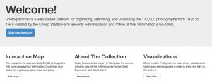
The introduction page is laid out very simply for the users to digest all the materials easily. On the top of the page, there is 5 tabs (Home, Maps, Search, About, Labs), and a corresponding information on what each of the tab is, in the middle of the home page. There is a big “Welcome!” text at the top, with a smaller text underneath that briefly explains the website, and a blue button that stands out that reads “Start Exploring,” making it obvious for users to find the starting point.

screen-shot-2016-10-02-at-11-56-10-pm

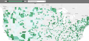
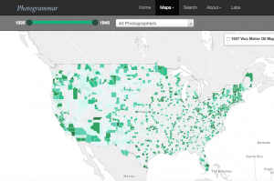
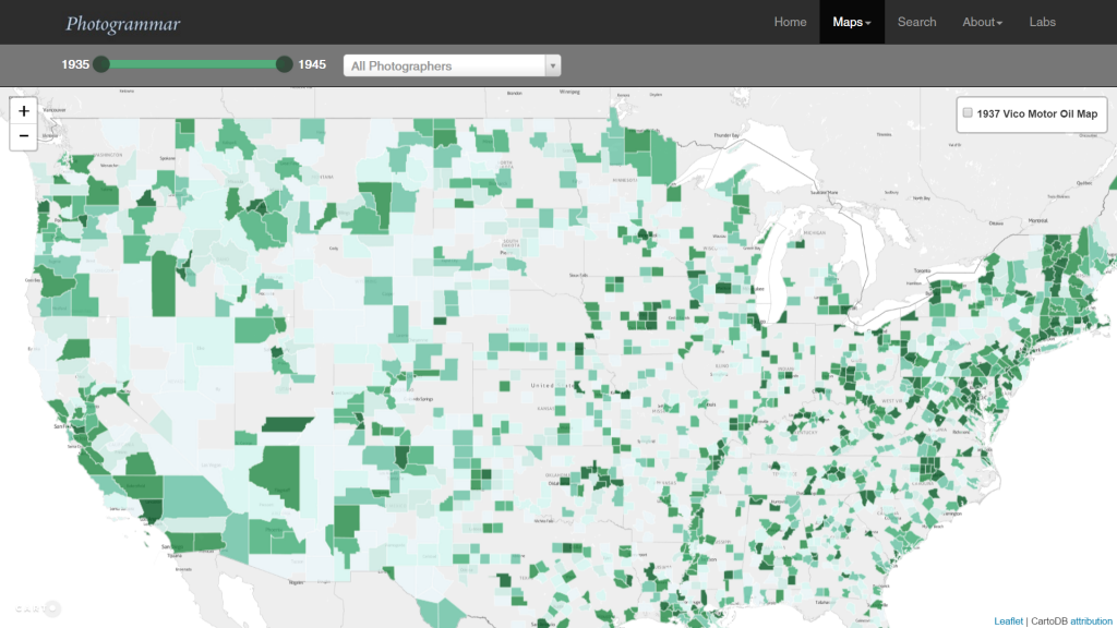
The main method that the website presented the website is through an interactive map, in which the users could click the approx. location on the map to see photos from that location during 1935-1945. Furthermore, there is a slider on the top of the map to allow users to choose any interval of time between 1935-1945. This is useful because users can choose to see photos, for instance, of 1935-1937 and compare it with 1943-1945 to see the difference in the standard of living.

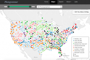
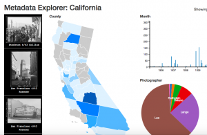
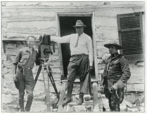
Another option the user can adjust is where they want to see the photos by county or dot. The county option highlights photos of counties by a hue of green color, with darker color symbolizing a greater concentration of photo per area.   On the other hand, the user can also choose the dot option, where different colored dots placed all over the map, each color representing a different photographer. Once the user clicks on a photo, the user can easily see all the photos from that location in a grid format, and by clicking a photo, the user receives a bigger picture of the photo with more information on the left of the photo with captions, name of photographer, date, location and more.


Week 1 Post: Reverse Engineer “Inventing Abstraction”

screen-shot-2016-10-02-at-11-20-11-pm
Inventing Abstraction (1910-1925) is an accompanying website for the Museum of Modern Art’s exhibition “Inventing Abstraction, 1910-1925”. While the exhibition aims to bring together works across countries and genres during the early years of abstraction to demonstrate how the style has emerged and developed, the website expands the framework by focusing on the relationships between the abstract artists behind the works and how their creativities might be sparkled within the intertwining network of their personal connections.

Various sources build up the content of the website. First, diversified portfolios consisting of images of artistic works like paintings or sculptures, audio recording of poems, video extract of non-narrative dances, a few supplemented by audio guides that give additional commentaries on the works. While the audio guides are exclusively provided by Acoustiguide, a company creating interactive guide tours for museums or historical sites, the sources of the portfolios are from not only the Museum of Modern Art but also private collections, museums and institutions around the world. Besides the portfolios, texts that elaborate on the artists’ biographies are created by the team at the Museum of Modern Art, along with podcasts and videos that shed more light on other artists’ views of the exhibits and the inspiration behind the website project respectively.

The sources are then processed by the computer. Basic processes include digitization of photos, sounds, and videos under each artist’s portfolio. To construct the network between artists, their names are entered into an excel spreadsheet that marks whether a relationship exists between one and another. The data exported from the spreadsheet forms the basis of the network graph where people with more connections are differentiated from those with less, a characteristic underscored by further visualizations in design. The artists are tagged with geographical and personal markers including “year of birth and death”, “birthplace”, “places worked”, and “interests” that, along with the portfolio, make up a full artist profile. Their names are also catalogued in alphabetical orders. The whole data are then modeled based on the software created by Columbia University.

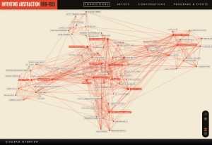
The interface of the website delivers an intuitive experience for the users. When one first enters the website, the home page introduces the early emergence of abstraction across different media, hinting at the idea conveyed later by the network graph that connections between artists of different fields lead to the development of abstraction. The button “Explore Connections” is placed in the lower right corner, a space arrangement that guides users to read the introductory texts in the middle first and thus equips users with the background knowledge to comprehend the significance of the network graph. The network graph is the heart of the website. The moment users leave the home page, they are taken to the page with the graph, with an “Overview” pane only automatically opened once that explains the logics behind the graph. The exploration of the network graph overall is a nonintrusive experience as buttons on the bottom navigation bar and on artists’ names on the network graph as nodes do not lead to separate webpages but the contents open side-by-side with the graph. Besides the UX design, the UI design also delivers an intuitive experience. The designers behind the project use Adobe Illustrator to construct the visual design of the contents. The color theme of “red”, “ivory” and “black” is used consistently throughout the design of the website and of the graph. “Red” marks only certain names within the artist catalogue and their corresponding nodes within the network graph to emphasize artists who have the most connections, or also the node of an artist that users click on, which then becomes the central node of his or her personal connections. The combination of UX and UI design therefore guides the users to understand the significance of the network structure behind the emergence of abstraction and how being in a network can foster creativity.

Reverse Engineer Project: Inventing Abstraction

Inventing Abstraction (1910-1925) is an online project hosted by the Museum of Modern Art promoting the exhibition of the same name as well as offering up viewers an additional insight into the vast amount of connections between the very first abstract artists. The exhibition ran from December 23, 2012 to April 15, 2013.

screen-shot-2016-10-02-at-8-55-07-pm

The website maps out connections of the early abstract artists featured in the exhibition such as Francis Picabia, Hans Arp, Pablo Picasso, Marcel Duchamp, and Georgia O’ Keefe. The map uses information from the artists shown in the exhibition and creates vectors between artists whose interactions had been documented during the time period of 1910-1925. The information was organized so that each individual artist has his or her own separate page when you click on the name. The page includes birthplace, places worked, interests, his or her art work(s) included in the exhibit, and, for certain artists, short biographical essays. The artists with the most connections during this time period are highlighted red to display their significance in the context of early abstract art.

Along with the interactive map, the website also offers up different tabs for viewers to gather additional insight on abstract art and the program. The top tabs include “Artists” “Conversations” and “Program and Events.” The “Artists” tab creates an alphabetical directory of the artists included in the map. The “Conversations” tab includes different artists discuss a painting featured in the exhibition. The “Program and Events” section directs the viewers to additional events held by the museum in conjunction or related to the Inventing Abstraction exhibition. The bottom tabs include an “About Exhibition” section where viewers have the opportunity to learn more about the showing as well as links to PDF copies of the interactive map and a checklist of the works featured. A “Publication” tab is included to promote a publication of the exhibition. The credits for both the museum exhibition as well as the website are also included in the bottom tabs.

The website was created by Second Story Interactive Studios and uses interactive technology to help viewer navigate their way through the map as well as 3D technology to make the map more interesting to the eye. Viewers are able to zoom in and out of the map easily with a zoom function in the corner. The website uses a simple theme of red, black, and cream colors to keep the focus on the content. All together, the website serves its primary function of displaying the connective map while offering additional information in a clear and concise manner.

Reverse Engineering “Inventing Abstraction”

The project I chose is Inventing Abstraction, a digital project with a goal of documenting the beginning of abstraction across artistic disciplines as well as illustrating the connections between artists that allowed the movement to thrive and spread quickly.

"Connections" from Inventing Abstraction

To begin with, the main source of information that this project uses is the MOMA exhibit Inventing Abstraction. This exhibit was shown from December 23, 2012 to April 15, 2013 and contains abstract art of various mediums, including paintings, photography, music, and film, from various artists from the years 1910 to 1915. Additional information about the individual artists and about each specific work of art is sourced from various curatorial assistants at MOMA.

In terms of processing, the first way the exhibit was processed was by taking pictures of all of the works that could be photographed and adding videos of other pieces (clips of dances, films, etc.). In addition to the images and videos documenting the physical pieces shown during the exhibition, the digital project delves farther, by also processing information about the artists themselves. The artists were processed by recording connections that artists had to one another. The project defines a connection as “individuals whose acquaintance with one another during these years could be documented”. This is a way of organizing the artists; it begins to support the argument that the movement of abstraction was an effort only possible through collaboration and these connections between like-minded individuals. Additional information about the individual artists and pieces was also organized alphabetically, by artist name.

In my opinion, the most interesting aspect of this digital project is how the information is presented to the audience. Obviously, the basic presentation of this project is over the web. More specifically, all of the information is presented in separate sections. To start with, the homepage has a basic description of the project and its purpose, and then a button “Explore Connections”. Clearly this was done because the creators felt that the “Connections” section was the most important, or at least what should be visited first by the audience. The “Connections” section largely contains a network diagram, easily the most impressive aspect of the project because it presents the connections in a way that is simple and straightforward to understand. Essentially, each artist is shown as a name next to a dot with red lines connecting various dots (artists). Artists with more than 24 connections within the network are highlighted in red. When the mouse is placed over an artist’s name, the lines are bolded and appear to pop out from the rest of the network. My only critique here is that the lines should change color as they pop out, as bolded red lines over red lines are still a little hard to differentiate. When an artist’s name is clicked, the user is taken to the artist’s page; this contains photos (or videos) of all the artist’s works as well as some other facts. These artist’s pages are also accessible under the “Artists” tab, which simply lists all of the artists who have work appearing in the exhibit. Lastly, there is the “Conversations” section; this contains videos giving more information about various works of art in the exhibition. My only critique here is that the videos are presented in a long list of thumbnails, making the user scroll through everything to find what they are looking for; this could be somewhat tedious.

I was not able to find the exact software or tools used to create the website or the network diagram; however, the project credits the design studio Second Story with the design and development of the network diagram.

Blog Post 1

For this assignment, I chose to analyze Photogrammar. This is a web based platform created to help the public visualize life in the United States from 1935-1945, the time known as the Great Depression and World War II. Photogrammar consists of thousands of photographs from this time period and allows a glimpse into a very different era of the United States. This Digital Humanities project has exhibit, map, timeline, and data visualization components. It is part exhibit because it contains primary sources in the form of photographs that are categorized and made for people to encounter. It is part map because it has an interactive map showing photographs from different locations. It is part timeline because it allows users to explore photographs within specific time periods or specific years. Finally, it employs digital visualization methods through its various tools for exploring the photographic collection.

The source of the information used for this project consists of historical photographs from the largest photography project ever sponsored by the federal government. This photography project took place from 1935-1944. The project was founded after President Roosevelt created the Resettlement Administration, a relief- based government program, in 1935 in order to aid the poorest third of farmers displaced by the Great Depression. This stirred up a lot of controversy from the general public. In order to gain support for this program, the Historic Section within the Information Division of the RA set out to document America through photographs to show the public how vulnerable and unhappy some people were, and why the Resentment Administration would help many people. The project was moved to the Farm Security Administration- Office of War Information in 1937. The FSA-OWI produced many iconic photographs and included many famous photographers. The negatives were sent back to Washington DC and became known as the FSA-OWI File. The entire collection has 170,000 photographs from 1935 all the way up to 1946.

The processing of the photographs involved  digitizing them in order to be fed into a computer and made computationally operable. They were digitized by scanning the physical photograph prints into a computer.

The project is presented in a two different ways. First, the photographs are displayed on an interactive map created by Leaflet, which is a JavaScript library for interactive maps. CARTO is also used with attribution. The interactive map has the option to allow users to view the map by “Counties” or by “Dots.”

The “counties” option breaks apart the photographs by which county they were taken in. Each county is presented in a varying shade of green. There is a timeline at the top of the map which allows the user to choose which year(s) of the photographs the user wants to explore. There is a window allowing the user to choose which photographers’ photos to explore.

screen-shot-2016-10-02-at-5-32-10-pm

The “dots” option breaks apart the photographs by the photographer who took them by including a color coordinated key. This option also has the same timeline and photographer pop up option as the counties option.

screen-shot-2016-10-02-at-5-39-59-pm

Both the Counties and Dots maps also have the ability to show the 1937 Vico Motor Oil Map alongside the photographs.

When the user clicks on the county or the dot, he/she is taken to a page with all the photographs corresponding to the location or photographer they choose to see. From this page, the user can click on a specific photograph and find an enlarged version, a caption, a photographer, the date taken, the specific location, the classification, lot number, and call number, as well as similar photos.

The second way that the project is presented is through the use of three different Photogrammar Labs. These are extra tools for exploring and interpreting the huge photographic collection. One of the labs is called Treemap created by Paul Vanderbilt in 1942. It is a 3-tier classification system that begins with 12 main subject headings, 1300 sub- headings, and then sub- sub headings. This allows users to explore the photographs based on the content of each photograph instead of the location or photographer.

screen-shot-2016-10-02-at-5-41-42-pm

The second lab is called Metadata Dashboard and allows the user to discover the relationship between date, county, photographer, and subject in photographs from individual states. This dashboard is still in development and only California is available to view. This is really cool to explore because you can click on multiple counties within California to view the data together, or explore only one county at a time.

screen-shot-2016-10-02-at-5-42-09-pm

The third lab is called ColorSpace and allows the view to explore the color photographs based on hue, saturation, and lightness. This feature is not developed yet and is coming soon.

Deconstruction of “Early African American Film”

index

I chose to deconstruct the project concerning “Early African American Film“. This project focuses on the history of silent race films from the period of 1909 to 1930 that were primarily intended for African American audiences.

The website starts with a slideshow and a link that says “click to explore” which sets the tone early on as there are snapshots of major components of the website. The user is then able to explore the website through the table of contents and quickly gain an overview of the website’s intent and purpose by selecting on “What is Race Film?”. This option is interesting as it allows the reader to choose whether to explore the history first or just learn the definition of race film. The options are heavily aided by a variety of rich sources that are hyperlinked into their descriptions. This is helpful as it makes their presentation more interactive as one can quickly watch “Birth Of A Nation” or further read up on a concept that they are interested in, as exemplified by them hyperlinking phrases or vocabulary. We soon learn that the purpose of the project is to not only enrich people with knowledge of early African American films but to also create a database that consists of a variety of primary and secondary sources.

The database they created contains specific information regarding the people and production companies for these early race films such as titles, dates, genres, etc. They relayed this information through a display called Airtable that is easy to navigate and allows one to make specific detailed search options. Furthermore, they even included a data dictionary that further breaks down the specifics by people, films, and sources and allows one to feasibly cite the data. This is important as it further develops the user-friendliness of the website while also allowing for accurate credibility.

The website also provides an abundant amount of background on how they sorted and researched the data regarding films, people, and production companies. These data entries consists of bar graphs, network diagrams, and interactive maps. Specifically, the “explore the people” option allows the reader to be informed on how to create their own network diagram which is helpful as it explains the displays that are less well-known. The “explore the production companies” option also includes a geographical map that shows the location of the companies displaying the idea that most of these films are centered around the eastern and southern regions.

Lastly, the website does a thorough job of listing all the sources they used by not only citing the source but by also providing a description. The user-friendliness of the website is further exemplified by the tutorial link that shows how to make maps and interact with the data.


Week 1 – Photogrammar

photogrammerPhotogrammar takes the photographs collected by FSA-OWI from 1935-1945 and organizes the pictures by region, time and photographer to help give a better visualization of the state of the country during the Great Depression and World War II.

While there were 170,000 photographs in the FSA-OWI’s collection, also known as “The File,”– which is currently maintained and cataloged by the Library of Congress– Photogrammar only incorporated 90,000 of the photographs in their project.

The photographs were sent to the collection as negatives and from there the negatives were developed by FSA-OWI, Stryker and other sources. These developed photographs would have been scanned by the Photogrammar team in order to upload it to the web. The team then had to parse Paul Vanderbilt’s Lot Number System in order to get the accurate information about each photograph. By parsing the information, they were able to assign related tags to each picture (12 main tags and 1300 sub tags). They were also able to group the pictures in 3 main categories: by photographer, year, and location. The team expressed that although some of the identification were easy to make out, such as the photographer name, some identification, like the call number, was difficult to figure out. However, later on they discovered it signified the order of the photographs, allowing them to put the pictures back into its original strips. This was a breakthrough as it allowed people to follow the photographer’s point of view and allow the people to feel as if they were also going on the journey with the photographer.

This project was created with the help of Vizzuality who incorporated Leaflet and CartoDB together. Aside from them, the main way the team presented these artifacts was by mapping them on an interactive US map. From the start, people are able to see which areas were more documented than the others. Then we are given the choice of narrowing down our options by filtering through the years or by the photographer. Filtering by photographers was especially interesting because it allowed the viewers to see where the photographer’s work was concentrated at or if they were on the move, it allowed us to get an instant view on how they traveled across the country. Once clicking on the location, we are then given list of small thumbnails that are related to our filtered search. This layout helps the viewers get a quick view on the state of the region that they are looking at. This in my opinion is a nicely designed interface as it allows the viewers to get an overall understanding without having to go through every picture, while still giving us the option to learn more about each picture by clicking on a specific one.

Mapping Indigenous LA – Blog Post 1

Mapping Indigenous LA

The Mapping Indigenous LA project seeks to create digital story maps that help to chart the geographies and sacred places of peoples indigenous to Los Angeles. With emphasis on the Gabrielino/Tongva and Tataviam, American Indians, and the indigenous diasporas from Latin America and Oceania, this project incorporates community-based research collaboration in order to tell the ongoing stories of indigenous peoples. The project seeks to counteract the notion that settler colonialism entirely eliminated native inhabitants, or that we should study the Tongva only in the way that Christian missions have affected them. The project’s story maps intend to document a more complex and inclusive version of indigenous peoples’ experiences throughout their continuing presence in the Los Angeles basin and surrounding islands.

The project’s website provides several story maps which document indigenous people’s experiences. These story maps incorporate photographs, videos, and maps as source materials in order to convey complex cultural geographies. For instance, late nineteenth century maps of Los Angeles that are used in the story map Mapping Indigenous LA were taken from UCLA Library Special Collections. Other sources come from books that are listed in the Resources section at the end of each story map. Because the project relies on community-based research, some materials also come from individual indigenous community members, as well as groups such as the Gabrielino/Tongva Springs Foundation.

The project creators combined all these sources into interactive narratives in the form of story maps. To create the story maps, they used esri’s mapping software ArcGIS. More specifically, the creators used one of esri’s Story Map application templates: the Story Map Journal app. In the Story Map Journal format, someone viewing the Mapping Indigenous LA story map, for instance, can scroll through written descriptions appearing in the left panel, while corresponding images, videos, and maps appear in the right panel. Some images, like maps, are interactive and allow the viewer to click on certain parts of the map to learn about the indigenous history of each. Also, when the viewer clicks on links within the written descriptions, different images appear on the right panel, thus allowing the viewer to see different parts of the narrative at will.

The Mapping Indigenous LA website itself matches the format of other websites associated with UCLA, with the same blue navigation bar that you find on MyUCLA. The homepage incorporates images that link to the story maps and other materials hosted on the site. There is also a brief description of the project’s aims, though the “Research Scope” section provides a more thorough explanation as to the project’s goals and parameters. In addition to providing several story maps, the website also contains a “Create Your Own Story Map” section, which provides thorough instructions for anyone who would like to contribute a story map to the project. This section details the process that the project creators used in order to create their story maps, but it also defines the nature of the project as ongoing and inclusive of many members of LA indigenous communities.

The website is presented clearly and is not difficult to navigate, though I found it necessary to read several sections of the website before I could grasp the purpose and scope of the project. The story maps are similarly easy to navigate, but require the viewer to interact extensively in order to extract all parts of the narratives.

Weekly Blog 1

screen-shot-2016-10-01-at-11-03-55-pmThe Photogrammar project aims to showcase the mission taken on by the Farm Security Administration – Office of War of providing photographs during one of America’s toughest times: the Great Depression. Photogrammar takes us on an interactive journey of exploring the havoc the Great Depression left in its wake throughout America, allowing users to see the greater history that resides within the country’s map.

It is clear that the source for this project comes from the collection of photographs from the Farm Security Administration – Office of War during the years of 1935 to 1934. In order to receive the necessary support for government programs aimed at providing relief, the FSA-OWI took it upon itself to document this time. The Library of Congress is responsible for cataloging this remarkable collection.

Photogrammar utilizes processes which enhance the interactivity of the project. An interactive map of the United States links places with photographs that portray the particular situation there during the Great Depression. This way, the user is exposed to a sort of “Big Brother-Esque” window into a particular time in our history. A spreadsheet separates components of the map into categories, such as by place, photographer, and date. Within the map, there are two general categorizations which can separate the database by counties and “dots.” These dots basically represent the different photographers and their respective photographs around the map. In addition, there is an option to visualize the 1937 Vico Motor Oil route. Overall, the processes utilized by the programmers build up the complexity of the project.

The “Photogrammar Labs” portion of the site depicts the data tools used to ensure a sleek presentation. The “Treemap” is used to visualize the classification system that Vanderbilt used to categorize the photographs. A “Metadata Dashboard” builds relationships between categories such as date, photographer, county and even subject of the photos according to their respective state. Although it is still in development, this allows for the utmost organization of the site. In addition, a development that is coming soon called “ColorSpace” organizes the color photographs based on different elements of color such as hue and saturation.

Upon entering the site, the user is greeted with a big “Welcome” which directs him/her to a prominent blue “Start Exploring” button that stands in stark contrast to the overall gray, white, and black background. The simplicity of the layout makes navigating much easier. A search option on the top right corner of the site allows the user to easily search any photograph by various categories. The overall way they chose to present the photographs allows them to reach their goal of presenting an interactive visualization of such a hard time in our history.

Early African American Film- Blog Post #1

Early African American Film Database Interface

After exploring the Digital Humanities projects and their online databases, the Early African American Film option caught my attention the most. It is a collective database created by students at UCLA about African-American silent race films. They narrowed their search to those created before the 1930’s specifically for African American audiences. They gathered their information from a vast array of primary and secondary sources, ranging from archives, collections, written media, and record of actors/actresses themselves. When creating this online archive, their intention was to inform people about a time period in the film industry not many knew about, as well as highlighting special films, actors/actresses and production companies from the business. To do this, they created data visualizations, ranging from excel sheets to diagrams, and even included step-by-steps instructions in case people wanted to replicate their findings.


The database includes both primary sources, such as George P. Johnson’s Negro Film Collection which had production documents from his company, documents related to his brother, who was a black silent film actor at the time, along with magazine and newspaper clippings from the times’ films. They visited museums holding hundreds of films, spoke to scholars knowledgeable about the subject, read books dedicated to films, and looked at other online archives. Their secondary sources included essays about the time, studies on film and race, actor/actress/director profiles, and educational books that studied the history of black people in America, which therefore included their role in silent films.


By taking pictures, scanning items, and taking electronic notes of the data they found helpful to their project, the students were able to place the information onto their online database and into a solely digital environment. From the findings, they created spreadsheets, interactive graphs, and diagrams. They use Airtable to create the database and store a copy onto Zenodo, where scholars can store digital work Thus, this is linked to Github, which allows other people to edit and add onto their information, therefore creating a completely collaborative database. Their data also includes a “digital object identifier”, which makes it possible for people to cite their online archive when using its information.


To present their data, they chose a simple interface, where the headings and drop down tables are well organized and incorporate the main ideas and main subheadings. The photographs used add to the black and white feel of the website, hence black and white films of the time. The graphs, visuals, and screenshots allow you to zoom in, move the cursor for information, view in a larger screen for comfort, or take you to a different page where the diagrams move and become interactive. Overall, this Digital Humanities project is easy to maneuver, enjoyable, and educational!