Week 8 Blogpost

For this week’s blog post, I decided to write my piece on the “Eight Trains.” The Eight Trains is about a man living in rural Japan, writing a narrative about his journey to and from his workplace.  There are 8 trains he must take every day, 4 to get to the workplace, and the same 4 trains going back.  He writes down all the details that stands out to him about the people in each train that he takes every Tuesday.

For my edge list, I used the columns of person and train. The persons column consists of only the narrator, because the story is being told in his point of view.  Unlike many other stories, where there are multiple characters with multiple interaction between different sets of people, this story is about from the author’s point of view.  Furthermore, I decided to use trains because each sets of train means different sets of interactions and people.  I also decided to include the weight here.  The weights are there, with one weight indicating one person that the author felt interesting enough to explain in his short narrative.

Thus, my network graph looks as follows.

screen-shot-2016-11-14-at-12-24-30-am

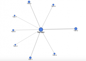
Clearly from the graph, we can see that each train (and thus, different sets of people) have less or more influence.  The first noteworthy observation for those who didn’t know the story is that all the trains are connected to the narrator, there are no interactions between the trains.  There is a clear center point here, indicating that there is a sort of “main character,” in this case being the author of the short story writing about his experience with Japanese train system.  Another observation from the graph that train 2 had the most interesting sets of people.  Not only is the train 2 the biggest node with the thickest edges, it is the most separate from the other groups.  

Unfortunately, there are some limitations, in which some information are missing. For example, it would have been nice to Train 1-8 circle around the train in numerical order.  If this was the case, we can sort of see the general trend of how interested the author was in each train. If we change the graph with the aforementioned changes, we would clearly be able to see that the author was more alert in the morning especially with train 2.  However, as the day progresses, he loses more and more interest.  Especially after train 5, which is his ride home, it becomes clear that the author has no more interest and is only thinking about getting home.  

Week 7 Blog Post 6

For this week, I’ve chosen to analyze the Caribbean Cholera Map.  Cholera is an infection that causes diarrhea and severe dehydration, which could lead to death if untreated.  The website displays instances of Cholera outbreak, hurricanes, tropical storms, and news articles all in one map.  You could see it in map form, or in timeline form. The website is simple, with a simple user interface for most readers to understand. Unfortunately that is the only positive design choice for this website,, as it is riddled with series of bad design choices for using a map as a type of data visualization to creatively show audiences the cholera outbreak in the Caribbean.  

The problem starts from the moment you enter the website.  It starts out with the map that is too zoomed out from the Caribbean, that the markers are overlapping.  This standard setup means that Cholera outbreak, which is arguably the most important aspect of the map, is hidden behind under less insignificant markers.  Which leads to me the next flaw: we need more information.  Yes, it is great to have a simple UI but you also need to have ways of displaying information if and when the audience chooses to.  In this website, no matter how much you explore, it is virtually impossible to find what cholera is, why Havana is significant, or why they also chose to put in hurricanes, tropical storms, and news articles onto the map.  In that sense, this map is subjective in that the the assumption is made that the audience already knows the answers I have posed in the previous sentence.  In addition, the map does not display all news articles and cholera outbreaks, so the authors of the website are choosing which ones were the most significant.  By choosing limited data from plentiful data through the author’s point of view, the website is very subjective.  Thus, the point of view of this article must be those who currently live in the Caribbean, who already knows the significance of Cholera and Havana in that region.

By navigating the frustrating UI and confusing elements, the map reveals a great deal of information about exactly where cholera exactly happened, and at what time point.  With the combination of timeline and a map, the user can choose a time they would like, and find out the locations of the outbreak, and receive more information by clicking on the markers.  The map on the other hand fails to describe which part of Caribbean had the worst impact, and its intensity.  Therefore, I imagine an alternate map that is more intuitive, where the user can display all cholera outbreak, hurricanes, tropical storm, and news article, regardless of time, and a check mark to see only one or few of the 4 markers.  The time can then be flexibly restricted depending on what time interval the user chooses to.  Then, like an earthquake magnitude map, this map could reveal the intensity of the earthquake by having more affected area (i.e. more deaths in a certain time period) have stronger color or a circle with a wider radius that indicates the intensity of the outbreak.  

Oct 24 Blog Post Human Population

screen-shot-2016-10-24-at-10-51-07-pm

For my blog post this week, I decided to create a data visualization out of a simple data that shows the year (every 10 years) and the population at that time.  The dates are from 1790-2010, meaning there are 23 different dates, and the population skyrockets from 3 million to 300 million, a 100x fold in the increase in population.  However, simply looking at this table does not tell the whole story.  For example, just from looking at this data that only contains 46 numbers, 23 dates and 23 population, one cannot tell if the increase from 1790 to 1890 was an exponential increase, such as 2x increase per year, or a straight line.  Especially as the numbers are really exact, for example the 1790 population being 3929214, our cognition has a hard time doing the simple math on the seemingly simple numbers.  It comes down to our psychology, where there are too much information coming in through our eyes, which actually creates a sort of stress and anxiety on our cognition, not allowing us to see the truth.

However, through this visualization shown above, we are clearly able to see that even simple data that only contains 46 numbers have a story to it.  The data visualization shown above is a line graph, where the x axis is the years, every 50 years, from around 1790 to around 2010.  The y axis is the population, 100 million people from 0 to 400 million. First, it is important to note that thanks to the style of this visualization, our cognitive load is lessened.  Before, we had to deal with 46 numbers, 23 of them very cognitively demanding.  Now we are only shown around a dozen numbers.  The smaller graph on the right is a slider, where by moving the white vertical ovals left or right, you can see the change in number of population with respect to the year in a much closer view.

screen-shot-2016-10-24-at-10-51-07-pm

The first trend that we couldn’t deduce before from that data is the fact that from from 1790 to around 1940/1950, there is an exponential increase.  By moving the slider closer, it is more obvious that the graph is exponential, the population increase is very slow at first, but once it picks up, the population increases multiple folds.  The graph shown right above reveals the effect of moving the sliders on the bottom to show the years between 1800 to 1950.  We can see, up until around 1940, the graph is almost a quarter-circle shape, which is one of the key features of an exponential growth.  However, from 1940, we can see there is a drastic decrease in the population growth. How could this be?  It is evident just by looking at the year, which is around 1940/1950, that this is due to WW2, in which the US had a deep involvement and consequently, severe casualties.  Thus, the population dips and we can see that shown in the graph.  This is hard to identify when looking at the data in table form, simply because the population is growing, so the population number is constantly increasing that humans cannot deduce the decrease in the amount of increase. But from this visualization, it is evident that the growth was not much. One can also tell by looking at the our first graph that the population kicks off after 1940/1950, but not necessarily in an exponential way, but in a more normalized straight growth.  Therefore, our table was not simply just an exponential growth or simple straight growth all the way, but a hybrid! All of these analysis would have been impossible without the help of the visualization.  It’s interesting to see that even simple data that contains only 43 number can have so much to say just by changing it from table to line-graph form!

Week 3 Post


For this week, I decided to analyze Gender Breakdown of City Workers by Department, which is a dataset that contains information about payroll men and women for a list of jobs.  This is to give the readers an objective data on how men and women compare in terms of salaries, and for the readers to analyze the inequalities depending on job description. The question that naturally arises from this data is, “are women really getting paid less, and why”?  The record in this dataset is the information collected from each department which contains data about # of Employee, Total Payroll, #Female, #Male, Female/Male Total Salary, and Female/Male Average Salary.  

Wallack and Srinivasan identifies ontology as the “system of categories and their interrelations by which groups order and manage information about the people places, things, and events around them.”  In other words, ontologies’ duty is to relay information of a reality of a certain phenomenon, which may push communities for a change. This dataset in particular is a meta-ontology, which is a state sponsored data to give an objective information to the public.  In this dataset, the ontology is comparing the salary of men and women in order to report the possible income inequality between sexes.

This dataset would be the most useful for equal rights activist, to get raw and objective information on how women and men’s salary differ, and to enact change of this injustice.  This data is simple in that the record can be categorized into 3 subgroups, job title, # of men and women employee, and salary difference between men and women.  Therefore, by looking at the table, the user can understand exactly which job employs more men or women, and what the salary difference is.  The website also allows different visualization of the data, for example, into bar graphs, pies, and treemap, which allows users to digest and compare the information more effectively.  

This dataset is great in that we can easily see the difference in salaries depending on gender and the job. However, the dataset is too simplistic in that we do not know exactly how many hours both men and women work.  In a society where the stigma of women as housewives still exist, perhaps women work less hours because as working parents, one usually have to take kids to school or pick kids up after school.  In our society, women are often assumed to take this role. Thus, perhaps the difference in payroll could be that women are working less hours due to this social stigma. On the other hand, it is possible that men and women work the same number of hours; we would never know unless we have that informations.

From a different person’s point of view, this dataset could be information containing the gender distribution for each job.  As each position have varying degrees of men and women worker, the graph shows which job is popular or more geared towards men and women.  Questions that could arise from this point of view is why some job has more men or vice versa, and is this through sexism, coincidence, or other reasons.  


Week 2 Japanese Internment


Introduction

The Collection of Material about Japanese American Internment, 1929-1956 bulk 1942-1946 contains 4 boxes and one map folder, detailing the lives of the Japanese Americans who were wrongfully interned without due process of law during WWII. The historical narrative engrained in these boxes and folder includes the life that the Japanese Americans had to endure from multiple perspectives, such as reports from the War Relocation Authority (WRA) who forcefully removed the Japanese American Citizens from their home, and yearbooks of those who endured such hardships and prejudice. The collection mostly focuses on the relocation camp of Manzanar and Minidoka.


The Historical Narrative

Box 1 of the collection includes reports of WRA, which details the life of the interned Japanese Americans from 1942-1945. There are 9 reports total in this box, which are chronologically ordered to understand the changes that happened during the whole internment process. From the finding aid of box 1, one can discover such information of the camp such as the reactions in and out of the camp, and the general politics inside the camp. Box 2 contains press releases by the WRA, many of them advocating the resettlement of the Japanese Americans out of the camps, as well as more in depth look at the life inside the camp, such as statistics on divorce, education, living conditions, and military services. Box 4 contains works written by Japanese American internees. Box 3 contains miscellaneous articles, speeches, theses and more about the internment of the Japanese. The historical that could be ascertained from this collection is the multiple perspective of the internment, from 1942-1946. One could get a pretty accurate detail of what was life like at the internment, in more or less chronological order. We can see what the opinions of those not only living inside the camp, but those outside as well.

The Missing Piece

One of the major problems of the collection is that both box 1 and 2, which is approx. 50% of the collection, are written by the WRA. WRA was the group that relocated the Japanese Americans, so there is inevitably some subjectivity in the reports. Box 1 which contains the report, is the only one in chronological order, so our main source of the historical narrative, with the cause and affect and datas strung together, is biased.  Furthermore, we are only given two main camps, so the data is limited, as life in other camps may not have been the same elsewhere.

The Remedy

To counteract this subjectivity, I think it is important for this collection to add another box, which has the accounts of the life inside the camp from actual Japanese Americans who endured the hardship of the camp. Then, this data should be ordered in chronological order so the researchers could get the sense of the historical narrative from the Japanese Americans Perspective, and compare it with the WRA’s take on the internment to get a more holistic view of the life in and out of the camp.


Blog Post Week 1

screen-shot-2016-10-02-at-11-55-52-pm

Introduction

For the blog post this week, I reverse engineered Photogrammer, which is a website that presents photos during World War 2 and the Great Depression. The website contains 170,000 photos from this era from 1935 – 1945, taken by the Farm Security Administration – Office of War Information (FSA-OWI). Photogrammer contain photos that depicts the harsh lifestyle that many Americans had to face during this devastating time, and is presented in an easy manner in which users can easily click, for example, on a map, to see photos during that period of time.

Sources

The photos used in the website were taken by the FSA-OWI from 1935-1945 to capture the lifestyle before and after the relieve services which were passed to get America out of the Great Depression. These relieve services were appointed by President Roosevelt, with the first major initiatives being passed in 1935, called the Resettlement Administration. Thus, by taking photos starting from 1935 where the Great Depression was still shattering the US economy, the photos were meant to be historical evidence that delineated the woe of the people during the depression, and eventually the success of these initiatives.

Processes

Photographers were sent all over the country to take pictures of the lifestyle, and sent to Washington DC, where the photos became known as the FSA-OWI File. Furthermore, more photos from other collection were added, to total 170,000 photos. Photogrammer then scanned these photos to digitize them, and were uploaded on their website, allowing people from all over the world to view the collection from the comfort of their own home.

screen-shot-2016-10-02-at-11-55-55-pm

Presentation

The introduction page is laid out very simply for the users to digest all the materials easily. On the top of the page, there is 5 tabs (Home, Maps, Search, About, Labs), and a corresponding information on what each of the tab is, in the middle of the home page. There is a big “Welcome!” text at the top, with a smaller text underneath that briefly explains the website, and a blue button that stands out that reads “Start Exploring,” making it obvious for users to find the starting point.

screen-shot-2016-10-02-at-11-56-10-pm

The main method that the website presented the website is through an interactive map, in which the users could click the approx. location on the map to see photos from that location during 1935-1945. Furthermore, there is a slider on the top of the map to allow users to choose any interval of time between 1935-1945. This is useful because users can choose to see photos, for instance, of 1935-1937 and compare it with 1943-1945 to see the difference in the standard of living.

Another option the user can adjust is where they want to see the photos by county or dot. The county option highlights photos of counties by a hue of green color, with darker color symbolizing a greater concentration of photo per area.   On the other hand, the user can also choose the dot option, where different colored dots placed all over the map, each color representing a different photographer. Once the user clicks on a photo, the user can easily see all the photos from that location in a grid format, and by clicking a photo, the user receives a bigger picture of the photo with more information on the left of the photo with captions, name of photographer, date, location and more.