Week 7- The Tenant

For this blog post, I decided to read the short story “The Tenant” by Victor Lodato. This story is about an alcoholic named Marie who becomes a tenant of the McGregor family. She lives in a small house on their land where she mainly drinks and reads books. You learn that her parents died causing her to derail her fairly normal life as an artist, become an alcoholic (or maybe a more pronounced one), and live a fairly nomadic life with very few possessions. She befriends one of the McGregor kids, Harland, and ends up helping him become a stronger reader in return for manual labor and ultimately companionship. As time goes on, she sinks deeper and deeper into alcoholism and eventually is hospitalized. The story ends with Harland going through her stuff after her death and reflecting on how she helped him develop into the person he is today.

As I read the story, I noticed that “place” was an important part of the story. Therefore, I decided to create a network map with Google Fusion tables to illustrate the connections between important people and places in the story. The nodes are places such as Marie’s house and the hospital while the edges are the people that connect the places such as Marie and Harland.

screen-shot-2016-11-14-at-2-48-08-am

This graph illustrates how places connect people in the story. For example, Marie’s House and the McGregor’s Land/House are important places which makes sense because that’s where the two main characters live and most of the character interactions take place. While this graph illustrates the importance between character interaction and place, it doesn’t innately show why these places are important to the story line. For example, the hospital only becomes an important place at the very end of the story when Marie gets sick and lots of characters come visit her. However, the way it’s represented in the graph makes it seem like it’s just as relevant throughout the story as the McGregor’s Land/house and Marie’s house. As a result, anyone looking at the graph would be missing important contextual information about why certain places have more connections than others.
Week 5- Locating London’s Past

For this blog post, I chose the map “Locating London’s Past.” This map uses a GIS interface in order to enable researchers to visualize and map data about London from the seventeenth and eighteenth centuries. This is done against a 1746 map of London created by John Rocque and the first accurate OS map. The project was carried out by several English Universities and institutions with the help of grant funding. They created their own online geocoding tool in order to carry out automated matching of location data as well as manual checking of that data.

The map allows you to choose between 5 layers which are 1746, 1869-1880, blank, map, and satellite. Then you can choose what data you want mapped by selecting one or more datasets such as Old Bailey Proceedings, Coroner’s Records, Criminal Justice, Four Shillings in the Pound Tax, Fire Insurance, Plague Deaths, Glass, and Population and Area Data. From there you can narrow down the data to specific parameters such as gender, keywords, and dates. The data that matches these parameters will then be mapped based on the geolocation of the records.

Turnbull states “a map is always selective. In other words, the mapmaker determines what is, and equally importantly, what is not included in the representation.” This definitely applies to Locating London’s Past. The mapmakers have decided to focus on mapping data from legal documents such as death records, insurance records, hospital records, and criminal records. It comes from the point of view of the government, given that these are documents that governing bodies collected. Furthermore, it reflects the viewpoint of the Universities that created the map because they are the ones who decided to use these specific datasets.

The map reveals how different points of data are geographically situated in regards to each other. For example, when looking at data from the plague datasets, you see that the deaths are all located very close to one another. However this map obscures the historical contexts in relation to these data points. That being said, you can research the datasets on the website and find out what mapping these points can show, but it isn’t readily available. For example, the authors state that by mapping the four shillings in the pound tax data set, you get an idea of the wealth distribution about London during that time. However, by having to toggle back and forth between that information and the visualization, the website does not provide a cohesive experience. I would suggest redesigning the map so that the historical relevance about the datasets were present when you mapped the information so that users get a better understanding of what the data actually shows about London’s past.


Week 4- MoMA data visualization

sheet-2

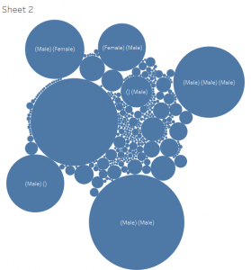
For this blog post I decided to build a data visualization for the data given to us for our final project. This data is information about artists and artworks that have been acquired by the Museum of Modern Art (MoMA) since its start in 1929. I created this visualization with Tableau and used the dimension “gender” and measure “number of records.” I then chose to present the data in the form of “packed bubbles” as I think it reveals a lot about the selected data.

The first revelation is that a lot of data cleaning will need to be done. For example, this visualization shows that some pieces are labeled “()(Male)” while others are labeled “(Male)()” which are actually the same category. There are many other situations like this which means that many categories will need to be merged with software such as OpenRefine. Also if you click on the circles you find that many pieces of data have things like “()” and “()()()” which both indicate that their is no information available. The visualization above also has a large circle with no label which also indicates that no information was found about gender for those pieces of data. As a result, if my group decides that gender is something we want to look into, then we know we can exclude this data.

Another thing this visualization shows is the fact that a lot of these artworks were worked on by multiple people. This was hard to see when just looking at the data table given that the row was so narrow that it only revealed the first gender. As a result, if my group decides to work with gender, we’ll need to decide whether we want to look at pieces of artwork that were worked on by just a single person or if we want to include pieces that were worked on by multiple people.

Payroll by Department Dataset

For this blog post, I decided to investigate the Payroll by Department dataset from the L.A. Controller’s Office website. This is payroll information for all the City Departments of Los Angeles since 2013 which is updated on a quarterly basis. The data types used for this dataset are Department title, Year, Job class, Projected Annual Salary, quarterly payment, payments over base pay, percent over base pay and total payments. A record in this dataset refers to above mentioned payroll information specific to one of the 56 departments included in the dataset.

Wallack and Srinivasan define ontology as “systems of categories and their interrelations by which groups order and manage information about the people, places, things, and events around them.” Based on this information we can see that this dataset’s ontology looks at how total payments differs across different departments and how that is broken down into specific categories such as quarters and payments over base pay. The people that will find this information the most illuminating are individuals interested in how much money in total is used to pay employees for each department in the city of Los Angeles. For example, those who are in charge of the city budget would find this categorization of data very useful. Other individuals that might be interested are those who are trying to compare the difference in pay for different departments across different cities within California or the US.

This dataset does a good job of giving total numbers for the money that goes into paying a city department. For example, when you click on the pie chart, the information you immediately get the department name and the total payments for that department. However, these records don’t let you get into the specifics or even tell you how many payments are totaled in the calculation. For example, the LAPD section shows a total payment of $1,344,118,166.75 but we have no sense of how that number breaks down into a payment for an individual officer.

While this ontology might be very useful for budget planning, it isn’t as useful for those trying to get a sense of what the average total payment per person is in each department. These would be people potentially interested in working for the city and wanting to compare average salaries from different departments. This kind of ontology would include data types such as average projected annual salary, average quarterly payments, and average payment over base pay.

Blog Post 2- Finding Aid for the Virgina Espino and Renee Tajima-Pena Collection of Sterilization Records

The Virginia Espino and Renee Tajima-Pena Collection of Sterilization records is a collection of legal records and court documents from the 1975 class action lawsuit Madrigal v. Quilligan. This lawsuit was brought to court by 10 Latina women against E.J. Quilligan M.D. and other hospital employees in regards to coerced sterilization of Latina women at Los Angeles County-University of Southern California Medical Center. While the ultimately judge ruled against the women, the lawsuit still increased public awareness about sterilization of minority women. Also included in this collection are Oral History Audio Recordings done by Virginia Espino documenting the interviews with prominent Latinas at the time of the court case and their involvement. Also included are interviews with a lawyer who supported the plaintiffs in the lawsuit and a doctor at the hospital who reported that minority women were being sterilized.

The court documents provide a very factual account of the court proceedings. The collection includes all the interrogatories as well as answers from the defendants and plaintiffs and other documents detailing the proceedings of the lawsuit. From these documents, one gets a comprehensive and non-biased narrative of the case proceedings given that they are all just reports and not subjective stories. The oral recordings give a very different historical narrative. These are personal accounts of people who were involved in the case. As a result, you’ll get a narrative that includes people’s feelings and different experiences that all show slightly different perspectives about the events of the case.

That being said, this collection is missing a large section of information. While there are 10 different tapes from individuals sympathetic to the plaintiffs, there are no interviews with those sympathetic to the defendants. This means that an entire perspective of the case is completely missing. Anyone trying to understand this lawsuit by looking at the information stored in this collection would have a significant bias towards the plaintiffs because the collection only includes interviews with people sympathetic to them. In order to remedy this, oral recordings should be made of Dr. E. J. Quilligan and other hospital employees who were involved in the case so that their perspectives can be included and considered. This collection also lacks interviews with the actual plaintiffs. While interviews with others involved in the case such as the lawyer and the doctor gives a more personal view of the lawsuit, having interviews with the actual women who were sterilized would provide more valuable information about the case.

Blog Post 1- Photogrammar

screen-shot-2016-10-03-at-1-15-30-am

For this weeks blog post, I decided to explore the project Photogrammar. Photogrammar takes the collection of photographs from the Farm Security Administration- Office of War Information (FSA-OWI) and organizes them in several ways such as photographer, location, classification, and date. It then presents the data collected in the form of a Map, a Treemap and a Metadata dashboard.

The source of this digital project is 170,000 photos taken between 1935 and 1946 by the Farm Security Administration- Office of War Information that are now housed in the Library of Congress. They were taken to document the US and demonstrate that the administration of relief services has been successful. Most of them come from the Farm Security Administration collection and the Office of War Information collection from both the Domestic Operations Branch and the Overseas Operations Branch. Also included are photos from the Office of Emergency Management-Office of War Information Collection, the American at War Collection, and the Portrait of America Collection.

The main processing method is digitization through scanning the photos. They have also been organized in various ways. In 1942, Paul Vanderbilt created the Lot Number system and Classification Tags system. The Lot Number system assigns a lot number to a set of photographs that are organized around a shooting assignment. The Classification Tags system assigns pictures tags such as “The Land.” This system has 12 main headings and 1300 sub-headings. Both of these systems are included Photogrammars organization of the photos. Photogrammar also organizes the photos based on photographer, data, and geocodes them based on location.

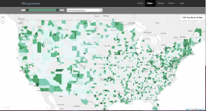
Photogrammar presents the photographs in two main ways: mapping and visualization. The map has two different ways of displaying the photographic data. The first maps the photos by the county in which it was taken. The darker the county, the more pictures were taken there. The second way maps the photos based on who took the actual photo. This is particularly interesting because you can see the routes that photographers must have taken while photographing the country. The map was created with CartoDB and leaflet mapping technology. The second way that Photogrammar presents the data is by creating a Treemap based on Paul Vanderbilts Classification Tags system. One starts with the top level or main heading such as “Social and Personal Activity” and then selects a sub level and sub-sub level where one can find all related photographs. By presenting the data in this fashion, the Classification Tags system illistrates how that aspect of life looked across the US from 1935-1946. The last way that Photogrammar presents the data is through a Metadata Dashboard. This allows you to select a county and then see who was photographing what, when. At this moment in time, California is the only state that is presented in this fashion but it still provides a very interesting look at the intersection between all the photographic data provided.