This week I looked at the “One More Last Stand” short story by Callan Wink. For this blog post I did a network analysis on the connection between characters, namely their interaction in the short story. This network graph illuminates immediately that Perry is a vital character in the story, and objectively one may figure out that he is the main character. He has communication lines with each person, and two people (Kat Realbird and the bartender) have direct communication to two other people. The graph has directional points, where you can see the communication originating from Perry, Kat Realbird, and the Bartender to the receiver. 
However there are limitations of this network analysis, specifically the inability to show the quality and nature of each relationship and conversation. We only know from this network analysis that Perry has spoken to Kat Realbird, the Twins, Andy, Ted, and the Bartender. The viewer does not know how many times they have spoken, and thus do not know the extent of each relationship. Perry speaks to Kat and Andy many times in the short story, but even for these two the nature of their relationship is different. I’m sure with more complicated network analysis tools one could better capture the relationships.
Another limitation is the connection between the characters aside from Perry. John Realbird and Kat Realbird are brothers and sisters, and John Realbird is the bartender’s cousin. This particular network analysis does not show the other relationships, and limits the other connections to the fact that Kat Realbird had spoken to her grandmother or the bartender had spoken to John Realbird. We can see, however, that if Perry wanted to reach John Realbird he has a connection to him through the bartender. This is not the only way to reach John Realbird, but it is one possibility because of the vast network of communication Perry has had.
Overall this was a fun activity to do a simply network analysis exercise. I can definitely see how a more complicated network analysis could show a lot more information and connections between nodes!
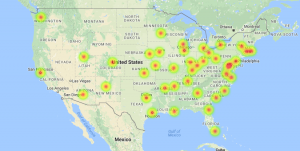 and temperature. The map allows the data to be visualized for an easier time identifying which cities were studied and where the SO2 and population levels are highest.
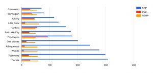 that the cities with higher populations does not necessarily have higher SO2 levels. I also included the temperature variable to show a data that is nearly stable throughout the whole data set. Ultimately we can see that having a large population is not direct causation of high SO2 levels. As a result, we raise more questions as to whether the SO2 levels has an effect on any changes of temperature, which we can find out if we compare and contrast this data with previous years’.
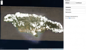
 on soccer balls, but buy clicking the information one will immediately notice that about 81,000 adults and youth participate in the City’s organized sports leagues.