This week I looked at the 19th-Century Caribbean Cholera TimeMap; this project was conducted by a team in Duke University. There is an “About” Section with tabs such as “Project Team”, “Methodology Considerations”, “Seasonality Correlations”, and “Migratino and Cholera”. (Unfortunately I could not access this information because each time I clicked a tab, the link would not take my anywhere. Maybe other students had better luck with this). However there is information I can access by simply looking at the home page. Turnbull believes that all maps are perspectival and subjective. Furthermore, on the homepage of the Turnbull reading and exhibitions, the site indicates tells the readers that Turnbull “analyses maps both as a metaphor for knowledge and also as a major means of knowledge representation in a wide array of cultures”. From Turnbull’s perspective of maps, I tried to decipher the perspective that the Caribbean Cholera TimeMap portrays.
.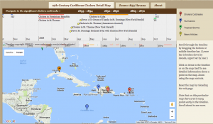
This map reflects the point of view of the team that created the map, and what they deemed important about the outbreak. They have a timeline starting from the early 1830’s to the late 1870’s, and based on the time period you choose, the map also changes to that time period. Each time period navigates to significant cholera outbreaks, but also marks the locations where there were hurricane, tropical storms, and particular news articles about the cholera outbreaks. We are missing a lot of contextual information, especially in terms of the significance and outcome of these outbreaks to the community. We do not know why the Duke team chose this particular time period as well. Although easily navigable, this map lacks information to give us a solid perspective. And since this was created by a team in a university in the U.S., we do not have the perspective of those who lived in the Caribbean and experienced these outbreaks. Therefore there may have been more outbreaks in different locations that we are missing, or stories about these outbreaks. An alternative map would include local stories and interviews (although difficult since they begin in 1830’s) and context to why they chose this outbreak to map out.
Based on this exercise there’s no disagreeing that maps are usually indicative of knowledge from its maker(s), and an array of maps would definitely represent a wide set of cultures. Maps are one way someone can view another’s perspective of the world around them, or in other words, how one “how humans see and depict the natural world”. Although cholera is the main focus of this map, we cannot see in what regards it was significant e.g. culturally, socially, and economically. With the spotlight on the Caribbean, we can definitively assume the creators of the map believed cholera as an important factor to those who lived there. However I heartily agree with Turnbull when he wants us to be careful “not to take one’s own view as definitive of all maps”.