For this week’s blog post, I decided to reverse engineer Photogrammar, which organizes and presents the Library of Congress’s 170,000 photographs taken from 1935-1945 for the US Farm Security Administration and Office of War Information (FSA-OWI). In order to reverse engineer this project, I will describe the sources, processes, and presentation choices utilized by the Yale research team.
The sources used by the research team were the FSA-OWI File photos held by the Library of Congress. The researchers also utilized the organization system conjured by Paul Vanderbilt, who was part of the FSA-OWI. In order to get these photos into digital form for processing, researchers scanned the images, organized them digitally by county and photographer, and built charts based off the information in the archives. Unlike other projects we’ve looked at, Photogrammar doesn’t appear to have much photo analysis, but rather presents the material in a digital format that makes the material easier for users to interact with.
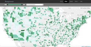
Upon entry to the site, the home page offers basic information about the project with a large blue “Start Exploring” button that beckons users to enter the site. By using the term exploring, the research appears more approachable for experienced researchers and casual Internet users alike. From this homepage, the site then goes to a map of the United States divided into counties, with those shaded in darker greens indicating more pictures from the collection taken in that county. This map was presented using the programs Leaflet and CartoDB. Users may control what time period of photos they look at through the timeline in the upper corner, which is useful for users looking for photos of a specific era, such as pre-WWII or the Great Depression.
For users with specific research goals, the Search tab and Treemap options are useful tools. The Search tab allows users to find their information by classifications such as Lot Number and Classification Tags, while the Treemap organizes the photos by Paul Vanderbilt’s 1942 organizational system. For casual internet users, these tools are easy to use, but not necessarily as easy to interact with as the maps.
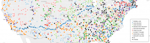
For someone with little digital humanities experience, like myself, the most interesting feature to the site is the Dots map. There you can see where each photographer took his or her pictures. This is particularly compelling for understanding the whereabouts and behaviors of the photographers themselves. For instance, with Jack Delano, his dots mark a clear path he took in March 1943 from southern California to Illinois. On this map, you can see the areas and regions that most inspired these photographers, which leaves room for further research. Then, on the Metadata page under the Labs tab, you can analyze photos from California on multiple plains of information, which shows compelling relationships between the photographers, the geographic locations, and the photo content.
Overall, I greatly enjoyed interacting with this research. It was easy to navigate and explore while packed with information and possible research direction.
I really enjoyed the way you took the reader step by step throughout the website. I also like how you included the images of the graphs in association with your descriptions. I found it interesting that you put it in your personal opinion as it put the commentary in a unique perspective that was relatable. Overall excellent post!