The “Best City in Florida” data provides 13 “quality-of-life variables” for 20 cities in Florida, including income, commute, job growth, physicians, murder rate, rape rate, golf, restaurants, housing, median age, literacy, household income, and recreation. No data type specifies the unit it uses, and while I can assume that income is measured in dollars per year, I am less certain about data types like recreation—does this refer to the number of recreational facilities in each city? In this case, some metadata would be helpful.
In spite of my uncertainty about some of the data types, I created several data visualizations using Google Fusion Tables. I found that bar charts were the most direct way to visualize the data (since I had a relatively large number of data sets, I chose the bar chart over the bar column chart). A scatter chart would have also been effective, but I found it more difficult to keep track of data points and to compare different data types in this format. Since I did not observe any change over time reflected in the data, I did not use a line chart.
As an experiment, I began by creating a bar chart that included every data type. The city “names,” designated by the letters A-T, appear on the x-axis, while the measurement for each data type appears on the y-axis. As you can see, the resulting bar chart is flawed in several ways: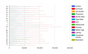
First, the bar chart appears very crowded. It is difficult to interpret all the data at the same time, and thus to effectively compare them. Also, the units of measurement differ for each data type, which also complicates comparison—average housing prices may seem extremely high in comparison to number of restaurants, but it is not necessarily relevant or helpful to compare these things. Finally, the scale differs for each data type, rendering some bars scarcely visible. Because housing prices are so much larger than murder rates, the latter data type appears tiny on the bar chart, when in reality murder rate has a large influence in a much different way than a housing price. While it is interesting to view all the data in one visualization, it is hardly more illuminating than viewing the data in Excel.
At this point, I started to create bar charts incorporating only a few data types. I realized that it was most effective to compare data types with the same units of measurement, or at least those with similar scales. For instance, since the numbers of golf courses and recreation facilities, respectively, are on a similar scale, a bar chart comparing them is easier to interpret than my first bar chart. 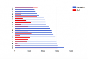
It becomes clear that, in general, there are more recreation facilities than golf courses, and that the number of golf courses seems to vary more from city to city than does the number of recreation facilities. However, despite the similarity of units and scale in these data types, comparing them does not necessarily illuminate anything significant about relative quality of life in each city. The fact that one city may have significantly more recreation facilities than golf courses may not affect every city resident equally, or even factor into quality of life much at all.
It is only when you can see a correlation between variations in each data type that comparing data begins to illuminate something about quality of life. In comparing housing prices to household incomes, I adhere to my notion that the units and scales of each data type should be similar while also tracing a thematic similarity between the two data types. For instance, I would expect household income to generally increase with housing prices in each city. Yet the bar chart reveals that this is not always the case:
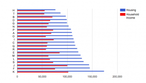
While the city with the highest housing price has a greater household income than the city with the lowest housing price, this is not the result of a consistent trend. As a result, I am able to conclude that while overall quality of life may not be lower where there is a greater disparity between household income and housing price, another factor (for instance, a lower murder rate) may have to improve quality of life in order to compensate for this discrepancy.
Finally, it is probably simpler to view a data visualization that features only one data type. Separating household income and housing price into separate bar charts allows you to notice differences within one particular data type, allowing for a more in-depth understanding of each. However, while the bar chart with two data types is perhaps more difficult to interpret, it allows for more direct comparison of each than if I were to simply compare two different bar charts.
Since I am new to creating data visualizations, I was a little confused by the data summarization function. Though the tutorial recommended using it, the “summarize data” button did not seem to make any difference in how the data appeared on the charts, other than requiring me to specify minimum, maximum, average, or sum for each value. I am wondering if summarization makes more of a difference with more complicated datasets, or if I am just missing something.


 and temperature. The map allows the data to be visualized for an easier time identifying which cities were studied and where the SO2 and population levels are highest.
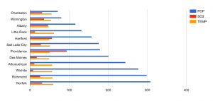 that the cities with higher populations does not necessarily have higher SO2 levels. I also included the temperature variable to show a data that is nearly stable throughout the whole data set. Ultimately we can see that having a large population is not direct causation of high SO2 levels. As a result, we raise more questions as to whether the SO2 levels has an effect on any changes of temperature, which we can find out if we compare and contrast this data with previous years’.
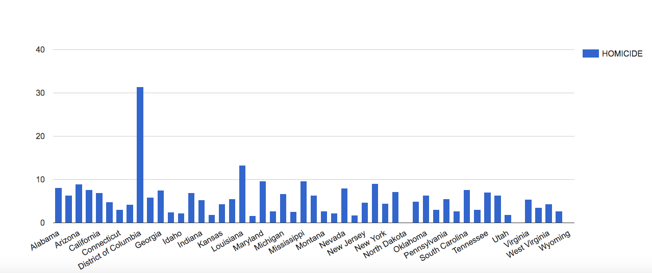
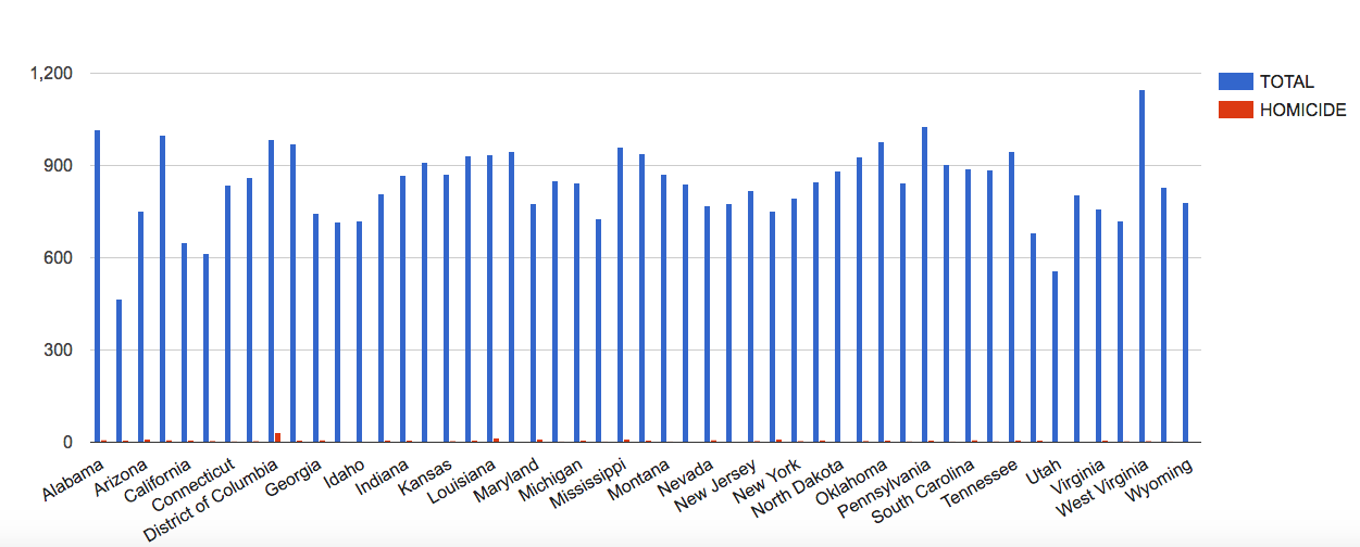
 Other interesting trends can be seen when showing the total party vote for a certain candidate in a certain election. These trends can be used to show what attributes in a candidate are more effective when running for president and which ones are more deleterious. It can also show the margins by which a presidency was won and to what extent overall voter turnout had an effect on the outcome of the election.
 Overall, the vast amount of data that is presented by this data set allows the viewer to manipulate it in many different ways and achieve various outputs. This data allows the viewer to make many connections and even more assumptions about presidential voting in America. However, this dataset could be improved by the addition of a qualitative element to show historical events or controversial bills that presidents passed along with more quantitative elements such as approval ratings and economic descriptions of the eras. These would allow more concrete postulations to be made about the data
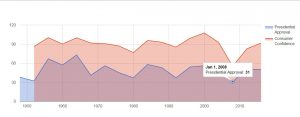

 The Cartesian coordinate system, with time on the x-axis and the values of the two indexes on the y-axis, creates the framework of observing the fluctuations of the stock market throughout time. In this framework, investors can easily pinpoint the rising or the dropping points of the stock market and therefore induct the factors that caused the stock indexes to fluctuate. For the same reason, direction is used as the visual cue so that investors can easily see the boom or bust periods of the stock market from the slope of the plots. The context of the visualization can be easily clarified with the title “Stock Market Indexes from 1991 to 2011”.

 This shows that the countries with the highest birth rates are also the countries with the highest infant mortality rate. It becomes obvious that families in poor countries are having more children because they’re experiencing far more child deaths than wealthy countries.

