Class Blog

Data Visualization: Featured Composers from Seasons 1842-52

Print

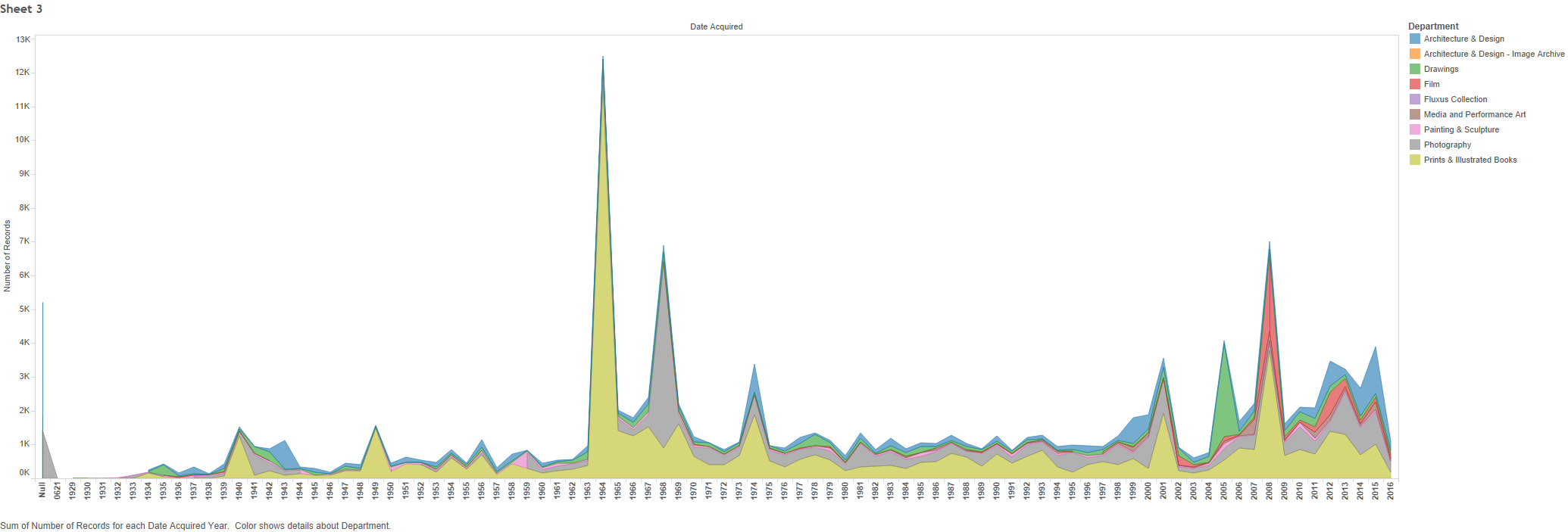
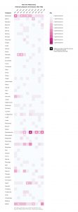
I created the adjacent data visualization on Adobe Illustrator using the dataset for my final group project: New York Philharmonic History Metadata. I’m focusing on creating data visualizations for the final project, so I used this assignment as an opportunity to experiment with the dataset. Just to get a scope of the entire dataset, the first concert date is December 7, 1842 and it ends on April 2, 1911.  This visualization only depicts a snippet of the dataset, focusing on the first decade (a total of 10 seasons) from 1842-1852.

I focused on this shorter timeframe because it was more manageable for the assignment, yet was still enough material to see composer trends. I was interested in examining the popularity of the various composers. For each season, how many performed songs were composed by each composer?

In order to make the visualization, I cleaned up the GitHub spreadsheet by manually going through each row. I paid careful attention to the programID, workID, workTitle, and composerName columns. There were many rows that had repeating workIDs. In some cases it was because the same piece was included in two different programIDs. I kept these repetitions because they signified multiple performances of the same musical piece. In other cases, there were repetitions in order to incorporate more specific data in the other columns, such as movement, soloistName, soloistInstrument, and soloistRole. For the purposes of this visualization, I deleted these rows because it made it difficult to count the number of pieces performed by the composers, and I wasn’t interested in portraying data about the movements or soloists.

I used color saturation to indicate the number of performances. The more pink the color, the higher numbers of performances. The white overlay circles indicate that the corresponding composer had the highest number of performances that season (some composers are tied for highest number for each season). At a glance, the visualization communicates which composers are the most prominent each season. Observing these trends in the data was difficult to determine on the spreadsheet, but when visualized the trends become much clearer.

Data Visualization Analysis

For this weeks analysis, I decided to focus my efforts on analyzing the data set related to New York’s Museum of Modern Art (MoMA). This dataset included various aspects regarding MoMA’s artwork collection such as Title, Artist, Gender, Department, and Acquisition Year. These are only a handful of the many kinds of categories provided in the dataset.

In order to do some exploratory research I tried to utilize Tableau to generate some data visualizations to help guide further research progression on this dataset.

One visualization I examined was a comparison of Artist involvement within each department at MoMA as shown in Figure 1. In this visualization the departments are organized from largest in terms of artwork records on the outside decreasing as it goes inward for the overall circle. The individual circles represent the individual artists with size corresponding to how many artworks they’ve submitted for that department. The two biggest departments are shown to be Print & Illustrated Books and Photography with the largest contributors for each to be Louise Bourgeois and Eugene Atget respectively.  The visualization helps showcase what are MoMA’s biggest departments in terms of artwork pieces as well as to show how condensed they might be to a few major artists.

Figure 1: Artist and Department Bubble Graphsheet-2


A second visualization that I analyzed was an analysis focused on charting out MoMA’s artwork acquisition dates on a time-plot as shown in Figure 2. The visualization overlays these acquisitions in terms of departments so it can then be shown which departments were most active in which periods. Looking at the chart, 1960-70 and 2008 stand out as major acquisition periods. The visualization helps showcase how wide a disparity these periods have in comparison to other years, something which would be much more difficult to quickly interpret from just looking at the raw data.

sheet-3

Blog Post 4 – Visualization

For this week’s blog post, I decided to use our project data and create a visualization that would help understand our assigned data better. For our final project, we have been assigned the Marvel and DC database of superheroes. However, for this visualization I only used the DC database. I created an alluvial diagram on RAM to show the correlation between the genders of superheroes and their eye color.

screen-shot-2016-10-24-at-8-46-42-pm

We notice how the distribution of eye color between both genders is pretty similar. The affinity for blue eyes is high in both male and female characters. We also notice many varied colors that we would normally not think of eye colors, such as violet, amber and pink. This visualization is also interactive, that is, if you hover over any of the relations it tells you exactly how many heroes in that gender have that specific eye color. Additionally we notice the sheer difference in the number of male characters as compared to female or genderless or transgender characters.

Creating this simple visualization really helped me look at my data in a different way. It even helped me realize that there were discrepancies in my data, and gave me direction to clean and filter it. For example, I noticed there is a segment of auburn hair in the eye color column, which means some data must have been entered in the wrong column by error. Although, the purpose of this visualization was not to find discrepancies in your data, rather to provide further insight. I think it really helped me understand my data better as a person with no prior knowledge handling data or any visualizations, especially in such large quantities.


Week 4- MoMA data visualization

sheet-2

For this blog post I decided to build a data visualization for the data given to us for our final project. This data is information about artists and artworks that have been acquired by the Museum of Modern Art (MoMA) since its start in 1929. I created this visualization with Tableau and used the dimension “gender” and measure “number of records.” I then chose to present the data in the form of “packed bubbles” as I think it reveals a lot about the selected data.

The first revelation is that a lot of data cleaning will need to be done. For example, this visualization shows that some pieces are labeled “()(Male)” while others are labeled “(Male)()” which are actually the same category. There are many other situations like this which means that many categories will need to be merged with software such as OpenRefine. Also if you click on the circles you find that many pieces of data have things like “()” and “()()()” which both indicate that their is no information available. The visualization above also has a large circle with no label which also indicates that no information was found about gender for those pieces of data. As a result, if my group decides that gender is something we want to look into, then we know we can exclude this data.

Another thing this visualization shows is the fact that a lot of these artworks were worked on by multiple people. This was hard to see when just looking at the data table given that the row was so narrow that it only revealed the first gender. As a result, if my group decides to work with gender, we’ll need to decide whether we want to look at pieces of artwork that were worked on by just a single person or if we want to include pieces that were worked on by multiple people.

Data Visualization – US Population

I used Google Fusion to create a graph displaying my data, which indicates the United States population in each decennial census from 1790 to 2010.

Since there were only two columns – year and population – I figured a simple bar graph would be clear in organizing the population number on the y-axis versus the year on the x-axis. The graph allows us to encode values to the image because we can take into consideration the length of the bars and the upward trend. When looking at the data itself, there’s a jumble of numbers without commas that makes the numerical value difficult to identify; however, inputing this information into a bar graph allows us to gauge the rise and decline.

The information can lead us to consider more research questions, such as influences on increase of population throughout the decades. Things we could look into based off of the data are the quality of health facilities, reasons for fluctuating birth and death rate, water/food accessibility, immigration/emigration, etc. Also, the data encourages us to look into specific states/areas and how much they constitute the percentage of the total country population, so that we could target problem areas for research.


Blog Post Week 4

unknown

For this week’s blog post I decided to make an alluvial graph using my group’s data set. Our dataset looks at the characters of DC and Marvel comics and various attributes associated with them. I made the graph solely using DC’s data set. This alluvial graph was made using RAW.

One of the interesting attributes listed int he DC data is the alignment of the characters (whether they are good, bad, neutral, or what they label to be “reformed”.) Several of the other columns in our data set list physical attributes of the characters. In our society today, there is a big emphasis placed on physical looks and characteristics. There are most definitely certain stereotypes and appearances that are associated with specific moral characteristics. I thought it would be interesting to look at what hair color is associated most with each moral category. We could then draw inferences on what society thinks a “bad” or “good” person looks like.

This data visualization helps the reader visualize the strength of the associations between the different hair colors and character alignment. It is interesting to see that the there are roughly the same amount of good characters with black hair as bad characters with black hair. This is surprising because dark hair many times has a notion of being associated with evil . There are of course many flaws with this. The first being that while the raw number of good and bad characters with black hair might be the same, we cannot draw any inferences about the proportions. There might be a disproportionately higher number of one type of character and this would influence the proportions. Another important thing to consider is what constitutes a good and bad character. Before understanding the true nature of these data types it would be foolish to draw conclusions based off of this graph.

This graph also illuminates several other connections between hair color and character alignment. For example there seem to be more good characters with blonde hair than bad characters. What is also interesting is that there seem to be more good characters with red hair than bad characters as well. Another interesting revelation by this graph is the diversity of hair color types. By just looking at the data one may not realize that there are characters with strawberry blond hair, reddish brown hair, gold, and pink hair. This graph makes it easy to spot the variety. Overall illustrations like this are really useful in seeing interesting trends, but one must be careful to understand the data types behind them.

Blog 4 – Titanic Data Visualization

screen-shot-2016-10-24-at-6-53-22-pm
0 = Crew 1 = First 2 = Second 3 = Third

For my blog post this week, I decided to take a look at the Titanic dataset provided. It provided information on the different classes that were aboard (distinguished as crew, first class, second class, and third class), the sex of the passengers, their age (distinguished as “adult” or “child”), and whether or not they survived the tragic sinking of the ship.

I specifically focused on exploring the relationship between the passengers’ class and whether or not they survived. For anyone that has seen the movie, it was obvious that the first class was privileged in more ways than one, most importantly when it came to escaping first as soon as tragedy struck. I wanted to see how this story compared to the “real” data (i.e. if there really was a correlation between class and survival). Looking at the dataset, this was not immediately evident as there were several data points.

Using Tableau, I was able to create a pie chart to better visualize the information I was given. Each of the colors correspond to a particular class and the size of each “slice” denotes the sum of how many in that particular class survived. As can be seen from this data visualization, first class and crew did indeed have a certain privilege when it came to survival, while the second class was not so lucky. The most peculiar thing, however, is that the visualization shows that the third class somehow had a large number of survivors. I did some research online and found that although third class passengers were mainly immigrants forced to stay below deck, no one knows exactly how such a large number survived. Overall, this data visualization was able to show the relationship between class and survival, and even a mysterious component which was not obvious from simply looking at the overwhelming dataset.

NY Tenements – Word Cloud Visualization – Week 4


Data Visualization
Data Visualization

For the purposes of this week’s assignment, I chose to use Wordle.net to create a visualization of our dataset – NY Tenements.  The dataset itself is a photo record of the New York tenements taken by inspectors during the 1934-1938 period.  The photos and any related records were gifted to the New York public library and archived in series of eight volumes, most of which were digitized or placed on microfiche, after which the nitrate based original negatives were destroyed.  A challenging feature of the dataset is the scarcity of information contained in each individual record – the majority of the information given is stored as a note attached to the record and each record contains a link not to the photograph but the page on which it is displayed.  There are a total of 1102 records

Given the wealth of information contained in the notes section, we drew from there and  created a  word cloud based upon the frequency of individual words used in the info provided.  I formatted the resulting word cloud based on personal taste.  I wanted to understand with what frequency the records identified location, building types and/or human presence in the photographs.  Looking at the visualization, I understand that overwhelmingly the images are derived from properties located in Manhattan, with Brooklyn coming in a second and the Bronx a distant third.  Interestingly, Queens barely registers at all, from which I might derive different meanings but that I know now that I need to look at more closely.  I can also surmise from the visualization that the records are predominantly of building exteriors, and that if human presence is noted, it is most often of children.  What I cannot surmise are the motivations of the individual inspectors who were taking the photographs and their choices regarding content.  I would move forward from this visualization by isolating more specific address information where it is available and looking for patterns that might indicate human condition, ethnic concentrations and/or the ways of occupying public/private spaces that might generate insight and the ability to formulate better questions.


Blog 4 Data Viz: Death Data

This week, I examined the data set on Death Rates. I explored many data sets on the website and found that this data set was already easy to read in an excel sheet, so I wanted to see how a data visualization could enhance the interpretation of this information.

This data set listed all 50 states plus the District of Columbia with information regarding deaths based on various causes such as cancer, stroke, suicide, homicide, and many more. What I found a bit confusing about this data set is that there were no units for the data points. I am not sure if the numbers listed are the total deaths per state, the percent of the population who died, etc.

screen-shot-2016-10-24-at-5-32-49-pm

For this blog post, I focused on suicide deaths. Using Google Fusion Tables, I created a bar chart with States on the x-axis and Suicide Deaths on the y-axis. States with the highest suicide deaths include Alaska, Montana, Nebraska, and New Mexico. I tried to think about if those states had anything in common that caused them to have the highest suicide deaths, but I wasn’t able to find any obvious similarities. States with the lowest suicide deaths include D.C., New York, Massachusetts, and New Jersey. These states are all located in Northeastern United States, but I’m not sure how that might relate to lower suicide deaths.

screen-shot-2016-10-24-at-6-03-34-pm

I also created another bar graph that compared the Total deaths to Suicide deaths. Suicide in the states Alaska, Montana, Nebraska, and New Mexico had the highest amount of suicide deaths, but when compared to the total, it was not the largest cause of death which can be easily judged by the size of the red bar compared to the blue.

screen-shot-2016-10-24-at-6-08-11-pm

Creating another bar graph with all causes of death provided in the data set, we can clearly see that heart failures and cancer are the leading causes of death in the states.

The data set would be more helpful if there was also related information such as age and income to determine any large factors contributing to deaths. It would also be helpful to know what year this data was gathered, because it may be outdated by now. The data set in the excel sheet was easy to read and the visualizations gave me another perspective to analyze the data, but it would be more effective if the data set was more complete with units and other related information.

Blog Post #4: Death Data

The ‘Death Dataset’ compares various causes of death, relative to state. All fifty states are featured, and categories of death include the total number of deaths, death by heart failure, cancer, respiratory failure, stroke, accidental death, vehicle death, Diabetes, Alzheimer’s, the flu, nephritis, suicide, homicide, and AIDS.

screen-shot-2016-10-24-at-11-52-37-am

For this data visualization, I’ve chosen to compare rates of suicide vs rates of homicide, varying from state to state. I began by uploading the raw data onto a Google Fusion table, managing to create a very basic column chart. I found this format to be the most feasible for comprehending the data — suicide rates are represented with blue, while rates of homicide are depicted in red. The x and y axis allows for an easy comparison of death tolls relative to state.

While the data visualization allows the viewer to access trends easily — i.e., one may quickly notice that the District of Columbia and Maryland both have greater rates of homicide, vs. greater rates of suicide. I may be lead to make some sort of inference as to why this is — close proximity, similar social circumstances, or etc. With other states visible on the chart, the rate of suicide typically surpass the rates of homicide. My only hesitation with this data vis is related to the raw data itself. There is no annotation for year, and there is no clue offered as to what year (or years) this information was extracted from. Alongside this, the dataset makes it unclear if the information is presented as deaths per state, or death per capita of each state (I highly doubt that total rate of homicide in the state of California is 7 per year?!).